Well, it's time for me to close out my week hosting @iamscicomm. Thanks for all of your questions and comments! I had so much fun chatting with folks from different fields and walks of life!

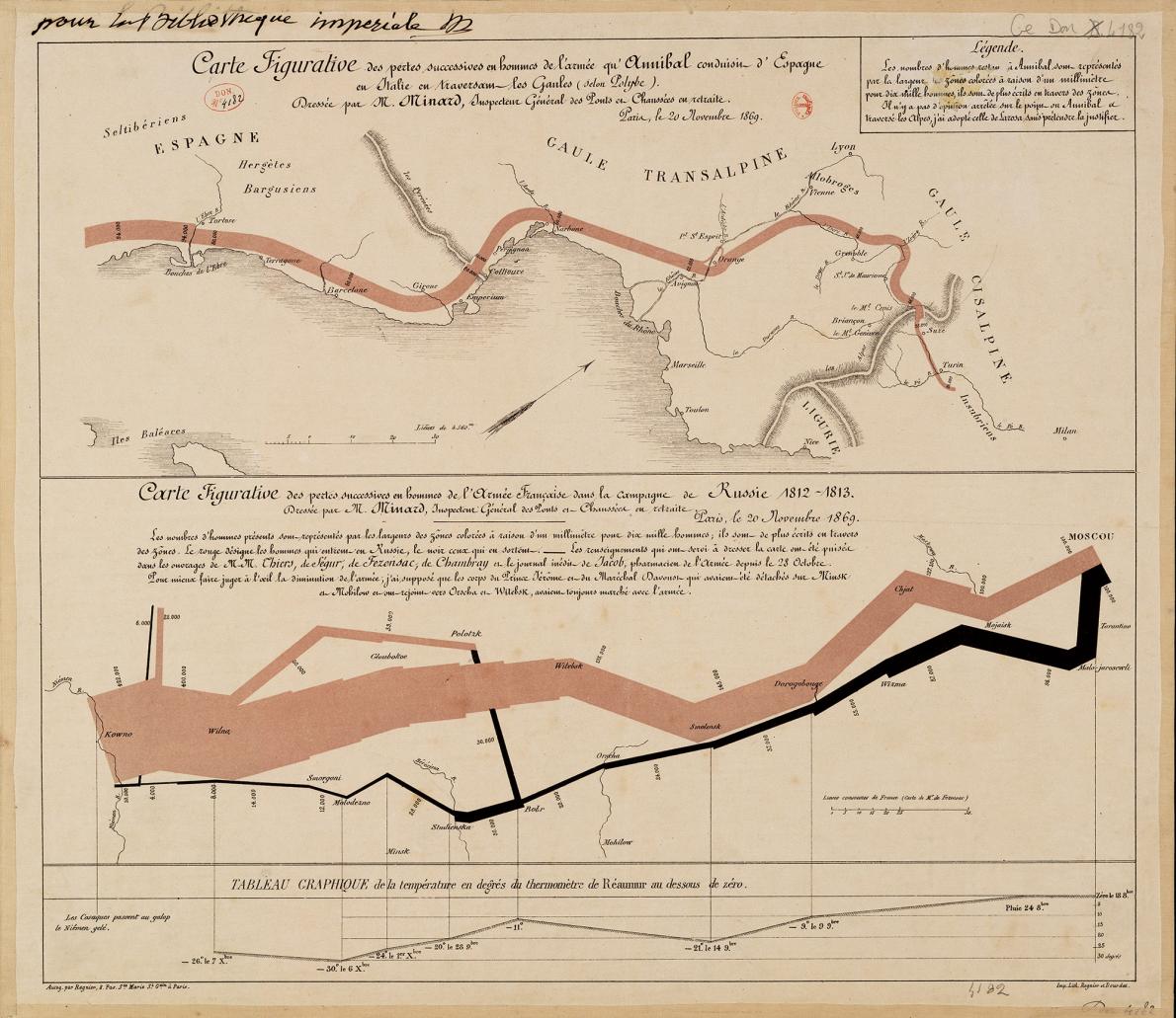
I'll leave you with my 5 general guidelines for creating more effective dataviz.
1. Show the Data.
Your reader can only grasp your point, argument, or story if they see the data. This doesn’t mean that all the data must be shown, but it does mean that you should highlight the values that are important to your argument.
2. Reduce the Clutter.
The use of unnecessary visual elements distracts your reader from the central data and clutters the page. Reduce/eliminate heavy tick marks, gridlines, textured gradients, too much text and labels. Focus on the data.
3. Integrate the Graphics and Text
Although our primary focus on creating a visualization is the graphic elements—bars, points, or lines—the text we include in and around our graphs is just as important.
4. Avoid the Spaghetti Chart
Sometimes we face the challenge of including lots of data in a single graph but we don’t need to try to pack everything into a single graph. Break up those complex/dense graphs and try a 'small multiples' approach.
5. Start with Gray.
Whenever you make a graph, start with all gray data elements. By doing so, you force yourself to be purposeful and strategic in your use of color, labels, and other elements.
If you'd like to learn more about #dataviz and more effective ways to communicate your data, please follow me:
Website: policyviz.com
Twitter: @jschwabish
Instagram: instagram.com/jschwabish/?hl…
And check out my latest book:
amzn.to/2zHQ4qv

• • •

Missing some Tweet in this thread? You can try to force a refresh
 

Keep Current with IAmSciComm | @jschwabish @policyviz

IAmSciComm | @jschwabish @policyviz Profile picture

Stay in touch and get notified when new unrolls are available from this author!

Read all threads

This Thread may be Removed Anytime!

PDF

Twitter may remove this content at anytime! Save it as PDF for later use!

Try unrolling a thread yourself!

how to unroll video
  1. Follow @ThreadReaderApp to mention us!

  2. From a Twitter thread mention us with a keyword "unroll"
@threadreaderapp unroll

Practice here first or read more on our help page!

More from @iamscicomm

27 Feb
I close out my week hosting the @iamscicomm account by sharing just a select few examples of #dataviz that don't follow the rules or templates or tried-and-true approaches. But they are beautiful and engaging and enlightening.
As you go forth and create your visualizations, continue to explore. Draw inspiration from all around you and from the amazing work these and other creators are generating.
Be sure to check out the amazing work from @NadiehBremer like this one on words translated into English. | visualcinnamon.com/portfolio/beau…

Her site: visualcinnamon.com
Read 6 tweets
27 Feb
Earlier in the week, I promised I'd put together a list of my favorite #dataviz tools. 🛠

These are by no means the only tools out there, but these are the ones I like and use regularly.

(Sigh, another thread....I know, I know....) 🧵
1. Excel. Yep, I use Excel for much of my #dataviz work. Excel is based on bars, lines, and dots, all in an X-Y space. Think of it that way, and you can create lots of stuff.

You can learn more in my step-by-step ebook: policyviz.com/product/a-guid…
2. #Rstats. If you code in SAS, Stata, SPSS, or other statistical packages, you won't have a hard time picking up #Rstats. Some great resources:
-r4ds.had.co.nz from @hadleywickham
-cedricscherer.com from @CedScherer
-r-graph-gallery.com from @R_Graph_Gallery
Read 11 tweets
27 Feb
I've written a bunch on how to create better data-rich tables. So prepare for a longish thread here. 🧵

Here's a 10-step summary of my "Ten Guidelines for Better Tables" in #BetterDataVisualizations and @benefitcost.
Before we get to the ten guidelines, recognize that just like in graphs and charts, there are a lot of pieces to tables. And, just like graphs and charts, we can control the look and design of all of these elements.
Rule 1. Offset the Heads from the Body
Make your column titles clear. Try using boldface type or lines to offset them from the numbers and text in the body of the table.
Read 13 tweets
26 Feb
Perhaps the most common #dataviz for qualitative data is the Word Cloud. ⛅️
In a word cloud, the size of each word is adjusted according to its frequency in a passage of text. Image
But here's the thing: The font, alignment, and color of the words in the word cloud can affect our perception of the data. Furthermore, it's hard to see the most important *concepts* in the text.
So, take the work @MartiHearst at Berkeley, who suggests breaking up the text into semantic groups before making the word cloud. | ischool.berkeley.edu/news/2019/word…
Read 4 tweets
26 Feb
We kick off today's subject of #dataviz for part-to-whole relationships and qualitative data with some of my favorite fun pie charts. I did not originally create these, and the original creators are lost to history.
Read 6 tweets
25 Feb
Flow maps are another kind of way to visualize your data. Maybe the most famous flow map is this one from Charles Joseph Minard in 1869. Tufte always touts this one as being the "best statistical chart ever made".

A quick 🧵 on the Minard map. Image
The famous Minard map shows 6 data values in a single view:
1. Number of troops (line thickness)
2. Distance traveled (scale)
3. Temperature (line at bottom)
4. Time (line at bottom)
5. Direction of travel (color)
6. Geography (cities, etc.)
But Tufte left out the fact that the Minard Napolean map was only one panel in a full spread. It also included the lesser-known map of Hannibal’s 218 BC march through the Alps to Rome. (This image from Ecole nationale des ponts et chaussées, which I include in my book.) Image
Read 4 tweets

Did Thread Reader help you today?

Support us! We are indie developers!


This site is made by just two indie developers on a laptop doing marketing, support and development! Read more about the story.

Become a Premium Member ($3/month or $30/year) and get exclusive features!

Become Premium

Too expensive? Make a small donation by buying us coffee ($5) or help with server cost ($10)

Donate via Paypal Become our Patreon

Thank you for your support!

Follow Us on Twitter!