
So, just gave a "hot-take-lightning-talk" to our team about:
*Why timeline maps are the new bar chart races.*
And since readers did not give me much hate for the last days (just "why do you believe in science"), I am ready for discussions & rants on twitter.
#ddj #dataviz
1/x
*Why timeline maps are the new bar chart races.*
And since readers did not give me much hate for the last days (just "why do you believe in science"), I am ready for discussions & rants on twitter.
#ddj #dataviz
1/x


As any good rant, it started with jealousy.
An editor sent me this viz by @juliustroeger @moklick @colorfuldata and @elena_erdmann. He asked whether we could do sth similar.
And of course we couldn’t. But also, after some time, I thought:
we shouldn’t.
2/x
An editor sent me this viz by @juliustroeger @moklick @colorfuldata and @elena_erdmann. He asked whether we could do sth similar.
And of course we couldn’t. But also, after some time, I thought:
we shouldn’t.
2/x
@juliustroeger @moklick @colorfuldata @elena_erdmann (Btw in general, I love ZeitOnline's team)
The reason is, I feel overwhelmed. Things are happening left and right, north and south. And just when I saw something, it is gone. Still, better than this map where nothing happens. But I guess, timeline maps suffer from 2 things:
3/x
The reason is, I feel overwhelmed. Things are happening left and right, north and south. And just when I saw something, it is gone. Still, better than this map where nothing happens. But I guess, timeline maps suffer from 2 things:
3/x
1. Often missing narratives.
2. Too much cues to process.
It reminded me of the debate about barchart races. Those nasty things that looked fancy but nobody could tell what they showed. Here a explanation/rant by @AlbertoCairo.
4/x
thefunctionalart.com/2019/11/the-ba…
2. Too much cues to process.
It reminded me of the debate about barchart races. Those nasty things that looked fancy but nobody could tell what they showed. Here a explanation/rant by @AlbertoCairo.
4/x
thefunctionalart.com/2019/11/the-ba…
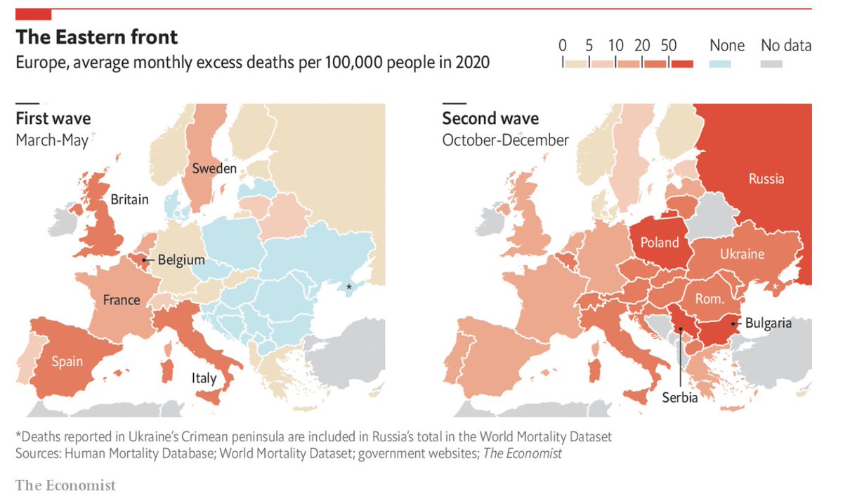
@AlbertoCairo But what if we actually have a narrative that is time and spatial dependent. Like the Western/Eastern divide between the surge of Covid-cases in Europe. Well, the @ECONdailycharts shows both in separate charts on its dashboard. But it is difficult with the scrolling.
5/x
5/x


@AlbertoCairo @ECONdailycharts A great one-chart solution is the one that they showed here. Which I like for its clarity. With a simple toggle button, you could make it a bit more playful. But it gets the message across.
6/x
6/x

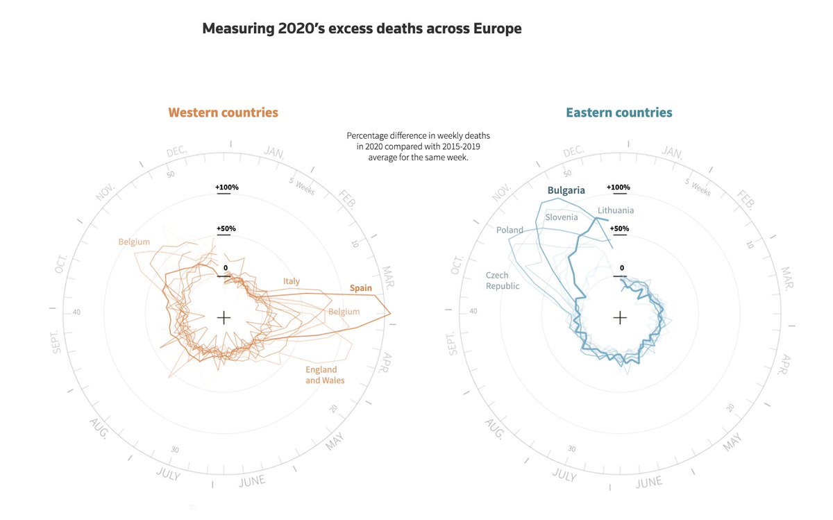
@AlbertoCairo @ECONdailycharts However, my favourite solution is this by @ReutersGraphics. And the great thing is: it uses almost no maps.
It is Nightingale charts that are divided into left and right for Western and Eastern countries. So it uses cues very subtly and just neatly tells the story.
7/x
It is Nightingale charts that are divided into left and right for Western and Eastern countries. So it uses cues very subtly and just neatly tells the story.
7/x

@AlbertoCairo @ECONdailycharts @ReutersGraphics All that being said, I am interested in other people's takes and opinions. Is there a good point for timeline maps? What have I overlooked? And how much am I just yelling at clouds?
8/x
8/x
Oh and on a final note, here are all the links to the graphics:
zeit.de/wissen/gesundh…
tagesschau.de/ausland/corona…
economist.com/graphic-detail…
economist.com/graphic-detail…
graphics.reuters.com/HEALTH-CORONAV…
9 and Fin/x
zeit.de/wissen/gesundh…
tagesschau.de/ausland/corona…
economist.com/graphic-detail…
economist.com/graphic-detail…
graphics.reuters.com/HEALTH-CORONAV…
9 and Fin/x
• • •
Missing some Tweet in this thread? You can try to
force a refresh


