There’s nothing like a 10-point Likert scale to make complete noise seem like scientific results.

Behold, the completely unactionable survey.
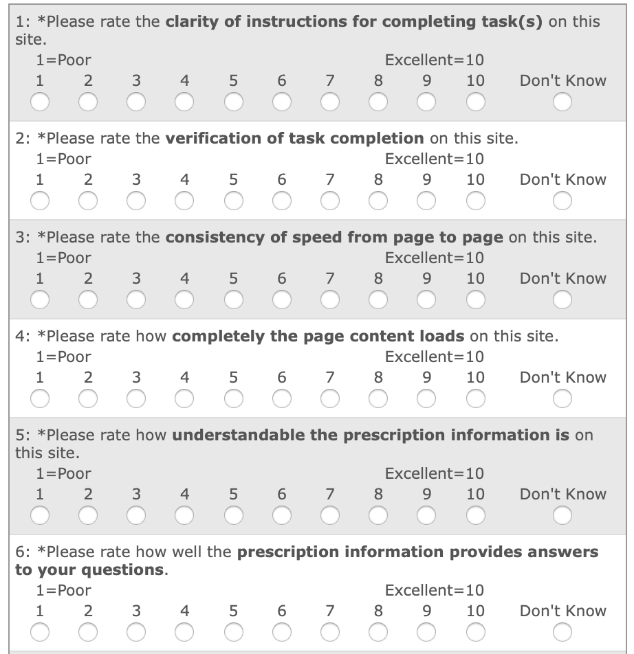
I blame Foresee for this. They sell snake-oil-disguised-as-scientific-survey-tool to thousands of unsuspecting product managers who want “data” to prove their decisions were right on.
I found the “consistency of speed from page to page” question to be quite amusing.

Is a 10 the right answer for a site that’s consistently slow?

Remember, even if your data is unreliable and unscientific, it still makes for an awesome PowerPoint chart, especially when you rotate it to look like it’s heading up and to the right.

“If you torture data long enough, it will confess to anything you’d like.”

– R. Coase, economist.

• • •

Missing some Tweet in this thread? You can try to force a refresh
 

Keep Current with Jared Spool

Jared Spool Profile picture

Stay in touch and get notified when new unrolls are available from this author!

Read all threads

This Thread may be Removed Anytime!

PDF

Twitter may remove this content at anytime! Save it as PDF for later use!

Try unrolling a thread yourself!

how to unroll video
  1. Follow @ThreadReaderApp to mention us!

  2. From a Twitter thread mention us with a keyword "unroll"
@threadreaderapp unroll

Practice here first or read more on our help page!

More from @jmspool

3 Dec 20
Let's talk about what early career UX folks should emphasize in interviews, especially when searching for the first job.

A mistake I see folks make is when they focus on the designs they've created. Often these are school or side projects. They look great. They work great.

1/
However, that's not what smart hiring managers care about.

Of course, if you produce crappy-looking stuff, they won't give you the time of day.

But you don't have crappy-looking stuff. That's not what's preventing you from getting that first dream gig.

2/
What's preventing you from getting that gig is that the hiring managers can't see your vector of growth.

You see, it's likely you're not telling your story right. The hiring manager doesn't care about your designs, because, let's face it, they aren't that impressive.

3/
Read 18 tweets
11 Aug 20
Dashboards are often what customers ask for.

They are rarely what customers need.

If you’re building a dashboard, it’s likely your user research wasn’t finished.
Dashboards report on current status.

Users don’t act on status.

They act on change in status.

Dashboards are passive when the user needs something active.

They are a failure before it happens.

“Users wouldn’t ask if they didn’t need them.”

Oh, there’s a need alright.

Dashboards aren’t a need. They are a solution. And, often, the wrong one.

Learn more about the problem and a better solution will likely present itself.

Read 13 tweets
20 Dec 19
Disappointed there are still hiring teams who won’t even talk to a candidate who doesn’t have an up-to-date portfolio.

Several excellent designers I know were unexpectedly laid off recently. They don’t have portfolios ready.

These teams will miss the chance to hire them.
Requiring a portfolio for an interview is a great way to push highly-qualified candidates away.

These folks can show their work, they just don’t have it packaged in a way to supply it when applying.

It’s a *huge* hiring mistake to refuse to talk with them.
I wrote about how to avoid key hiring mistakes like this one.

articles.uie.com/reviewing-ux-p…
Read 24 tweets
3 Dec 19
Hello, UX Managers.

Are you building your team and hiring UX professionals?
UX Designers?
UX Researchers?
UX Writers and Content Specialists?

Reply to this tweet with a link to the job description and the job's location.

I'll retweet it to my 100k followers.
My followers include very talented UX professionals who:

• Are early in their career and are looking for their first job.

• Can work remotely.

• Are looking for an org that will sponsor a visa.

You get extra karma points if your job is open to any of these wonderful folks.
Feel free to reply with any open posting, even if I retweeted it recently.

I do this every month. Here's November's collection of posts:
Read 5 tweets
6 Nov 19
“Quant tells us what. Qual tells us why.”

This oversimplification regularly gets teams into trouble.

It suggests that quant and qual are simple, single dimensional measurements.

And it suggests they’re somehow to be considered separately.

Neither suggestion is correct.
Qualitative data comes in all shapes and sizes, as does quantitative data.

For qual data, we have user's problems, their needs, their journeys, their outcomes.

For quant, we have success rates, problem rates, attitudes, costs.
We mix and match. More importantly, we combine them to tell a story the informs the decisions we have before us.

The richer the data, the better the story.

And the better our decisions will be.
Read 11 tweets
1 Nov 19
A/B testing is an effective approach to use science to design and deliver deeply-frustrating user experiences.
A/B testing without upfront research is just random monkeys testing random designs to see which of those designs do “best” against random criteria.

If drug testing was actually implemented like most A/B tests, you’d give 2 drugs to 2 groups of people and pick the “winner” by whichever group had fewer deaths.

Read 4 tweets

Did Thread Reader help you today?

Support us! We are indie developers!


This site is made by just two indie developers on a laptop doing marketing, support and development! Read more about the story.

Become a Premium Member ($3/month or $30/year) and get exclusive features!

Become Premium

Too expensive? Make a small donation by buying us coffee ($5) or help with server cost ($10)

Donate via Paypal Become our Patreon

Thank you for your support!

Follow Us on Twitter!