“An endless nightmare. I think the verdict would be ‘Oh don’t read that horrid book.'”
Rejection letter quote for War Of The Worlds, a novel by H.G. Wells.
Rejection letter quote for War Of The Worlds, a novel by H.G. Wells.

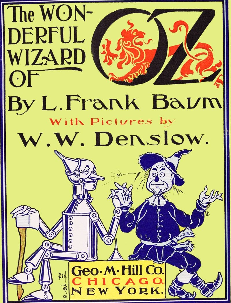
“Too radical of a departure from traditional juvenile literature.”
Rejection letter quote for The Wonderful Wizard Of Oz, a novel by L. Frank Baum.
Rejection letter quote for The Wonderful Wizard Of Oz, a novel by L. Frank Baum.

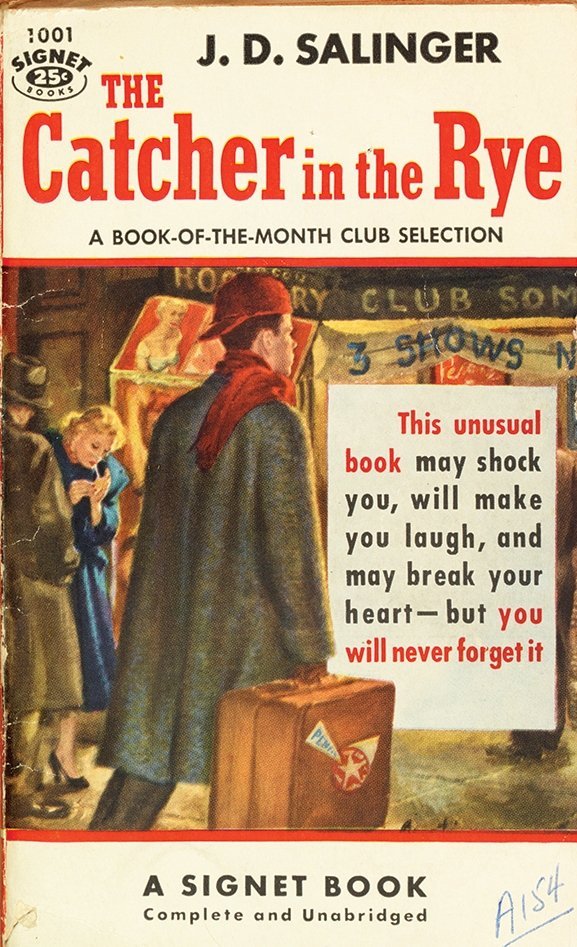
“We feel that we don’t know the central character well enough.”
Rejection letter quote for The Catcher In The Rye, a novel by J.D. Salinger.
Rejection letter quote for The Catcher In The Rye, a novel by J.D. Salinger.

“Hopelessly bogged down and unreadable.”
Rejection letter quote for The Left Hand Of Darkness, a novel by Ursula K LeGuin.
Rejection letter quote for The Left Hand Of Darkness, a novel by Ursula K LeGuin.

“An absurd and uninteresting fantasy which was rubbish and dull.”
Rejection letter quote for Lord Of The Flies, a novel by William Golding.
Rejection letter quote for Lord Of The Flies, a novel by William Golding.

“Apparently the author intends it to be funny - possibly even satire - but it is really not funny on any intellectual level.”
Rejection letter quote for Catch-22, a novel by Joseph Heller.
Rejection letter quote for Catch-22, a novel by Joseph Heller.

"Your pigs are far more intelligent than the other animals, and therefore the best qualified to run the farm.”
Rejection letter quote for Animal Farm, a novel by George Orwell.
Rejection letter quote for Animal Farm, a novel by George Orwell.

"I rack my brains why a chap should need thirty pages to describe how he turns over in bed before going to sleep.”
Rejection letter quote for In Search Of Lost Time, a novel by Marcel Proust.
Rejection letter quote for In Search Of Lost Time, a novel by Marcel Proust.

"First, we must ask, does it have to be a whale?"
Rejection letter quote for Moby Dick, a novel by Herman Melville.
Rejection letter quote for Moby Dick, a novel by Herman Melville.

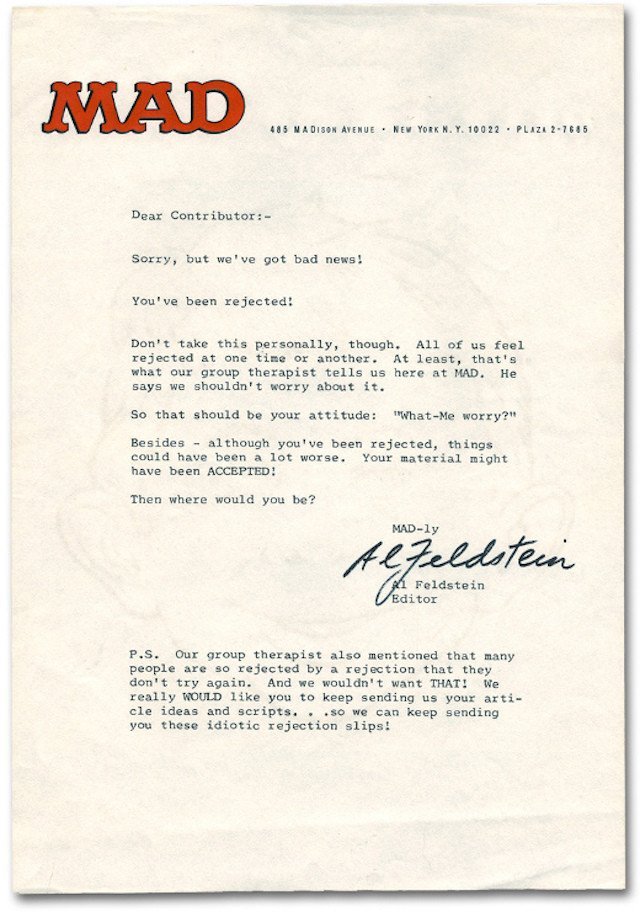
Whatever you do as a writer, stick to it. Success involves knocking on many doors before you decide which one you're going to kick down... 

• • •
Missing some Tweet in this thread? You can try to
force a refresh


