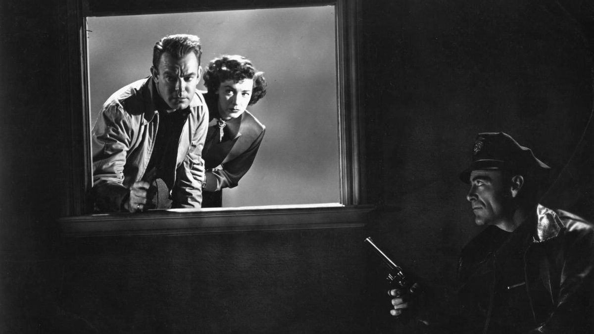
we’re watching MANK tonight and my immediate thought is that the lighting is bad
i’m not comparing the lighting to color films, i’m comparing the lighting to the films MANK is trying to invoke. even something as dark and shadowy as RAW DEAL (1948) which takes place mostly indoors, has bright highlights
okay, here’s the thing. i am actually totally for a movie that tries to emulate the look and rhythms of a film from the late 1930s and early 1940s. but if you’re going to do it, do it! it is distracting to me, for example, that the editing rhythms are still very modern.
amanda seyfried is great though
• • •
Missing some Tweet in this thread? You can try to
force a refresh
an annual household income of $400,000 puts one in the top 2 percent of households! no you aren’t a billionaire or multi-millionaire but that doesn’t mean you aren’t very affluent.
great scene, incredibly frustrating movie. denzel is magnetic whenever he is on the screen but the film is built around russell crowe’s much less compelling protagonist
in fairness “great scenes, frustrating movie” is the ridley scott special
absolutely. there’s that whole run of tony scott movies that basically ride on the fact that Denzel is the most compelling screen presence of his generation
using my laptop as a laptop for the first time in forever (i'm usually either on my ipad or i have it plugged in to a monitor w/ a separate keyboard and mouse) and i keep trying to touch the screen like a maniac.
my brain just completely rejects the idea that i cannot touch the screen to open up a notification or swipe to a different application
also! the aspect ratio of laptop screens is ridiculous. too much horizontal space!
bribing members of congress with spending to help their districts — or even on pet projects — is good. it helps make politics concrete, and connects elections to outcomes.