Thread! I've watched 100s of hours of photography videos on YouTube. I've learned from the experts! From them, I've learned that being a good photographer is all about having the latest gear, having more megapixels, and knowing those cool Lightroom tricks.
So, thank you, YouTube experts! I now have the confidence to help other beginning photographers get better. In the rest of this thread I'll critique some photos that have been sent to me for review.
We'll start with one sent to me by "Henri". My critique: there's too much motion blur. Next time, up your ISO and use a faster shutter speed. And there's way too much sensor noise! Get yourself a professional camera, mate!
Here's another submission from "Henri". Nice snapshot, but it would be stronger without the distracting background detail and the half of an arm on the left. Henri, don't be afraid to crop your work! Crop crop crop! Also, let's not encourage underage drinking!
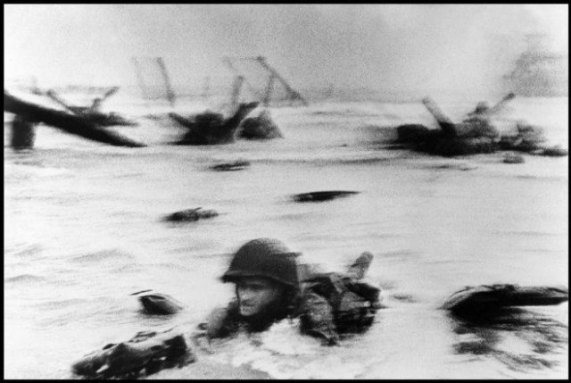
Here's a submission from "Robert". He says he took it at the beach. Well, I hate to say it Robert, but this is terrible -- way too shaky and blurry. I suggest that you invest in a camera that has proper image stabilization.👍
Here's a street photo from "Arthur". This poor person has dilated pupils and is demonstrating aggressive behavior. I really don't think it's ethical to take photos of homeless people like this ☹️
A studio portrait from "Mathew". My initial reaction: Why so glum? Pro tip: Make sure your subjects are relaxed in the studio. Maybe put on some theatre music?
A nice, if overly clichéd, shot of Half Dome by "Ansel". Ansel said he likes using film, but I'd recommend that he upgrade to a full frame digital camera with 15 stops of dynamic range to get some real detail in those shadows.
This tweetstorm sponsored by Squarespace
This family portrait by "Dorothea" seems a bit rushed. The mother looks disheveled and the kids are too shy. Also, photoshop out those wrinkles for pete's sake! The healing brush is your friend! I recommend that the family come back to the studio for a reshoot.
"Irving" wants my opinion on this one. Well, the sitter looks too tense imo. Try to get your subjects to smile, Irving! Also, could you not find that poor man a decent chair?
Finally, an excellent portrait taken by a photographer who obviously knows exactly what they are doing! The subject is relaxed and smiling, and in focus with no distracting background. Irving and Dorothea, you could learn from this! This gets the top score of 10/10.
Dear "Cindy", I think you clicked the shutter at the wrong time. Try waiting until your subject is looking TOWARDS the camera. Look at the previous portrait to see how it's done.
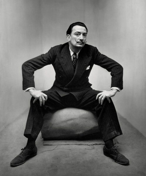
I hate it when people overuse photoshop like this -- it's so fake and unbelievable. Dear whoever, instead of using a green screen you should pose these men in front of a real background. You're in NYC, so the Rockefeller Plaza would be a good outdoor location.
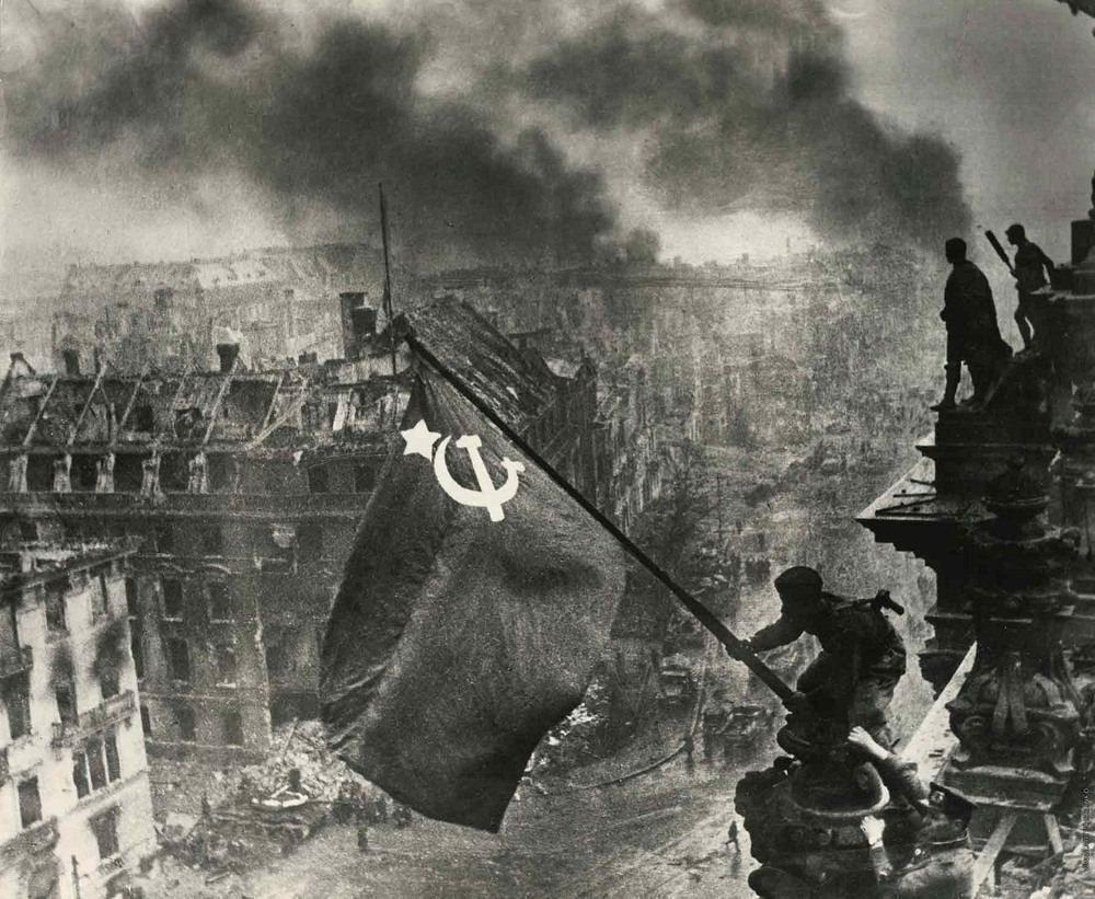
A lucky shot by "Sam", but I have to say that this was no time to get all hipster and arty with the black and white. Colour would have been so much more powerful -- a real missed opportunity! ☹️
This shot by "Jeff" is ok but could be much better. Start by shopping out the distracting street lights in the foreground. More importantly, the strong diagonal composition has been ruined by including a random passer-by with their groceries. Better luck next time!
"Nicéphore" (obviously a pseudonym🙄) sent me this. Appallingly blurry and low res. And it doesn't look like a very interesting composition, even if I could see it properly. Don't use a homemade camera next time! Even a cheap point & shoot would be better.
This snapshot by "Andreas" is technically good but not at all ready for instagram. In the future, if you want to take a photo of food, make it much more appetizing, like a close up of your lunch or something. No one is going to buy a print of this to hang on their wall.
This one by "Robert" is way too busy. Get a decent zoom and focus on one subject at a time. Also the focus is a little soft, so I'm guessing his camera doesn't have face detection -- I'd strongly recommend that as an upgrade.
The details in the background are very distracting. Personally, I would have gone with a wide open lens to emphasize the foreground and get some nice creamy bokeh.
I'm seriously concerned about the safety of this child. Where is this boy's mother?
This one, from "Roger", is just boring. A bunch of bowling balls scattered around? Pro tip: Add an attractive model to give it some human interest!
"Elliot" loves dogs. This doggo is obviously a good boi. I cannot say anything bad about this photo.
Overall, I'm disappointed in the quality of these submissions. I'm totally over this hipster trend for B&W and lots of film grain. I'd strongly recommend that the photographers I critiqued watch more YouTube videos, so that they can see what good photography is all about. /end

• • •

Missing some Tweet in this thread? You can try to force a refresh
 

Keep Current with Scott Wlaschin

Scott Wlaschin Profile picture

Stay in touch and get notified when new unrolls are available from this author!

Read all threads

This Thread may be Removed Anytime!

PDF

Twitter may remove this content at anytime! Save it as PDF for later use!

Try unrolling a thread yourself!

how to unroll video
  1. Follow @ThreadReaderApp to mention us!

  2. From a Twitter thread mention us with a keyword "unroll"
@threadreaderapp unroll

Practice here first or read more on our help page!

More from @ScottWlaschin

23 Dec 19
If you care about usability, human factors, normal accidents, etc, then this is a must read. If this has been reported correctly, the design of the ship's navigation system is shocking.
features.propublica.org/navy-uss-mccai…
To summarize: The US Navy's John McCain collided with an oil tanker and 10 people died. The crew using the navigation system got blamed but the navigation system itself didn't. Sadly, though, many of the mistakes have been made before and will probably be made again 😟
Mistake #1 -- Lack of training: [the helmsman] felt confident using the system to control the speed and heading of the ship. But... “There was actually a lot of functions on there that I had no clue what on earth they did,” he said of the system.
Read 26 tweets
12 Oct 19
I'm developing a new alternative to microservices that addresses many of the problems that people run into. I call it "SPMSA". Bear with me -- I'll explain the acronym in a later tweet. 1/
First, design your microservices in the usual way. No more than 500 lines each, say, and with well-defined interfaces. But here's the first trick: you put them all in the same repo. This means that you have a single commit that encompasses all services at once. 2/
That means when you commit or refactor, you can build and test the services as a whole system and be sure that they *always* all work together! Awesome! 3/
Read 12 tweets
4 Aug 19
This is a great idea: . Before I was a programmer I use to do a bit of odd-job carpentry, so I'm going to chime in with my take based on my experiences in that field.
When you're outside an area of expertise looking in, it can often seem monolithic and uniform, but when you're an insider you quickly realize that there are many different subcommunities, each with different specialties and different approaches. They sometimes hate each other :)
We know this is true for programming, so why shouldn't we expect this is true for everything else too? In fact, a good clue that someone doesn't have any experience in a certain area is that they radically over-simplify things. Experienced people never think things are simple.😀
Read 25 tweets
24 Jun 19
NewCrafts is the one of the best conferences if you like alternative takes on programming culture. There are a number of excellent videos available on their site: videos.ncrafts.io I'm going link to a few below. #newcrafts
If you have a philosophical bent, start with "Nihilism and technology" by @ethicistforhire videos.ncrafts.io/video/338479835
or "In defence of uncertainty" by @abebab videos.ncrafts.io/video/338449961
Read 11 tweets
19 Mar 19
Recently @Hillelogram linked to Pamela Zave's work on "Feature Interaction" pamelazave.com/faq.html. This is well worth reading and has some nice examples where two features work correctly in isolation, but fail when combined. For example:
Carol has Do Not Disturb enabled except for her colleagues. Later, her colleague Bob starts forwarding all calls to Carol. When Alice (who Carol doesn't know) calls Bob, the call is forwarded to Carol. Should Carol's phone ring?
The "Do Not Disturb" and "Call Forwarding" features both work as designed but their interaction is not obvious. Designing and testing the components individually will not address the problem. You might not even be aware that you have a problem!
Read 10 tweets
28 Dec 18
You're not a real developer if you don't have a computer science degree
You're not a real developer if you weren't hacking when you were eight years old
You're not a real developer if you don't spend your spare time coding
You're not a real developer if you do it for the money
You're not a real developer if you don't understand math jokes
You're not a real developer if you've never heard of XKCD
You're not a real developer if you don't like Star Wars
You're not a real developer if you don't play video games
You're not a real developer if you're not passionate about coding
You're not a real developer if you don't read Hacker News and /r/programming
You're not a real developer if you've never gatekept about who's a real developer
Read 18 tweets

Did Thread Reader help you today?

Support us! We are indie developers!


This site is made by just two indie developers on a laptop doing marketing, support and development! Read more about the story.

Become a Premium Member ($3/month or $30/year) and get exclusive features!

Become Premium

Too expensive? Make a small donation by buying us coffee ($5) or help with server cost ($10)

Donate via Paypal Become our Patreon

Thank you for your support!

Follow Us on Twitter!