, 26 tweets, 6 min read
My Authors
Read all threads
If you care about usability, human factors, normal accidents, etc, then this is a must read. If this has been reported correctly, the design of the ship's navigation system is shocking.
features.propublica.org/navy-uss-mccai…
To summarize: The US Navy's John McCain collided with an oil tanker and 10 people died. The crew using the navigation system got blamed but the navigation system itself didn't. Sadly, though, many of the mistakes have been made before and will probably be made again 😟
Mistake #1 -- Lack of training: [the helmsman] felt confident using the system to control the speed and heading of the ship. But... “There was actually a lot of functions on there that I had no clue what on earth they did,” he said of the system.
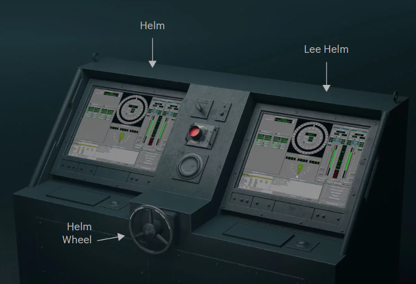
#2 Few tactile controls: This picture shows hardly any. And using the touchscreen for everything? It seems like it would be really easy to make mistakes. "Navy technicians would even disable the touchscreen to avoid rudder changes caused by accidental taps."
Did the designers of this system study aircraft? Even glass cockpits have lots of tactile controls.
E.g. "Flap levers/switches normally have a cap or top that is flat and parallel to the wings. It's easy to identify solely by touch."
aviation.stackexchange.com/questions/2272…
From that same comment: "Muscle memory is a big part of quickly and correctly executing an emergency checklist." Personally, I'd be interested to know how well touchscreen-only systems work in emergencies.
#3 Not meeting real world requirements: "The navigation system could also become overloaded if too much information streamed in from a ship tracking database used worldwide to prevent maritime collisions. The solution: Drop the feed when it became too much" 😬
Previous problems made people lose trust in the system: “Usually when we have a fault with that system,” [the captain] said, “their resolution is to reboot the system.” 🙄
#4 Cost cutting: "Because of staffing shortfalls, higher-ups had waived a requirement to have a technician on board with specialized training to maintain the [navigation system]." And I wouldn't be surprised if training was reduced to save money as well.
#5 Bad UI: A number of stations could take control of the ship but it was not obvious to the user which one actually had active control. And I'm guessing that if you attempted to do something when you didn't have control there would be no warning on the screen to let you know.
Here's my understanding of the accident:

1) Because of continued problems and lack of trust in the navigation system, the captain turned off most of the automation, which also turned off some of the safeguards. That this would happen was not documented.
2) Due to a recent major accident on another Navy boat that was caused by overwork, the captain wanted to make sure the the crew took proper breaks. So, an inexperienced helmsman was put in charge for a while.
features.propublica.org/navy-accidents…
3) To help out the inexperienced helmsman, the captain assigned someone else to control the speed. During this handover process the helmsman's station accidentally lost control of the rudder (because no safeguards).
4) So his steering actions did nothing. Because of the bad UI and lack of training, he thought that steering had been lost completely.
5) Also as part of the handover process (by a drop down menu! 🙄) the two main drive shafts got decoupled. For some reason, the UI required that they be transferred separately rather than as a single unit, even if they were currently ganged together.
6) When speed was reduced, only one shaft slowed, so that the ship started turning. Yet the UI showed no rudder deflection. Because of that, the crew got hyperfocused on the steering, with a completely wrong mental model of what was happening.
7) There was a fail-safe device known as the "big red button" that would return control to the station where the button was. However due to lack of training, the crew thought the big red button sent steering control to the rear of the ship.
8) Presumably, the crew thought the unresponsive bridge station was faulty, so an officer ordered the aft station to take control. Various people pressed the big red button, including someone on the bridge. It took 26 seconds for the aft station to properly assume control.
9) At which point it was too late. The ships collided and people died.
The Navy review said: “There is a tendency of designers to add automation based on economic benefits (e.g. reducing manning, consolidating controls) without considering the effect to operators who are trained and proficient in operating legacy equipment.”
As in many accidents, it's always easy to blame the operators when really it's the complex system that's the problem, not helped by typical issues such as underfunding, lack of training, bad UI and ignoring human factors, etc., etc.
As software devs, we have a *responsibility* to build systems that are robust against these kinds of problems. I found that books like "The Field Guide to Understanding Human Error", "The Logic Of Failure", "Normal Accidents", "The Design of Everyday Things" were very helpful.
See also work by Nancy Leveson () and Steven Shorrock ()
I also always recommend "How Complex Systems Fail" by Richard Cook. web.mit.edu/2.75/resources…
And for SRE in particular there's the @LFISoftware project from @nora_js et al.
learningfromincidents.io/blog/learning-…
@LFISoftware @nora_js I guess that's the end of my rant. But this stuff really bothers me. So my plea to you, if you are involved in software development in any capacity, please learn about human factors, usability, etc. You could save someone's life.
Missing some Tweet in this thread? You can try to force a refresh.

Enjoying this thread?

Keep Current with Scott Wlaschin

Profile picture

Stay in touch and get notified when new unrolls are available from this author!

Read all threads

This Thread may be Removed Anytime!

Twitter may remove this content at anytime, convert it as a PDF, save and print for later use!

Try unrolling a thread yourself!

how to unroll video

1) Follow Thread Reader App on Twitter so you can easily mention us!

2) Go to a Twitter thread (series of Tweets by the same owner) and mention us with a keyword "unroll" @threadreaderapp unroll

You can practice here first or read more on our help page!

Follow Us on Twitter!

Did Thread Reader help you today?

Support us! We are indie developers!


This site is made by just three indie developers on a laptop doing marketing, support and development! Read more about the story.

Become a Premium Member ($3.00/month or $30.00/year) and get exclusive features!

Become Premium

Too expensive? Make a small donation by buying us coffee ($5) or help with server cost ($10)

Donate via Paypal Become our Patreon

Thank you for your support!