A quick drawing lesson for artists who struggle with street scenes/buildings-
I was giving feedback on a student layout and realized the advice here could help other people too.
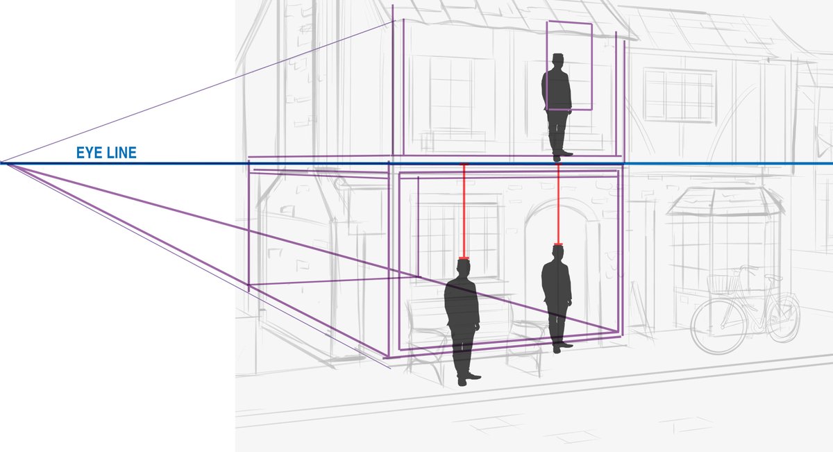
Here's the construction build.
The perspective is consistent, which is a great first step.
I was giving feedback on a student layout and realized the advice here could help other people too.
Here's the construction build.
The perspective is consistent, which is a great first step.

The perspective is working, but there's a common proportion problem.
To check and adjust, we need to find the eye line used to build the scene. Follow back the perspective lines and there it is. Straight forward.
To check and adjust, we need to find the eye line used to build the scene. Follow back the perspective lines and there it is. Straight forward.

From here I add a scale figure. Sometimes I'll draw one in, but when I'm doing a lot of critiques I use an architectural figure silhouette like this instead.
I size the figure to fit on the bench and will use that to measure everything else in the scene. So far so good.
I size the figure to fit on the bench and will use that to measure everything else in the scene. So far so good.

If a part of the scale figure crosses the eye line, that will be consistent everywhere they stand on the same ground plane at every distance.
In this case they're below the eye line, but the distance will scales proportionately. Easy to check with copy + paste in digital.
In this case they're below the eye line, but the distance will scales proportionately. Easy to check with copy + paste in digital.

So, shifting the figure over slightly and scaling them, the size of the doorway is a bit big, but there are big doors/doorways on the front of some buildings so it works.
The bike is a touch too large for a 100% realistic scene, but that's easily scale-able too. No big deal.
The bike is a touch too large for a 100% realistic scene, but that's easily scale-able too. No big deal.

Here's where it gets interesting-
Imagine the building is transparent. There are walls, a floor and a ceiling on the main floor. The ceiling might be a bit taller or a bit shorter, but between those floors are support beams and load-bearing materials.
Imagine the building is transparent. There are walls, a floor and a ceiling on the main floor. The ceiling might be a bit taller or a bit shorter, but between those floors are support beams and load-bearing materials.

The size of the figure at that position remains constant, so if I slide a copy of them vertical up, you can see that the second floor window is at pelvis level.
The second floor is too short.
The second floor is too short.

Based on our rough floor build, the window should be somewhere around here and the roof should be raised to match.
In this way, they could build more floors or check all the buildings down the street for proportion relative to each other. Digital makes that process a lot easier.
In this way, they could build more floors or check all the buildings down the street for proportion relative to each other. Digital makes that process a lot easier.

I see this all the time with street scene drawings. People remember to check the relative size at street level, but after that each floor just becomes a series of random stacked windows that aren't properly spaced out and look really weird.
Even if you're drawing a scene that's more cartoony, it's still helpful to think in terms of relative proportion and to establish an overall sense of scale, even if it's exaggerated.
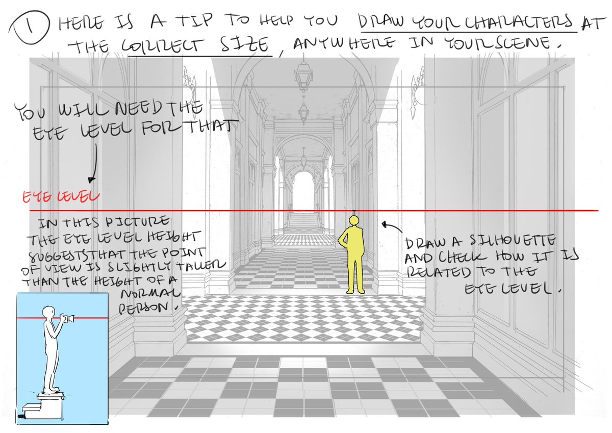
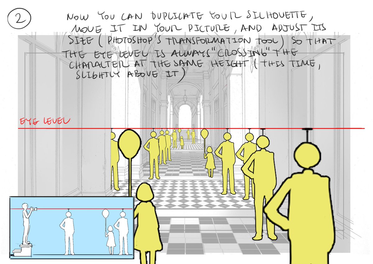
.@Thomasintokyo shows off this same basic theory masterfully in these tutorial examples- 


• • •
Missing some Tweet in this thread? You can try to
force a refresh


