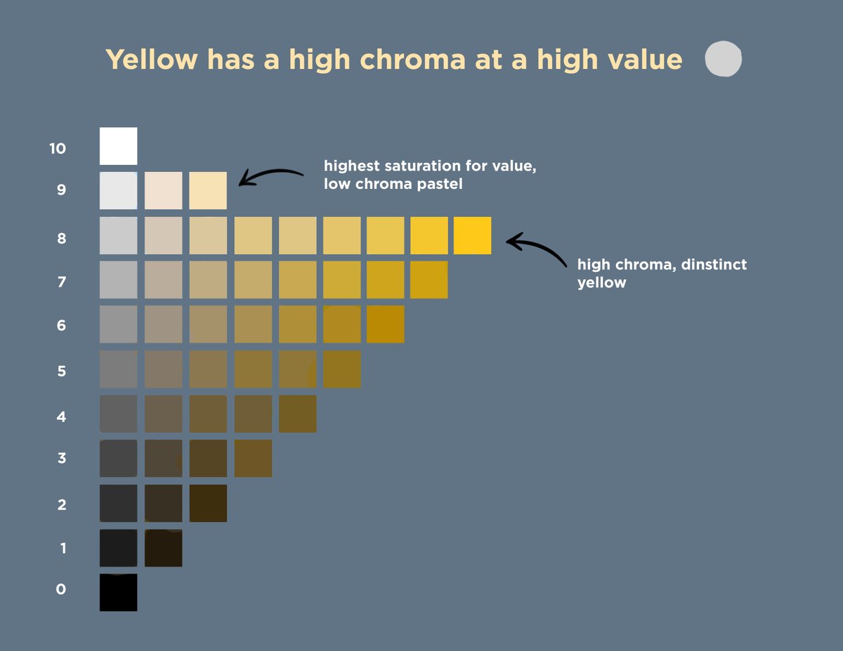
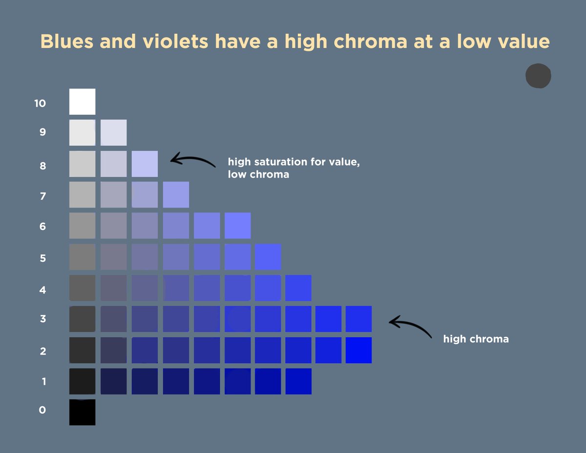
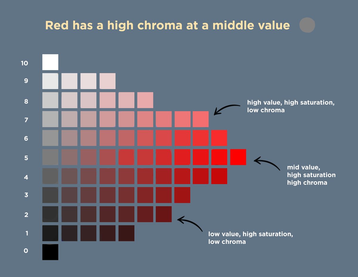
Thread on composition! It's not about math formulas or memorizing golden ratios. Contrast provides focal points, and you can arrange these in various ways to create different feelings. Some arrangements create very reliable effects, and you can add these tools to your toolbox!
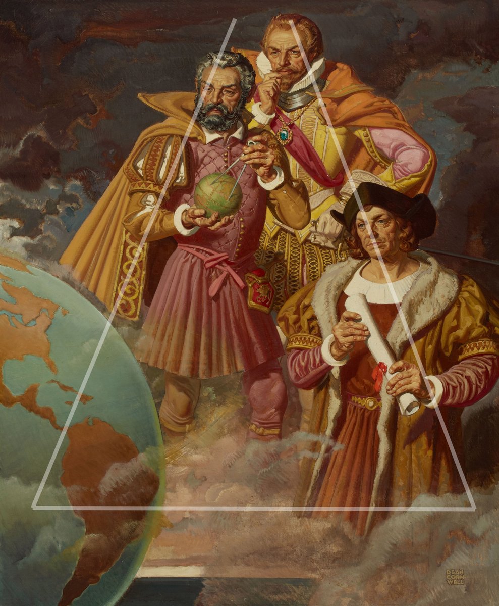
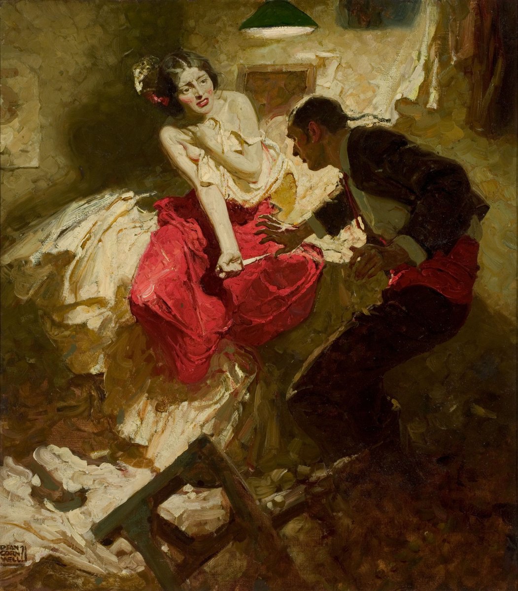
Let’s take a look at the compositions of Dean Cornwell. One of the most common tools is using a symmetrical triangle arrangement of focal points to convey stability. This first image conveys a stalemate or delicate balance of power with an inverted triangle...
While in this composition sketch the upright stable triangle conveys a more traditional feeling of power.
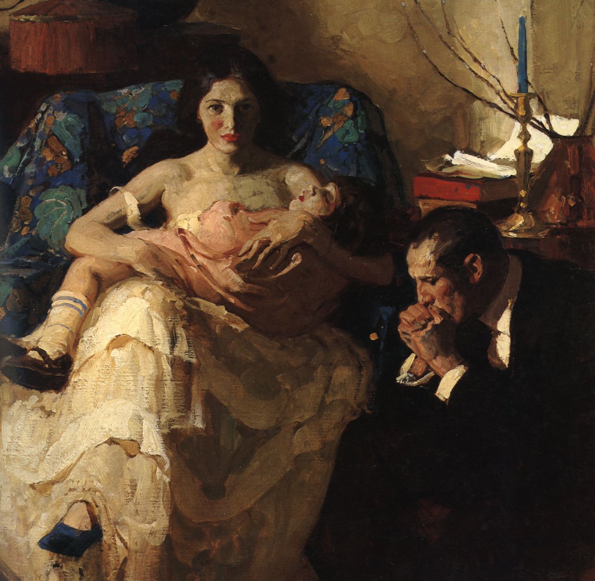
The more asymmetrical the triangle, the greater the feeling of dynamic motion, perfect for this chaotic scene.
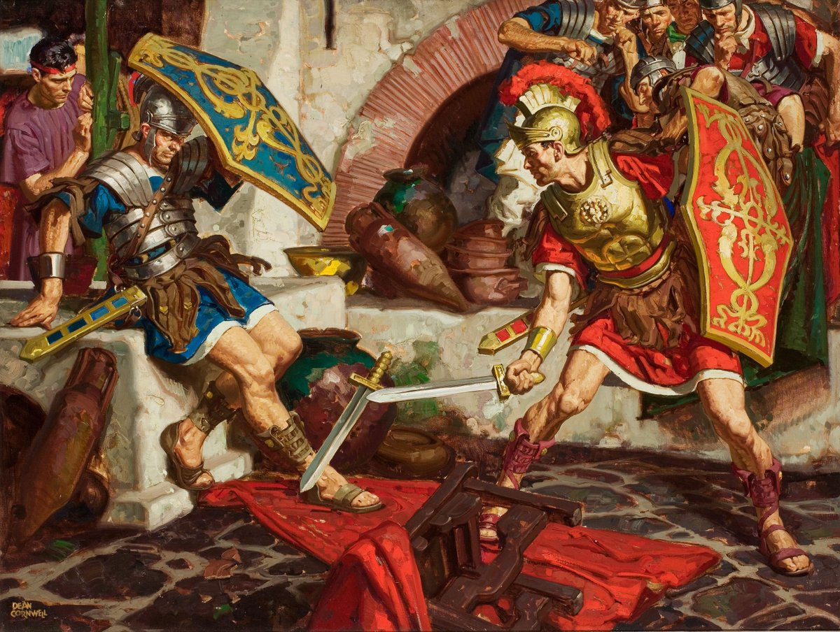
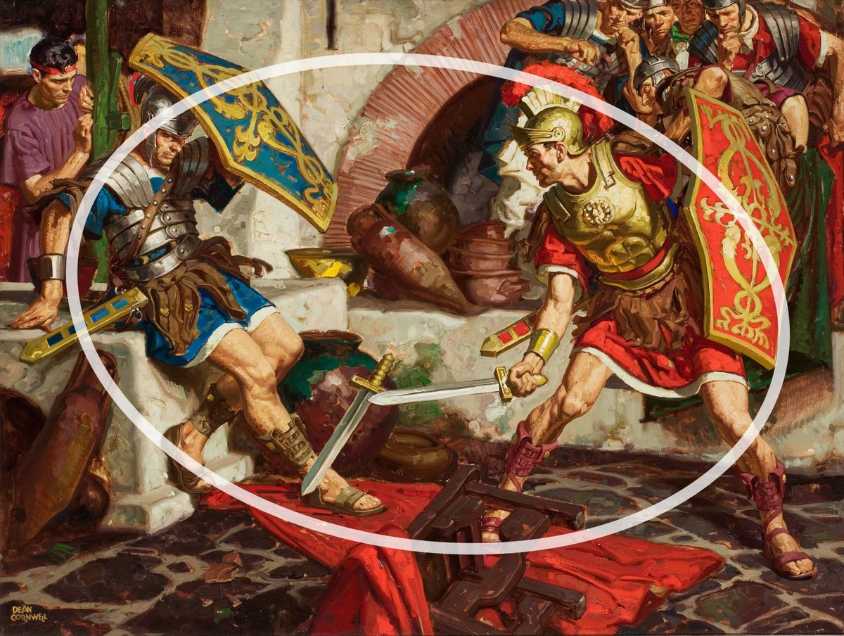
With many focal points arranged in a circle, a sense of swirling motion can be achieved, which fits really well for this battle.
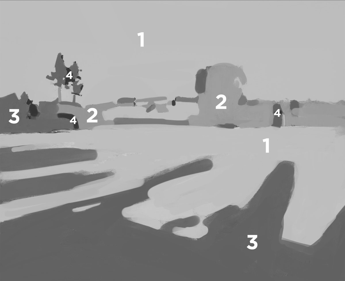
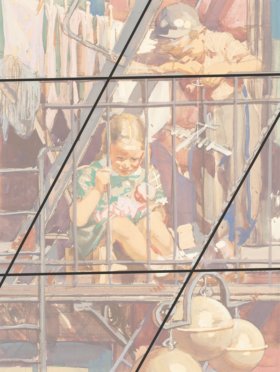
Composition isn't just about shapes, we can think about the division of space to create interesting relationships and how these repeating angles create a scaffolding that all the smaller relationships are based on.
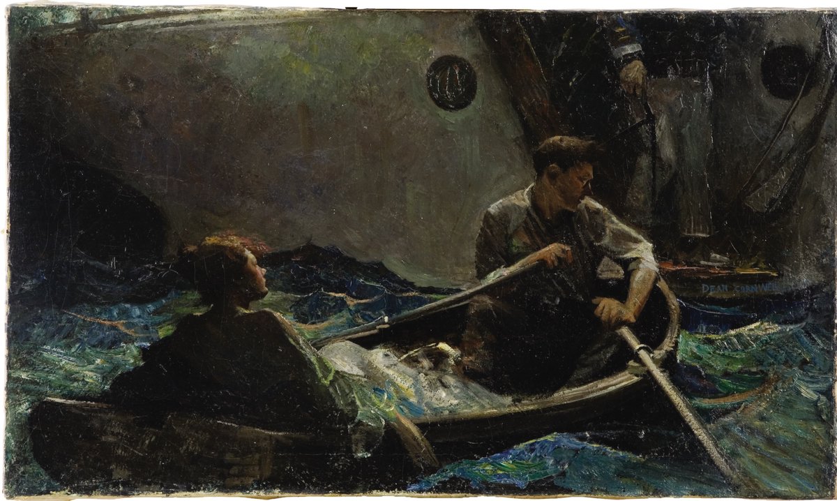
This scaffolding is less consistent, and conveys the uncertain feeling of the journey of this lifeboat at sea. There are no rules in composition, so experiment and play with different arrangements to find the one that fits your idea!
If you enjoyed this, check out my two ebooks! They are all my previous tutorials, greatly expanded upon, and have lots of bonuses like a glossary, recommended reading, and all the artist names right there with the examples: gumroad.com/l/YPtf
New thread on values! What does pixel art have to do with value grouping in painting? It’s all down to a concept I call *dithering*. We are naturally very good at seeing small differences, and this is not helpful for painting, because we need to see differences *between* things.
Have you ever done a study of a painting and found yourself zooming in, only to zoom out and find that it was only getting worse? This is because of focusing on small differences too early. How do we even get started with all of these patterns and materials here?
When we make this painting tiny, notice how all of the detail in the tapestry blends together, and we can easily compare that group with everything else. The whole complex tapestry area is the same value group as the shirt! Now, the image consolidates into a few simple groups.
Tip about highlights in painting and drawing! Highlights show structure in the lit side of an object, and they are just as useful as shadows for showing form.
Highlights like to hang out in corners because there are a lot of angle changes there, and therefore more chances for the light to be reflected back to your eye.
That doesn't mean that specular highlights can't show up on flat planes, it just means that you have to find the one perfect angle to do so, like this camera angle here.
Thread on values! Have you ever had to rely on tweaking levels in Photoshop in order to get your painting to have enough contrast? Here’s how to confidently control values from the very beginning!
Values (and color, and edges, and drawing) are all about relationships. Let’s use this scene as an example. The cloud definitely reads against the sky, but it is just a temperature change, not a value change. We want to look for the big similarities and differences first.
When looking at this scene in real life, the goal is to compress a lot of information into groups while keeping the relationships consistent. This makes it easier to paint and allows us to design. You will rarely ever need more than 4 groups to do this.
Thread on how to do composition studies! The secret is to look for the big relationships. We are not painting objects, but rather designing an abstract composition that has the feeling we want. Zoom way out, look for big value shapes, and compare across the whole painting!
After we have our black and white study, then add temperature information on top. Don’t use layer modes like color or overlay, but rather paint directly and opaquely right on top. This will help us gain an understanding of how color relates to value.
Dean Cornwell is great to study for this because we can see his decision making. Look how the value of the dark blue cloth is the same in light as the white dress is in shadow. These are the big relationships to look for, and then naturally the small differences group themselves.
Thread on color part 3! We've gone over a lot of the science, but how do we use all of this creatively in our paintings? How do we make a black and white image look natural? The secret and key to the whole thing is in a property of color called Chroma.
Chroma is distinct from, but related to, saturation. You can have a highly saturated yellow hue at a dark value. This would mean that it is a pure color, but at a low intensity. That color is not high chroma, because it appears brown and not what we would describe as yellow.
Yellows have a high chroma at bright values, reds at middle values, and blues and violets at dark values. At extreme values, it becomes harder to have a high chroma for any color. Instead of copying a scene without direction, we can control our values to show the colors we want.
Thread on color in painting part 2! How do we know how to confidently decide on colors in the infinite lighting situations that we can imagine? We’re going to dive deeper this time into how light works, and what determines the color we actually see when light reaches our eyes.
First, materials. They all reflect the scene, just differently. Diffuse materials absorb/scatter some wavelengths beneath the surface while reflecting the rest, some metals reflect all of the light, and others are colored due to uneven absorption and emission by their electrons.
The more pure and strong the reflection of the light source, the further the shift in color towards it. The direction of hue shifting depends on the material. A yellowy-green grass will travel through the greens when reflecting the blue sky, while skin will go through the pinks.