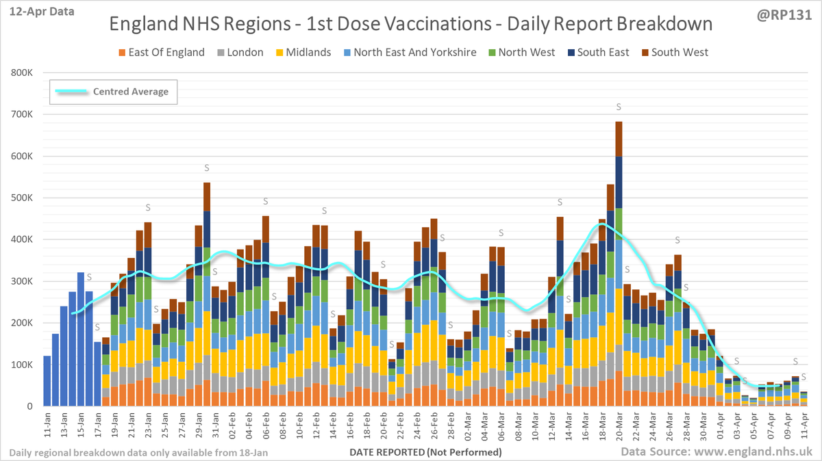
England #NHS region vac. chart based on today's (12-Apr) report.

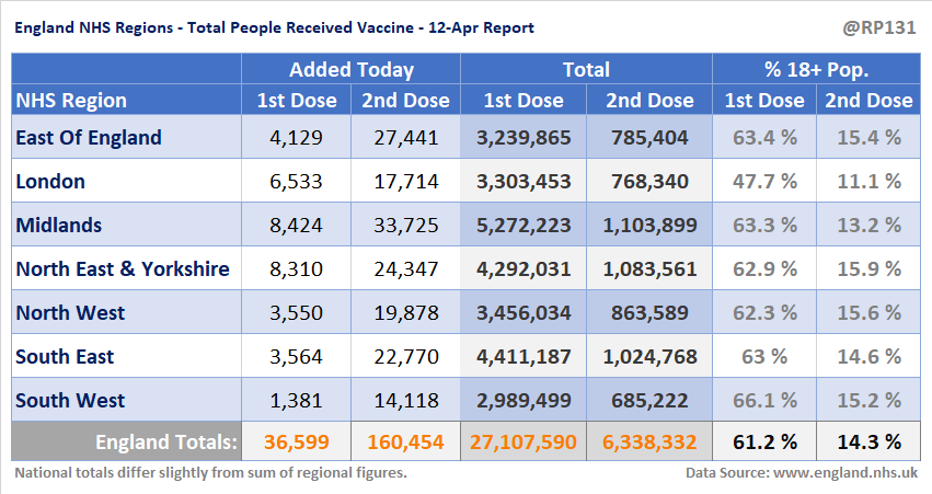
1st doses have increased by 37K since yesterday to 27.1M.

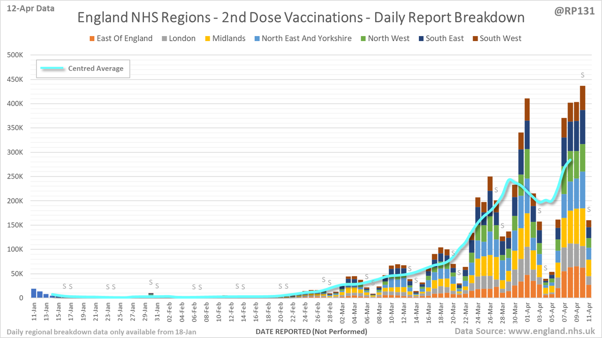
2nd doses are up by 160K to 6.3M.

Approx. 61.2% of the 18+ population has now received a 1st dose.
Same view for 2nd doses.
Charts plotting rates per 1M population to allow relative comparison.
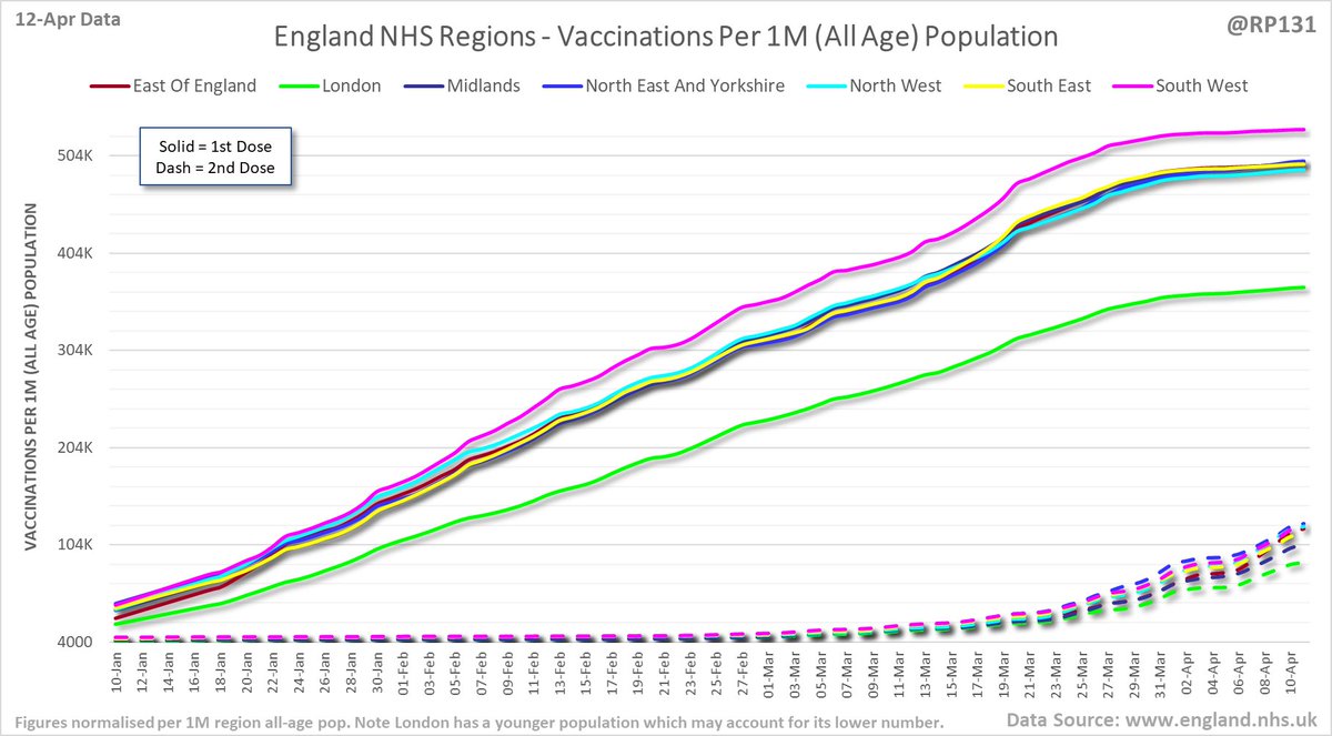
Table view of today's (12-Apr) updated England NHS region vaccination data.

• • •

Missing some Tweet in this thread? You can try to force a refresh
 

Keep Current with Richard 📊📉

Richard 📊📉 Profile picture

Stay in touch and get notified when new unrolls are available from this author!

Read all threads

This Thread may be Removed Anytime!

PDF

Twitter may remove this content at anytime! Save it as PDF for later use!

Try unrolling a thread yourself!

how to unroll video
  1. Follow @ThreadReaderApp to mention us!

  2. From a Twitter thread mention us with a keyword "unroll"
@threadreaderapp unroll

Practice here first or read more on our help page!

More from @RP131

12 Apr
Pinned index post linking to a simple table of contents page to make it easier to find my normal daily posts.

Old style links also inclued in replies below for people who don't like new table of contents...

…ddatashare.s3-eu-west-1.amazonaws.com/index.html
Hospital data:
Positives test additions (now incl. animation):
Death additions (now incl. animation):
Bubble / Tiers / Sub-Regions:

https://t.co/SfJrX6HGZF
Read 4 tweets
12 Apr
Updated table of top 30 MSOAs (by rate) based on latest numbers in today's report. Image
Bringing back the view of how many weeks the MSOAs have been in the suppressed 'less then 3 +ves in the last week' category. Since they don't allow us to distinguish between zero / 1 / 2, we generally consider it to mean zero. Link to full table in reply below. Image
Read 6 tweets
12 Apr
#covid19uk - Detailed positive tests thread. The majority of this thread is a set of views of rolling 7 day average positives per 100K by specimen date. Starting with England regions: Image
Some of the more detailed content from this thread has been moved to an external page to try and make the twitter updates a bit more manageable. You can still see the full version here: …ddatashare.s3-eu-west-1.amazonaws.com/Detail/Detail_…
UK nations: Image
Read 10 tweets
12 Apr
#covid19uk - Tables thread. Re-ordered now to put the more popular rate sorted table at the top. So this is top 50 England Local Authorities by positives per 100K population in last 7 days, up to 3 days ago. Bright green means lower than previous period. Image
Cumulative summary view by regions. Image
Read 6 tweets
12 Apr
Latest view on England covid hospital admissions (as of 12-Apr) with 151 reported for 10-Apr.

The 7 day average is now equivalent to around 14-Sep (i.e. 205 days ago). Image
Latest view on England confirmed covid patients currently in hospital, with 2,108 reported as of 8am on 12-Apr.

The count is now 2,108 and equivalent to around 11-Apr (i.e. 1 days ago). Image
Age ranges of England hospital admissions. Note this age-range data lags a day or so behind the above totals data. Image
Read 7 tweets
12 Apr
Bubble chart (Tiers / Sub-region) thread. This type of chart allows us to compare week on week changes by seeing if the points are above or below the dotted line. This version is grouped by "sub-regions" as were previously used for assigning tiers: Image
Table of sub-regions to act as key for the numbers on the above chart. Image
Link to the new interactive version of this bubble chart: …ddatashare.s3-eu-west-1.amazonaws.com/Bubble.html
Read 6 tweets

Did Thread Reader help you today?

Support us! We are indie developers!


This site is made by just two indie developers on a laptop doing marketing, support and development! Read more about the story.

Become a Premium Member ($3/month or $30/year) and get exclusive features!

Become Premium

Too expensive? Make a small donation by buying us coffee ($5) or help with server cost ($10)

Donate via Paypal Become our Patreon

Thank you for your support!

Follow Us on Twitter!