Our work from last year on how to communicate personalised risks from COVID-19 is out:
royalsocietypublishing.org/doi/10.1098/rs…
In it we describe a series of studies by the Winton team
@d_spiegel @SciComGuy @mesotronium @CRSchneider3 @sarahdryhurst @acethecurious @lfinikarides @LuoniGiulia
royalsocietypublishing.org/doi/10.1098/rs…
In it we describe a series of studies by the Winton team
@d_spiegel @SciComGuy @mesotronium @CRSchneider3 @sarahdryhurst @acethecurious @lfinikarides @LuoniGiulia
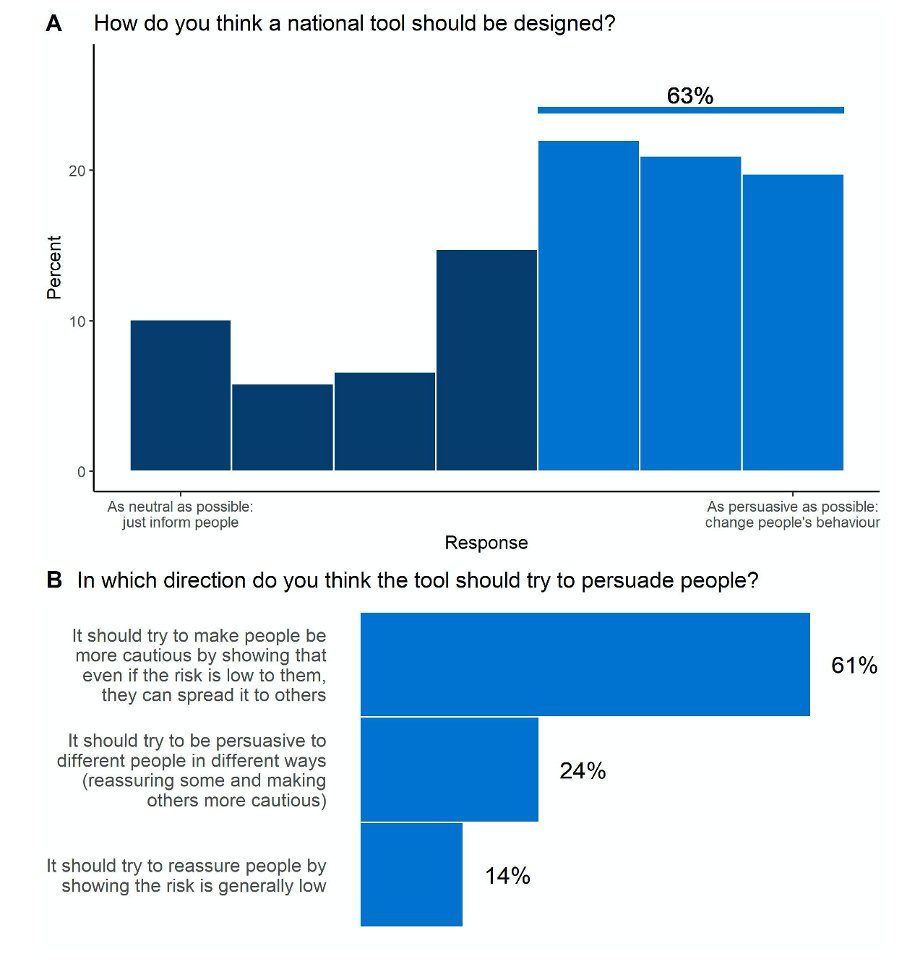
In summary, for those developing personal risk calculators:
1) Are you trying to change behaviour or simply inform people? It changes your communication approach.
UK opinion last summer:
1) Are you trying to change behaviour or simply inform people? It changes your communication approach.
UK opinion last summer:
2) What are you trying to communicate? The risk of catching it and dying from it, or the risk of dying from it if you catch it? Whichever it is, be very clear
3) Who are your audience? Public or health professionals?
UK public keen for this information in our surveys
3) Who are your audience? Public or health professionals?
UK public keen for this information in our surveys
Then our advice on how to communicate the numbers:
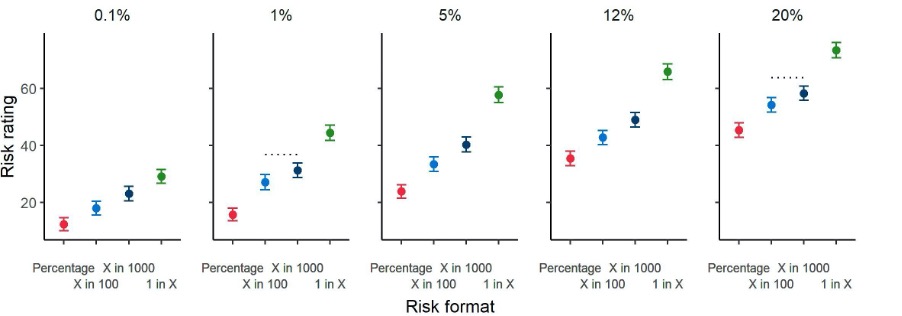
Percentages seem clearest format, but also convey the smallest feeling of risk. For balance maybe include also ‘x out of 1000’ , which gives a larger feeling of risk. Do not describe as ‘your risk’ – maybe ‘risk result’.
Percentages seem clearest format, but also convey the smallest feeling of risk. For balance maybe include also ‘x out of 1000’ , which gives a larger feeling of risk. Do not describe as ‘your risk’ – maybe ‘risk result’.
People liked ‘positive framing’ (how many people likely survive), but the numbers were rated slightly harder to understand. Probably stick with the familiar ‘likelihood of dying’.
A visual scale: despite the difficulties of a linear scale, it was more trusted over a log scale.
A visual scale: despite the difficulties of a linear scale, it was more trusted over a log scale.
Numbers need context. People don’t normally think in numbers. When asked to put a number on risks of people dying from COVID-19 if they caught it, they over-estimate (and the effect of the number format is evident again). But they do know the major risk factors.
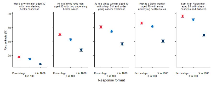
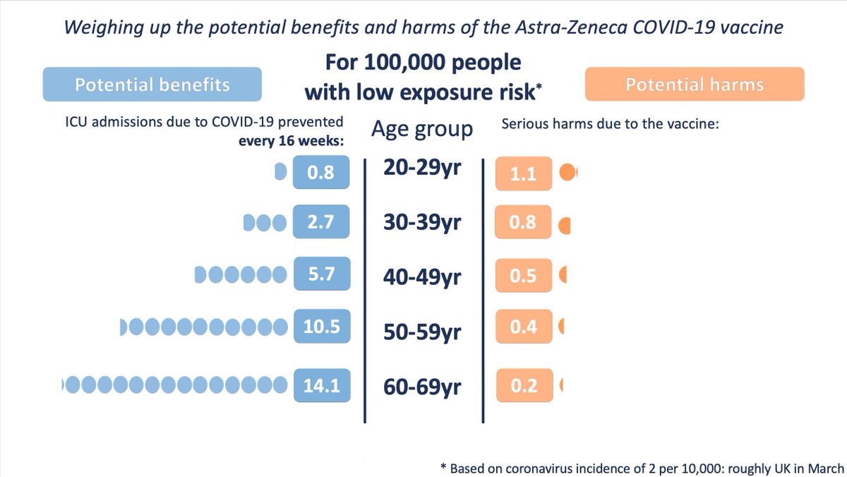
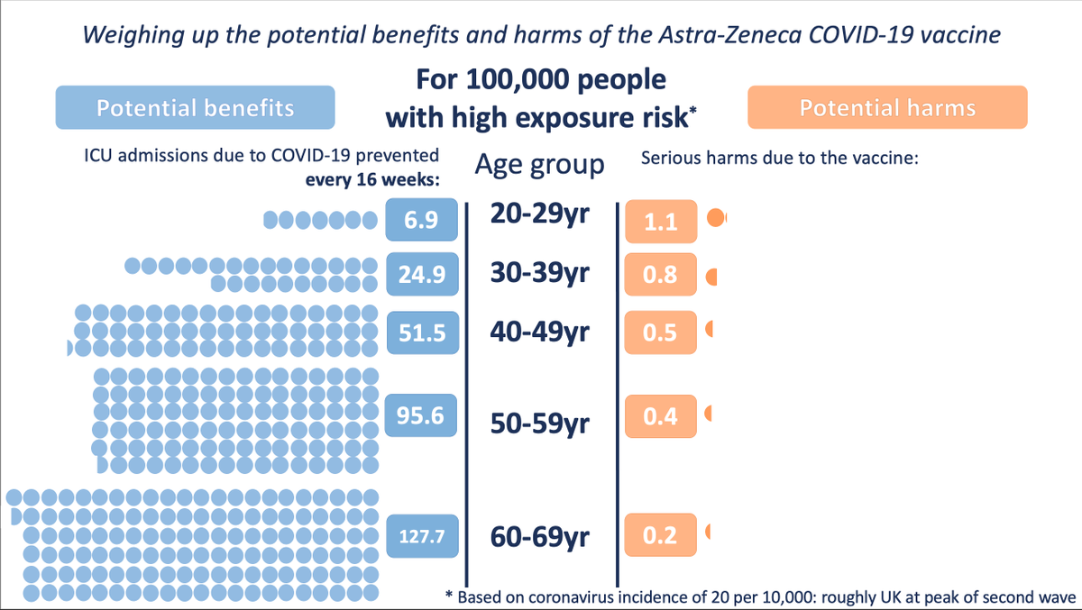
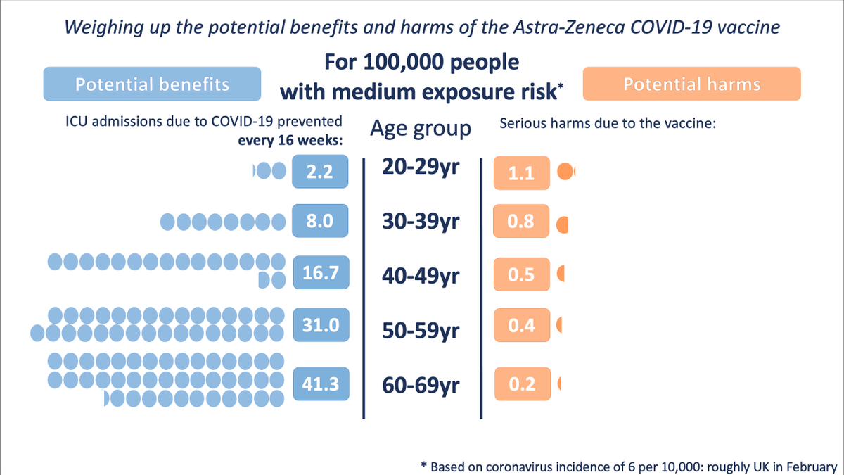
Because people seem to think in terms of ‘personas’ the most helpful context seemed to be giving the risks for different, well-described ‘personas’ (e.g. 'the risk for a 70yr old with no health conditions) along the scale (and explaining the top of the scale)
It was not so helpful to give people ‘other risks they face’ as comparators, or numbers other than an absolute risk (such as a percentile) as they tended to mistake that for the absolute risk.
Total n in studies was 5,520 plus 28 in-depth interviews with public and 7 GPs.
Total n in studies was 5,520 plus 28 in-depth interviews with public and 7 GPs.
• • •
Missing some Tweet in this thread? You can try to
force a refresh