What to do if
- you start a side project
- you are a developer
- you don't have a designer? 🤔
🧵 Practical guide
- you start a side project
- you are a developer
- you don't have a designer? 🤔
🧵 Practical guide
1/9
First of all.
Check your competitors. I had 170+ competitors in the market.
There are for sure plenty of similar products, at least with similar features.
Make a list of them. Take screenshots of their pages. And put all this in a single place (Figma/Sketch)
First of all.
Check your competitors. I had 170+ competitors in the market.
There are for sure plenty of similar products, at least with similar features.
Make a list of them. Take screenshots of their pages. And put all this in a single place (Figma/Sketch)
2/9
Now, let's be honest. You don't have money for paying UX research for building
- wireframes
- informational architecture
- personas
- doing research
- making customer journey maps etc
Admit it. You're a side hustler and you probably don't want to spend years and $$$.
Now, let's be honest. You don't have money for paying UX research for building
- wireframes
- informational architecture
- personas
- doing research
- making customer journey maps etc
Admit it. You're a side hustler and you probably don't want to spend years and $$$.
3/9
Now, open your favorite text editor and write down roughly what big features will you have.
Let's say, it's a todo app. After quick brainstorming, you'll probably have something like
- task list
- add a new task
- calendar
- login/logout
- teams
- tags
- subtasks
- etc
Now, open your favorite text editor and write down roughly what big features will you have.
Let's say, it's a todo app. After quick brainstorming, you'll probably have something like
- task list
- add a new task
- calendar
- login/logout
- teams
- tags
- subtasks
- etc
4/9
Now, take a pen and paper, and make a very rough layout (!) of what it could look like.
You've seen a lot of competitors already, so can mix their ideas.
Okay, we're doing the todo app, and the first what I could think of is this 👇
Now, take a pen and paper, and make a very rough layout (!) of what it could look like.
You've seen a lot of competitors already, so can mix their ideas.
Okay, we're doing the todo app, and the first what I could think of is this 👇

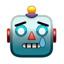
5/9
Not that pretty, huh?
Now, you need some styling, fonts and all that stuff. You don't need to invent anything!
Just select a property framework (@tailwindcss or @getbootstrap or whatever).
Go to @envato and check out dozen of similar admin templates.
Not that pretty, huh?
Now, you need some styling, fonts and all that stuff. You don't need to invent anything!
Just select a property framework (@tailwindcss or @getbootstrap or whatever).
Go to @envato and check out dozen of similar admin templates.
6/9
So far we have
- rough layout
- selected framework/styling, that we will use so that our UI doesn't look very bad
- we have plenty of screenshots from competitors
If you are familiar with vector editors, you can use them. If not, you can start coding right away
So far we have
- rough layout
- selected framework/styling, that we will use so that our UI doesn't look very bad
- we have plenty of screenshots from competitors
If you are familiar with vector editors, you can use them. If not, you can start coding right away
7/9
I just went straight to @asana and @tailwindcss and got some styling from them.
Here what I end up with after ~10 mins of "designing".
This is very rough, bad etc, but that's how it starts. Later on you'll improve it further and further
I just went straight to @asana and @tailwindcss and got some styling from them.
Here what I end up with after ~10 mins of "designing".
This is very rough, bad etc, but that's how it starts. Later on you'll improve it further and further

8/9
- Start ask people's opinions. If it looks good or bad.
- Start collecting ideas. Literally, open your to-do app and push any idea of what can be improved
- Keep on watching competitors, what do they have
- Start ask people's opinions. If it looks good or bad.
- Start collecting ideas. Literally, open your to-do app and push any idea of what can be improved
- Keep on watching competitors, what do they have
9/9
Remember.
All the CSS frameworks, design markets, logo creators, favicon generators, pinterest and other sites allow you to find almost ANY UI implementation.
The hardest thing is to organize everything correctly,. That's why we look at competitors
Remember.
All the CSS frameworks, design markets, logo creators, favicon generators, pinterest and other sites allow you to find almost ANY UI implementation.
The hardest thing is to organize everything correctly,. That's why we look at competitors
• • •
Missing some Tweet in this thread? You can try to
force a refresh