How user interface evolved for the past 40 years ✨
Visual Thread 🧵
Visual Thread 🧵
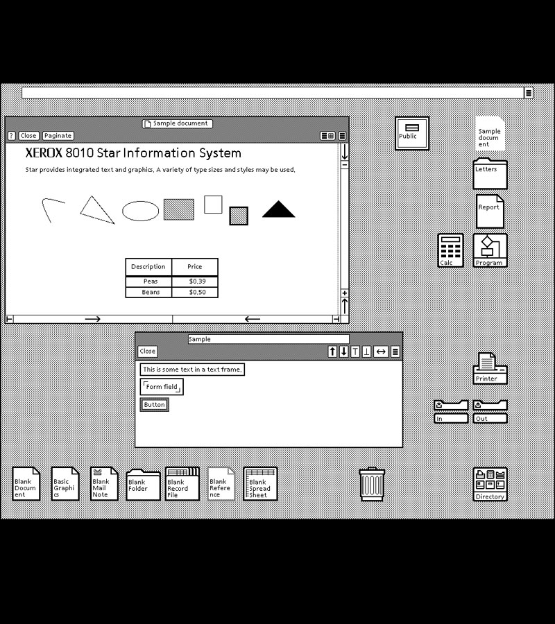
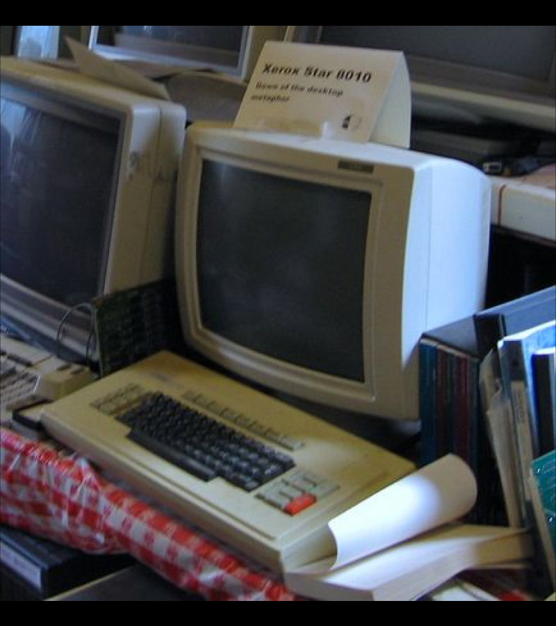
Xerox 8010 Star, released in 1981
It was the first commercial personal computer that had
such things as
- window-based graphical user interface
- icons
- folders
- mouse (two-button)
- Ethernet networking
- file servers
- print servers
- e-mail.
It was the first commercial personal computer that had
such things as
- window-based graphical user interface
- icons
- folders
- mouse (two-button)
- Ethernet networking
- file servers
- print servers
- e-mail.
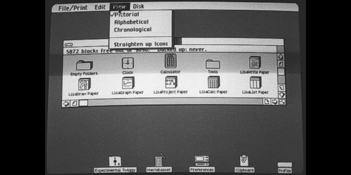
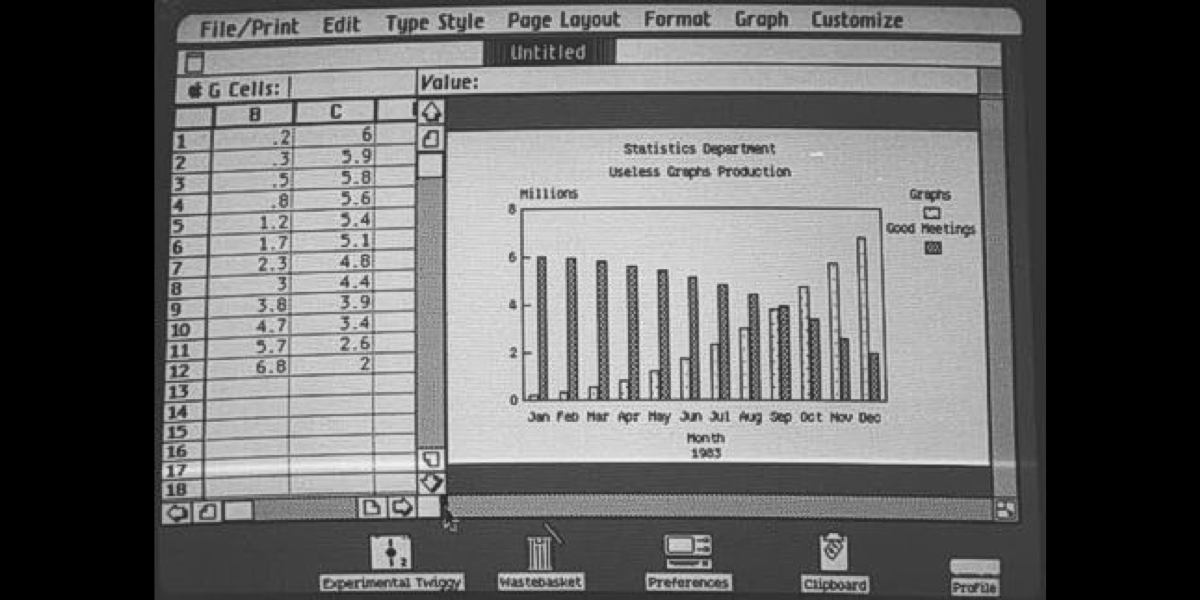
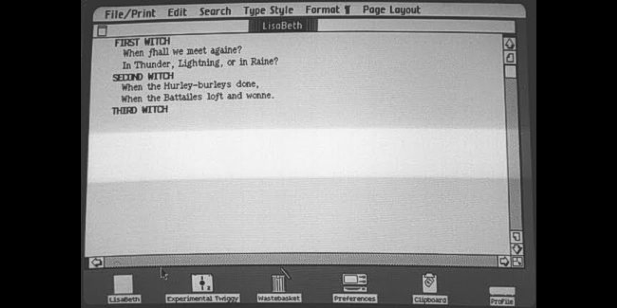
Apple Lisa Office System 1. Released on January 19, 1983.
It is one of the first personal computers to present a graphical user interface (GUI) in a machine aimed at individual business users.
It is one of the first personal computers to present a graphical user interface (GUI) in a machine aimed at individual business users.

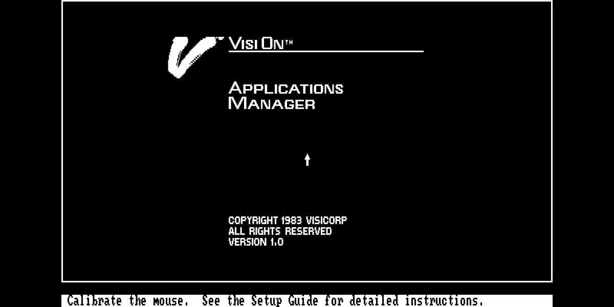
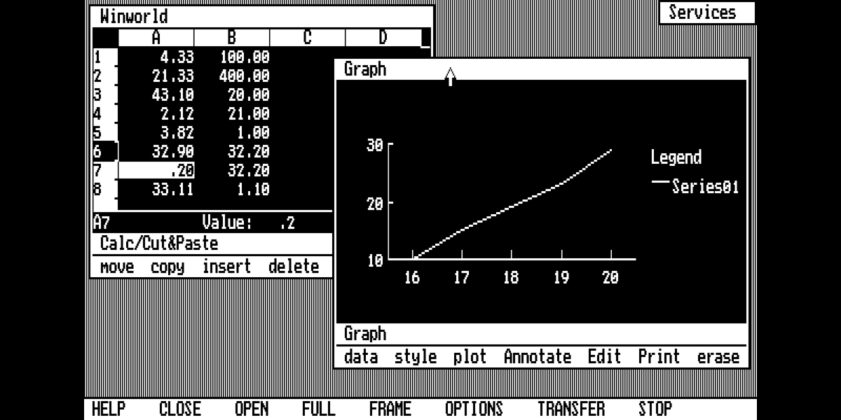
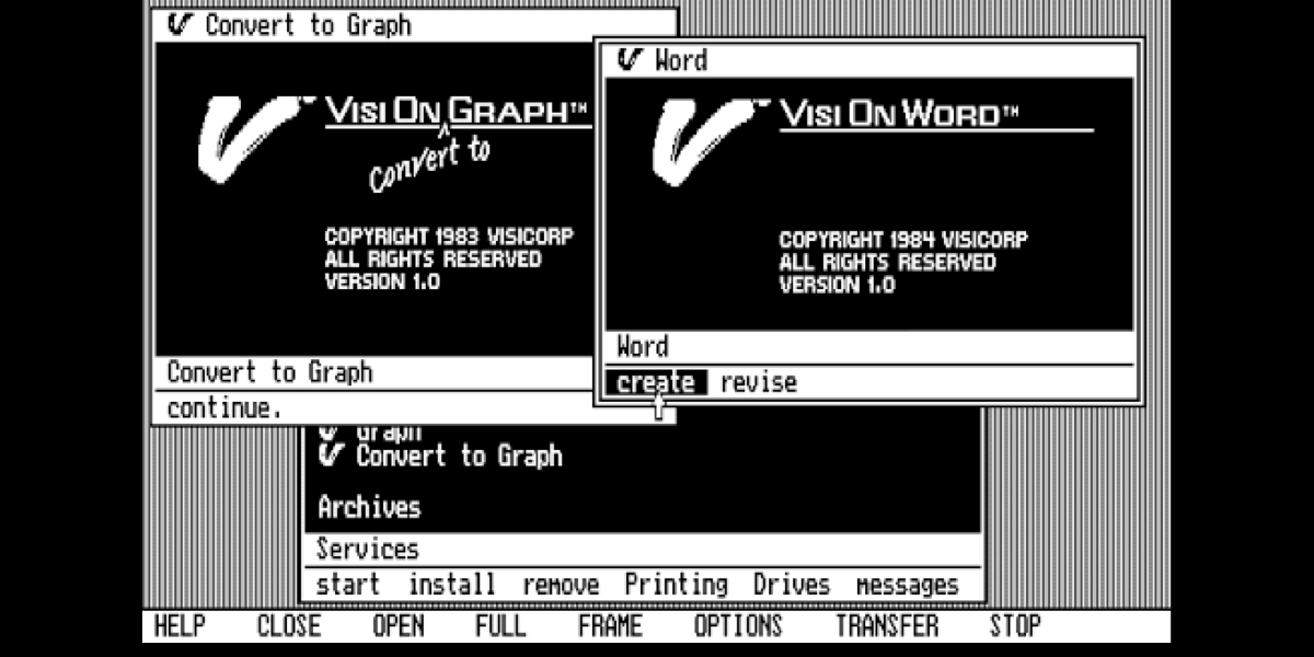
VisiCorp Visi On. Released on December 16, 1983
VisiCorp Visi On was a short-lived but influential graphical user interface-based operating environment program for IBM-compatible personal computers running MS-DOS.
VisiCorp Visi On was a short-lived but influential graphical user interface-based operating environment program for IBM-compatible personal computers running MS-DOS.

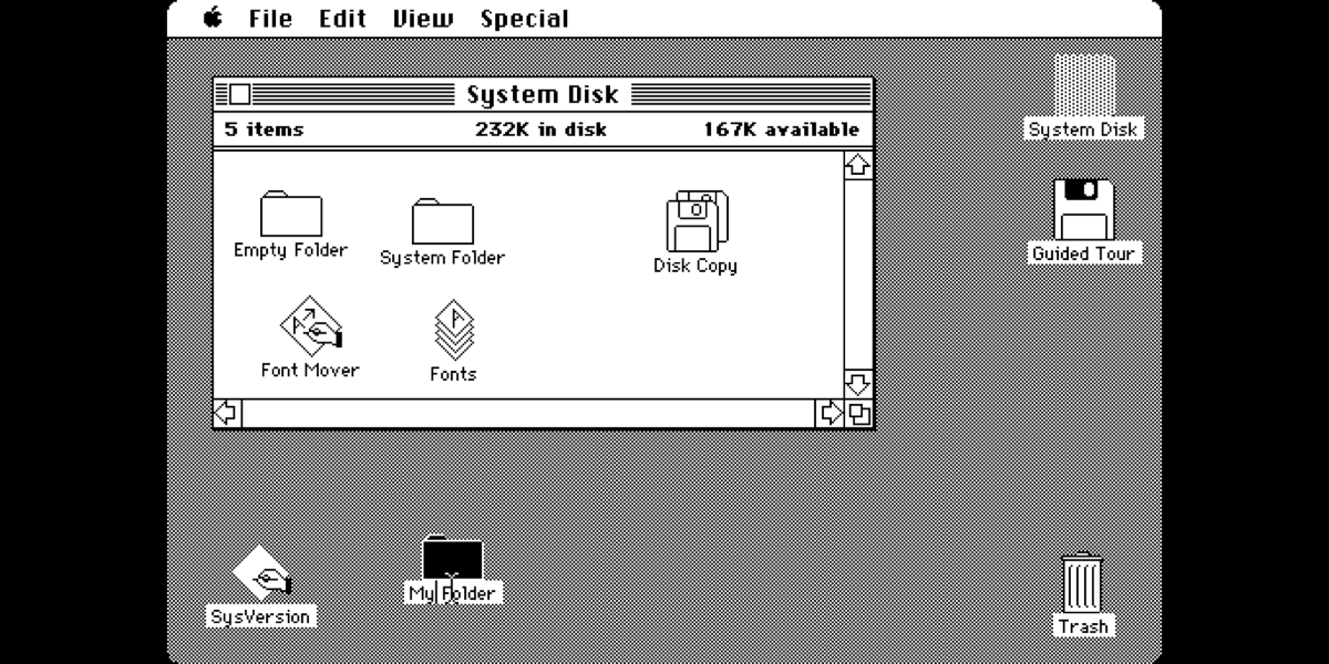
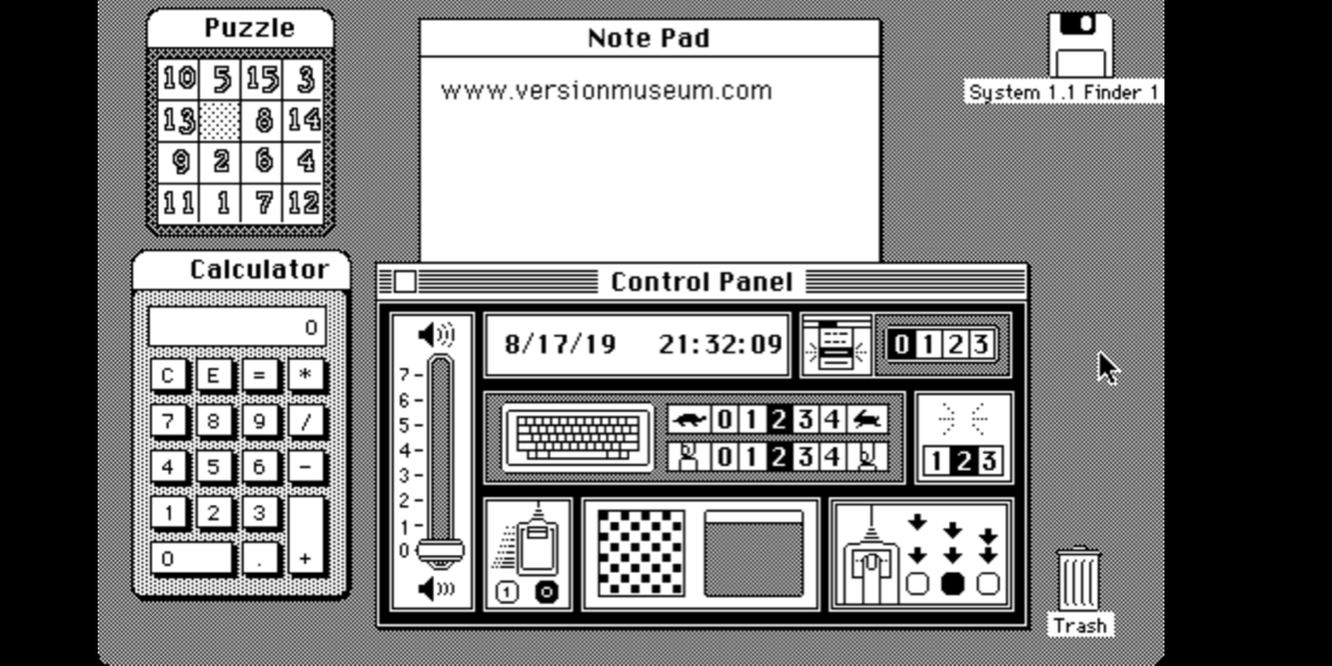
Mac OS System 1.0. Released on December 29, 1984
The Macintosh "System 1" is the first version of Apple Macintosh operating system and the beginning of the classic Mac OS series.
The Macintosh "System 1" is the first version of Apple Macintosh operating system and the beginning of the classic Mac OS series.


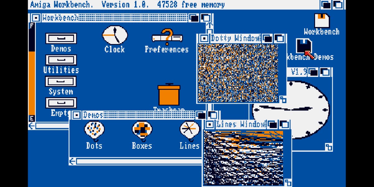
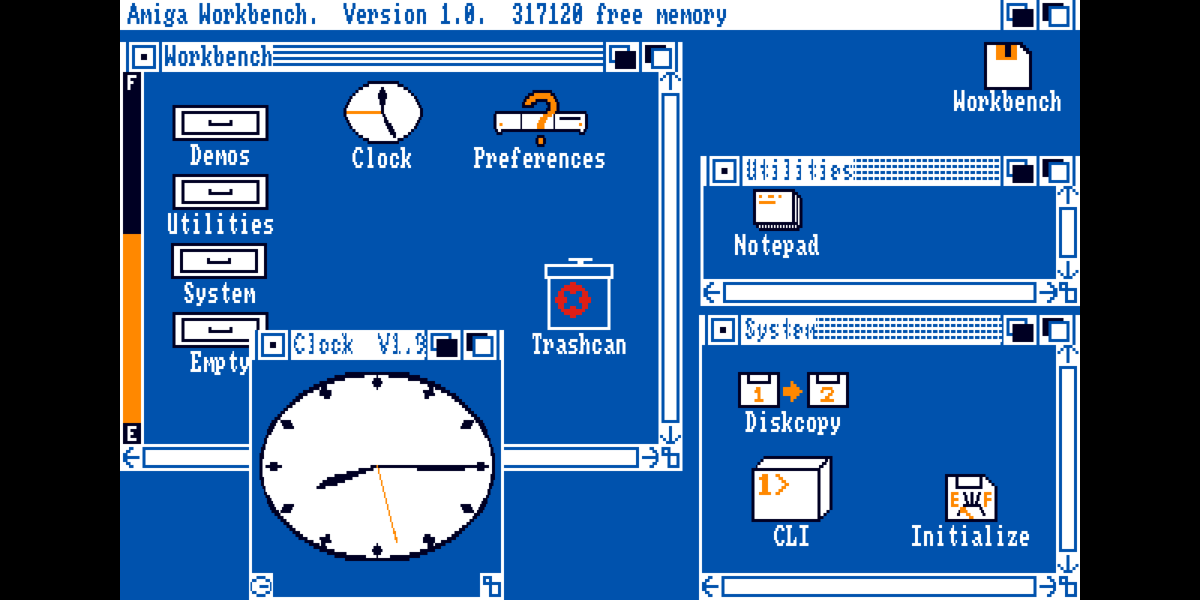
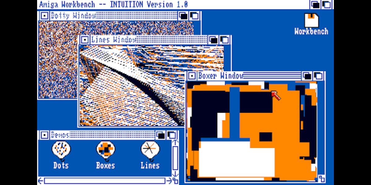
Amiga Workbench 1.0, released in 1985
Workbench is the graphical file manager of AmigaOS developed by Commodore International for their Amiga line of computers.
Workbench provides the user with a graphical interface to work with file systems and launch applications.
Workbench is the graphical file manager of AmigaOS developed by Commodore International for their Amiga line of computers.
Workbench provides the user with a graphical interface to work with file systems and launch applications.

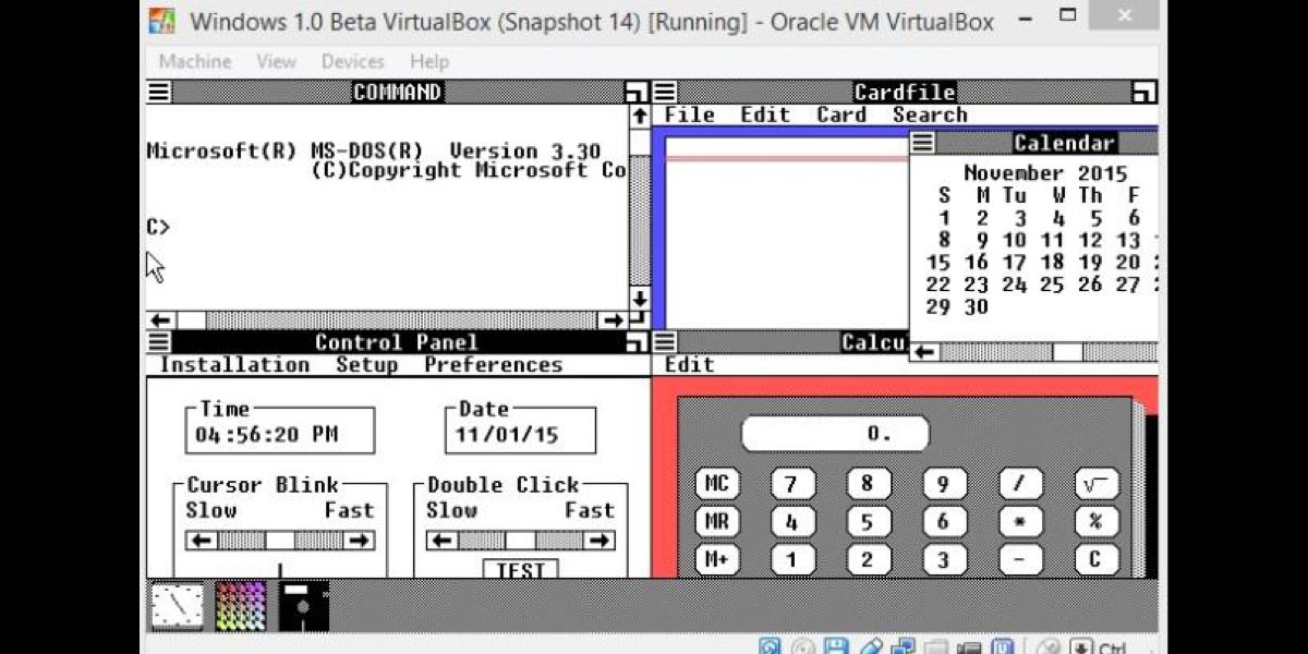
Windows 1.0, released in 1985
In this year Microsoft finally caught up with the whole graphical user interface craze and released Windows 1.0, its first GUI based operating system.
In this year Microsoft finally caught up with the whole graphical user interface craze and released Windows 1.0, its first GUI based operating system.


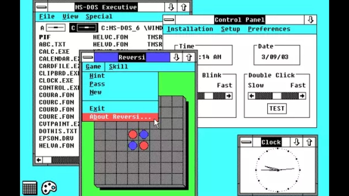
Windows 2.0, released in 1987
In this version, the actual management of the windows had significantly improved. The windows could be overlapped, resized, maximized and minimized.
In this version, the actual management of the windows had significantly improved. The windows could be overlapped, resized, maximized and minimized.
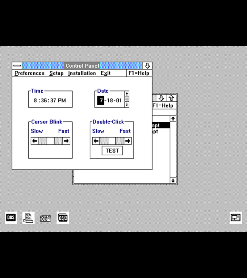
OS/2, released in December 1987
OS/2 is a series of computer operating systems, initially created by Microsoft and IBM under the leadership of IBM software designer Ed Iacobucci.
OS/2 is a series of computer operating systems, initially created by Microsoft and IBM under the leadership of IBM software designer Ed Iacobucci.
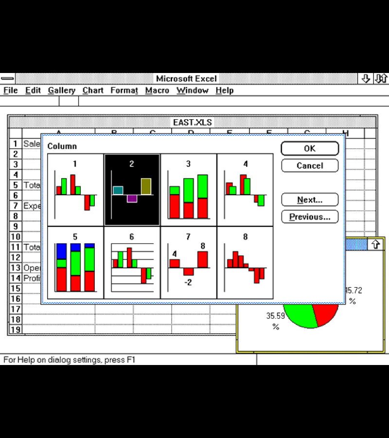
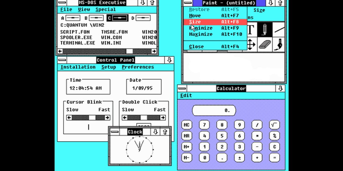
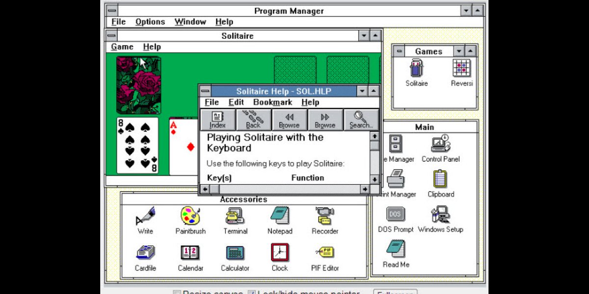
Win 3.0, released on May 22, 1990
Windows 3.0 is the third major release of Microsoft Windows, launched in 1990.
Like its predecessors, it is not an operating system, but rather a graphical operating environment that runs on top of DOS.
Windows 3.0 is the third major release of Microsoft Windows, launched in 1990.
Like its predecessors, it is not an operating system, but rather a graphical operating environment that runs on top of DOS.

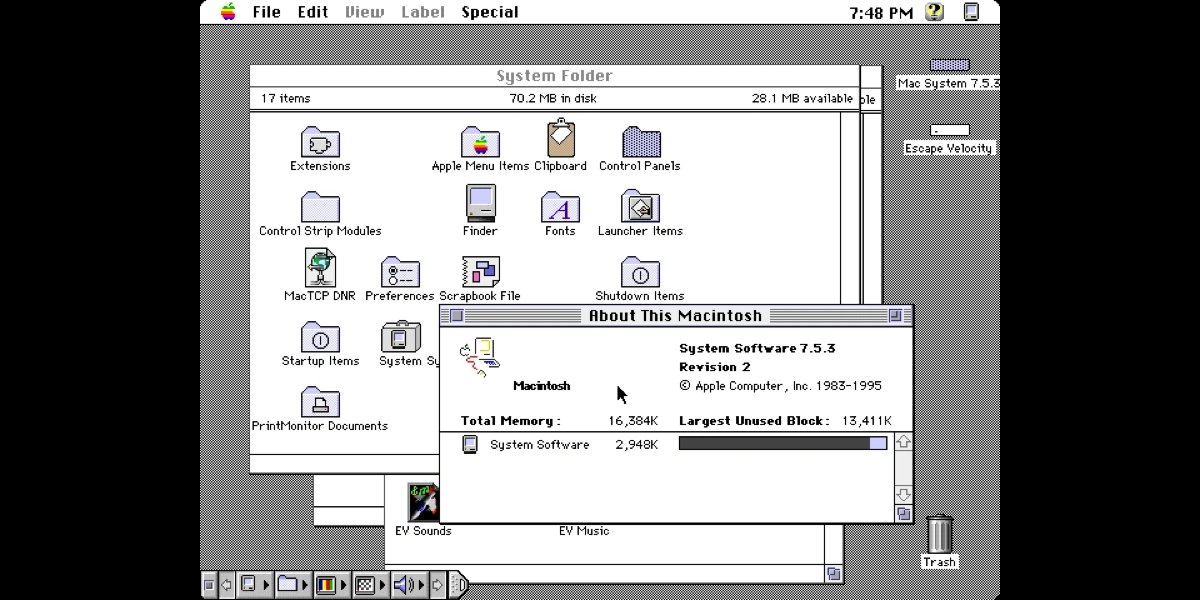
Mac OS System 7, released on May 13, 1991.
System 7, codenamed "Big Bang", and also known as Mac OS 7, is a graphical user interface-based operating system for Macintosh computers and is part of the classic Mac OS series of operating systems.
System 7, codenamed "Big Bang", and also known as Mac OS 7, is a graphical user interface-based operating system for Macintosh computers and is part of the classic Mac OS series of operating systems.


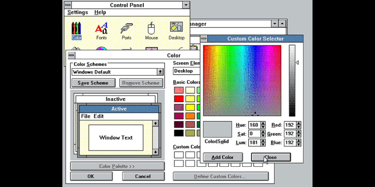
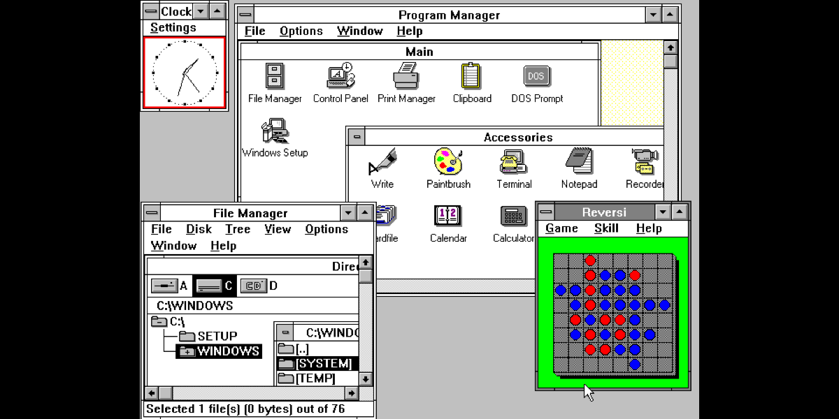
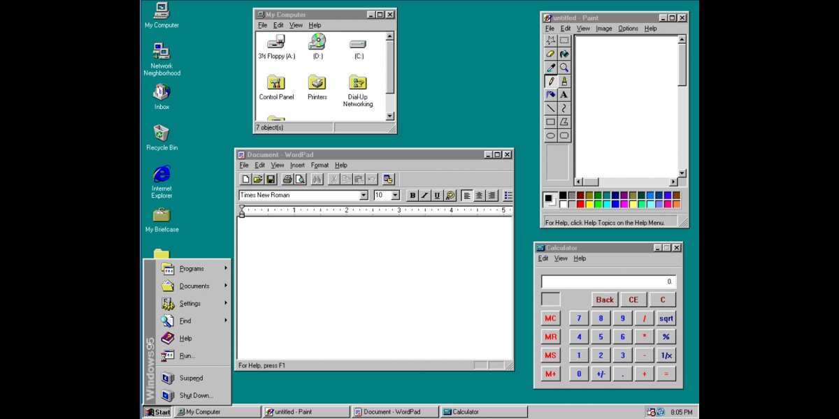
Windows 95, 1995.
The user interface was completely re-designed since version 3.x. This was the first Windows version where a small close button was added to each window.
This was a huge step forward for Microsoft regarding the operating system itself and the unified GUI.
The user interface was completely re-designed since version 3.x. This was the first Windows version where a small close button was added to each window.
This was a huge step forward for Microsoft regarding the operating system itself and the unified GUI.


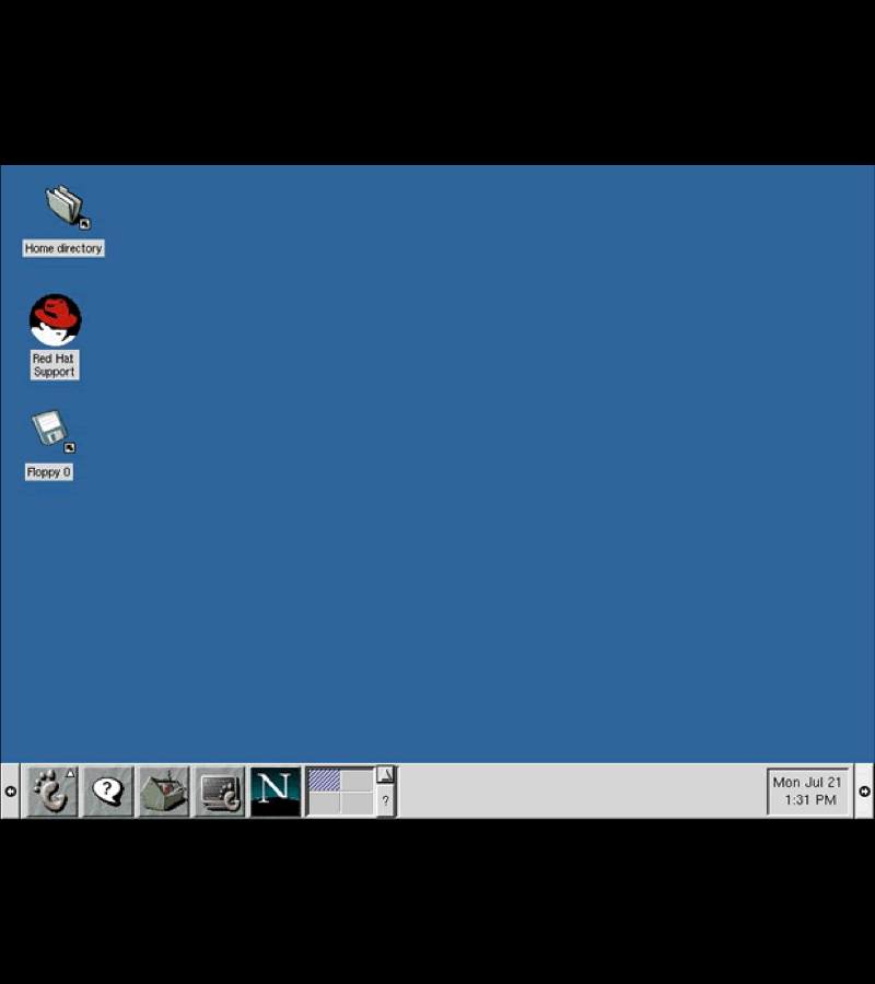
KDE 1.0, 1998 & Gnome 1.0, 1999.
Both KDE and Gnome are desktop environments for unix-like operating systems.
Both KDE and Gnome are desktop environments for unix-like operating systems.

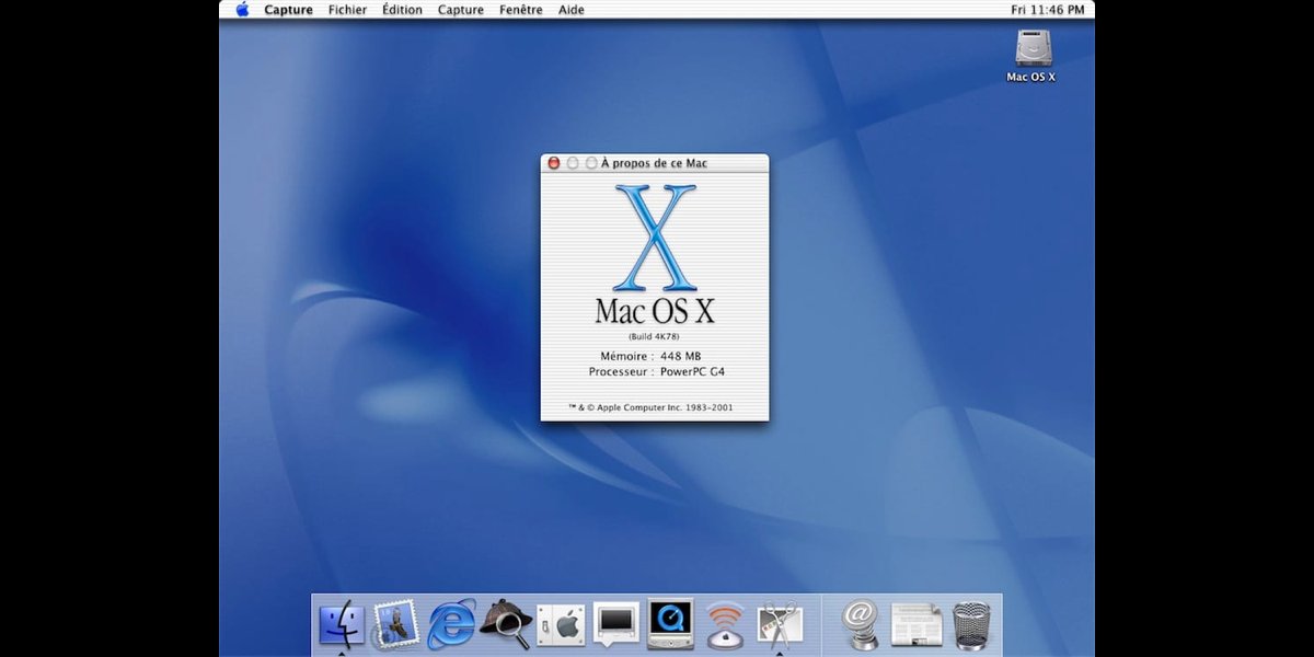
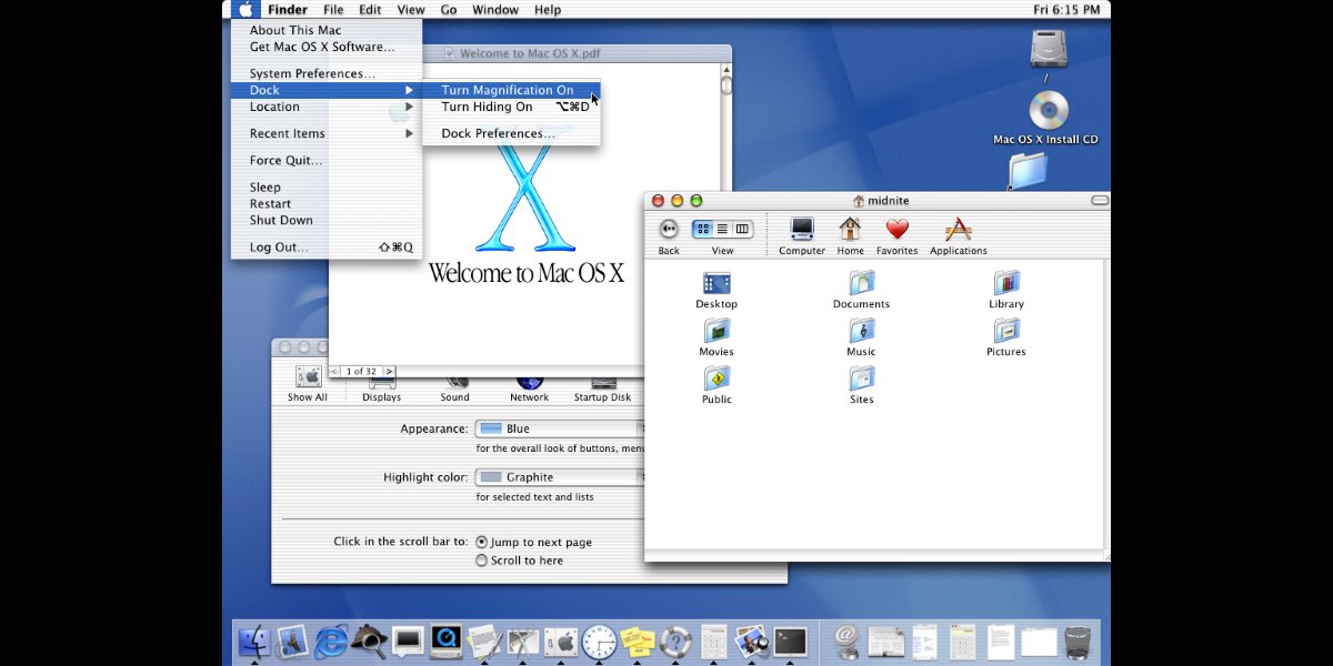
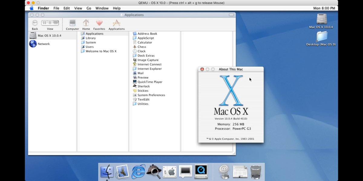
Mac OS X, 2001
In early 2000 Apple announced their new Aqua interface and in 2001 the company released it with their brand new operating system called Mac OS X.
In early 2000 Apple announced their new Aqua interface and in 2001 the company released it with their brand new operating system called Mac OS X.

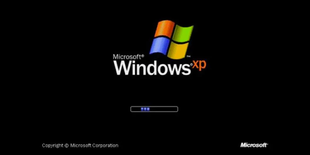
Windows XP, 2001
As Microsoft tends to change their GUI completely with every major operating system release, Windows XP was no exception.
The GUI itself is skinnable, users could change the whole look and feel of the interface.
As Microsoft tends to change their GUI completely with every major operating system release, Windows XP was no exception.
The GUI itself is skinnable, users could change the whole look and feel of the interface.


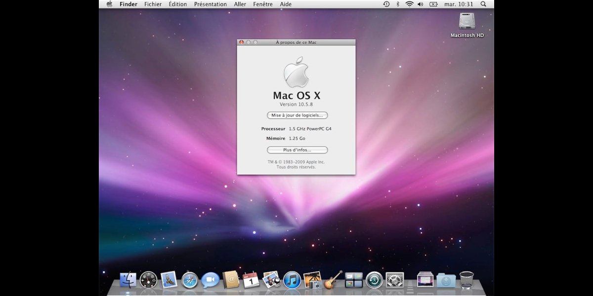
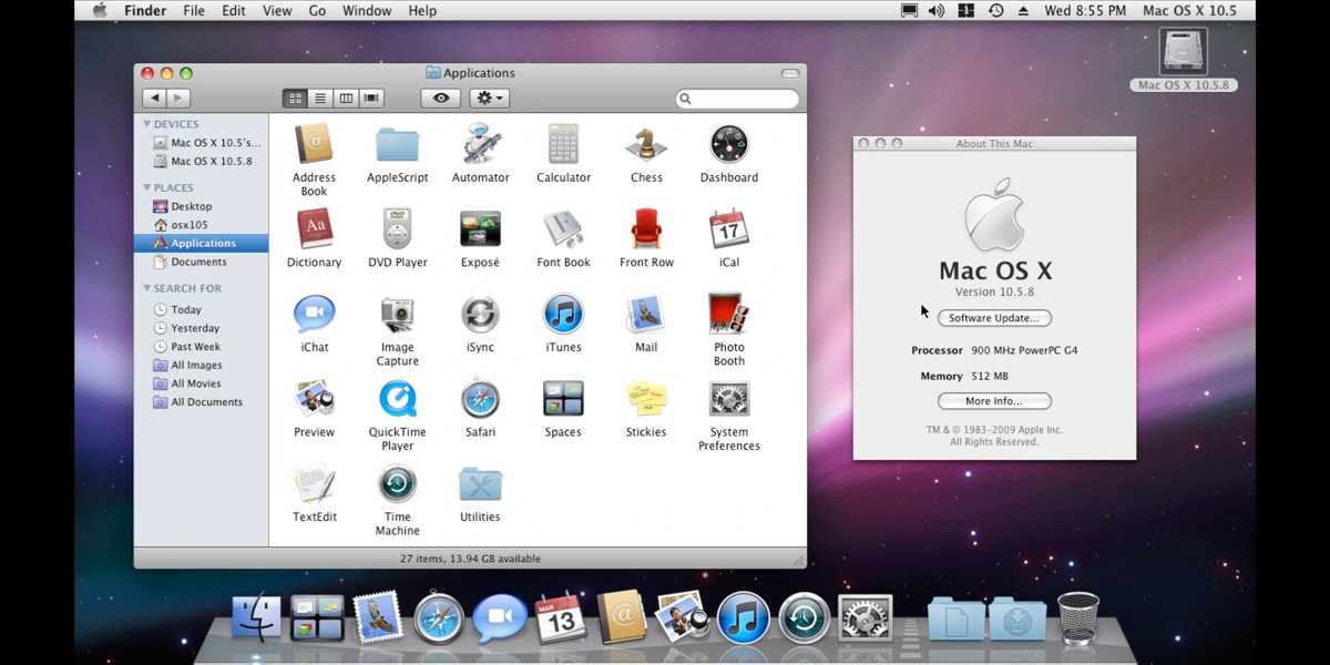
Mac OS X Leopard, 2007
The basic GUI is still the Aqua with its candy scroll bars and platinum grey, blue colors.
The new GUI features a more 3D look, with the 3D dock and lots more animation and interactivity.
The basic GUI is still the Aqua with its candy scroll bars and platinum grey, blue colors.
The new GUI features a more 3D look, with the 3D dock and lots more animation and interactivity.

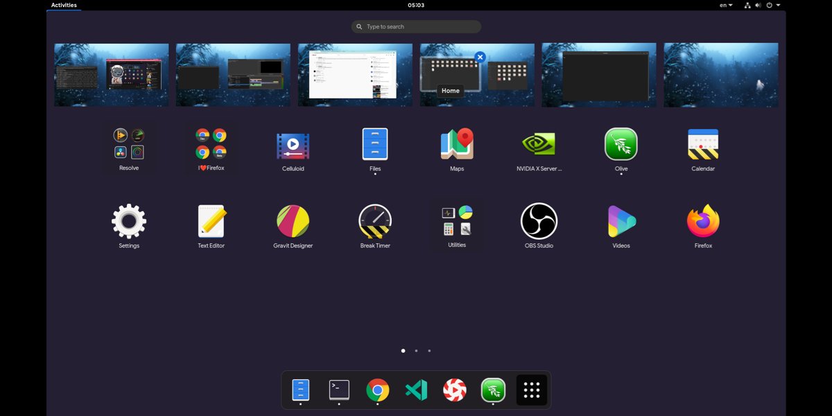
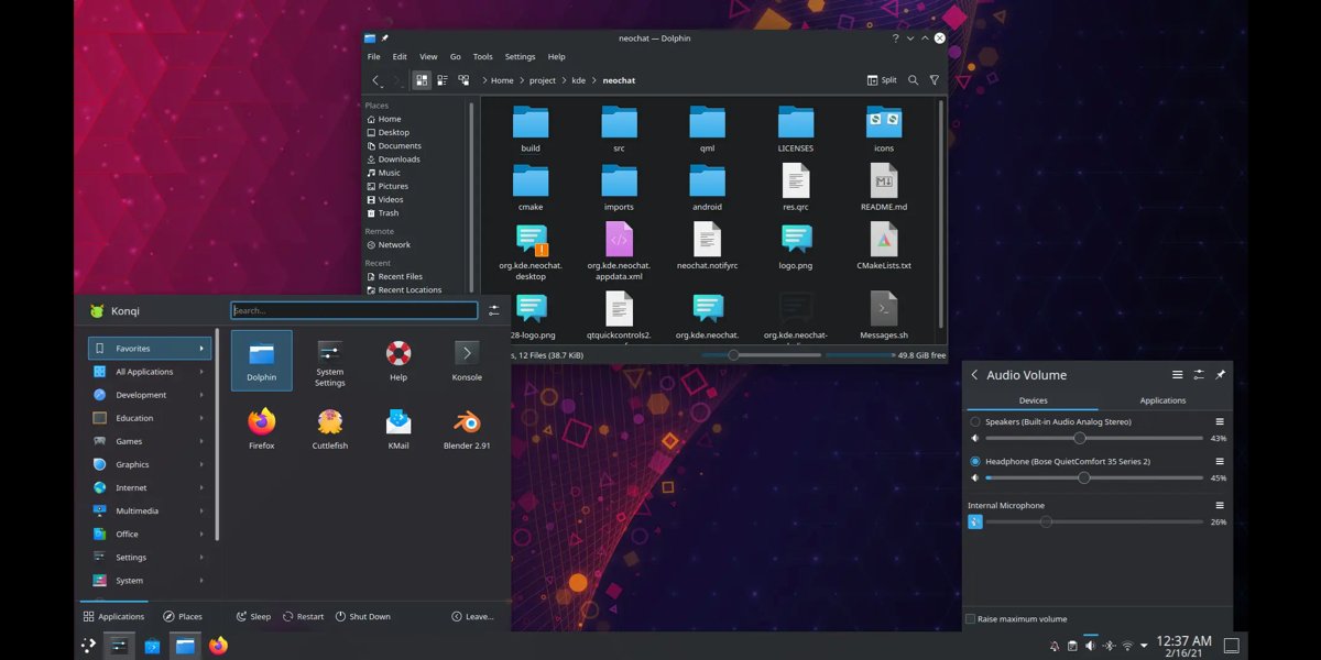
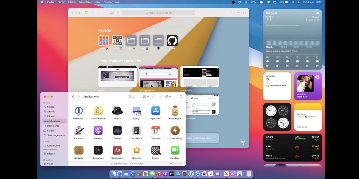
The current state of user interfaces.
- Gnome 40. March 24, 2021
- KDE Plasma 5. 15 July 2014
- Windows 10. July 15, 2015
- macOS Big Sur, November 12, 2020
- Gnome 40. March 24, 2021
- KDE Plasma 5. 15 July 2014
- Windows 10. July 15, 2015
- macOS Big Sur, November 12, 2020

• • •
Missing some Tweet in this thread? You can try to
force a refresh