15 Common CSS mistakes developers make 👀
👇
👇
1. Not using a CSS reset
Each browser has its own default styling for HTML elements.
I'd say it's not just good practice, it's a MUST to reset the styling to some default values and then start styling from scratch
That will help:
necolas.github.io/normalize.css/
Each browser has its own default styling for HTML elements.
I'd say it's not just good practice, it's a MUST to reset the styling to some default values and then start styling from scratch
That will help:
necolas.github.io/normalize.css/
2. Starting with the desktop version
It’s easier to develop for a small screen before scaling the design up to a large screen.
You can always make existing elements bigger to fill a blank space on a larger screen.
But it's harder to do it vice versa.
It’s easier to develop for a small screen before scaling the design up to a large screen.
You can always make existing elements bigger to fill a blank space on a larger screen.
But it's harder to do it vice versa.

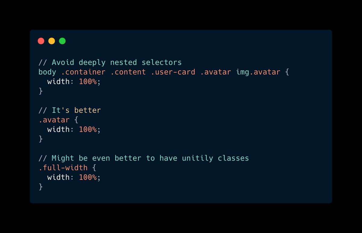
3. Deeply nested selectors
Just because the DOM tree looks one way does not mean the CSS should match it.
HTML is for structure. CSS is for styling.
Just because the DOM tree looks one way does not mean the CSS should match it.
HTML is for structure. CSS is for styling.
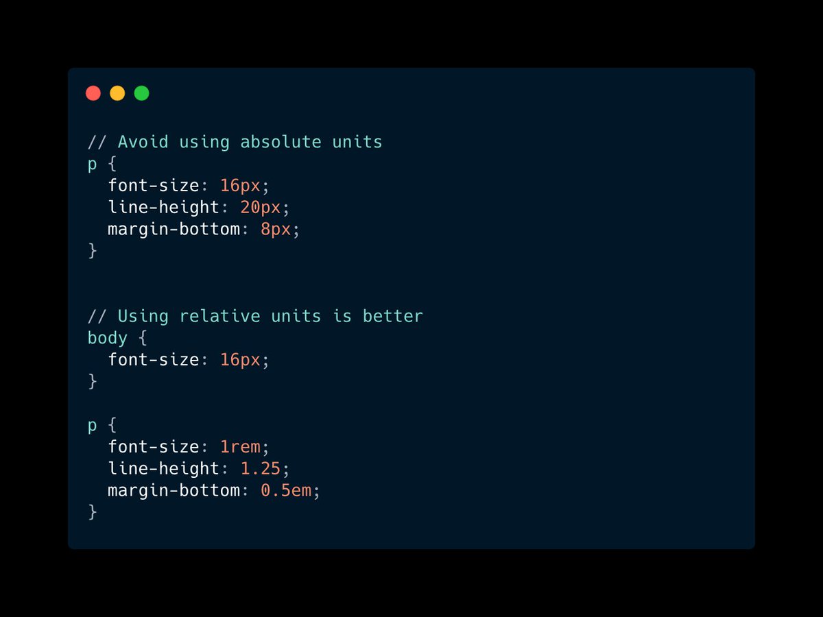
4. Using px units
I found a nice answer from Stack Overflow: stackoverflow.com/a/43131958/106…
Pay attention that the answer from 2012 stated that you should use px.
But the second answer explains that it's fine to use relative units nowadays.
I found a nice answer from Stack Overflow: stackoverflow.com/a/43131958/106…
Pay attention that the answer from 2012 stated that you should use px.
But the second answer explains that it's fine to use relative units nowadays.
5. Writing 0px
This is just redundant: instead of 0px you can just use 0.
❌ Bad:
margin: 10px 0px 15px 0px;
✅ Good:
margin: 10px 0 15px 0;
This is just redundant: instead of 0px you can just use 0.
❌ Bad:
margin: 10px 0px 15px 0px;
✅ Good:
margin: 10px 0 15px 0;
6. Using color names instead of hex code
While it seems that there are 17 standard colors (w3.org/TR/CSS21/synda…), I think it's a very bad practice to use color names.
Who knows how they'll be rendered.
Plus you still need a lot of custom colors, so why not be consistent?
While it seems that there are 17 standard colors (w3.org/TR/CSS21/synda…), I think it's a very bad practice to use color names.
Who knows how they'll be rendered.
Plus you still need a lot of custom colors, so why not be consistent?
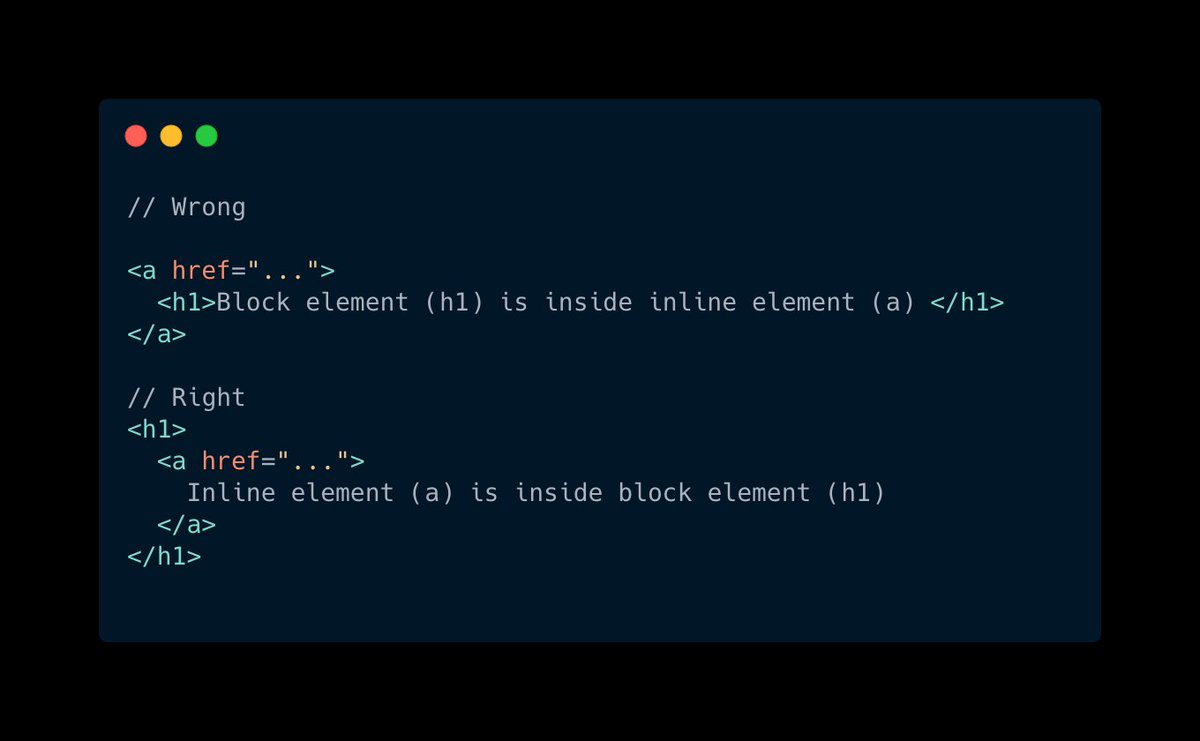
7. Putting block elements in inline
From Mozilla docs:
Generally, inline elements may contain only data and other inline elements.
You shouldn't put block elements inside inline elements. 👆
From Mozilla docs:
Generally, inline elements may contain only data and other inline elements.
You shouldn't put block elements inside inline elements. 👆
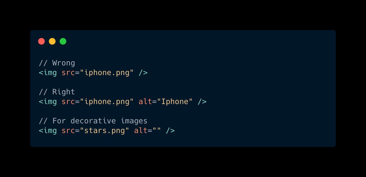
8. Missing alt text for images
Alt is a required (!) attribute for images (w3schools.com/tags/att_img_a…)
Screen readers use alt to understand what the image is about.
If the image serves DECORATIVE purposes, then you should put alt="" (an empty string)
Alt is a required (!) attribute for images (w3schools.com/tags/att_img_a…)
Screen readers use alt to understand what the image is about.
If the image serves DECORATIVE purposes, then you should put alt="" (an empty string)
9. Repeating the same code
It often happens that in big projects you keep on writing the same styling, because it's easier to add one class, than refactoring the whole project.
But it's not a good thing and you should avoid it.
Frameworks like @tailwindcss might help
It often happens that in big projects you keep on writing the same styling, because it's easier to add one class, than refactoring the whole project.
But it's not a good thing and you should avoid it.
Frameworks like @tailwindcss might help
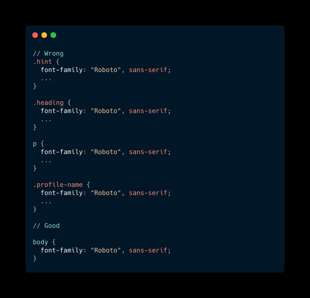
10. Duplicating font-family everywhere
Another thing related to code duplication is FONT duplication.
I often see that developers copy-paste styles from Sketch/Figma, and end up having the same font-family and line-height.
Another thing related to code duplication is FONT duplication.
I often see that developers copy-paste styles from Sketch/Figma, and end up having the same font-family and line-height.
11. Z-index hell
If you worked on a large project, then you probably tried desperately something like: z-index: 99999.
Managing z-indexes is not that easy.
Check out this article from @smashingmag
smashingmagazine.com/2021/02/css-z-…
If you worked on a large project, then you probably tried desperately something like: z-index: 99999.
Managing z-indexes is not that easy.
Check out this article from @smashingmag
smashingmagazine.com/2021/02/css-z-…
12. Not knowing the difference between visibility and display
`visibility: hidden` = It is not visible but gets up its original space
`display: none` = It is hidden and takes no space.
This is important to know 👆
`visibility: hidden` = It is not visible but gets up its original space
`display: none` = It is hidden and takes no space.
This is important to know 👆
13. Not using shorthand syntax, when it's reasonable
Sometimes it's not reasonable to use shorthand syntax, e.g. for the font property.
However, when it comes to margins/paddings/borders etc, it's perfectly fine.
Sometimes it's not reasonable to use shorthand syntax, e.g. for the font property.
However, when it comes to margins/paddings/borders etc, it's perfectly fine.

14. Not using semantic tags
HTML has a lot of semantic elements, like <article>, <header>, <footer>.
Use them instead of <div>, it will help for SEO & screen readers.
HTML has a lot of semantic elements, like <article>, <header>, <footer>.
Use them instead of <div>, it will help for SEO & screen readers.
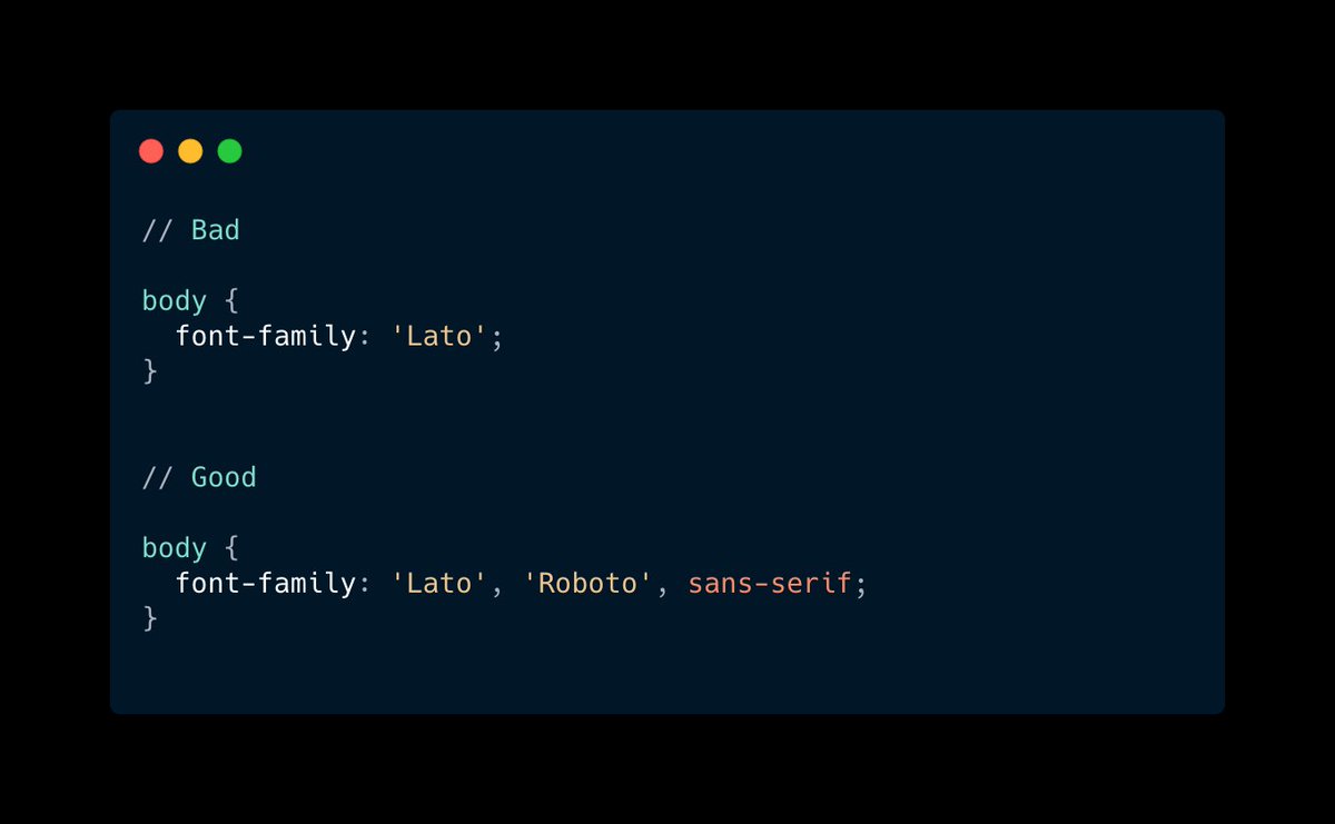
15. Not providing fallback fonts
It might happen that the user doesn't have installed the font you use.
In this case, you can specify other fonts and font families (!) that should be used.
It might happen that the user doesn't have installed the font you use.
In this case, you can specify other fonts and font families (!) that should be used.
• • •
Missing some Tweet in this thread? You can try to
force a refresh