You must have used the border-radius property in CSS, but here is complete guide covering some of the hidden concept of it
🧵👇🏻
🧵👇🏻

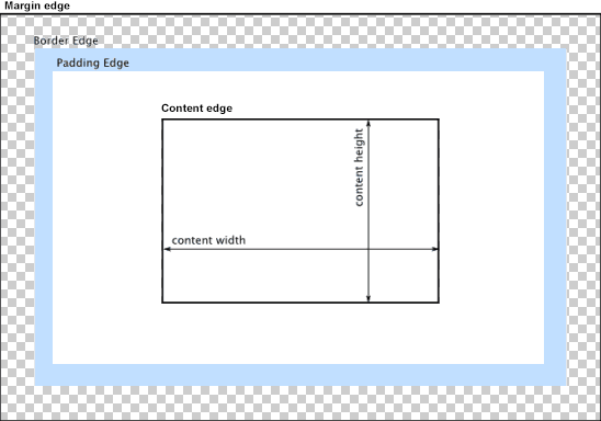
The border-radius CSS property rounds the corners of an element's outer border edge. You can set a border-radius in order to make round edges of sharp cornered box
Well we know that every element is a box in webpage. Consider that box clipped using 8 clips 👇🏻
We can adjust that clips in order to make distorted shapes
We can adjust that clips in order to make distorted shapes

We can shift the position of eight clips and make some amazing random shapes.
The syntax is pretty easy, we can consider it as border-radius accepts 8 value for each clip, four value before slash (/) and four values after slash
The syntax is pretty easy, we can consider it as border-radius accepts 8 value for each clip, four value before slash (/) and four values after slash

Let's decode what each value means.
border-radius: 2px 4px 6px 8px / 10px 12px 20px 16px;
The first 2px simply means the distance of first clip from the top left corner and second value that is 4px means the distance of second clip from top right corner
border-radius: 2px 4px 6px 8px / 10px 12px 20px 16px;
The first 2px simply means the distance of first clip from the top left corner and second value that is 4px means the distance of second clip from top right corner

When we write simple border-radius: 10px, it means all clips and equal distance from their initial points.
border-radius: 50% 50% 50% 50% / 50% 50% 50% 50%; is same as border-radius: 50%
border-radius: 50% 50% 50% 50% / 50% 50% 50% 50%; is same as border-radius: 50%
There is another easy way to remember the numbering of clips.
Top left 1
Top left 2
Top right 1
and so on...

Top left 1
Top left 2
Top right 1
and so on...


Great! This is pretty much it for this thread. I hope you like it, if so, share this thread with your connections ❤️
Peace out 😉
Peace out 😉
• • •
Missing some Tweet in this thread? You can try to
force a refresh


