💡 #designthinking
Found this on @dribbble dribbble.com/shots/15653593…
Things I like:
- Subtle texture in the background
- Mix of line illustrations w/ photography. I do this a lot in my work to give the design a more "organic" feel and help lead the eye
🧵👇🏻 1/5
Found this on @dribbble dribbble.com/shots/15653593…
Things I like:
- Subtle texture in the background
- Mix of line illustrations w/ photography. I do this a lot in my work to give the design a more "organic" feel and help lead the eye
🧵👇🏻 1/5
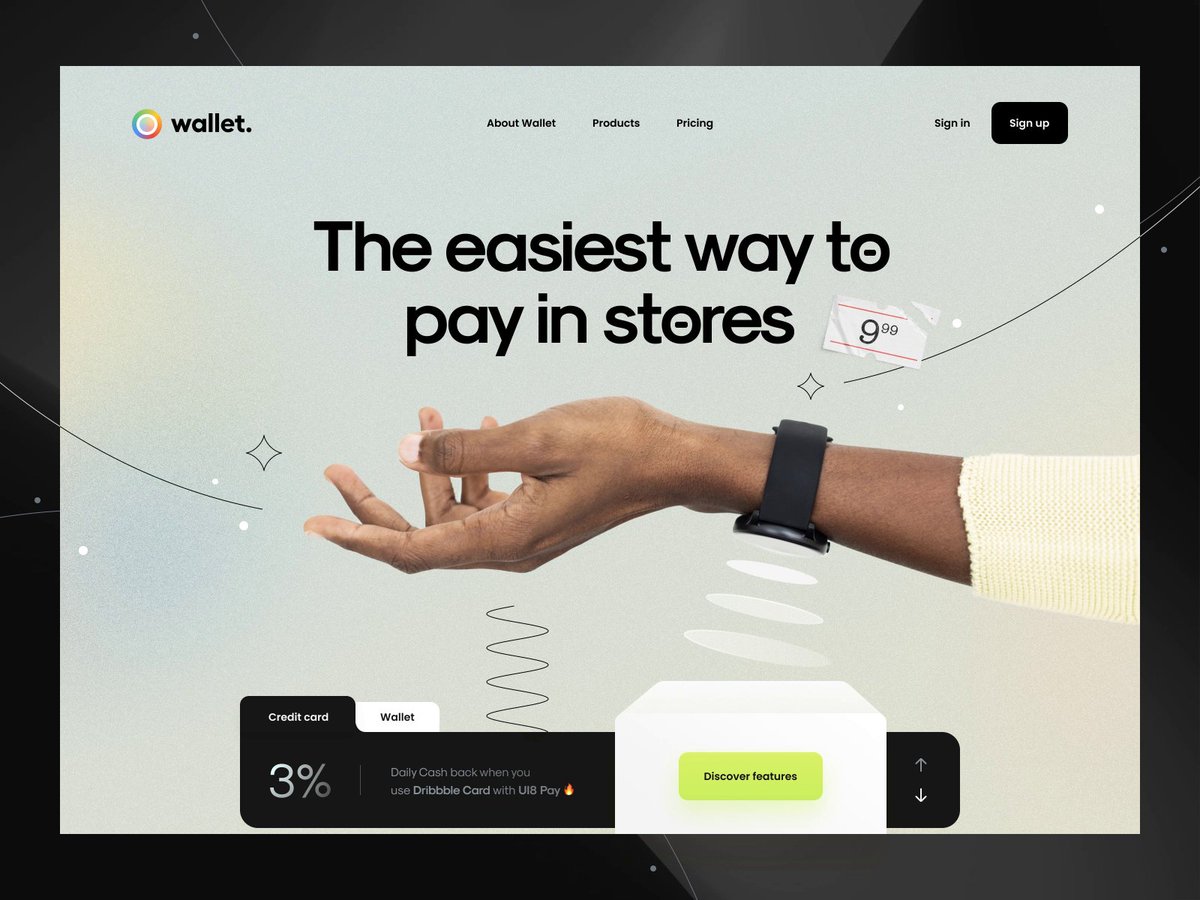
Where this design ultimately fails (and it's BIG): It took me **way too long** to realize this site is promoting paying through your watch. It didn't occur to me until I saw the caption: "The fastest way to pay without-touch."
🧵 2/5
🧵 2/5
My train of thought: "If it's related to touch, shouldn't you see a fingerprint or the palm? ... oh, there are "waves" coming out of the watch ... I get it now."
🧵 3/5
🧵 3/5
The white waves get lost in the background. I love illustrative elements, but they also camouflaged the waves coming out of the watch. There's not enough **contrast.** In fact the black squiggle is louder and throws off the visual hierarchy.
🧵 4/5
🧵 4/5

You can have something that looks good but ultimately fails if it doesn't accomplish your business goals. This is not good design.
Good design takes all these goals (consumer, marketing, business, visual) into consideration.
🧵 5/5
Good design takes all these goals (consumer, marketing, business, visual) into consideration.
🧵 5/5
• • •
Missing some Tweet in this thread? You can try to
force a refresh