💡 #designthinking
It's important to surround yourself with good design. Ask yourself the hard questions: What works? What could be improved?
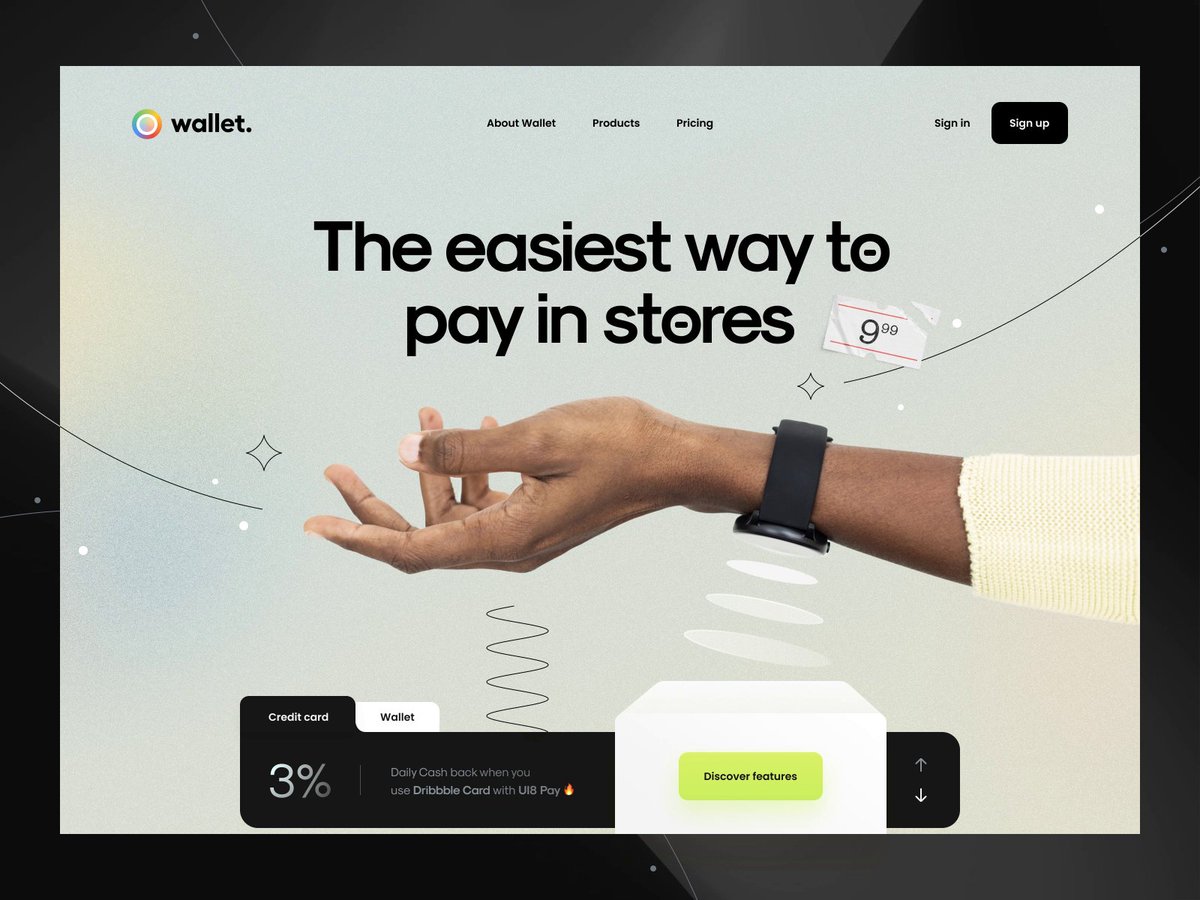
I came across this design on @dribbble: dribbble.com/shots/15501287… Let's talk about it.
🧵👇🏻 1/16
It's important to surround yourself with good design. Ask yourself the hard questions: What works? What could be improved?
I came across this design on @dribbble: dribbble.com/shots/15501287… Let's talk about it.
🧵👇🏻 1/16
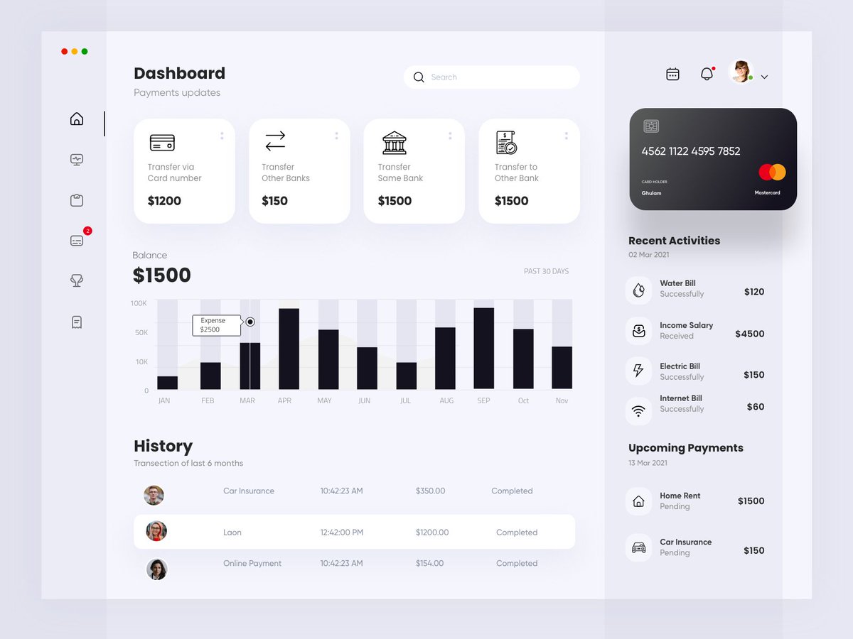
Dashboards are hard:
- Summarizing *a lot* of info in one place
- Info needs to be easily digestible
- Different people prioritize info differently depending on their use case
This dashboard does a *great* job of taking all those things into consideration
🧵 2/16
- Summarizing *a lot* of info in one place
- Info needs to be easily digestible
- Different people prioritize info differently depending on their use case
This dashboard does a *great* job of taking all those things into consideration
🧵 2/16
The Typography looks great. There's a good mix of thicks and thins that create contrast and help communicate visual hierarchy.
🧵 3/16
🧵 3/16
Color Palette.
I love working in neutral colors and then using color to accent.
That's exactly what the designer did here. The only color:
- Red and Green dots to communicate status
- Avatars
- Credit Card
🧵 4/16
I love working in neutral colors and then using color to accent.
That's exactly what the designer did here. The only color:
- Red and Green dots to communicate status
- Avatars
- Credit Card
🧵 4/16
There's still room for improvement:
The credit card is shifted above the cards next to it and has a heavier drop shadow. This makes it feel like it is the highest or closest item to the user. This emphasis is unnecessary.
🧵 5/16
The credit card is shifted above the cards next to it and has a heavier drop shadow. This makes it feel like it is the highest or closest item to the user. This emphasis is unnecessary.
🧵 5/16

The CC already has emphasis = the Mastercard logo is in color & it's the largest area of black.
The CC isn't the most important thing. Yes, the user needs to know which account they're viewing but that should be a small piece of the overall picture.
🧵 6/16
The CC isn't the most important thing. Yes, the user needs to know which account they're viewing but that should be a small piece of the overall picture.
🧵 6/16
There are several items where the alignment isn't consistent. The items in each section should match, and ideally, a similar pattern should be established across the entire page.
🧵 7/16
🧵 7/16


I like the gray text because it helps communicate visual hierarchy, but the text isn't accessible. This could easily be fixed by making it a shade darker.
I use Contrast App from @soffessoffes and @mdsmds to check colors.
🧵 8/16
I use Contrast App from @soffessoffes and @mdsmds to check colors.
🧵 8/16

These sections aren't consistent. "Dashboard" and "History" are section headers with subtext underneath.
"Balance" is the section header.
I'm not recommending that $1500 be listed as subtext. It's too important for that. But, the treatment does need to be revisited.
🧵 9/16
"Balance" is the section header.
I'm not recommending that $1500 be listed as subtext. It's too important for that. But, the treatment does need to be revisited.
🧵 9/16

The relationship between the text and the data is wrong. The label says "Past 30 Days" but we're showing the last year(?) of data.
In the bar graph, it would be helpful to signify which month is the current month.
🧵 10/16
In the bar graph, it would be helpful to signify which month is the current month.
🧵 10/16

In design, proximity helps communicate relationships. If 2 items are close together, the eye connects them.
The columns of data are even, but the avatar doesn't need the full width, creating a large gap between the avatar and label. They almost appear disconnected.
🧵 11/16
The columns of data are even, but the avatar doesn't need the full width, creating a large gap between the avatar and label. They almost appear disconnected.
🧵 11/16

Proximity again. Headings should appear closer to the data they're referring to. Here, "Upcoming Payments" is referring to the content below it, but it's actually closer to the content above it.
🧵 12/16
🧵 12/16

In general, I like how these cards look, but I still have questions. Is this money being transferred in or out? A simple + or - would fix this. You _could_ introduce color, but color alone shouldn't signify status (accessibility, esp if you're red/green color blind).
🧵 13/16
🧵 13/16

I had a professor in college that called this "Mystery Meat Navigation." I'm not sure where each of the icons in the navigation will take me.
Good UX means the user doesn't have to guess. There shouldn't be any surprises.
🧵 14/16
Good UX means the user doesn't have to guess. There shouldn't be any surprises.
🧵 14/16

I have *mad props* to anyone that's designing in their second language. I only know 1 language 😞 so I can't even imagine!
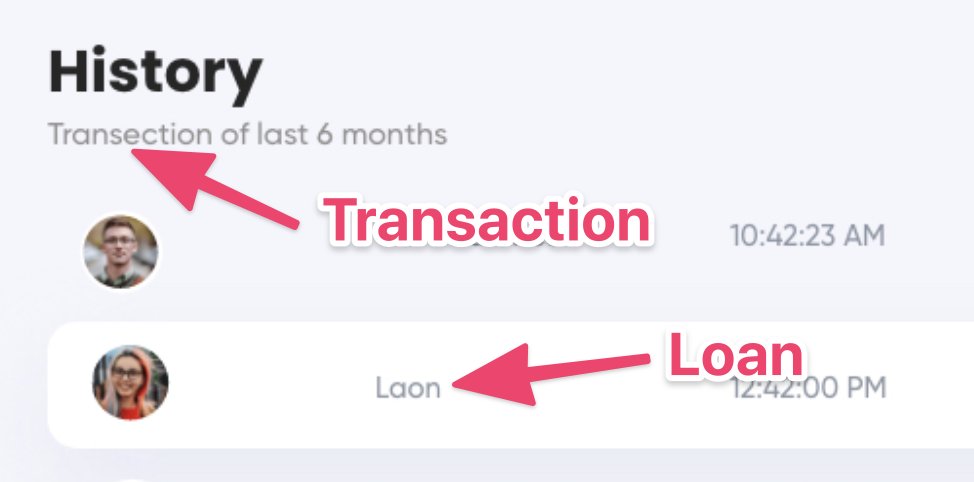
As a product designer, attention to detail is essential. If you're applying for a highly competitive job in the US, spelling needs to be 💯
🧵 15/16
As a product designer, attention to detail is essential. If you're applying for a highly competitive job in the US, spelling needs to be 💯
🧵 15/16


A lot of these items nitpick, but it's the attention to details that separate good designs from great designs. Overall, I really like this composition, but the small things could really push this over the edge to great.
🧵 16/16
🧵 16/16
• • •
Missing some Tweet in this thread? You can try to
force a refresh