I analyzed 100s of landing pages to give you some inspiration.
Here are 34 of the very best:
Here are 34 of the very best:
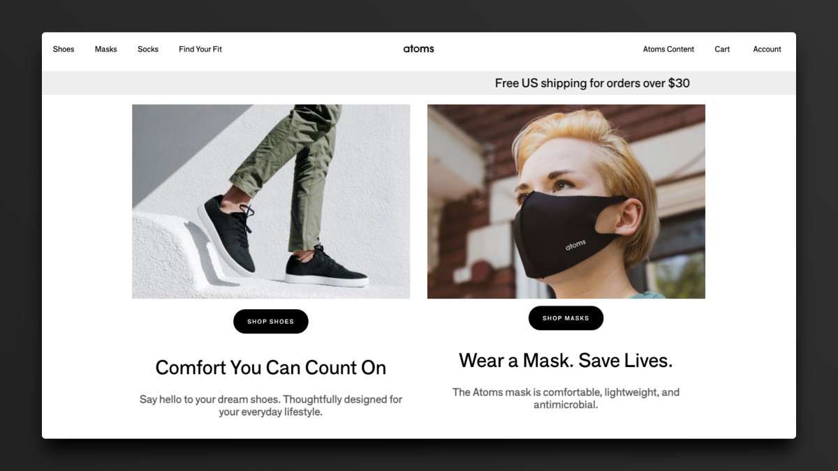
Website:
@WearAtoms
1 Great Feature:
Gives us options, but not too many options.
1 Opportunity:
Reduce the speed of the rotating banner.
@WearAtoms
1 Great Feature:
Gives us options, but not too many options.
1 Opportunity:
Reduce the speed of the rotating banner.
Website:
@coda_hq
1 Great Feature:
Great copy that informs and relates all at once.
1 Opportunity:
The colors may be a bit too much here. Needs greater contrast of elements.
@coda_hq
1 Great Feature:
Great copy that informs and relates all at once.
1 Opportunity:
The colors may be a bit too much here. Needs greater contrast of elements.

Website:
@DescriptApp
1 Great Feature:
Eyes point straight to the button on this page.
1 Opportunity:
Needs social proof above the fold.
@DescriptApp
1 Great Feature:
Eyes point straight to the button on this page.
1 Opportunity:
Needs social proof above the fold.

Website:
@every
1 Great Feature:
Adds a micro-delight under the button to accentuate the call to action.
1 Opportunity:
Show us the newsletter on a device.
@every
1 Great Feature:
Adds a micro-delight under the button to accentuate the call to action.
1 Opportunity:
Show us the newsletter on a device.

Website:
@fast
1 Great Feature:
Shows the product in action instantly.
1 Opportunity:
Update the iPhone mockup to a newer model.
@fast
1 Great Feature:
Shows the product in action instantly.
1 Opportunity:
Update the iPhone mockup to a newer model.

Website:
@useFluent
1 Great Feature:
Gives a demo on page with no effort required.
1 Opportunity:
Could use some empty space at the bottom for social proof.
@useFluent
1 Great Feature:
Gives a demo on page with no effort required.
1 Opportunity:
Could use some empty space at the bottom for social proof.

Website:
@gumroad
1 Great Feature:
Best CTA copy on the internet.
1 Opportunity:
If the focus is on creators, let's show them right off the bat.
@gumroad
1 Great Feature:
Best CTA copy on the internet.
1 Opportunity:
If the focus is on creators, let's show them right off the bat.

Website:
@TZhongg
1 Great Feature:
A little context goes a long way here. Highly focused.
1 Opportunity:
Change the main CTA from Discover to Sign Up.
@TZhongg
1 Great Feature:
A little context goes a long way here. Highly focused.
1 Opportunity:
Change the main CTA from Discover to Sign Up.

Website:
@jamesclear
1 Great Feature:
Ultimate lead magnet: an entire chapter of a book.
1 Opportunity:
CTA button is too far down the page and could be moved up.
@jamesclear
1 Great Feature:
Ultimate lead magnet: an entire chapter of a book.
1 Opportunity:
CTA button is too far down the page and could be moved up.

Website:
@julian
1 Great Feature:
4 high-quality options to choose from. Nothing more, nothing less.
1 Opportunity:
Test moving the subscribe box above the content boxes.
@julian
1 Great Feature:
4 high-quality options to choose from. Nothing more, nothing less.
1 Opportunity:
Test moving the subscribe box above the content boxes.

Website:
@LambdaSchool
1 Great Feature:
Showcases real people wearing Lambda School swag.
1 Opportunity:
Add social proof below the button (X students have found jobs).
@LambdaSchool
1 Great Feature:
Showcases real people wearing Lambda School swag.
1 Opportunity:
Add social proof below the button (X students have found jobs).

Website:
@latecheckoutplz
1 Great Feature:
Extremely clear and specified messaging.
1 Opportunity:
Could use a CTA button or clear next step.
@latecheckoutplz
1 Great Feature:
Extremely clear and specified messaging.
1 Opportunity:
Could use a CTA button or clear next step.

Website:
@LiveRecover
1 Great Feature:
Dead simple. Easy to know what action to take.
1 Opportunity:
Change the image to a software GIF.
@LiveRecover
1 Great Feature:
Dead simple. Easy to know what action to take.
1 Opportunity:
Change the image to a software GIF.

Website:
@goodmarketinghq
1 Great Feature:
Wastes no time getting you right into the important content.
1 Opportunity:
The Subscribe CTA at the top blends in a bit too much.
@goodmarketinghq
1 Great Feature:
Wastes no time getting you right into the important content.
1 Opportunity:
The Subscribe CTA at the top blends in a bit too much.

Website:
@mymind
1 Great Feature:
Beautiful color palette.
1 Opportunity:
Show the app in action above the fold.
@mymind
1 Great Feature:
Beautiful color palette.
1 Opportunity:
Show the app in action above the fold.

Website:
@NotionHQ
1 Great Feature:
Contrasting to a tee. White background, black text, red button.
1 Opportunity:
Show how many people use Notion every day.
@NotionHQ
1 Great Feature:
Contrasting to a tee. White background, black text, red button.
1 Opportunity:
Show how many people use Notion every day.

Website:
@beondeck
1 Great Feature:
Case studies available for real people right above the fold.
1 Opportunity:
Room for improvement on messaging. It isn't 100% clear what On Deck does here.
@beondeck
1 Great Feature:
Case studies available for real people right above the fold.
1 Opportunity:
Room for improvement on messaging. It isn't 100% clear what On Deck does here.

Website:
@pipe
1 Great Feature:
Perfect color palette to make dark mode work.
1 Opportunity:
Include social proof of how much has been given to companies through Pipe.
@pipe
1 Great Feature:
Perfect color palette to make dark mode work.
1 Opportunity:
Include social proof of how much has been given to companies through Pipe.

Website:
@public
1 Great Feature:
All content focused to one side for ease of submission.
1 Opportunity:
Point the CTA straight to the app store instead of texting the link.
@public
1 Great Feature:
All content focused to one side for ease of submission.
1 Opportunity:
Point the CTA straight to the app store instead of texting the link.

Website:
@rainbowdotme
1 Great Feature:
Shows exactly what you'll expect to see when you download the app.
1 Opportunity:
Make the phone image a GIF for even greater context.
@rainbowdotme
1 Great Feature:
Shows exactly what you'll expect to see when you download the app.
1 Opportunity:
Make the phone image a GIF for even greater context.

Website:
@RoamResearch
1 Great Feature:
Puts the focus on the software and its superpowers.
1 Opportunity:
Test out displaying a product GIF instead of product images.
@RoamResearch
1 Great Feature:
Puts the focus on the software and its superpowers.
1 Opportunity:
Test out displaying a product GIF instead of product images.

Website:
@savvycal_
1 Great Feature:
Perfect text alignment and awesome positioning.
1 Opportunity:
The product demo is just a tad too far down the page.
@savvycal_
1 Great Feature:
Perfect text alignment and awesome positioning.
1 Opportunity:
The product demo is just a tad too far down the page.

Website:
@stir
1 Great Feature:
Typography is bold and on point.
1 Opportunity:
Replace Get Started with more specific CTA language.
@stir
1 Great Feature:
Typography is bold and on point.
1 Opportunity:
Replace Get Started with more specific CTA language.

Website:
@stripe
1 Great Feature:
Makes a complex product more accessible with imagery.
1 Opportunity:
Increase the size of Start Now and remove the secondary CTA as a test.
@stripe
1 Great Feature:
Makes a complex product more accessible with imagery.
1 Opportunity:
Increase the size of Start Now and remove the secondary CTA as a test.

Website:
@SubstackInc (Feat @Apompliano)
1 Great Feature:
Clear focus on the sign-up box. Eyes go nowhere else.
1 Opportunity:
No ability to add much social proof.
@SubstackInc (Feat @Apompliano)
1 Great Feature:
Clear focus on the sign-up box. Eyes go nowhere else.
1 Opportunity:
No ability to add much social proof.

Website:
@super_
1 Great Feature:
Extremely clear messaging.
1 Opportunity:
Show us the product right away.
@super_
1 Great Feature:
Extremely clear messaging.
1 Opportunity:
Show us the product right away.

Website:
@coreyhainesco
1 Great Feature:
Social proof abounds here and it instills trust.
1 Opportunity:
Show an example email or add a link to one.
@coreyhainesco
1 Great Feature:
Social proof abounds here and it instills trust.
1 Opportunity:
Show an example email or add a link to one.

Website:
@your__tempo
1 Great Feature:
Minimal and beautiful, but shows us everything we need to see.
1 Opportunity:
The CTA button is a little too far down the page.
@your__tempo
1 Great Feature:
Minimal and beautiful, but shows us everything we need to see.
1 Opportunity:
The CTA button is a little too far down the page.

Website:
@TheHustle
1 Great Feature:
Displays the newsletter contents prior to sign up.
1 Opportunity:
Eliminate redundancy of the logo in the nav and hero.
@TheHustle
1 Great Feature:
Displays the newsletter contents prior to sign up.
1 Opportunity:
Eliminate redundancy of the logo in the nav and hero.

Website:
@typefullyapp
1 Great Feature:
You're in the app without any clicks.
1 Opportunity:
They just need to monetize.
@typefullyapp
1 Great Feature:
You're in the app without any clicks.
1 Opportunity:
They just need to monetize.

Website:
@VeryGoodCopy
1 Great Feature:
Displays numerical social proof above the button.
1 Opportunity:
Add a testimonial above the fold.
@VeryGoodCopy
1 Great Feature:
Displays numerical social proof above the button.
1 Opportunity:
Add a testimonial above the fold.

Website:
@visualizevalue
1 Great Feature:
Everything you need is accessible nearly without scrolling.
1 Opportunity:
Eliminate the popup and just have a small opt-in at the top of the page instead.
@visualizevalue
1 Great Feature:
Everything you need is accessible nearly without scrolling.
1 Opportunity:
Eliminate the popup and just have a small opt-in at the top of the page instead.

That's all, folks!
Did you like this thread?
1. Retweet the 1st tweet above
2. Follow me @heyblake
I'll also be giving away one free year of Copy.ai to a random retweeter!
RT the first tweet to enter.
Did you like this thread?
1. Retweet the 1st tweet above
2. Follow me @heyblake
I'll also be giving away one free year of Copy.ai to a random retweeter!
RT the first tweet to enter.
• • •
Missing some Tweet in this thread? You can try to
force a refresh