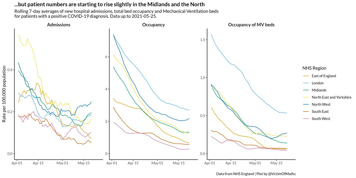
I remembered that NHS England publish daily admissions data at regional level, so here's what those numbers look like.

Admissions have started to rise in the Midlands and North of England, and bed occupancy and ventilator use have risen in the NW. But the numbers are small.
What happens next depends on three things (I think):

1) Do cases in areas with high case rates just now spread into older age groups
2) Do vaccines lead to fewer admissions and deaths even if cases do spread to older age groups
3)Do cases start to rise widely elsewhere
I'm not going to make predictions, but I'm still not too pessimistic.
R code for these plots is here:
github.com/VictimOfMaths/…

• • •

Missing some Tweet in this thread? You can try to force a refresh
 

Keep Current with Colin Angus

Colin Angus Profile picture

Stay in touch and get notified when new unrolls are available from this author!

Read all threads

This Thread may be Removed Anytime!

PDF

Twitter may remove this content at anytime! Save it as PDF for later use!

Try unrolling a thread yourself!

how to unroll video
  1. Follow @ThreadReaderApp to mention us!

  2. From a Twitter thread mention us with a keyword "unroll"
@threadreaderapp unroll

Practice here first or read more on our help page!

More from @VictimOfMaths

27 May
A conversation with @jburnmurdoch yesterday sparked an idea for a new plot to try and illustrate how different we'd expect the number of deaths due to the current COVID outbreak in Bolton to be compared to previous waves.

A lot going on here, so let's unpick it a bit... Image
Clever people like Dan Howden (formerly of this parish) have been using published data on COVID cases and deaths by age to estimate age-specific Case Fatality Rates - the % of cases in an age group which leads to a death within 28 days. cebm.net/covid-19/the-d…
For any day's newly announced cases, we can use these numbers to estimate how many deaths we'd expect to result from those cases, accounting for the age profile of cases.

@danc00ks0n has a nice dashboard that does this:

public.tableau.com/app/profile/da…
Read 16 tweets
26 May
Thinking about this a bit more, it seems very plausible that 1 won't happen (much*) and 2 and 3 will.

This would lead to a scenario where there are widespread infections across the country, but overwhelmingly in unvaccinated, younger, lower risk groups...
This would lead to a small rise in hospital admissions (as we're already starting to see in the NW) and deaths (relative to what has gone before), and potentially a bigger rise in other consequences like long COVID, although the evidence around that is much more uncertain (AIUI). Image
Which raises the question of how government would respond. They could either take action to try and limit the spread (be that local restrictions or national lockdowns), or they could just let the virus spread as the consequences will be far less severe than uncontrolled spread...
Read 8 tweets
25 May
I've tweaked this plot slightly so it now shows the movement of each Local Authority in the last week across the plot.

Growth of cases is fairly steady in Bolton and Glasgow, but accelerating in Blackburn, Bedford, Rossendale and Clackmannanshire in Scotland.
Tips on reading this plot:

1) Moving from left to right means cases are rising (and from left to right means they are falling)

2) Above the horizontal line, moving up means case growth is accelerating, moving down towards the line means growth is stalling
3) Below the line, moving up means the fall in cases is slowing, moving down means it's accelerating.

So what we expect to see is areas moving in a circle as cases rise, then fall back again.

Movement up and right is bad. Down and left is good.
Read 5 tweets
24 May
Scotland don't publish an age breakdown of COVID cases at Local Authority level (I don't think), but the national picture shows the same pattern as we see in parts of England where cases are rising - cases are only increasing in the under 45s. Image
This is a different pattern from both October (cases started in teenagers then moved up the ages) and January (cases rose in all age groups at once).

Vaccines, innit 💉💪 Image
Here's a bonus streamgraph version, for those of you who like that sort of thing. Image
Read 4 tweets
24 May
A bit more perspective on COVID cases in Bolton:

Because the profile of cases is much younger than previous waves, the expected mortality rate is much lower.

If there were no more cases, we'd expect 4 deaths over the next month or so. Image
Obviously 4 deaths is 4 more than we'd really like, but compared to the 738 deaths to date in Bolton, it's clear that this outbreak is (at the moment) nothing like what has come before.
Even over the whole of the North West the number of cases we've seen so far are expected to lead to just 24 further deaths. Image
Read 5 tweets
20 May
COVID case numbers in Bolton do look rather scary.

BUT...
These cases are very heavily weighted towards younger age groups who are less likely to have been offered a vaccine and are less likely to end up in hospital.

There has been a rise in cases in people in their 50s/60s in the last few days of complete data, which we need to watch
Overall the age profile of cases in the current outbreak in Bolton is quite different to what we've seen before.

Some of this will be differences in testing, particularly among schoolchildren, but I doubt we're testing people aged 50+ less than we were back in January.
Read 12 tweets

Did Thread Reader help you today?

Support us! We are indie developers!


This site is made by just two indie developers on a laptop doing marketing, support and development! Read more about the story.

Become a Premium Member ($3/month or $30/year) and get exclusive features!

Become Premium

Too expensive? Make a small donation by buying us coffee ($5) or help with server cost ($10)

Donate via Paypal Become our Patreon

Thank you for your support!

Follow Us on Twitter!

:(