A conversation with @jburnmurdoch yesterday sparked an idea for a new plot to try and illustrate how different we'd expect the number of deaths due to the current COVID outbreak in Bolton to be compared to previous waves.
A lot going on here, so let's unpick it a bit...
A lot going on here, so let's unpick it a bit...
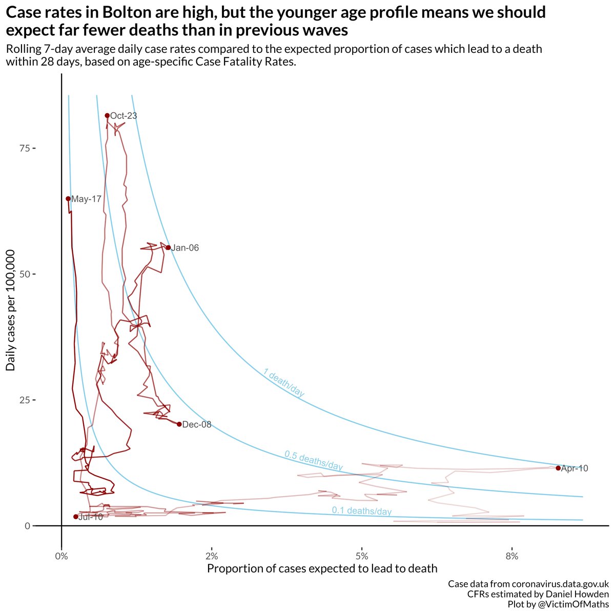
Clever people like Dan Howden (formerly of this parish) have been using published data on COVID cases and deaths by age to estimate age-specific Case Fatality Rates - the % of cases in an age group which leads to a death within 28 days. cebm.net/covid-19/the-d…
For any day's newly announced cases, we can use these numbers to estimate how many deaths we'd expect to result from those cases, accounting for the age profile of cases.
@danc00ks0n has a nice dashboard that does this:
public.tableau.com/app/profile/da…
@danc00ks0n has a nice dashboard that does this:
public.tableau.com/app/profile/da…
One way of looking at these numbers is to calculate the % of cases on any given day that we would expect to lead to a death. Essentially this is just taking the average of the age-specific CFRs, weighted by the number of cases in each age group.
This is a measure of the fatality risk associated with each new case. It seems useful to compare this against the total number of cases. Plotting these against each other for Bolton a few selected dates, gives us something like this:

To help us compare these points, I think it's helpful to add some lines which represent 'contours' on this plane where the total number of deaths expected from that day's cases are the same.
Like this:
Like this:

This shows us that the total number of deaths we'd have expected from the cases in April 2020 (bottom right) was similar to in January 2021.
That's because much lower testing rates in April meant we were only testing high risk groups with higher CFRs.
That's because much lower testing rates in April meant we were only testing high risk groups with higher CFRs.

Whereas in January 2021 we were finding a lot more cases, but they were in younger, lower risk age groups.
I think the difference between October (when we saw high case numbers in 18-24 year olds) and January (fewer cases overall, but greater expected mortality) is interesting.
I think the difference between October (when we saw high case numbers in 18-24 year olds) and January (fewer cases overall, but greater expected mortality) is interesting.
The final step is to show the full trajectory, using a 7-day rolling average to keep it from being too messy, fading in from oldest to most recent dates. To show how things have evolved over the pandemic.
Now you can see why I picked those dates in particular!
Now you can see why I picked those dates in particular!

Here's the complete plot. This shows just how different the fatality risk associated with current cases is to in previous waves. Even though case rates are currently higher than in early January, we'd expect the number of deaths from these cases to be ~10 times lower.

I think the movement down and rightwards in early December is interesting too - case rates were falling, but skewing older, so the expected number of deaths wasn't changing.
An important illustration that it's useful to look beyond the headline case figures.
An important illustration that it's useful to look beyond the headline case figures.
Caveats:
1) CFRs have changed over time (generally reducing as we get better at treating cases). For simplicity I've just used the most recent estimates from Dan Howden (based on data from April)
1) CFRs have changed over time (generally reducing as we get better at treating cases). For simplicity I've just used the most recent estimates from Dan Howden (based on data from April)
2) Testing rates have changed over time. Back in April 2020 we were testing much less, so you would expect the CFR to be higher. This time round we are testing a lot more children, who have very low fatality risks (thankfully)
3) Deaths are not the only outcome that matters. Being ill is rubbish, being hospitalised is much worse, and some people obviously suffer serious longer-term consequences (i.e. long COVID).
If you made it this far (well done) then I'd be interested in any feedback on this chart. I like it, but maybe it's just too complicated or messy to be of much use?
R code is here for the enthusiastic:
github.com/VictimOfMaths/…
Should be (relatively) easy to adapt to other LAs.
R code is here for the enthusiastic:
github.com/VictimOfMaths/…
Should be (relatively) easy to adapt to other LAs.
A couple of people suggested adding years to the dates, so here you go:

• • •
Missing some Tweet in this thread? You can try to
force a refresh