How to Design a Better Cta Button 👊
Quick Tutorial
Quick Tutorial

Let's start with this simple button.
⚠️ Disclaimer:
You can build a decent business with the exact same button. But if you want to WOW your users, follow the next tips to make your CTA stand out...
⚠️ Disclaimer:
You can build a decent business with the exact same button. But if you want to WOW your users, follow the next tips to make your CTA stand out...

1. Add Padding
Saying it again (without feeling any guilt):
"Whitespace is your best design pal."
💡Rule of thumb:
Set the horizontal padding equal to x2 the vertical one.
You can always use other formulas but that's a quick way to make it look visually nice.
Saying it again (without feeling any guilt):
"Whitespace is your best design pal."
💡Rule of thumb:
Set the horizontal padding equal to x2 the vertical one.
You can always use other formulas but that's a quick way to make it look visually nice.

2. Use rounded corners
This advice is optional and depends on your overall UI style.
💡Rule of thumb:
• Rounded corners are for modern & playful UIs
• Sharp corners are for "serious" & luxury products
This advice is optional and depends on your overall UI style.
💡Rule of thumb:
• Rounded corners are for modern & playful UIs
• Sharp corners are for "serious" & luxury products

3. Capitalize Your Copies
Capital letters/words emphasize your message. Use it for the content that your users can't afford to lose.
Also, users SPEND MORE TIME reading uppercase text.
💡Rule of thumb:
• Uppercase: for SHORT COPY
• Capitalize: for Larger Copies
Capital letters/words emphasize your message. Use it for the content that your users can't afford to lose.
Also, users SPEND MORE TIME reading uppercase text.
💡Rule of thumb:
• Uppercase: for SHORT COPY
• Capitalize: for Larger Copies

4. Gradient For More Emphasis
Gradients make bold statements! That's why designers choose gradient backgrounds for their CTA buttons.
To make them stand out, even more!
💡Rule of Thumb:
Use my free tool to create a decent gradient in a few clicks
magicpattern.design/tools/gradient…
Gradients make bold statements! That's why designers choose gradient backgrounds for their CTA buttons.
To make them stand out, even more!
💡Rule of Thumb:
Use my free tool to create a decent gradient in a few clicks
magicpattern.design/tools/gradient…

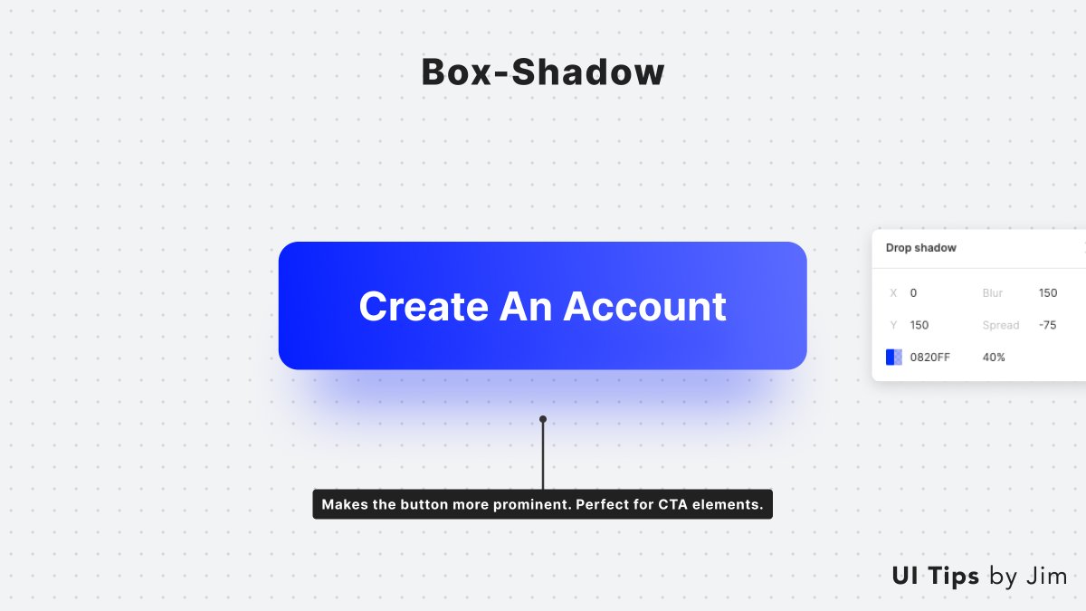
5. Use Shadows
Shadows show elevation and emulate the real 3D world.
They make your button look like it's floating on a higher level upon all the other elements. It prompts you to click it!
💡Rule of thumb:
Check this dope free tool by @gvrizzo:
getcssscan.com/css-box-shadow…
Shadows show elevation and emulate the real 3D world.
They make your button look like it's floating on a higher level upon all the other elements. It prompts you to click it!
💡Rule of thumb:
Check this dope free tool by @gvrizzo:
getcssscan.com/css-box-shadow…
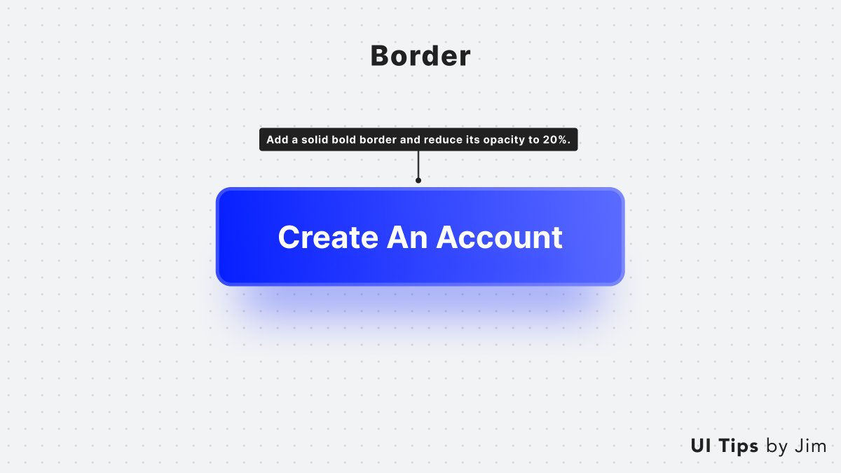
6. Add an Outline
It's optional but you can add a solid outline to upgrade your button's aesthetics.
🤯Pro tips:
• Add opacity to the border (10%-30%)
• Use a gradient color for the outline
It's optional but you can add a solid outline to upgrade your button's aesthetics.
🤯Pro tips:
• Add opacity to the border (10%-30%)
• Use a gradient color for the outline
7. Use Icons
Icons help users visually identify the button's purpose with a quick glance.
Two ways to use them:
• Describe the action with an icon
• Show action with an arrow or chevron icon
🤯Pro tip:
Align it to the right to keep the button's text centered.
Icons help users visually identify the button's purpose with a quick glance.
Two ways to use them:
• Describe the action with an icon
• Show action with an arrow or chevron icon
🤯Pro tip:
Align it to the right to keep the button's text centered.

Do you enjoy these tips?
Join my bi-weekly newsletter where I post similar content and more in-depth landing page teardowns 👇
learnuidesign.eo.page/jim
Join my bi-weekly newsletter where I post similar content and more in-depth landing page teardowns 👇
learnuidesign.eo.page/jim
• • •
Missing some Tweet in this thread? You can try to
force a refresh