Orwell2024 Profile picture
Jun 7, 2021 15 tweets 7 min read Read on X
1/ A great summary! After having peer reviewed many papers in the past, I can't leave this uncommented. There is just too much truth in it. But also many things missing. @markdhumphries

elemental.medium.com/the-absurdity-…
2/ "only one of Einstein’s 300 or so published papers was ever peer-reviewed, which so disgusted him that he never submitted a paper to that journal again."

He was not alone. Nature rejected Kary Mullis PCR paper (Nobel Price awared).

And what about drasticresearch.org/our-works/
3/ Peer Review is nothing more than "please have a look". It's a basic check, not a quality endorsment. Most papers I received were Chinese low quality papers pushing into high-end journals like Phys. Rev. B or Phys. Rev. Letters. I rejected (or redirected elswhere) most of them.
4/ It was clear that pushing low quality into high-end journals was about reputation and money. It's a quantitative money game, driven by the sick funding process in science. The more I rejected (or redirected elsewhere), the more I received from Phys. Rev. I noticed empirically
5/ Other reviewers may not be critical, so the flooding tactics to the high-end obviously works by being lucky (catching e.g. a lazy "ok" reviewer). For my own papers, I considered such high-end flooding tactic as unmoral to engage in. Nice small conferences are fine too for me.
6/ "much peer review is aggressive, rude, lazy, or just plain bad.".

You nailed it!

We don't get paid for this, so what do you expect? Quality? Most papers are bad, so it's really not fun nor a popular task to proof read. 99.99..% of the papers are not breaking discoveries.
7/ When a paper drops in for review, what is more likely? A) You drop your work or B) you pass it on to the PhD student? At some point, when Phys. Rev. sent too much, I started to reduce, reject or pass on. Checking the "not my field" box was the fastest way out for boring papers
8/ Peer Review is NOT a quality stamp nor a "certification" like mainstream COVID manic media claims.

"Does it stop a plainly wrong or plainly nonsense paper from being published? No"

Examples? @ConceptualJames @peterboghossian demonstrated:

9/ The article forgot to mention another issue: Rivality between competing groups. Dirty games may be played on the high end front. Rejection in order to publish ahead. At least that's what rumors tell for high impact publications on Moore's law research. Not seen it myself.
10/ Academic integrity and courage at the level of @ConceptualJames @BretWeinstein @peterboghossian @SwipeWright is exceptionally rare. They deserve a big thank you in this sinister "post factual" propaganda times of political science.
12/ The weak point seems to be at the editorial level. Once you get a political agenda pushing admin on such post, it's game over. In science and media. Nice example is @ggreenwald (also a shining star) who resigned from the outlet he co-founded.
theguardian.com/media/2020/oct…
13/ Team #DRASTIC has shown us the pathway for the future. It's time to scarp and wrap-up the dead dinosaurs, both in media and science journals.

Ideally we should have a block chain version of an uncensorable version of Twitter for science with a built in pre-print database.
14/ Closing words: "Satoshi Nakamoto" un-reviewed #bitcoin paper provided a solution to a long unsolvable mathematical problem: "The #Byzantine Generals’ Problem". A major mathematical discovery with disruptive impact on society.
bitcoin.org/bitcoin.pdf
link.medium.com/8tpn7lYHWgb

• • •

Missing some Tweet in this thread? You can try to force a refresh

 

Keep Current with Orwell2024

Orwell2024 Profile picture

Stay in touch and get notified when new unrolls are available from this author!

Read all threads

This Thread may be Removed Anytime!

PDF

Twitter may remove this content at anytime! Save it as PDF for later use!

Try unrolling a thread yourself!

how to unroll video
  1. Follow @ThreadReaderApp to mention us!

  2. From a Twitter thread mention us with a keyword "unroll"
@threadreaderapp unroll

Practice here first or read more on our help page!

More from @orwell2022

Jul 16
1/ Can you see it? The national PHA-adjusted series (past cooled ~1°C) follows town sampling, not rural. Today’s still-rural historical sites are the control: their surroundings haven’t changed, so they measure climate, not real estate change.

x.com/i/grok/share/9… x.com/orwell2022/sta…Image
2/ We increase the sampling to all available stations with 100+ years of data. The message stays the same: ClimDiv follows town sampling, not rural sampling. Because wrongly adjusted to do so.

Image
3/ Want to replicate?


The LLMs can one shot it today. Constant time effort now. Imagine: people spammed “scientific journals” with such trivia verification analysis. And did it wrong too. In 2013. x.com/i/grok/share/7…Image
Read 5 tweets
Jul 15
1/ Good morning, SimCity.
Good morning, Jumanji.

Ready Player One just equipped the science glasses.

Hidden doors. Easter eggs. Boss fights.

Today’s level: PHA vs. the climate model and data.

Score. PHA is out. Out out out. Image
2/ Hidden door unlocked.

FudgeData PHA meets SimCity CMIP6.

Two simulations. Two game game provider. Same level.

But they’re not compatible.

That’s how you find hidden doors. 🎮

PHA loses hard.
Game over.
Out.

We told’ya it’s wrong. Image
3/ Next level: the magic CO₂ potion. 🧪

According to the game engine, this tiny ingredient drives the outcome.

The catch? The direct signal is hard to isolate, so the effect depends strongly on assumed feedbacks.

Popeye science:

Tiny can of spinach.
500% strength boost. 💪🥬 Image
Read 9 tweets
Jul 8
1/ NL data. We now plot the total forcing 🔴, including the measured SSR and CO₂ contribution 🟢. The black curve ⚫ shows the temperature response, the blue curve 🔵 shows the upper physics estimate (dry Stefan–Boltzmann) for the expected temperature response. Image
2/ NL data. We now plot the total forcing 🔴, including the measured SSR and CO₂ contribution 🟢. The black curve ⚫ shows the temperature response, the blue curve 🔵 shows the upper physics estimate (dry Stefan–Boltzmann) for the expected temperature response. Image
3/ NL data. We now plot the total forcing 🔴, including the measured SSR and CO₂ contribution 🟢. The black curve ⚫ shows the temperature response, the blue curve 🔵 shows the upper physics estimate (dry Stefan–Boltzmann) for the expected temperature response. . Image
Read 7 tweets
Jul 1
1/ A famous @BerkeleyEarth paper found no rural–urban difference despite the well known UHI impacting most historical stations. How is this paradox possible?

They used MODIS=🚮. At 10 m Sentinel-2, their “rural” stations light up urban.

Examples 🟥=real estate👇 Image
2/ MODIS uses a binary classification with a high threshold to flip to “urban,” so many urban sites are labeled “rural.” That compares urban to urban. BE also uses fragmented records and a changing station ensemble = 🚮. Apply one basic filter—data must exist ≥9 months/year👇 Image
3/ Using a quantitative urbanization metric (with units) from S2-GHSL at ~2000× higher resolution, the curves split as expected. BE paper should have raised ALL red flags in peer review: no units, no Q criteria, no methods, implausible results. Yet it passed. Still no retraction. Image
Read 7 tweets
Mar 18
1/ Can you actually find a hockey stick in truly rural stations?
Not in a stitched statistical construct — in a real, coherent station record.
Here’s a tool to test it yourself.

Link below. Image
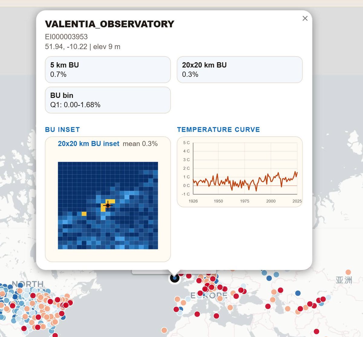
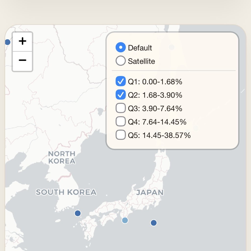
2/ This map shows all stations with 100 years of data and at least 9 valid months per year.
That leaves about 500

🌎 🌎

Stations are colored by the level of built-up area around the site. Click any station to view its details and temperature curve. orwell2024.github.io/builtmap/Image
3/ Low built-up ≠ high-quality station. It’s a mandatory condition, not a guarantee.

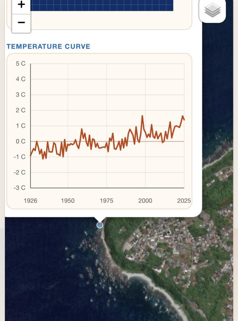
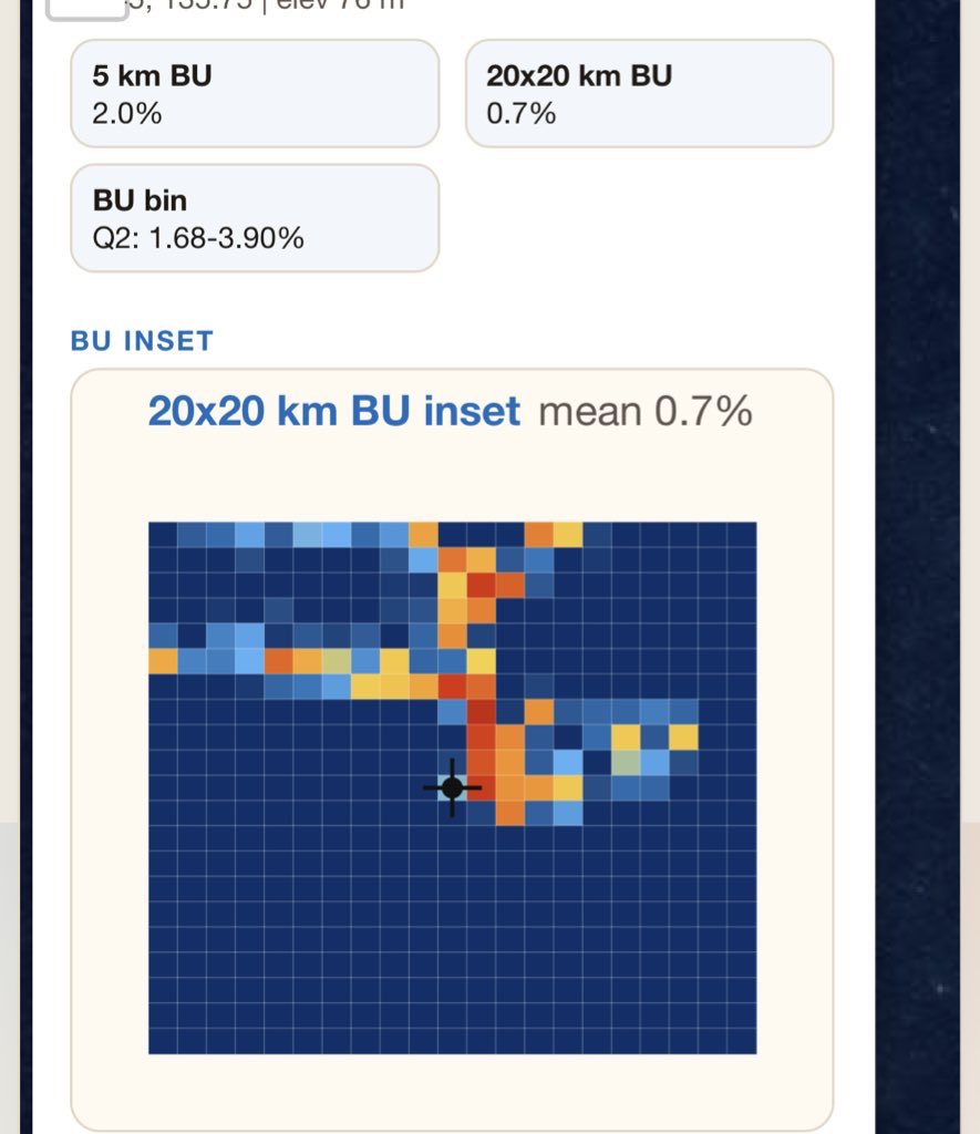
Switch to sat view and inspect the site closely— the problems often shows up immediately. Like here.
Coastal locations
commonly have this issue. Water makes them appear rural. They aren’t. Image
Image
Image
Image
Read 8 tweets
Jan 30
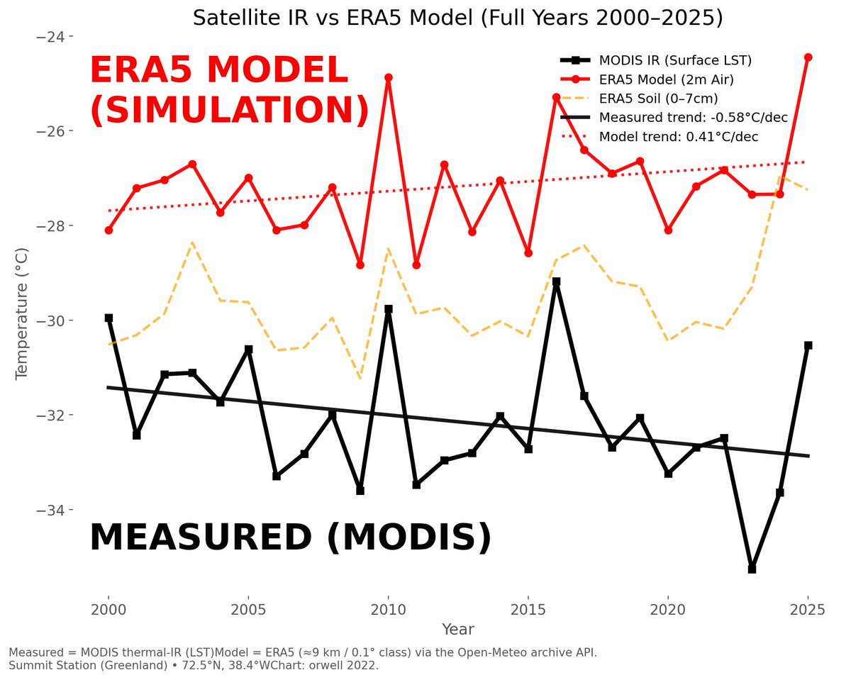
Spectacular model failure: the simulation is detached from reality.

MEASURED (MODIS): cooling.
ERA5 model: warming.

Same grid cell, same year but OPPOSITE trend?

If a “model” can’t even get the sign right it’s a full fledged GIGO failure. Worse than worthless. Image
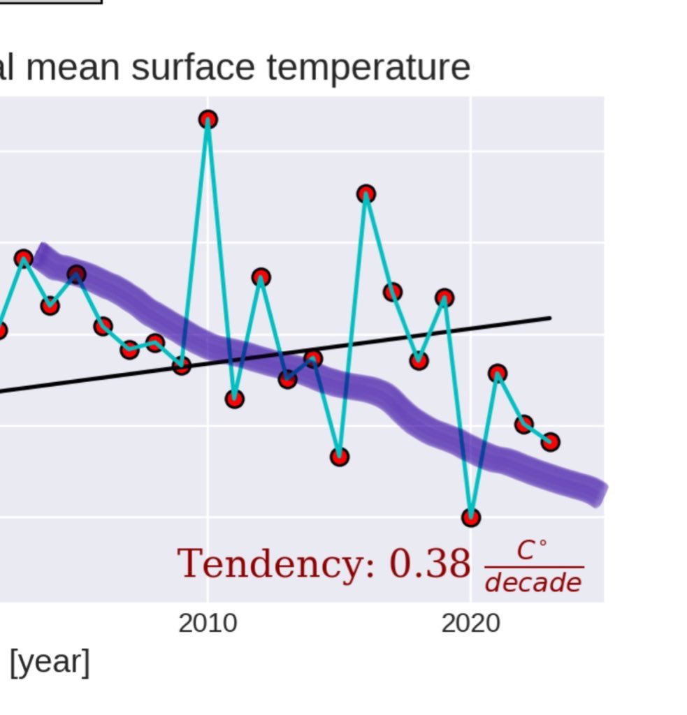
Flagged this two years ago, and it’s still absurd.

Measured surface temperature (LST) is declining since 2000.

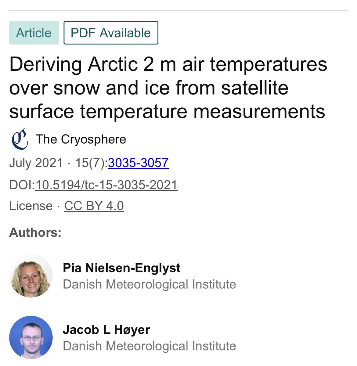
ocean.dmi.dk/arctic/ist_cli…

ERA5 shows 2 m air warming. Wrong trend, same place, same period.

Worse: ERA5 “surface” proxy warms too. Misses LST too.!! x.com/orwell2022/sta…Image
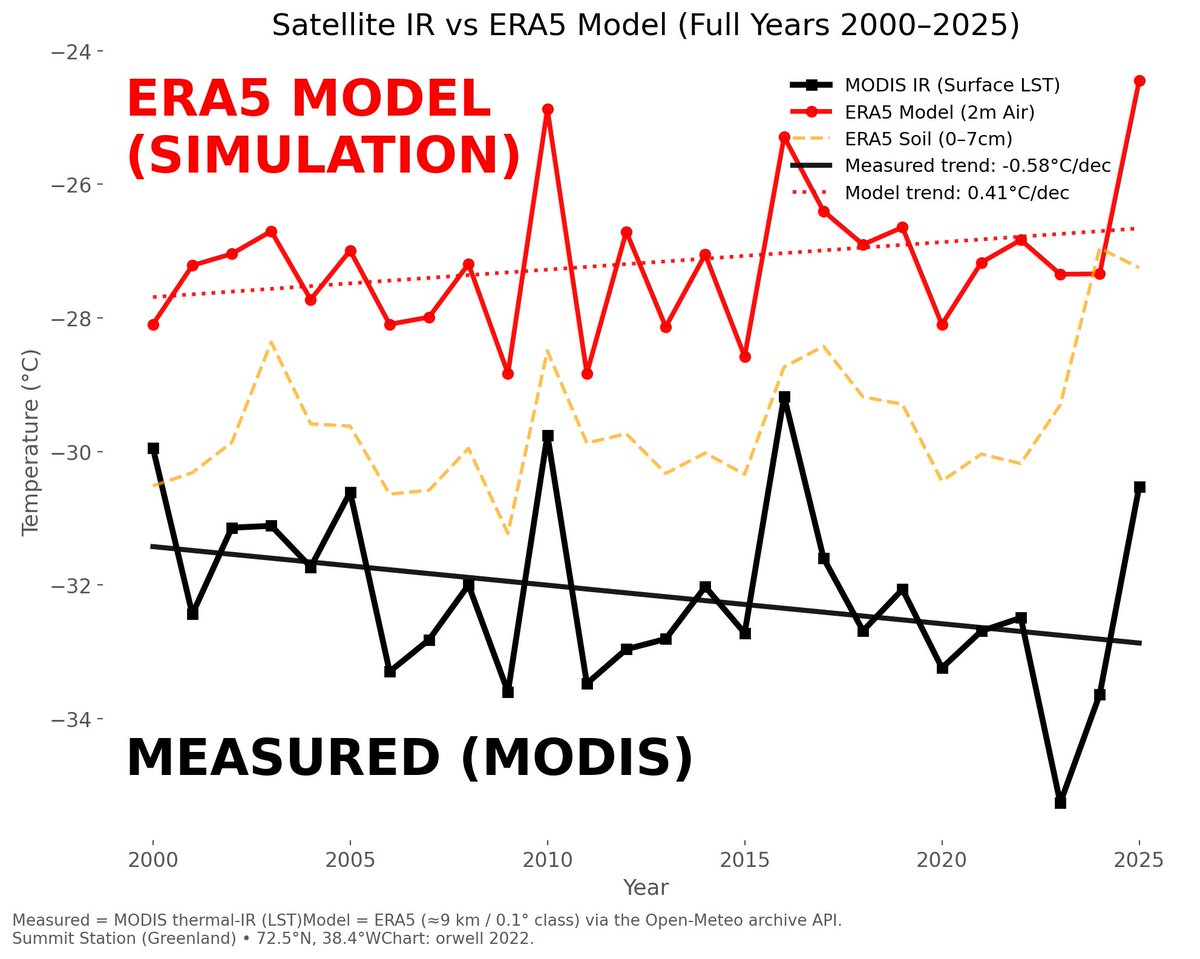
Here’s the part that should make you stare:

ERA5 “2 m air” is derived from surface T.

So when LST is cooling ERA5 should follow the observed surface.

It doesn’t. The ERA5 surface proxy warms too.

Not a model of reality but a calculation of what they’d like reality to be. Image
Image
Read 6 tweets

Did Thread Reader help you today?

Support us! We are indie developers!


This site is made by just two indie developers on a laptop doing marketing, support and development! Read more about the story.

Become a Premium Member ($3/month or $30/year) and get exclusive features!

Become Premium

Don't want to be a Premium member but still want to support us?

Make a small donation by buying us coffee ($5) or help with server cost ($10)

Donate via Paypal

Or Donate anonymously using crypto!

Ethereum

0xfe58350B80634f60Fa6Dc149a72b4DFbc17D341E copy

Bitcoin

3ATGMxNzCUFzxpMCHL5sWSt4DVtS8UqXpi copy

Thank you for your support!

Follow Us!

:(