). A classic 5th (where 5=1) would target 23,076. But sometimes 5th waves can fall short & reach only 0.618x1 (29,872). THREAD/1
Sometimes there can even be a “failed 5th” (retest of the wave 3 low at 30,017). Yes EWT is as much art as science. With all the attention out there on the triangle breakdown, it wouldn’t surprise me if we end up with a shorter 5th. /2
If so, it’ll be important that the retest gets rejected with a powerful reversal. That could trigger a bullish momentum divergence (the opposite of what we saw at the high). But if BTC makes a new low and stays there, that would be a bearish sign. /3
Another positive development is that BTC has followed the general boom/bust pattern of the meme stocks (with a one month lag). This suggests that we are now in the general time zone for a low. /4
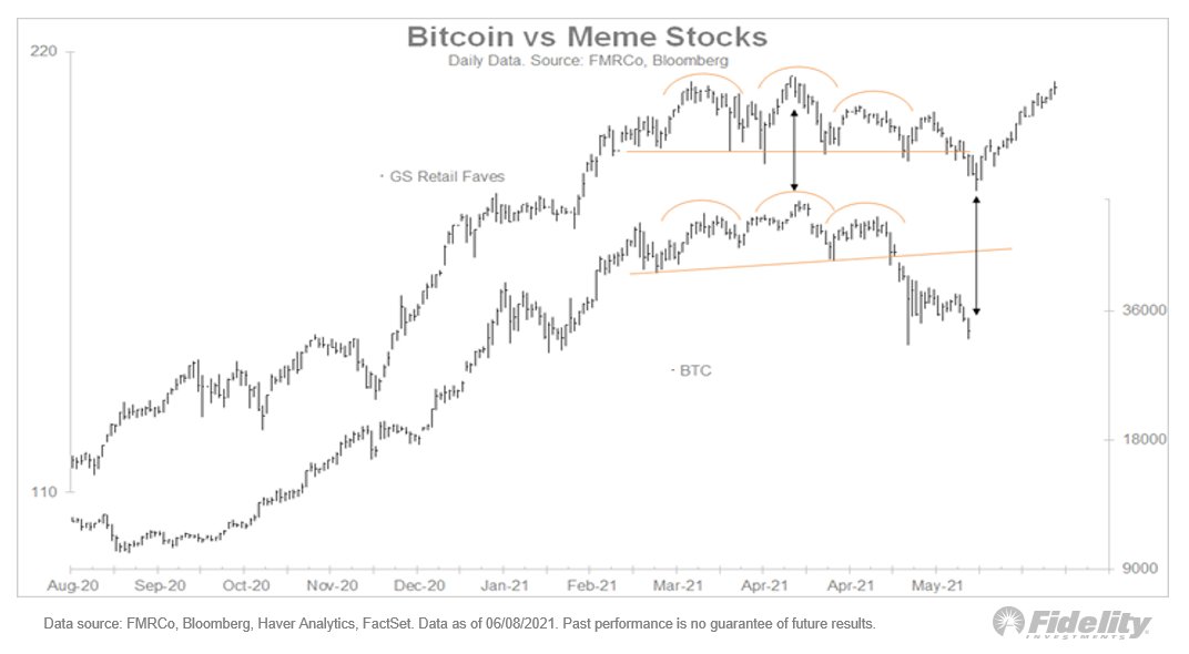
Finally, we often find so-called “inter-market” divergences at lows. If BTC does undercut the low, we have the potential for a bullish divergence from the bitcoin-sensitive equities. Note that this index produced the opposite signal at the highs. END/5
• • •
Missing some Tweet in this thread? You can try to
force a refresh
As a “lifelong” technician, I am finding that bitcoin lends itself well to technical analysis. Here is my take on the recent price action. (THREAD)
Elliott Wave Theory: Looking at the chart pattern since the recent high of 64,870, I can't help but notice that a textbook 5-wave decline may be unfolding. According to EWT, primary trends move in 5 waves and corrections are 3 waves. /2
The typical progression is that wave 1 is generally dismissed as noise, then wave 2 is a sharp and deep retracement of wave 1 (at least 62% but sometimes 75% or more), which creates the false comfort that it was indeed just a minor correction. /3
A year into a new bull market cycle, the valuation-driven phase is giving way to a more mature earnings-driven cycle. This chart shows the interplay between the deltas of total return, valuation & earnings. Note the similarities of our current cycle & the GFC. THREAD/1
In March 2009, the S&P 500 finally bottomed after a 57% decline. As is typical for this type of cycle, price bottomed several quarters before earnings. The blue bars below show the year-over-year change in the P/E ratio and the pink bars show the change in EPS. /2
Note how changes in earnings and valuation tend to be almost a mirror image of each other. The dark blue line is the year-over-year total return for the SPX. /3
While the S&P 500 has hovered around the 4100 level since April, there has been a lot of churn beneath the surface, with the highest fliers rising to truly spectacular levels before crashing back to earth. THREAD/1
To help visualize this, I indexed the various sectors & styles to the Feb 2020 (pre-Covid) high in the S&P 500. This first chart shows the S&P 500 w/ its eleven sectors. The dispersion in sector performance was very wide last fall (mostly due to energy), but it has tightened. /2
Next, the four style boxes (Russell indices). See the recent lopsided performance by large-cap growth, which then passed the baton to value and small caps a few months ago. Whatever dispersion existed last fall has dwindled, while the S&P 500 churns sideways. /3
Eye on earnings: Back in 2009-10, the market corrected 16% even though earnings growth was finally coming through. It's a good reminder that the market always looks ahead; at times of rapid earnings growth, the price reaction can seem counter-intuitive. (THREAD/1)
The same thing seems to be happening now. Could the earnings picture look any better? Q1 earnings season is pretty much wrapped up and the growth rate has soared 27 percentage points since the start of earnings season. /2
Compared to the typical cycle, earnings are out-performing, and therefore so is price. /3
We can see “inflation fixation” playing out in the markets. Value sectors like energy and financials are positively correlated to interest rates, which are either rising now or are expected to rise in the future if inflation expectations become entrenched. (THREAD/1)
While the relative performance of small caps vs large caps peaked right in line with the peak reopening of the economy (purple bars vs blue line below), the value/growth ratio has continued to gain in line with this inflation narrative. /2
This next chart shows the 52-week correlation between various sectors and the 5-year Treasury yield. /3
Building on the previous thread: The “inflation fixation" dominating the news right now is driven in part by supply shortages (be it labor or materials), but the fact is that none of us really knows the answer to this riddle yet. (THREAD/1)
While some companies have announced higher pay to lure minimum wage workers back, the labor backdrop today couldn’t look any different from the inflationary 1970s. /2
The chart below shows inflation metrics and labor trends. With the labor force barely growing and union membership near historic lows, it’s not clear to me where the secular wage-driven inflation creep is going to come from. /3