
New variant tech briefing published today! assets.publishing.service.gov.uk/government/upl…
Today's R #tweetorial: The construction of this epicurve-in-an-epicurve, our first plot showing the increasing number of #DeltaVariant cases detected using sequencing AND genotyping. #Rstats #epitwitter
Today's R #tweetorial: The construction of this epicurve-in-an-epicurve, our first plot showing the increasing number of #DeltaVariant cases detected using sequencing AND genotyping. #Rstats #epitwitter
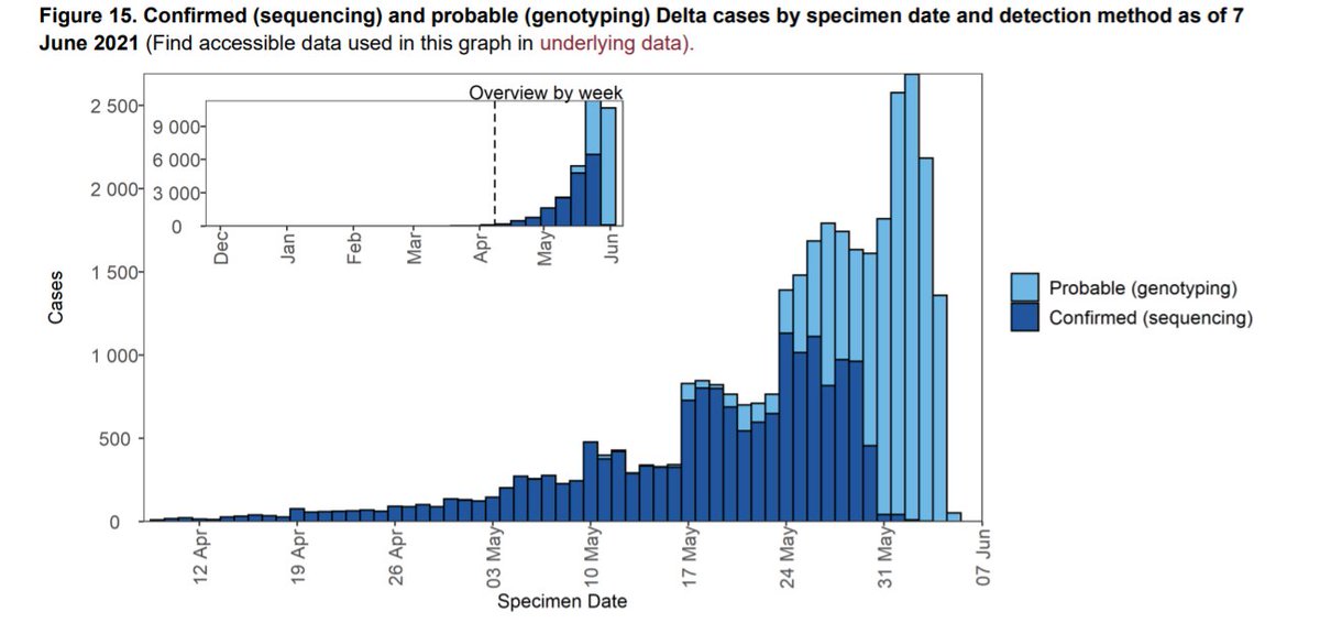
Genotyping with the reflex PCR involves looking for a combination of variant-specific mutations. Implementing genotyping surveillance has been a massive public health effort, and means a more complete, timely, yet alarming picture of Delta trends - but better we know!
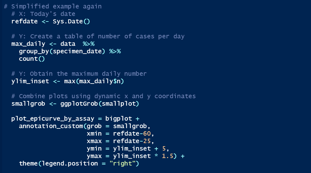
To create the plot, we use ggplotGrob and annotation_custom, both ggplot2 functions. We combine an epicurve of daily Delta counts for the last 60 days with an inset of longer-term weekly counts. Here are the two ggplot objects seperately: [smallplot] (left) and [bigplot].
A grob is a “grid graphical object”, i.e. a set of instructions for creating a plot. We use ggplotGrob to change [smallplot] into a grob, then annotation_custom to insert [smallplot] into [bigplot] by providing the coordinates of [smallplot]’s four corners onto [bigplot]'s axis.
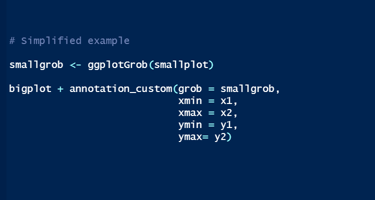
But how to automate so that the smaller epicurve is always sat in the right place? We make the left and right sides of [smallplot] align with 60 and 25 days ago on [bigplot] respectively (xmin and xmax). The bottom (ymin) and top (ymax) sides are based on the maximum daily count.
We have automated graph production every week for all variants of interest, as seen in the variant data update: assets.publishing.service.gov.uk/government/upl….
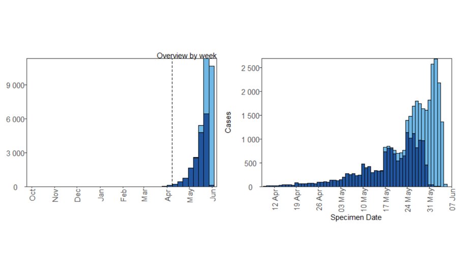
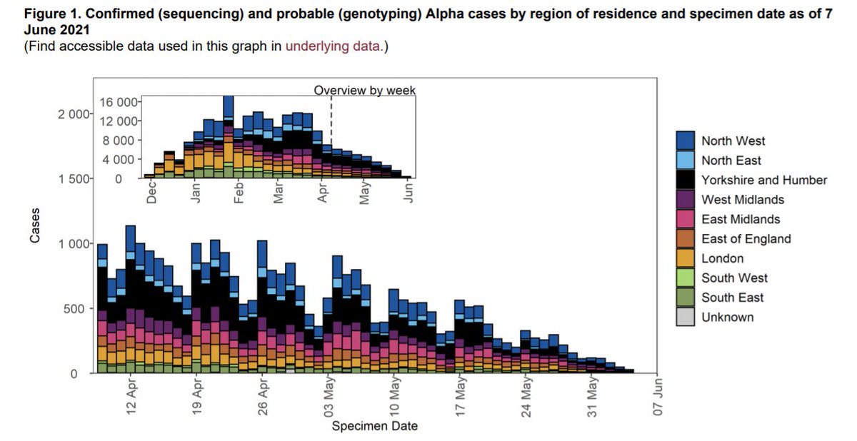
Check out this epicurve for Alpha - clearly continuing to decline despite the genotyping roll-out.
Check out this epicurve for Alpha - clearly continuing to decline despite the genotyping roll-out.
There you go, more combined plots, in a different way from the patchwork package I shared last time. Props to my colleague Soeren Metelmann who wrote most of this one.
I’m really proud of these tech briefings. We are ~40 scientists across many teams, working intensely to push out the latest and most useful data weekly. It is a fantastic collaborative effort and exactly what I hoped I’d be doing one day. #Science!
• • •
Missing some Tweet in this thread? You can try to
force a refresh


