
Death Cross 📚
The heavily discussed MA 50 vs MA 200 Death Cross and why it is not what they are trying to sell you
▪️ What is it supposed to be?
▪️ Is it really a sell signal?
▪️ What truly happens?
▪️ The takeaways from Death Cross?
THREAD
1/13
The heavily discussed MA 50 vs MA 200 Death Cross and why it is not what they are trying to sell you
▪️ What is it supposed to be?
▪️ Is it really a sell signal?
▪️ What truly happens?
▪️ The takeaways from Death Cross?
THREAD
1/13

▪️ What is it supposed to be?
The death cross is a TA pattern indicating the potential for a major sell-off.
It appears on a chart when a simple short-term 50 moving average crosses below its long-term 200 moving average.
Indicating you should sell your position.
2/13
The death cross is a TA pattern indicating the potential for a major sell-off.
It appears on a chart when a simple short-term 50 moving average crosses below its long-term 200 moving average.
Indicating you should sell your position.
2/13

▪️ Is it really a sell signal?
Well, that's at least what the "puppeteer" want you to believe.
Truth be told moving averages are a powerful tool when used in the right way.
This is not one of those situations and I will show you exactly why.
3/13
Well, that's at least what the "puppeteer" want you to believe.
Truth be told moving averages are a powerful tool when used in the right way.
This is not one of those situations and I will show you exactly why.
3/13

First of all, we must understand that moving averages are all lagging indicators.
They are good for showing a trend when the price is above/below them however the cross itself is lagging information and by itself provides very little value
4/13
They are good for showing a trend when the price is above/below them however the cross itself is lagging information and by itself provides very little value
4/13

▪️ What truly happens?
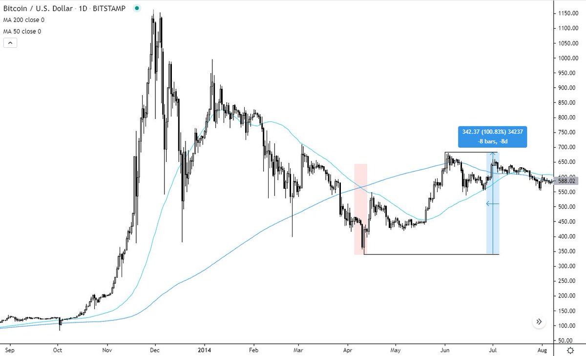
Let's have a closer look at the history of the #Bitcoin death crosses.
The First Death Cross in the history of #BTC price appears in April 2014.
A sell signal as they would try to tell you. What happens afterward? 100% rally...
5/13
Let's have a closer look at the history of the #Bitcoin death crosses.
The First Death Cross in the history of #BTC price appears in April 2014.
A sell signal as they would try to tell you. What happens afterward? 100% rally...
5/13
Later on that year we are given a "Life Cross".
What happens afterward? Price dumps...
Followed by another Death Cross this time it luckily works, however only after faking the first two times & in the very early stages of #Bitcoin. Let's move on.
6/13
What happens afterward? Price dumps...
Followed by another Death Cross this time it luckily works, however only after faking the first two times & in the very early stages of #Bitcoin. Let's move on.
6/13

After the biggest bear market in #BTC history, we finally get Life Cross in July 2015 next year.
What happens? You'd be buying the local top before price dumps another 40%
Followed by a Death Cross in September same year. That would literally make you sell the bottom
7/13
What happens? You'd be buying the local top before price dumps another 40%
Followed by a Death Cross in September same year. That would literally make you sell the bottom
7/13

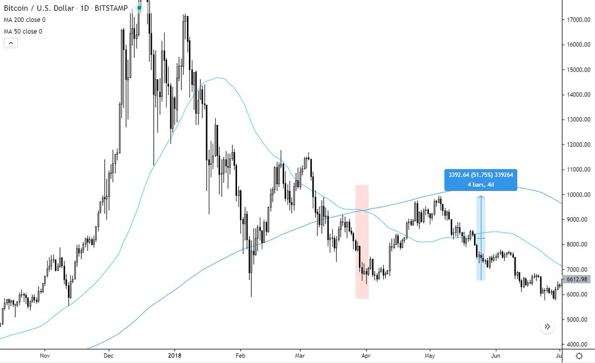
We don't get another Death Cross till the infamous 2018 bear market.
It's March 2018 and we finally get it. What happens? You'd sell the bottom once again and price goes on to run 50%
8/13
It's March 2018 and we finally get it. What happens? You'd sell the bottom once again and price goes on to run 50%
8/13
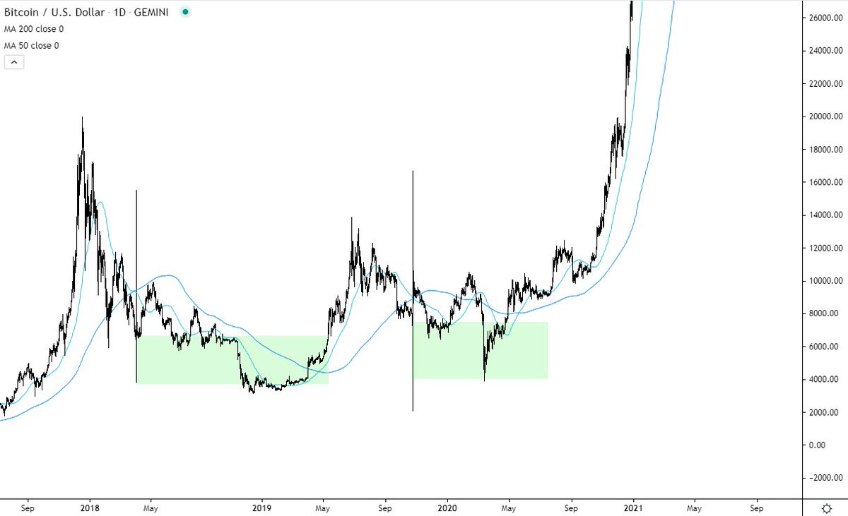
OK moving onto another Death Cross in October 2019
What happens? Death Cross approaches, you sell the bottom, price rallies 40%
Followed by a Life Cross and crash of 60%
Followed by literally selling the bottom at 6000$ before we head into the 2020 bull market.
9/13
What happens? Death Cross approaches, you sell the bottom, price rallies 40%
Followed by a Life Cross and crash of 60%
Followed by literally selling the bottom at 6000$ before we head into the 2020 bull market.
9/13

Moving onto the present day and we are facing another infamous Death Cross
Well if history teaches us anything it's that it's actually more of a bullish than bearish signal.
A 40-50% rally from here wouldn't surprise me at all.
10/13
Well if history teaches us anything it's that it's actually more of a bullish than bearish signal.
A 40-50% rally from here wouldn't surprise me at all.
10/13

▪️ The takeaways from Death Cross?
As you can clearly see the cross by itself doesn't mean much at all & it's almost the opposite of what they are trying to tell you
If anything it shows that the current macro trend has been paused and will take some time to recover
11/13
As you can clearly see the cross by itself doesn't mean much at all & it's almost the opposite of what they are trying to tell you
If anything it shows that the current macro trend has been paused and will take some time to recover
11/13
Overall the first death cross prices have been a great place to buy in the long run.
An important takeaway from this is that the Death/Life Cross by itself doesn't hold much importance as it is heavily lagging behind price and there are far better tools to use.
12/13
An important takeaway from this is that the Death/Life Cross by itself doesn't hold much importance as it is heavily lagging behind price and there are far better tools to use.
12/13

Hope you have found this thread once again valuable & you won't get tricked so easily this time
Please consider liking & sharing it with your friends. It's gonna help me create more of these educational threads & help your friends to get better at this game. Thank you 🙌
13/13
Please consider liking & sharing it with your friends. It's gonna help me create more of these educational threads & help your friends to get better at this game. Thank you 🙌
13/13

One more add-on for traditional markets
https://twitter.com/jackis_trader/status/1406369004118233088
• • •
Missing some Tweet in this thread? You can try to
force a refresh


