EMP at Berkeley Lab Profile picture
Jun 22, 2021 7 tweets 4 min read Read on X
The race is on! The declining COST of wind and solar power is in a race with declining MARKET VALUE: which will win? New research in Joule looks at trends by region, at emp.lbl.gov/news/declining… THREAD! Image
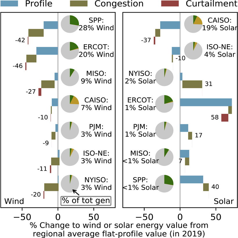
While solar has high value at low penetrations, value falls as output grows – solar is 19% of generation in CAISO, with major drops in value. Wind has low value at every penetration, but has faced less value decline with market share to date. 2/x Image
The biggest value penalties come from the timing of generation not matching high market prices, and from congestion causing pockets of low prices. Curtailment was not a major factor. Value penalties rise with market share. 3/x Image
The good news is that the COST of wind and solar has fallen faster than its VALUE. But how long can that continue? What happens if future value falls below cost?

New research in Joule looks at trends by region, at emp.lbl.gov/news/declining…

4/x Image
Strategies to minimize value decline must be matched with its cause in each region. New transmission will relieve congestion penalties. Storage or flexible demand will help with the timing penalty. 5/x Image
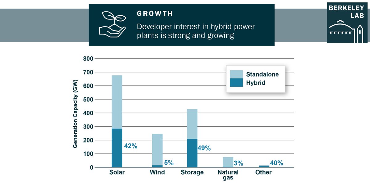
Solar developers are responding by pairing #solarenergy with batteries in “hybrid” plants. Wind developers are using larger blades to shift output to more hours. Vehicle and building electrification may change the game altogether.

6/x Image
For the full analysis of the race between COST and VALUE of wind and solar, see the @BerkeleyLab research in the journal Joule at emp.lbl.gov/news/declining…. /end Image

• • •

Missing some Tweet in this thread? You can try to force a refresh
 

Keep Current with EMP at Berkeley Lab

EMP at Berkeley Lab Profile picture

Stay in touch and get notified when new unrolls are available from this author!

Read all threads

This Thread may be Removed Anytime!

PDF

Twitter may remove this content at anytime! Save it as PDF for later use!

Try unrolling a thread yourself!

how to unroll video
  1. Follow @ThreadReaderApp to mention us!

  2. From a Twitter thread mention us with a keyword "unroll"
@threadreaderapp unroll

Practice here first or read more on our help page!

More from @BerkeleyLabEMP

Jan 19, 2023
As the line to connect generation projects to the grid gets longer, interconnection costs are going up. We collected and analyzed data from the PJM interconnect, our second analysis in a series exploring interconnection costs. Thread… emp.lbl.gov/interconnectio…
@rtoinsider @CleanEnergyGrid @FERC @ClementsFERC @CleanFERC @ACORE @gregwetstone @TKavulla @EPSAnews @SEIA PJM has the largest queue of any region. Cumulative GW grew 4x from 2017 to 2021 to 288GW. Preliminary numbers show another 40 GW for 2022, making the total in the queue 2x PJM’s highest load. 93% is renewables or storage. See queue data at emp.lbl.gov/node/3133. 2/x
Interconnection costs are the upgrades to the grid to accommodate new generation, like new wires, transformers, substations, and broader upgrades to the transmission network. In PJM, most of these costs are borne by developers and can make or break a project. 3/x
Read 11 tweets
Apr 21, 2022
The power plant of the future is a hybrid – generation plus storage. Batteries help smooth the output of solar and wind, increasing their value, but raise key questions about grid operations. In a new report we round up our body of research on hybrids. Our TOP TEN findings... 🧵 Image
@POWERmagazine @ELECTRICPOWER @SEPAPower @APowerAlliance @Edison_Electric @publicpowerorg @NRECANews @IPPNYORG @aectnet @BerkeleyLab First, here’s a summary of the top 10 findings on our hybrid research. For the full report see emp.lbl.gov/publications/b…. 2/x Image
1) By the end of 2021, there was more than 8,000 MW of wind or solar generation connected to storage in the US. But interconnection queues show thousands of projects proposed, with 280 GIGAWATTS of solar paired with 208 GW of batteries. Other pairings are also possible. 3/x Image
Read 13 tweets
Apr 13, 2022
Our update on the grid interconnection queues is out, and folks, we are in new territory. Terawatt territory. THREAD! emp.lbl.gov/queues
There is now a staggering 1.4 TERAWATTS of generation and storage capacity in interconnection queues in the US – more than the capacity of ALL existing power plants – though most will not be built. For full data and more, see QUEUED UP at emp.lbl.gov/queues. 2/x
As of the end of 2021, there were over 8,100 projects seeking interconnection in the US, with over 1,000 GW of generation and 427 GW of storage.
The enormous queues show strong commercial interest in new development, with over $2 TRILLION in potential investment. 3/x
Read 14 tweets
May 24, 2021
We have new data on utility interconnection queues! THREAD! There is now over 750 GW of generation and 200 GW of storage capacity in interconnection queues in the US – a new record. For full data and more, see QUEUED UP at emp.lbl.gov/publications/q…. 1/x
To put that in perspective, the US had a total of 1,117 GW of utility-scale capacity operating last year. While not all projects will get built, it shows strong commercial interest in new development. See the interactive data visualization at emp.lbl.gov/publications/q… 2/x
Solar and wind dominate the queues. Solar is booming, and increasingly paired with storage. Wind queues are consistent around 200 GW, while gas projects in queues have declined. Including estimated battery capacity for some hybrid projects, proposed storage exceeds 200 GW. 3/x
Read 10 tweets
Apr 13, 2021
THREAD: In 2005, the official Annual Energy Outlook saw power sector CO2 rising from 2,400 to 3,000 MMT by 2020. But actual emissions fell to 1,450 MMT, 52% below projected levels. A new @BerkeleyLab report looks at how we got “halfway to zero.” emp.lbl.gov/publications/h… 1/11
The biggest change was drastically less demand for electricity, due in part to sectoral and economic changes, but also to greater energy efficiency driven by policies and technology advancement. Instead of rising by 24% it was dead flat. 2/11
And as demand stayed flat, cheaper natural gas from the shale gas revolution combined with the rapid growth of wind and solar power to squeeze out coal. Some nuclear retirements were offset by greater output at existing plants. 3/11
Read 11 tweets
Nov 10, 2020
The new @BerkeleyLab compilation of utility-scale #solar data and trends is out! A briefing slide deck, data file, maps, and data visualizations can all be found at utilityscalesolar.lbl.gov.

Here are some highlights → THREAD
More than 4.5 GW of utility-scale (>5 MW) solar came online in 2019, bringing cumulative capacity to 29 GW. Projects are spread across all 10 regions that we track, though more heavily concentrated in the sunniest regions. Maps and data available at utilityscalesolar.lbl.gov. 2/x
The median installed cost of new projects in 2019 fell to $1.4/W-AC, down 20% from 2018 and more than 70% from 2010. 77% of projects and 88% of capacity added in 2019 used single-axis tracking. More details in the new @BerkeleyLab data resource at utilityscalesolar.lbl.gov. 3/x
Read 10 tweets

Did Thread Reader help you today?

Support us! We are indie developers!


This site is made by just two indie developers on a laptop doing marketing, support and development! Read more about the story.

Become a Premium Member ($3/month or $30/year) and get exclusive features!

Become Premium

Don't want to be a Premium member but still want to support us?

Make a small donation by buying us coffee ($5) or help with server cost ($10)

Donate via Paypal

Or Donate anonymously using crypto!

Ethereum

0xfe58350B80634f60Fa6Dc149a72b4DFbc17D341E copy

Bitcoin

3ATGMxNzCUFzxpMCHL5sWSt4DVtS8UqXpi copy

Thank you for your support!

Follow Us!

:(