20 UI/UX Mistakes that KILLS your usability 😵
In no particular order 👇
In no particular order 👇
1️⃣ Aesthetics Over Functionality
Everything in this world needs balance.
If you try to make something look very good but not usable - 👎
If you try to make something usable that doesn't look good - you'll have a product for developers 😅
Everything in this world needs balance.
If you try to make something look very good but not usable - 👎
If you try to make something usable that doesn't look good - you'll have a product for developers 😅
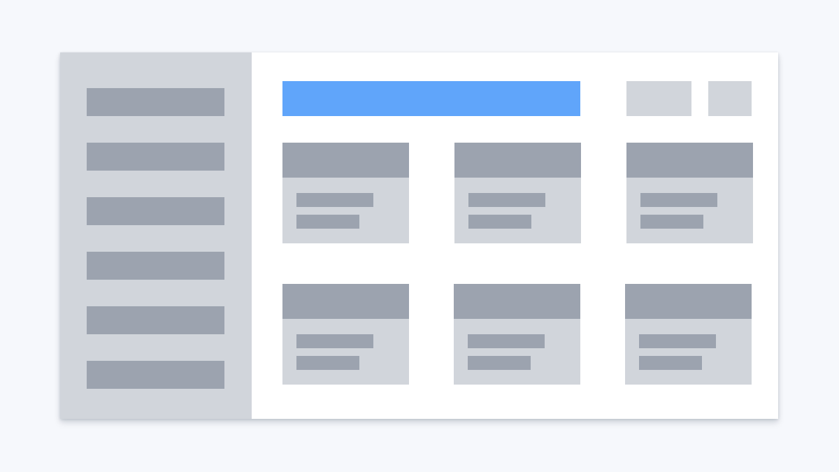
2️⃣ Content Placement
There are some established patterns of content placement.
Hero sections, navigation, search, logout link, etc.
If you don't follow them at all, users will struggle to find what they're looking for.
There are some established patterns of content placement.
Hero sections, navigation, search, logout link, etc.
If you don't follow them at all, users will struggle to find what they're looking for.
3️⃣ Complex Navigation
That might seem easy but in fact, it's not.
Imagine you have an e-commerce shop with hundreds of categories.
it's going to be a challenge to make the navigation easy to use.
UX method of card sorting might help here: en.wikipedia.org/wiki/Card_sort…
That might seem easy but in fact, it's not.
Imagine you have an e-commerce shop with hundreds of categories.
it's going to be a challenge to make the navigation easy to use.
UX method of card sorting might help here: en.wikipedia.org/wiki/Card_sort…
4️⃣ Bad Navigation Logic
Very popular issue: you know that the page exists, but you don't know how to get to it.
So you use google or internal search all the time. I do this for Google console for example.
The site/app structure should be clear and reasonable.
Very popular issue: you know that the page exists, but you don't know how to get to it.
So you use google or internal search all the time. I do this for Google console for example.
The site/app structure should be clear and reasonable.
5️⃣ Dark Patterns
Dark patterns might increase sales, but they still kill usability.
For example, if you have ads that mimic site content.
Users expect to get the content but instead got redirected to somewhere else.
Dark patterns might increase sales, but they still kill usability.
For example, if you have ads that mimic site content.
Users expect to get the content but instead got redirected to somewhere else.
6️⃣ Lack of Search or Bad Search
For most sites search is important. You might not have it at all.
Or the search may have been designed poorly:
- Wrong place
- Wrong look
- Wrong size
- No autosuggestions
- The search engine works badly
- etc
For most sites search is important. You might not have it at all.
Or the search may have been designed poorly:
- Wrong place
- Wrong look
- Wrong size
- No autosuggestions
- The search engine works badly
- etc
7️⃣ Useless Filters
Sometimes you might get into the trap of database thinking.
If there are 100 attributes in your database, it doesn't mean that you have to display 100 filters one after another.
Sometimes you might get into the trap of database thinking.
If there are 100 attributes in your database, it doesn't mean that you have to display 100 filters one after another.
8️⃣ Autoplaying audio/video
This is just annoying. 😡
This is just annoying. 😡
9️⃣ Excessiveness
If you put too many things on one screen, it might increase the cognitive load which will result in poor usability.
There is a "Single Responsibility Principle" in development.
Same works in UI/UX. 1 screen - 1 purpose ☝️
If you put too many things on one screen, it might increase the cognitive load which will result in poor usability.
There is a "Single Responsibility Principle" in development.
Same works in UI/UX. 1 screen - 1 purpose ☝️
1️⃣0️⃣ Poor Forms
It's a very popular problem. For example:
- Way too many fields
- Multi-columns
- No validation
- No masks
- No autosuggestions
- No hints
- Wrong size of inputs
- and much more
It's a very popular problem. For example:
- Way too many fields
- Multi-columns
- No validation
- No masks
- No autosuggestions
- No hints
- Wrong size of inputs
- and much more
1️⃣1️⃣ Responsiveness
Simply: you don't have the mobile design. Or you have a poor mobile design.
It requires additional effort to make one.
For example, on mobile, we don't have the hover state. The actual screen size is small. And so on.
Simply: you don't have the mobile design. Or you have a poor mobile design.
It requires additional effort to make one.
For example, on mobile, we don't have the hover state. The actual screen size is small. And so on.
1️⃣2️⃣ Accessibility
The most popular example of this is poor contrast.
There are three a11y levels: A, AA, and AAA. And each has quite a lot of requirements.
You're good if you conform AA level.
The most popular example of this is poor contrast.
There are three a11y levels: A, AA, and AAA. And each has quite a lot of requirements.
You're good if you conform AA level.
1️⃣3️⃣ Speed
If your site is slow it instantly destroys conversion. Nobody wants to wait. The pace of our life increases every day.
Nowadays people can barely wait for a taxi for 5 minutes.
Do you think they will wait 1-2 minutes while all your JS stuff loaded? 🙄
If your site is slow it instantly destroys conversion. Nobody wants to wait. The pace of our life increases every day.
Nowadays people can barely wait for a taxi for 5 minutes.
Do you think they will wait 1-2 minutes while all your JS stuff loaded? 🙄
1️⃣4️⃣ Animations
Animations are great, but if used properly.
Usually, they should be micro animations that help to understand what's going on.
Users came to use your site not to watch movies.
Animations are great, but if used properly.
Usually, they should be micro animations that help to understand what's going on.
Users came to use your site not to watch movies.
1️⃣5️⃣ Poor Copy
"We are creative professionals that will make you happy".
*User closes the site*
Ambiguous, not clear copy really confuses people. Be straight to the point.
"We are creative professionals that will make you happy".
*User closes the site*
Ambiguous, not clear copy really confuses people. Be straight to the point.
1️⃣6️⃣ No Analytics
In order to understand where your users are stuck, you should use some analytics tools.
As well as conducting usability testing, user interviews, and all that stuff.
In order to understand where your users are stuck, you should use some analytics tools.
As well as conducting usability testing, user interviews, and all that stuff.
1️⃣7️⃣ Neglecting UX Gestalt Principles
UI Design is based on UX Gestalt principles.
Such things as proximity, contrast, similarity, and others are crucial.
They are the foundation of a good-looking and usable interface.
UI Design is based on UX Gestalt principles.
Such things as proximity, contrast, similarity, and others are crucial.
They are the foundation of a good-looking and usable interface.
1️⃣8️⃣ Tiny Clickable Areas
Do not forget to make an invisible clickable area around icons and other elements that are hard to hit.
Especially on mobile.
Do not forget to make an invisible clickable area around icons and other elements that are hard to hit.
Especially on mobile.
1️⃣9️⃣ Content Duplication
You don' need to have <h1>, breadcrumbs, the description that says the same thing.
Probably you don't need any text/labels at all if your content speaks for itself.
You don' need to have <h1>, breadcrumbs, the description that says the same thing.
Probably you don't need any text/labels at all if your content speaks for itself.
2️⃣0️⃣ No Way To Get In Touch
In most cases, you should provide a way of user feedback.
Remember: having problems is okay.
What's not okay is if you don't solve them.
In most cases, you should provide a way of user feedback.
Remember: having problems is okay.
What's not okay is if you don't solve them.
• • •
Missing some Tweet in this thread? You can try to
force a refresh