
[We are still in the bull market] #Bitcoin
You can also see it from Quicktake: cryptoquant.com/quicktake/60fa…
👇👇To view all the details of the data presented follow the thread👇👇
You can also see it from Quicktake: cryptoquant.com/quicktake/60fa…
👇👇To view all the details of the data presented follow the thread👇👇
https://twitter.com/gaah_im/status/1417528927778656258
1. I recently posted a Quicktake saying that we are not in a bear market and did the comparison of the current cycle with the previous cycle, 2017 using the MVRV. Now, we have the full chart from the first moves to the first Halving and the 2013 cycle which is quite similar to...
current bull run that has not been reversed yet.
2. The yellow box is the best time to sell and the box in green signals the best time to buy, already below in the box in blue is a peculiar moment that happens only in bear market after hitting a top in prices near the Halving ..
2. The yellow box is the best time to sell and the box in green signals the best time to buy, already below in the box in blue is a peculiar moment that happens only in bear market after hitting a top in prices near the Halving ..

it starts between 900 to 800 days remaining.
3. During a bull market correction occurs up to the range in the green box, but not up to the blue box, so during a bullish market the range in green is the best time to buy.
3. During a bull market correction occurs up to the range in the green box, but not up to the blue box, so during a bullish market the range in green is the best time to buy.

We can see that during previous cycles, including 2017, potentially end-of-cycle tops occur only below 900 to 800 days remaining for the next Halving. There are about 1,000 days remaining on average for the next Halving!
In 2017 as I showed in the chart above there was a touch of the box in yellow and soon after a touch of the box in green (marked in the circle in 'purple), and then only then does it seek the upper part of the sell range and gets to touch 5.00, being a danger zone marked...
in the box in red (5.00 - 6.50) in which signaled ALL of Bitcoin's end-of-cycle tops, including 2017.
Notice that after this move, a few months later came the end-of-cycle top bringing it closer to the next halving.
Notice that after this move, a few months later came the end-of-cycle top bringing it closer to the next halving.
Only after touching the range of the spectacular selling moment, the price comes back down into the green box and goes lower literally the 'bottom', which occurs only in BEAR MARKET, in which we pass through the most important event for #Bitcoin, ...
its inflation is adjusted accordingly and less BTC are issued every 10 minutes on average, reducing once again its supply leading to a new cycle of appreciation according to the rising demand.

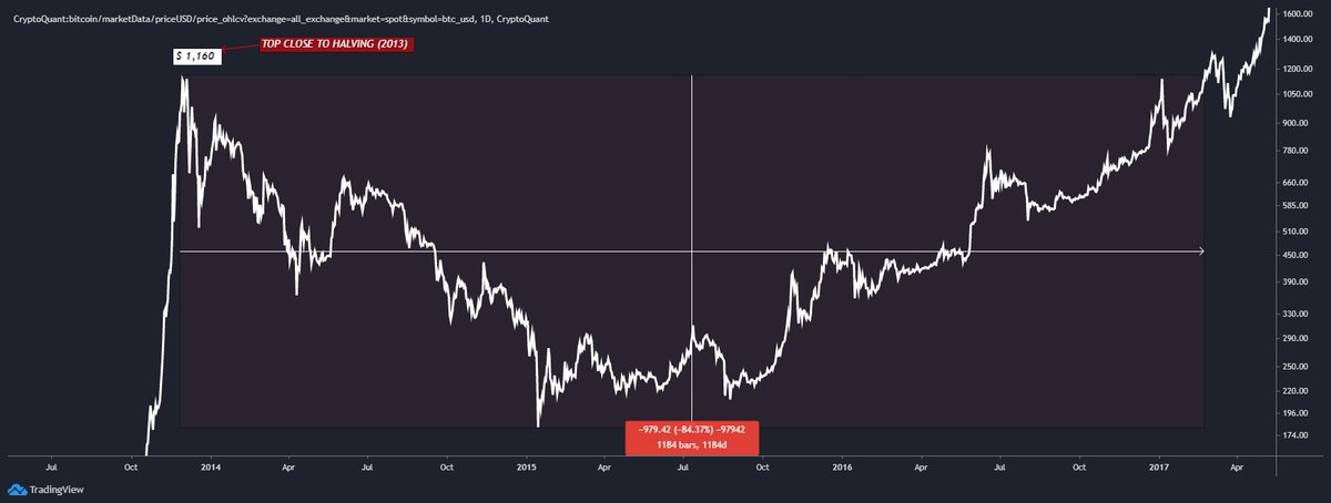
4. In 2013 we can see that the first top occurred after the halving and still the MVRV sought the red zone, this did not happen in the current cycle, and soon after prices correct about 80% taking the indicator to the green range (best time to buy) for a bull run and ...
then prices actually seek the historical top of that cycle taking the indicator once again to the danger zone which MARKED ALL BITCOIN CYCLE TOPS, INCLUDING 2017.
Only after hitting the top at the end of that same year does the MVRV drop back down to the green box and ...
Only after hitting the top at the end of that same year does the MVRV drop back down to the green box and ...
then lose it as momentum has turned to a bear run and potentially the price seeks the bottom in the blue range as marked by the yellow arrow, historically only in the period when we are near the halving, below 900 to 800 days remaining, does the short term bearish trend ...
formed lead to the bear market.
Marked in the blue box we clearly see the period when MVRV reaches the bottom, marked in the blue box, already very close to the next halving and such an event happening. The 'bottom' literally happens during just before, during and just after ...
Marked in the blue box we clearly see the period when MVRV reaches the bottom, marked in the blue box, already very close to the next halving and such an event happening. The 'bottom' literally happens during just before, during and just after ...

the event.
5. Here are all the periods marked on the MVRV chart, where the indicator looks for the buy zone that only in bear markets happens.
5. Here are all the periods marked on the MVRV chart, where the indicator looks for the buy zone that only in bear markets happens.


6. Besides 2013 and 2017, the first move before the first halving, marked from the first historical top in mid-2011 also in the middle of the bull run before reaching the cycle high, the MVRV sought the green zone signaling the best buying moment in the bull run.

Is the same occurring in this current cycle? Did the same occur in 2013? Did the same occur in 2017?
7. The first move before the first halving was followed by 4 tops, 4 ATH, with the last top marking the end of the first cycle at $30.00. As shown in the MVRV in white circle,...
7. The first move before the first halving was followed by 4 tops, 4 ATH, with the last top marking the end of the first cycle at $30.00. As shown in the MVRV in white circle,...

after hitting the first ATH at $0.09 the indicator looks for the best buy zone in green.
As the volatility was much higher at the time because of the low volume and marketcap the indicator went far beyond the marked zone, and stayed a side time between the danger zone and ...
As the volatility was much higher at the time because of the low volume and marketcap the indicator went far beyond the marked zone, and stayed a side time between the danger zone and ...
the sell zone, precisely because the price in this first cycle made 4 tops, having then 4 corrections in the middle of the run.
8. After the top at $30.00 of that cycle coming close to halving, the bear run appears and the event occurs during it in 2012 with #Bitcoin ...
8. After the top at $30.00 of that cycle coming close to halving, the bear run appears and the event occurs during it in 2012 with #Bitcoin ...

correcting over 93% since its historic top.
9. Just as shown in the indicator prices in 2013 show us exactly the same behavior, where the MVRV goes to the green zone while prices correct about 80% (the chart shows 73% as the lines mark close), and ...
9. Just as shown in the indicator prices in 2013 show us exactly the same behavior, where the MVRV goes to the green zone while prices correct about 80% (the chart shows 73% as the lines mark close), and ...

soon after a corrective downtrend, which historically happens in all cycles, at the end of 2013 the ATH of the cycle comes and only after that we actually enter the bull run followed by the next halving in 2016.
10. Therefore, the current moment we are experiencing is precisely the touch in the green zone which demonstrates the best buying moment, because we are still in a bull market.
The price can still seek the range between $25,000 - $24,000, in case there is more search for liquidity in the short term, but the range that we are accumulating has already made the MVRV indicator touch the range between 1.50 - 1.00 signaling THE BEST BUYING MOMENT!

11. The moments marked in the MVRV we can observe in the S2F model chart from @100trillionUSD , where I mark in the black arrow the moments equal to what we are experiencing and in red the tops signaling end of cycle, ...
in which I have first target for $80,000 - $100,000 and second target between $180,000 - $200,000.
The current bull run is very similar to 2013, notice how the two tops on the black arrow were higher than the average 365 of the S2F, but not in 2017.
The current bull run is very similar to 2013, notice how the two tops on the black arrow were higher than the average 365 of the S2F, but not in 2017.
To conclude I bring the fear/gain index showing today the same level since COVID DAY in March 2020, precisely indicating market sentiment for in fact $30,000 to be the bottom. Bottoms are marked by extreme fear and tops by extreme greed.

P.S: I don't have any major histories of the index, the most I have available goes back to early 2018.
View the live chart at CQ:
cryptoquant.com/prochart/lPM9Y…
cryptoquant.com/prochart/0HOz7…
View the live chart at CQ:
cryptoquant.com/prochart/lPM9Y…
cryptoquant.com/prochart/0HOz7…
See more about the MVRV data used here: dataguide.cryptoquant.com/market-indicat…
*MVRV (Market Value to Realized Value) ratio is defined as an asset's market capitalization divided by realized capitalization.
*MVRV (Market Value to Realized Value) ratio is defined as an asset's market capitalization divided by realized capitalization.
View the Bitcoin price chart live on CQ:
cryptoquant.com/prochart/Tgh3O…
It is mapped as I showed throughout the thread!
cryptoquant.com/prochart/Tgh3O…
It is mapped as I showed throughout the thread!
and the live graph of the MVRV mapped the past cycles in log scale: cryptoquant.com/prochart/0HOz7…
• • •
Missing some Tweet in this thread? You can try to
force a refresh


