Is it just me or do all SaaS sites look the same?
The @FoundationIncCo team wanted to find out.
We took 100 SaaS sites and analyzed their marketing approach to design.
Grab a coffee, bookmark it and enjoy the thread 🧵
Here’s what we learned studying 100+ SaaS sites.
The @FoundationIncCo team wanted to find out.
We took 100 SaaS sites and analyzed their marketing approach to design.
Grab a coffee, bookmark it and enjoy the thread 🧵
Here’s what we learned studying 100+ SaaS sites.
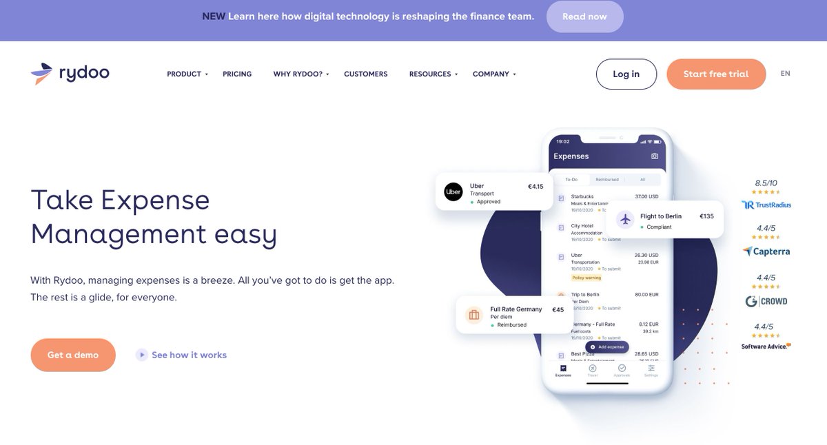
98% Of Brand Logos Are On The Left
The placement of the logo on the top left of a website is a common design best practice.
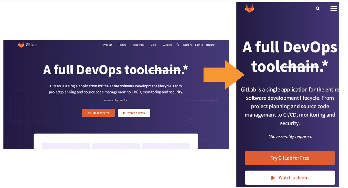
It’s an approach that most designers use inside of SaaS and outside of SaaS. But sometimes brands will switch things up and go in the middle like this:
The placement of the logo on the top left of a website is a common design best practice.
It’s an approach that most designers use inside of SaaS and outside of SaaS. But sometimes brands will switch things up and go in the middle like this:
Most SaaS Websites Are Mobile Responsive
The world runs on mobile. In April 2021, 56% percent of all web traffic came through mobile phones. 📲
Mobile responsive sites are a great way to ensure you don’t deliver broken experiences for people on a desktop or visiting on mobile.
The world runs on mobile. In April 2021, 56% percent of all web traffic came through mobile phones. 📲
Mobile responsive sites are a great way to ensure you don’t deliver broken experiences for people on a desktop or visiting on mobile.
54% Of SaaS Homepages Don't Use Video
This one surprised me... But it shouldn't have.
Video is ridiculously intimidating for brands. But it can be a great approach to build a more intimate and human relationship with your website visitors.
This one surprised me... But it shouldn't have.
Video is ridiculously intimidating for brands. But it can be a great approach to build a more intimate and human relationship with your website visitors.
There’s Always Primary Call To Action Above The Fold
There’s a clear best practice in SaaS that your call to action driving people to do something needs to be above the fold.
More than 90% of SaaS sites that were in this SaaS research had a button or CTA above the fold.
There’s a clear best practice in SaaS that your call to action driving people to do something needs to be above the fold.
More than 90% of SaaS sites that were in this SaaS research had a button or CTA above the fold.
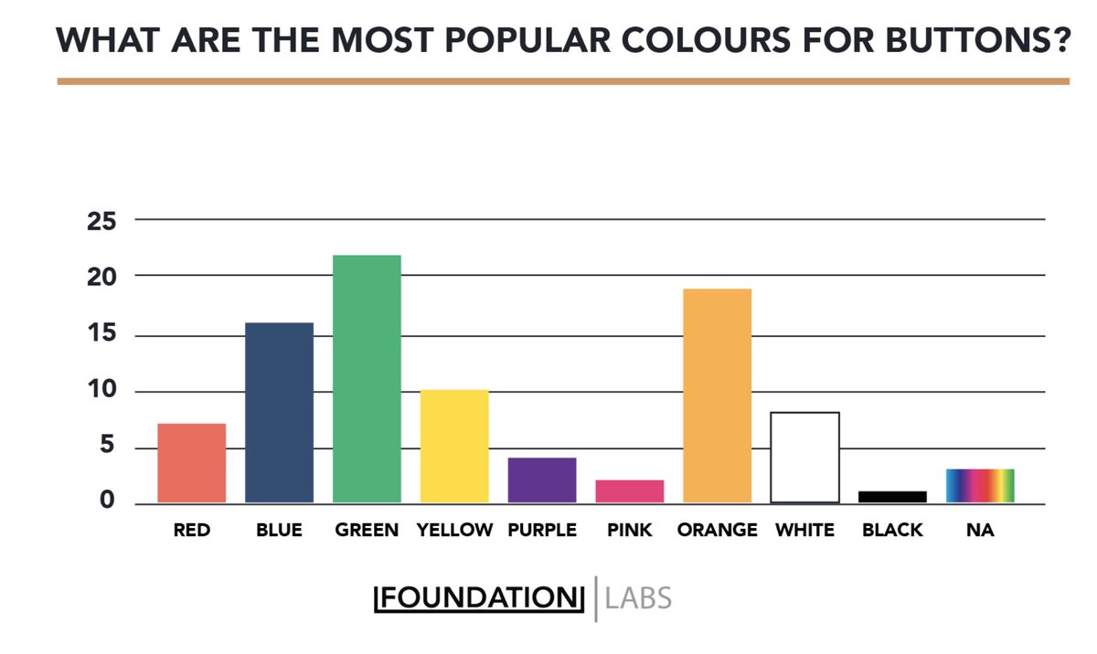
Green Means Go & It's The Most Popular Button Color
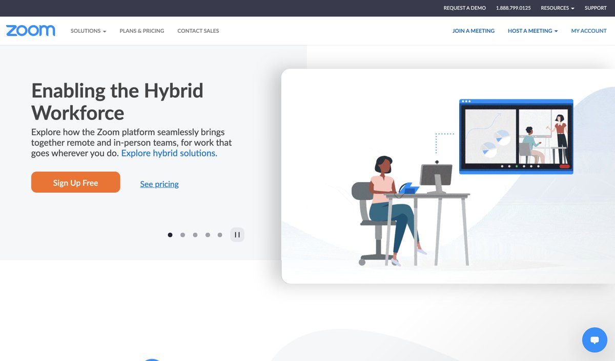
The second most popular colour for buttons is orange (see Zoom in the last tweet) followed by Blue.
The second most popular colour for buttons is orange (see Zoom in the last tweet) followed by Blue.
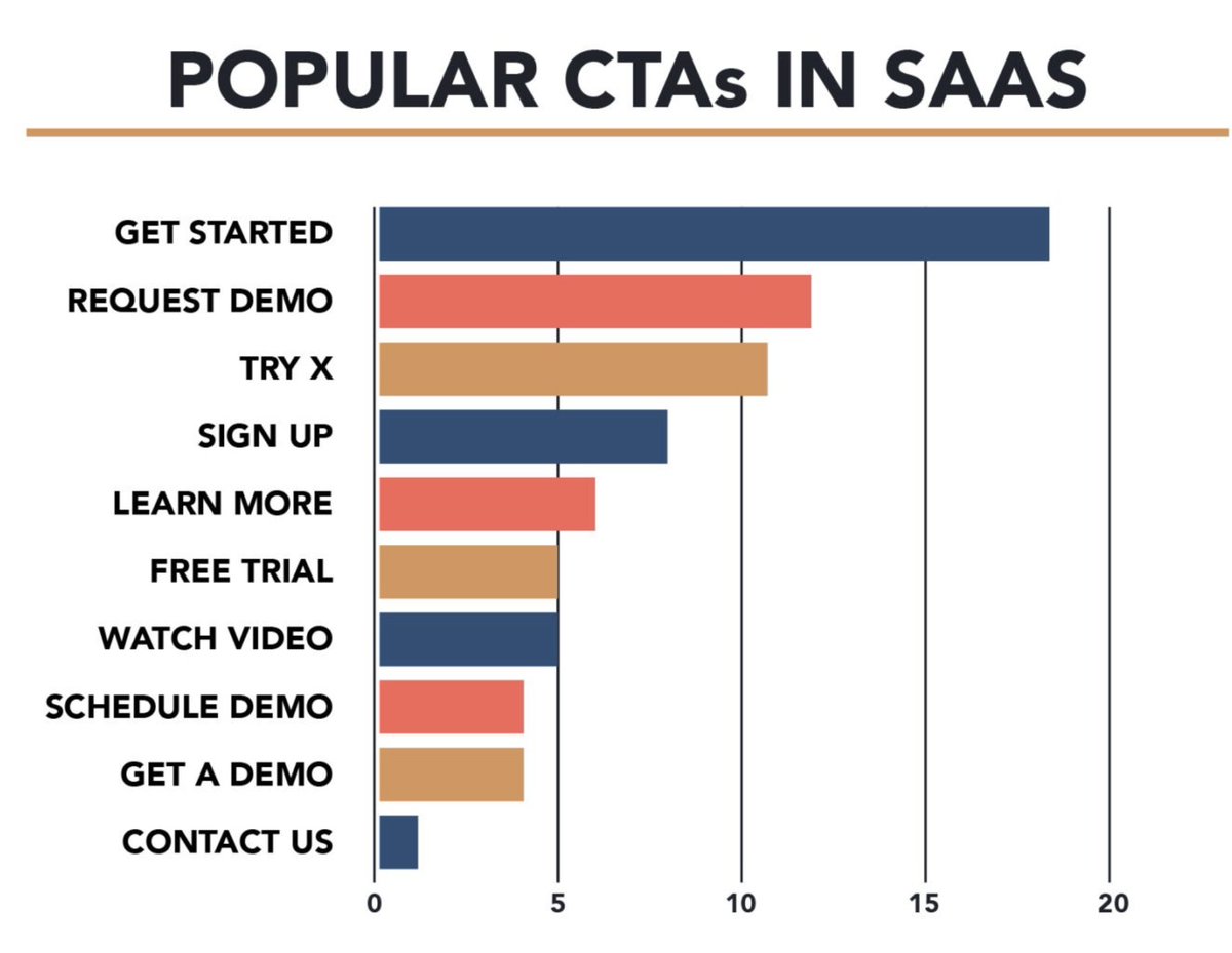
"Get Started" Is The Most Popular Call To Action
The most common words + phrases within the call to actions tended to be: Free, Demo, Get, Started, Try X and Request…
The most common words + phrases within the call to actions tended to be: Free, Demo, Get, Started, Try X and Request…
Using A Light Background Is Best Practice
Most of the sites (92% of them) we reviewed used white or light colors as the primary background for their sites.
One of the sites we found that used a dark background changed it to light 4 months after we found it...
White is crisp:
Most of the sites (92% of them) we reviewed used white or light colors as the primary background for their sites.
One of the sites we found that used a dark background changed it to light 4 months after we found it...
White is crisp:
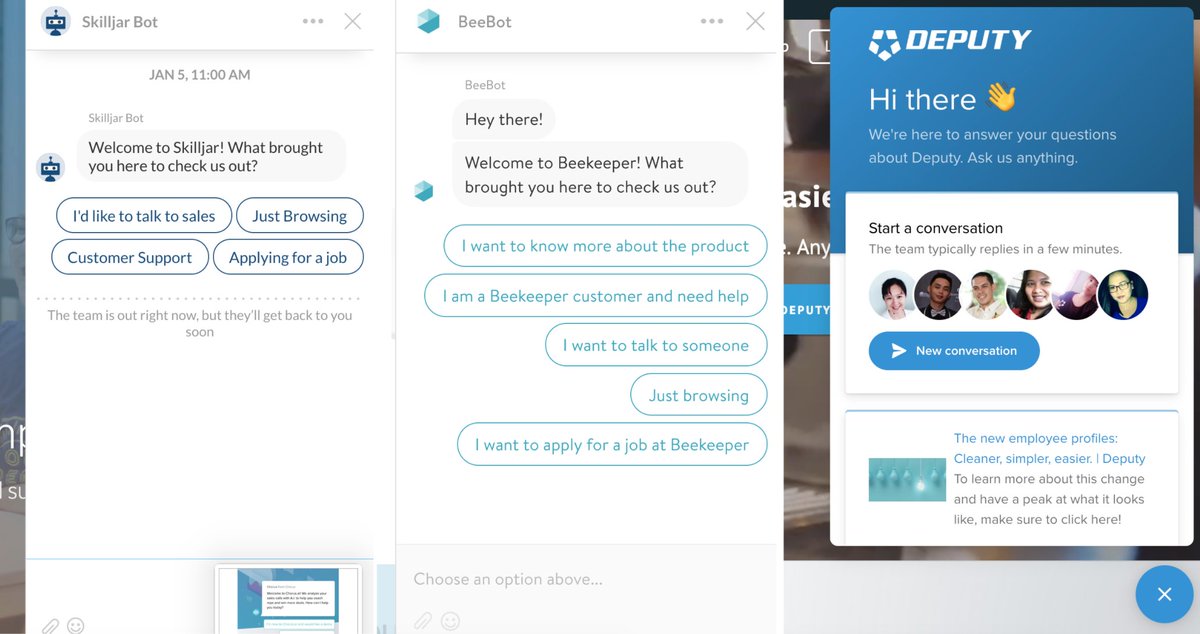
Half Of The SaaS Brands Use A Live Chat Tool
Our research found that nearly 50% of SaaS sites have a chat box in the corner ready to be engaged with.
Across most of these sites the services being used were Intercom or Drift.
Our research found that nearly 50% of SaaS sites have a chat box in the corner ready to be engaged with.
Across most of these sites the services being used were Intercom or Drift.
56% Of SaaS Sites Use Real People On The Homepage
The rest of the others are mostly using illustrations. You know the illustrations I'm talking about... The one's that are kinda like people but not really like people..
No shade though. These illustrations can be great.
The rest of the others are mostly using illustrations. You know the illustrations I'm talking about... The one's that are kinda like people but not really like people..
No shade though. These illustrations can be great.
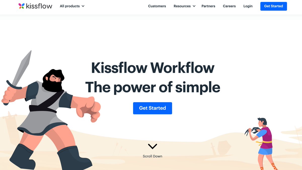
Leveraging Illustrations In SaaS Is Common (70%)
There's a wide range of use cases but illustrations showing people using tech are VERY common. There are a few brands like Kissflow that have fun with it.
Side note - Check out: @illustrationblk for your site.
There's a wide range of use cases but illustrations showing people using tech are VERY common. There are a few brands like Kissflow that have fun with it.
Side note - Check out: @illustrationblk for your site.
So Should You Follow The Standards?
Depends.
Experimenting with design is a great way to uncover something before the rest of the industry. That said, the risk of design experimentation is that users could find the entire experience broken and poorly created.
So be careful.
Depends.
Experimenting with design is a great way to uncover something before the rest of the industry. That said, the risk of design experimentation is that users could find the entire experience broken and poorly created.
So be careful.
Experimentation is one of the most important things that SaaS companies. So don't use all of these ideas as a crutch to say WE MUST do this...
Run your own experiments.
It could be testing new images or trying new copy in buttons like I advised here...
Run your own experiments.
It could be testing new images or trying new copy in buttons like I advised here...
https://twitter.com/TheCoolestCool/status/1417181695518953476
When @FoundationIncCo (follow us so you don't miss the next report) put this together we thought we would find more brands doing the same things.
But there's a decent mix!
If you like SaaS & want info like this subscribe to our free newsletter: foundationinc.co/newsletter/
But there's a decent mix!
If you like SaaS & want info like this subscribe to our free newsletter: foundationinc.co/newsletter/
And if you enjoyed this thread; scroll over my face, double click, find that follow button and hit it.
I tweet about SaaS, content, growth & entrepreneurship.
And I'm always looking to connect with new people.
So let's do it.✌🏿
I tweet about SaaS, content, growth & entrepreneurship.
And I'm always looking to connect with new people.
So let's do it.✌🏿
• • •
Missing some Tweet in this thread? You can try to
force a refresh