
A recent #fontSunday topic of ‘bold headlines’ made me want to talk about bold letters a bit.
THREAD:
THREAD:
I have been a fan of very bold letters for a long time. With the Lettermatic catalog, I think it has essentially been a self-imposed rule that all of our designs get taken to a very bold extreme. Because… it’s fun! 
Not only are very bold letters eye-catching and powerful from an aesthetic perspective, I actually find they help my design process itself. I’ll explain…

Previously I did a thread about counterforms. I talked about the negative space trapped within letters, and how all letters are made from this positive/negative balance. So how do you… make letters bolder?
https://twitter.com/rileycran/status/1420032663767986176

It is tempting to say you just add positive space. But typically it’s actually more like: add positive space while removing negative space. The counterforms sort of get the air vacuumed out of them, and the letters simultaneously get a bit wider, as the positive space grows.
As letters get bolder, the differentiation between thick and thin (also called contrast) tends to increase. This is primarily to allow the counterforms to be as large as possible, despite the extra weight, because we rely so heavily on counterforms for reading.
We also employ another method for emphasizing the counterforms as much as possible, even at very bold weights: bold letters tend to have a taller x-height, compared to lighter weights.
Let’s look at the letter ‘o’ in Parclo Sans as it changes in weight from lightest to boldest. As the letter gets bolder, the positive shape gets larger.
Additionally, the negative shape (the counterform) gets smaller.
Weight also impacts spacing. The spacing of a given weight of a typeface is connected to the amount of space trapped inside the letters. So as the ‘air’ is removed from the counterforms, the amount of space between letters is similarly reduced to maintain balance and rhythm.
When I am designing a typeface, I find that pushing the design to an extreme of weight helps me learn a lot about what this typeface really *is*. It’s sort of a stress test… what happens to these design details when I push them to be really bold? How could they work differently?
Certain letter constructions do not lend themselves to getting very bold in weight. For instance a grotesque-style ‘s’ with closed terminations tends to sort of ‘run into itself’ eventually…

…whereas a humanist ‘s’ with open terminations can get significantly bolder without feeling uncomfortable.

I often wonder… are the open terminations (that help that ‘s’ become very bold) also a quality that helps the ‘s’ be easier to read in a Regular weight? I’m inclined to say yes, because both successes depend on a reader identifying the counterforms.

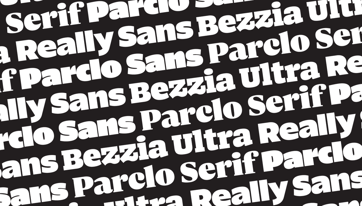
When @cleerdesign commissioned me to design what would become Parclo Sans, we pushed the design as far as it could go in weight. This Ultra weight is probably the boldest style of a typeface I’ve ever drawn, and it involved a lot of very careful optical trickery to make it work.

At that extreme of weight, the extenders get a bit shorter, to emphasize the way the words set like a BRICK. The lowercase ‘i’ actually gets shorter just so that the ‘dot’ can fit comfortably in relation to the ascender height.
The term ‘Ultra’ itself is probably worth talking about, too. Even though it might seem like there’s a book somewhere that defines what each weight name means, there is no such definition or standard to adhere to.
What is Regular? Generally it is the weight that looks nice in running text, as informed by all the other running text people have read. In that way each scribe and typeface designer has effectively been contributing a tiny bit to that definition, since we began creating letters.

What is Bold? Well, Bold is probably the style that seems to provide a nice contrast of emphasized weight, as compared to Regular.
I like to think of ‘Ultra’ as: this is as bold as I can make this before it becomes unreasonable. What’s the maximum amount of weight I can get into these letters before they become useless to designers? Or impossible to discern for a reader?
Bezzia has an Ultra weight too. Making very bold serif typefaces can be even more complicated because you… run out of places to put serifs. It can feel like trying to get a massive plane to take off on a 10 foot runway.

In the Bezzia typeface, at its the boldest weights, it occasionally will ‘forget’ a serif on purpose. I bet you didn’t notice that the ‘n’ is missing an interior serif here, at first glance. And yet that helped you read the letter without the clutter that two serifs would create.

Really Sans has an Ultra weight in its large optical size. It’s purposefully designed with a tall x-height and very tight spacing, for that eye-catching visual tone that some associate with 1970s headline typography.

Really Sans is a bit more geometric; this time the counterspace at the center of the ‘o’ becomes more like a pinhole, than a tall sliver.
Thinking about weight this way has some fascinating impacts on various styles of a type family. For instance, Parclo Sans has widths. Here are bolder words in the Normal and Condensed widths. They feel similarly dense, right? But why?

The optical appearance of weight is clearly not linked exclusively to positive shapes. Because the positive shapes are completely different thicknesses in the two fonts.

Instead, the appearance of ‘boldness’ in type is directly related to the balance between positive and negative space. If you have significantly more positive space than you do negative space, you will always create the illusion of ‘boldness,’ regardless of the exact measurements.
Thanks for reading, everyone! And as usual, if you’re curious to learn more about the Lettermatic fonts, head to the site and take them for a spin. Get yourself some (fully-featured) trial fonts! 🔤🔠
lettermatic.com/fonts
lettermatic.com/fonts
Special thanks to @danellecheney and @heather_cran for their help assembling the imagery for this thread!
• • •
Missing some Tweet in this thread? You can try to
force a refresh


