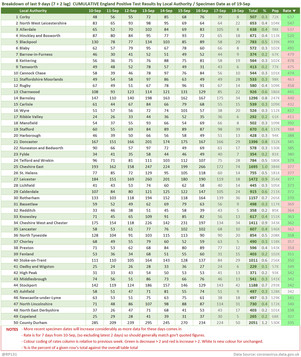
#covid19uk - Tables thread. Starting with the top 50 England Local Authorities by positives per 100K population in last 7 days, up to 3 days ago. Bright green means lower than previous period.
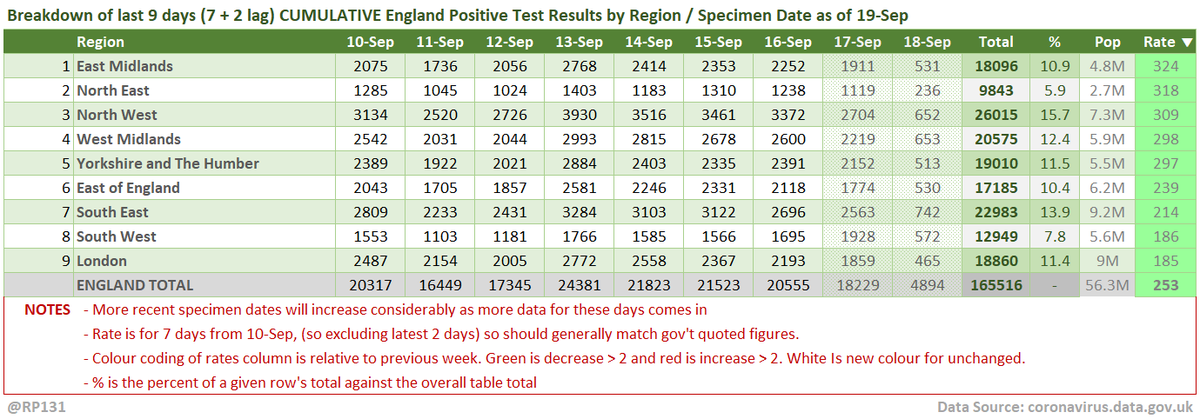
Cumulative summary view by regions.
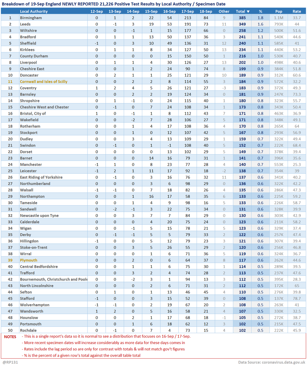
Table view of today's 21,226 NEWLY REPORTED England positive test results by local authority and recent specimen dates. Here showing top 50 authorities which represent 52% of the population, but have 57% of the positives.
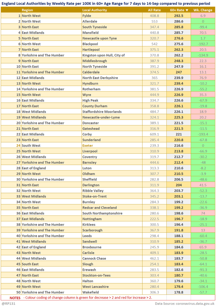
Top 50 table view of latest availble Local Authority data for the 60+ age range for 7 days to 14-Sep sorted by descending rate per 100K population (of that age range). Change column is compared to previous week with red for increase and green for decrease.
Some of the more detailed content from this thread has been moved to an external page to try and make the twitter updates a bit more manageable. You can still see the full version here: …ddatashare.s3-eu-west-1.amazonaws.com/Table/Table_20…

• • •

Missing some Tweet in this thread? You can try to force a refresh
 

Keep Current with Richard 📊📉

Richard 📊📉 Profile picture

Stay in touch and get notified when new unrolls are available from this author!

Read all threads

This Thread may be Removed Anytime!

PDF

Twitter may remove this content at anytime! Save it as PDF for later use!

Try unrolling a thread yourself!

how to unroll video
  1. Follow @ThreadReaderApp to mention us!

  2. From a Twitter thread mention us with a keyword "unroll"
@threadreaderapp unroll

Practice here first or read more on our help page!

More from @RP131

19 Sep
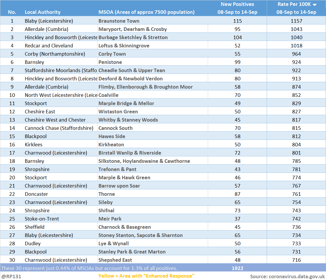
Updated (19-Sep) table of top 30 MSOAs (by rate) based on latest numbers in today's report.

This table often feels a bit out of date because by the time these local figures filter through, the LA has already peaked.
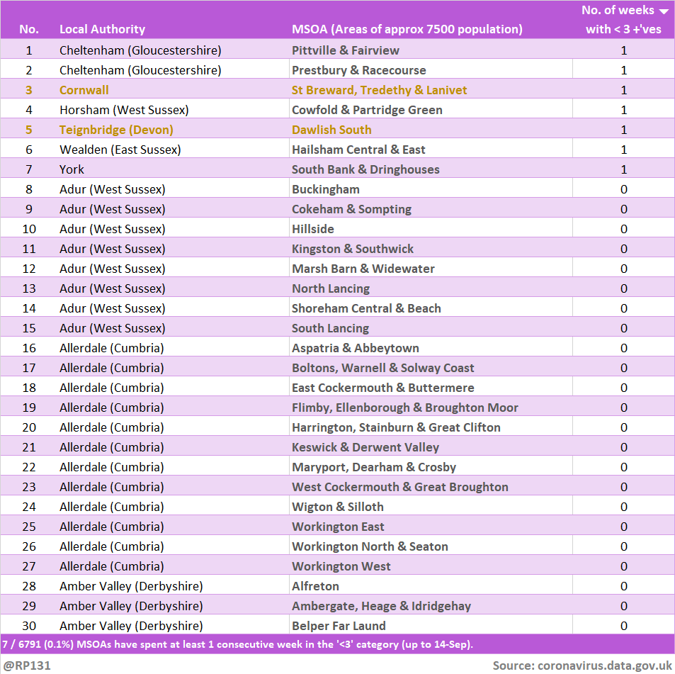
Bringing back the view of how many weeks the MSOAs have been in the suppressed 'less then 3 +ves in the last week' category. Since they don't allow us to distinguish between zero / 1 / 2, we generally consider it to mean zero. Link to full table in reply below.
Read 6 tweets
19 Sep
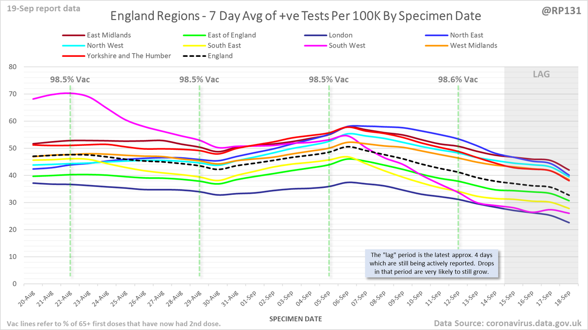
#covid19uk - Detailed positive tests thread. The majority of this thread is a set of views of rolling 7 day average positives per 100K by specimen date. Starting with England regions:
Some of the more detailed content from this thread has been moved to an external page to try and make the twitter updates a bit more manageable. You can still see the full version here: …ddatashare.s3-eu-west-1.amazonaws.com/Detail/Detail_…
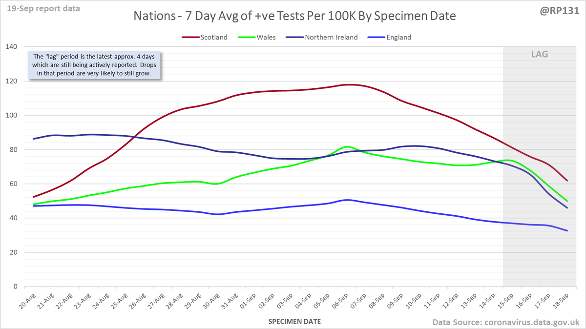
UK nations:
Read 12 tweets
19 Sep
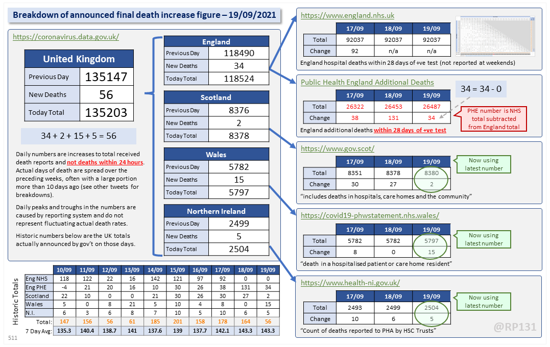
Dashboard for 19-Sep to explain the #covid19uk total death increase figure of 56.

For England, NHS data is merged by PHE for a net total of 34.

This keeps the UK 7 day rolling average the same at 143.3.
Date of death chart for England regions drawn with 7 day rolling averages of deaths per 1M population.
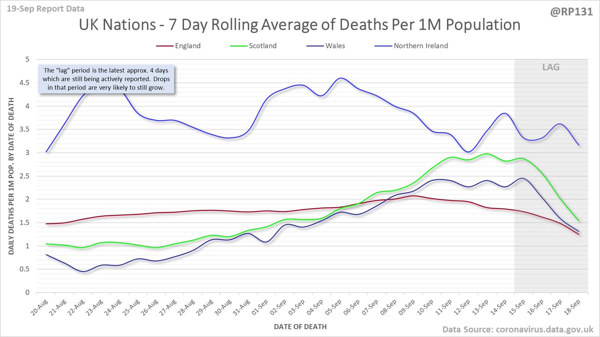
Date of death chart for UK nations drawn with 7 day rolling averages of deaths per 1M population.
Read 8 tweets
19 Sep
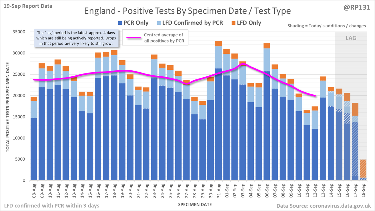
29,612 new #covid19uk positive tests reported today (19-Sep). Similar numbers to last Sunday so we might be about to see a levelling off.
Animated chart to show LFD-only positives being either converted into PCR confirmed positives or removed due to negattive confirmation, over the last 14 days of reports.
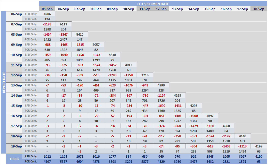
Pivot table of daily changes to LFD Only and LFD Confirmed by PCR figures to see if we can identify where LFDs are now being removed due to negative follow-up PCRs.
Read 8 tweets

Did Thread Reader help you today?

Support us! We are indie developers!


This site is made by just two indie developers on a laptop doing marketing, support and development! Read more about the story.

Become a Premium Member ($3/month or $30/year) and get exclusive features!

Become Premium

Too expensive? Make a small donation by buying us coffee ($5) or help with server cost ($10)

Donate via Paypal Become our Patreon

Thank you for your support!

Follow Us on Twitter!

:(