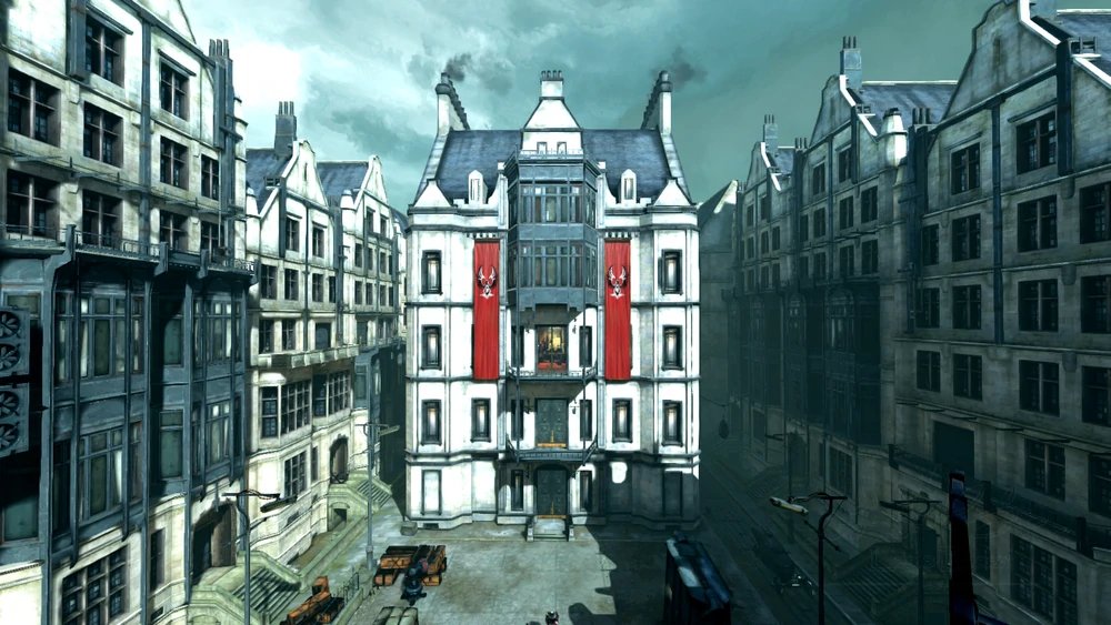
The 9th thing I worked on at Arkane is the one you've probably been waiting for, and I'm here to talk about it just in time for #Blocktober; The Clockwork Mansion of Dishonored 2.
For that, we have to start with the prototypes. 1/19
For that, we have to start with the prototypes. 1/19
I created this proof of concept early in 2013, long before the map was greenlit to be included in the game, basically to say "yes this could be amazing" and "yes I should work on it." It did both, but it would still be over a year before the map was officially OK'd. 2/19
But sure, I could make a bunch of blocks animate however I wanted. What is possible using real level geometry? That's why I made this prototype. A bit less wild? Yes. But still clearly do-able. 3/19
That prototype introduced the idea of rooms that were moved around like cargo containers and slotted into place, making the map's layout totally dynamic, but without transforming rooms. I am glad we didn't go in that direction. 4/19
The map was originally to feature an area which we nicknamed the "rat maze". My prototype for it fully embraced the video game tropes of yesteryear. Nonsensical traps that killed you unless you had advanced knowledge or perfect reflexes? Check. 5/19
More rat-maze shenanigans. This stuff was really entertaining to design, but pretty out of tone with the rest of the game and our approach to level design. You may want to skip this one if you get motion sickness easily. 6/19
I also had to prototype how the robotic enemies would handle the transformations. I imagined them magnetizing to the floor and folding up. When in this state, they'd be vulnerable to hacking. (More potential motion sickness here.) 7/19
After nearly a year of working on other prototypes it was time to revisit the Clockwork Mansion and finally get it validated. I made a new version with fewer twisty rooms, and more emphasis on the "behind the scenes" areas. 8/19
At this stage I didn't imagine it looking like a mansion from the outside. There would be either an ominous superstructure around it, or it would be entirely underground. 9/19
So, it was validated! Meaning it was time to start thinking about the structure and layout of the map. I know some layout diagrams predate this one, but this is the earliest one I could find. 10/19 

Of course, it's me, so things didn't stay simple for long. You can see a lot of dead ideas in this diagram if you comb through it. (Feel free to ask about them.) 11/19 

I was really struggling to find a way to present this very three-dimensional space (it wasn't going to have "floors" in the normal sense) that also transformed. Here's another layout proposal and probably my 5th iteration on trying to document it. 12/19 

The influence of the old Infocom maps is starting to be even more clear; particularly Spellbreaker, one of my favorites. 13/19 infodoc.plover.net/maps/spellbre.…
I'm almost there with this layout. As I zero in on the final design, the proposals start to become a lot more restrained, more focused on doing a few things very well, rather than just throwing every idea in my noggin onto the page. 14/19 

And here we are; the final paper map design before we switched to blockout. Amusingly we've also come full circle back to the simplicity of the first layout diagram. 15/19 

Sadly I don't have any graybox images or videos of the final layout design to share, but here is some pre-alpha Void Engine footage using a very early blockout kit used by level artist David Di Giacomo. 16/19
Before I wrap this up, here's a -very- early proposal for the player's interactions with Jindosh. I'd make diagrams like this for any complex branching narrative moments. This practice would serve me well as Campaign Designer. 17/19 

And a more evolved iteration on the above, focused more on the player's physical progression through the map. 18/19 

Thank you very much for reading. I hope you found this peek at the prototyping and paper-map stages of this location enlightening. ☺️ If you have any take-aways, please share them. 💛 19/19
Reminder: To view the full-res diagrams (on desktop), once you open them, right-click and choose "view in another tab".
• • •
Missing some Tweet in this thread? You can try to
force a refresh


