Folks, if you see anyone quoting Alex Berenson / Joe Rogan on how case rates in England are higher among vaxxed than unvaxxed, that data is incorrect, as explained here.
Here’s our full story from earlier this week on why that table and a lot of other data on vaccinations in Europe, the US and beyond is misleading, due to faulty population data ft.com/content/125fba…
Important addendum:
@UKHSA are not out there to mislead anyone, and 99.999% of what they’ve published has been exemplary. They’ll emerge from the pandemic with one of the best records worldwide in publishing timely and important data. This was one exceptionally rare misstep.
• • •
Missing some Tweet in this thread? You can try to
force a refresh
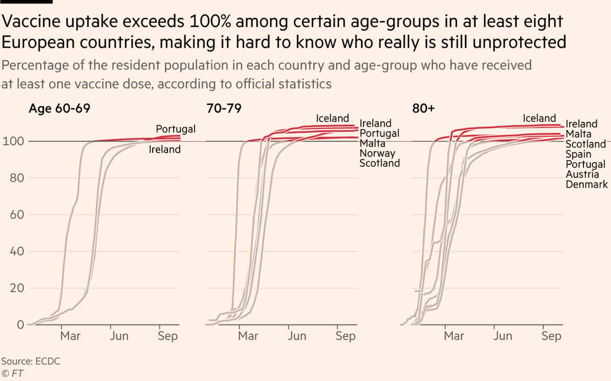
NEW: people obsess over vaccine uptake stats, eagerly comparing one country to others to see which has jabbed the highest share of its population, but what if I told you many — perhaps most — of those stats are wrong?
Time for a thread on bad Covid data and how it can cost lives
Let’s start with the most obvious sign of the problem:
In several European countries, the share of elderly people who have been vaccinated exceeds 100%.
To state the obvious, this is not possible.
But it’s not just a funny quirk, it has big implications.
In reality these countries won’t have reached 100%, so there are tens of thousands of unvaxxed elderly that are invisible, and no-one is going to visit someone to make sure they’re jabbed if they think everyone is jabbed.
Really interesting story from @mjruehl in Singapore (82% of population fully vaxxed), where the transition from Zero Covid to living with the virus is not going smoothly to say the least. on.ft.com/3maIJnW
Lots of lessons here for Australia, New Zealand and others
As @mjruehl writes, Singapore's problem stems from the interplay of two factors:
• A population that has become extremely nervous and worried about *any* Covid
• A policy of mass testing asymptomatic people, many of whom rush to hospital after a positive, even if symptom-free
The local reaction has been, as ever, polarised. Healthcare professionals have criticised the mass testing policy [given the context in which it's being rolled out], while 25% of the population want a return to lockdown, and there are petitions to reintroduce quarantine hotels.
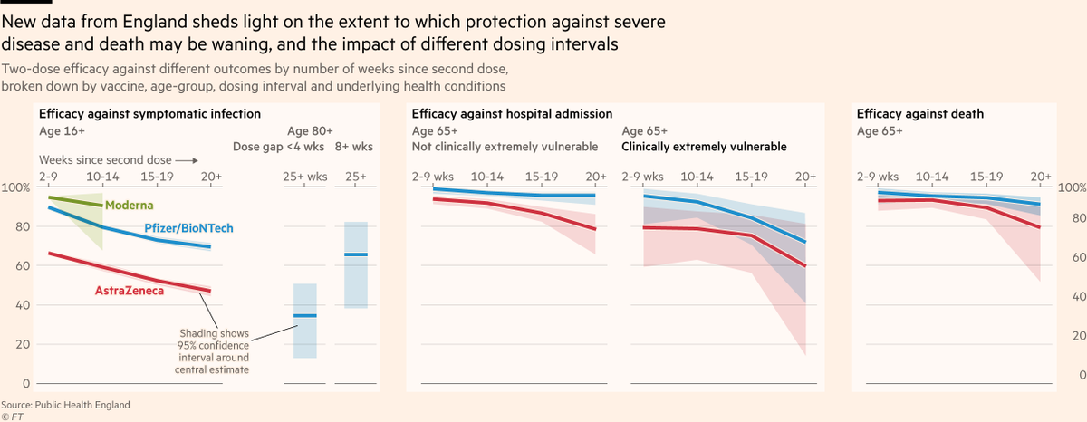
NEW: lots of news recently on waning immunity against infection, but a study has now landed from Public Health England on how vaccines are faring against *severe disease & death*
This chart summarises key findings, but the paper is a real goldmine, so let’s dig into more detail:
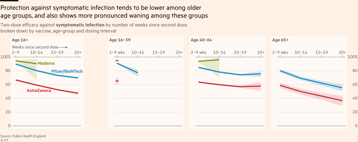
First up, fresh data on protection against symptomatic infection. Key results:
• We knew protection started out lower among older groups. Now we know they also see the most waning
• Waning much more muted (if happening at all) among under-65s
• Moderna > Pfizer > AstraZeneca
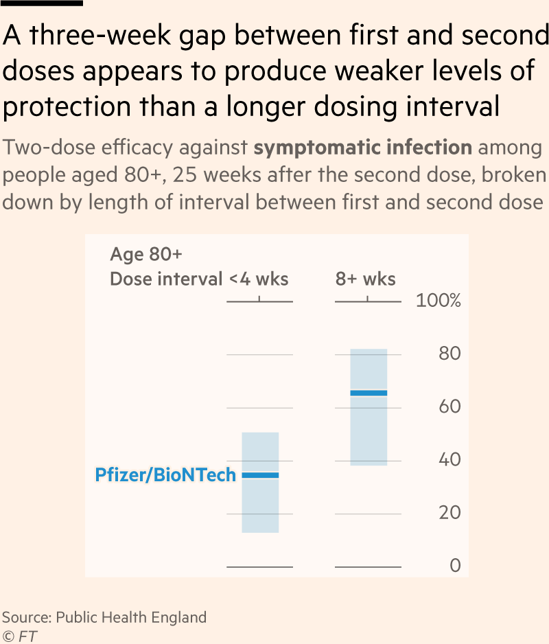
Sticking with symptomatic infection, they also looked at a hot topic: the impact of the interval between first and second dose
Very short intervals (3 weeks, e.g in US) produce lower protection than longer intervals (e.g UK & Canada), though note overlapping confidence intervals
NEW: in the last couple of weeks there have a *lot* of new studies out assessing vaccine efficacy, many of which have touched on the question of waning immunity.
Unsurprisingly, these have prompted a *lot* of questions.
Time for a thread to summarise what we do and don’t know:
Let’s start with last week’s Oxford paper, the most significant study to date on waning immunity to Covid.
The researchers found signs that vaccine efficacy against symptomatic infection erodes over time, and that waning may occur faster in some vaccines than others.
Unsurprisingly, this prompted a lot of questions.
Could it just be that the first people to be vaccinated were older, and perhaps more vulnerable to waning?
NEW: lots of attention on ONS Infection Survey today, but some confusion over how it should (and should not) be used to asses whether England’s fall in cases is "real"
Quick thread:
Most attention has gone on ONS “% of people testing positive” metric showing a continued rise
But "testing positive" is a lagging indicator of cases. It estimates how many *have* Covid today, not how many are *catching it* today.
Fortunately, ONS has re-introduced its incidence data (blue line), which is a much better yardstick for cases, though always 2 weeks old 😩.
So how to resolve issue of one lagging indicator, and one that’s 2 wks old?
Look to Scotland, where cases peaked 2 wks before England, so ONS indicators have had time to catch up
Turns out ONS incidence fell at exactly same time as cases 🙂. ONS positivity likewise, just lagged
There’s a wild story about the women’s gymnastics at the Sydney Olympics in 2000, which I think is very relevant to what we’re hearing about Simone Biles, and the wider point of how the top level of elite sport is just as much mental as it is physical.
In the women’s all-round final in 2000, the organisers set the vault at the wrong height. Two inches too low. This was a pretty huge deal.
For competitors who have done thousands, maybe tens of thousands of vaults at a specific height, a two inch difference is night and day.
In the first round, 17 of 36 finalists fumbled the vault
One landed on her back. Clear gold-medal favourite, Russia’s Svetlana Khorkina (comfortably won qualifying) landed on her knees.
Total chaos, and nobody knew why. Athletes second-guessing themselves.