
In honor of the final release of Attack on Titan coming out in print, I thought I would dig up some info on the process of creating the logo from my archives to share. My schedule has prevented me from doing these posts this past year, but I wanted to mark the occasion. 1/8 

10 YEARS AGO, I was tasked with creating the Attack on Titan logo. I was told it "might be a big deal". It happened very quickly, so the sketches are beyond basic. I knew I wanted it simple and iconic, unique letter shapes to make it feel timeless and not tied to a setting. 2/8

Right away the focus landed on the "A" and "T"--they repeat a lot. I wanted the whole thing to just feel a little off; similar to our world but different. Here's a somewhat chronological chart of the evolution of the letters in very simple pen stroke built letterforms. 3/8

Once I got the letters nailed down to the shapes I liked, I began laying out how the text would be used on the covers. 4/8

Seen here is as much of general type-build sheet as I can find. Over the course of the last decade I ended up having to do so many variations and spin-offs that I had to create a makeshift font with many variable letters depending on the letters around it. 5/8

The original distressing was done in Photoshop, but around 2016 I went back and did a vector version in Illustrator. The logo was being blown up for banners and such at that point so it had to scale. Shown here are most of the special and spin-off series logos. 6/8

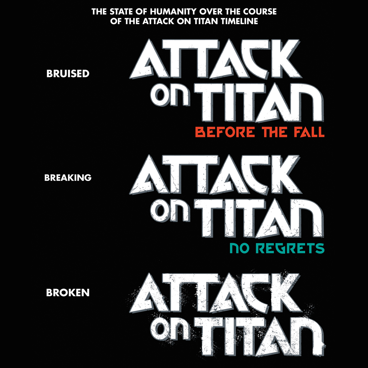
A little touch I'm proud of that never seemed to get noticed--different series were set at different points in the timeline. The further back from the main series, the less distressed the logo was, to try to illustrate the fall of humanity over time. 7/8
It has been an honor and a privilege to work on this series the past ten years; from designing the logos and covers to illustrating the covers for the Colossal Editions, I'm proud of the work we've done together. 8/8
#manga #logodesign #kodanshamanga #AttackOnTitan
#manga #logodesign #kodanshamanga #AttackOnTitan
• • •
Missing some Tweet in this thread? You can try to
force a refresh


