Is today's market an echo of the 1940s? The next few charts show the risk-reward tradeoff for the current cycle and for the WWII era. Look at this first one—a snapshot of the past 70 years—and I'll explain. (THREAD)
The chart above sets the stage with the baseline history. Cash at the lower left, stocks at the upper right, 60/40 in the sweet spot, and commodities in the worst place possible: earning only the inflation rate but with a massive vol. /2
Now let’s look at the past 18 months in the chart below. Commodities are up and to the right, along with equities, while bonds are well below the inflation rate. /3
Now check out the WWII years, below. Price controls slowed commodities, but equities did extremely well. Bonds returns were slightly under the inflation rate, but with inflation checked by price controls, we can assume that the actual real return for bonds was worse. /4
And here is the current cycle compared to the 1942-46 period. A similar story for equities, but with more vol during the current cycle. Bonds are doing much worse now, and commodities are doing much better. /5
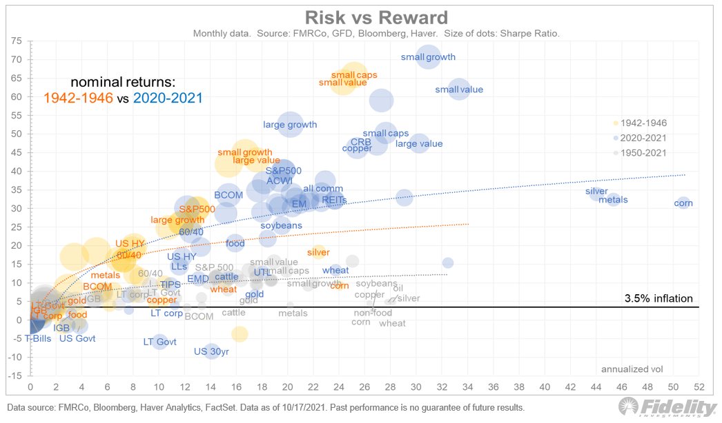
Interestingly, the inflation rate since March 2020 is 3.6%, the same as the 70-year inflation rate (CAGR), and also the same as the (official) inflation rate for 1942-46. It makes for an easy comparison in the chart above. /6
Following the surge in equities during the 1942-46 period, there was a bear market and then a long period of sideways. That’s when inflation really took off, as there were no longer any price controls to hold it back. /7
The Fed held bond yields well below the inflation rate until 1951 (the year that the Fed gained its independence). The CAGR for long-term Treasuries during 1942-51 was around 2.5%, while inflation was 5.6%. /8
Below is a look at 1942-46 alone vs the entire “financial repression” era of 1942-51. The previous charts showed nominal returns, but this one shows real returns. /9
The risk-return curve flattened as equity CAGRs had several years of negative real returns. For the nine-year period, real return on cash and bonds was firmly negative, as it is today. The future might look a bit like the 1940s, the Fed’s intended taper notwithstanding. /END

• • •

Missing some Tweet in this thread? You can try to force a refresh
 

Keep Current with Jurrien Timmer

Jurrien Timmer Profile picture

Stay in touch and get notified when new unrolls are available from this author!

Read all threads

This Thread may be Removed Anytime!

PDF

Twitter may remove this content at anytime! Save it as PDF for later use!

Try unrolling a thread yourself!

how to unroll video
  1. Follow @ThreadReaderApp to mention us!

  2. From a Twitter thread mention us with a keyword "unroll"
@threadreaderapp unroll

Practice here first or read more on our help page!

More from @TimmerFidelity

22 Oct
Bitcoin made a new all-time high of $66,000 on Wednesday. The chart below shows that both my supply and demand models continue to point to higher prices. (THREAD)
The gains have been pretty stealthy and without the help of momentum chasers. That may be ending now with the SEC approval of a futures-based ETF. /2
Whether such a development will prove to be a sell-the-news event remains to be seen, but I doubt it given the on-chain dynamics mentioned above. /3
Read 5 tweets
20 Oct
To put the current inflation spike in perspective, let's compare the current cycle to previous economic expansions. This chart shows the CPI index during all expansions since 1870 (as defined by NBER). (THREAD) Image
I'm intrigued by the 1940s analog. Unfortunately, we don’t have a true picture of inflation during the 1942-46 cycle, because of war-time price controls. I have seen some estimates that prices would have been 30% higher were it not for the price controls. /2
The next chart shows what commodity prices are doing now and what they have done during past expansions. It’s interesting that the current surge looks a lot like that other post-pandemic expansion of 1921-23. /3 Image
Read 5 tweets
14 Oct
Would a rotation from growth to value benefit non-US equities? In principle, yes, but the earnings picture for MSCI EAFE (Europe, Australasia and Far East) and EM (and especially China) suggests some caution. (THREAD)
The chart above, and the ones below, use the Datastream “squiggles” series for consensus earnings estimate progression by calendar year. The estimates run from the February before the calendar year to the February after. /2
The top panel above shows the dollar estimates and the bottom panel shows the progression from the start of each squiggle. The yellow bars show the 36-month Z-score of the MSCI USA total return. /3
Read 9 tweets
14 Oct
Will market leadership change back to value since rates are on the move? Long-duration growth stocks are convex to interest rates, and the relative performance of cyclicals/value stocks (especially financials and energy) is positively correlated to rising yields. (THREAD)
So, in theory, if bond yields rise to a new equilibrium (I’m guessing 2% for the 10-year), then value should take over for now. /2
I doubt the latest employment report will dissuade the Fed from starting its taper soon, so that suggests that in 2022 the bond market could be facing the opposite supply/demand dynamic as in 2021. /3
Read 4 tweets
13 Oct
The market is in mid-cycle and is following a typical pattern. This chart shows earnings growth in light blue and P/E growth in pink. The blue bars extend into 2022 because they include current estimates. (THREAD)
See the pattern? First, the market bottoms, then earnings typically bottom a few quarters later. In between those two inflection points is a big expansion in the P/E multiple. /2
From there, the P/E ratio peaks on a rate-of-change basis, then earnings growth goes positive, then the change in the P/E ratio turns negative, and then earnings growth peaks. /3
Read 5 tweets
12 Oct
Price follows earnings, except at the tails. Very negative earnings growth tends to produce positive returns (red dots below on the left), because this usually occurs at market bottoms. This chart illustrates earnings growth (horizonal) and the S&P 500 return (vertical). (THREAD)
On the other hand, very positive earnings growth does not seem to be correlated (see the pink dots on the right in the chart above). /2
Historically, when earnings growth is above 30%, the regression line for earnings vs. price is flat as a pancake. Investors don’t reward extremely high earnings growth because it tends to be unsustainable. That's what happened in 2018 following the tax cuts. /3
Read 4 tweets

Did Thread Reader help you today?

Support us! We are indie developers!


This site is made by just two indie developers on a laptop doing marketing, support and development! Read more about the story.

Become a Premium Member ($3/month or $30/year) and get exclusive features!

Become Premium

Too expensive? Make a small donation by buying us coffee ($5) or help with server cost ($10)

Donate via Paypal Become our Patreon

Thank you for your support!

Follow Us on Twitter!

:(