Inflation is much on the minds of investors and rightly so. So let’s take a look at sector performance during inflation waves in the past. It may surprise you. (THREAD)
In addition to the inflation regimes of the 1940s and 1970s, there were two smaller waves over the past few decades, as measured by swings in the 5-year inflation CAGR. The first was 1987-92 and the second was 2003-08. The chart above shows these four regimes. /2
The next chart shows the S&P 500 real return during those regimes. The long-term CAGR for the inflation-adjusted S&P 500 is 6.82% (since 1926). Stocks have done OK during inflation regimes (the '70s being the exception), at least compared to its long-term trend. /3
We know that equity valuations are inversely correlated to inflation, but that doesn’t necessarily translate to negative or below-average returns. It all depends on the starting point and what happens on the “E” side of the P/E ratio. /4
My guess is that most people would just assume that inflation regimes are uniformly bad for equity returns, using the 1970s as the obvious example. But the data show otherwise. /5
And by the way, did you notice that these structural inflation waves tend to occur in cycles of around 10-15 years? 1942-50, 1965-80, 1987-92, 2003-08, 2020-?. On that basis alone, we seem to be due for another wave. /6
So which sectors win and lose during inflation waves? The next chart shows the correlation of monthly relative returns against the monthly inflation rate for the 11 GIC sectors. /7
The message is fairly consistent: energy sector relative returns have been positively correlated to inflation every single time, while consumer discretionary and financials have been negatively correlated every single time. /8
The relative performance data are a bit less consistent, however, as this next chart shows. Energy is still the most consistent relative winner, but consumer and financial stocks are a bit more mixed. /END

• • •

Missing some Tweet in this thread? You can try to force a refresh
 

Keep Current with Jurrien Timmer

Jurrien Timmer Profile picture

Stay in touch and get notified when new unrolls are available from this author!

Read all threads

This Thread may be Removed Anytime!

PDF

Twitter may remove this content at anytime! Save it as PDF for later use!

Try unrolling a thread yourself!

how to unroll video
  1. Follow @ThreadReaderApp to mention us!

  2. From a Twitter thread mention us with a keyword "unroll"
@threadreaderapp unroll

Practice here first or read more on our help page!

More from @TimmerFidelity

5 Nov
Bitcoin in recent weeks has beautifully fulfilled its premise as a hedge against declining purchasing power. (THREAD) Image
The chart above shows a hypothetical portfolio with 98% intermediate bonds and 2% Bitcoin. Even a small Bitcoin allocation could protect a conservative bond investor against a loss of purchasing power resulting from rising inflation and financial repression. /2
In 2018, the 2% allocation would have added almost 4 points of annualized volatility, while also amplifying drawdowns (i.e. the opposite of what a diversifier should do). But... /3
Read 4 tweets
5 Nov
Why should any investor own bonds at this point, given that they barely produce any nominal income, and are likely to lose value in real terms? Take a look at this chart, and we'll explore the question a bit more. (THREAD) Image
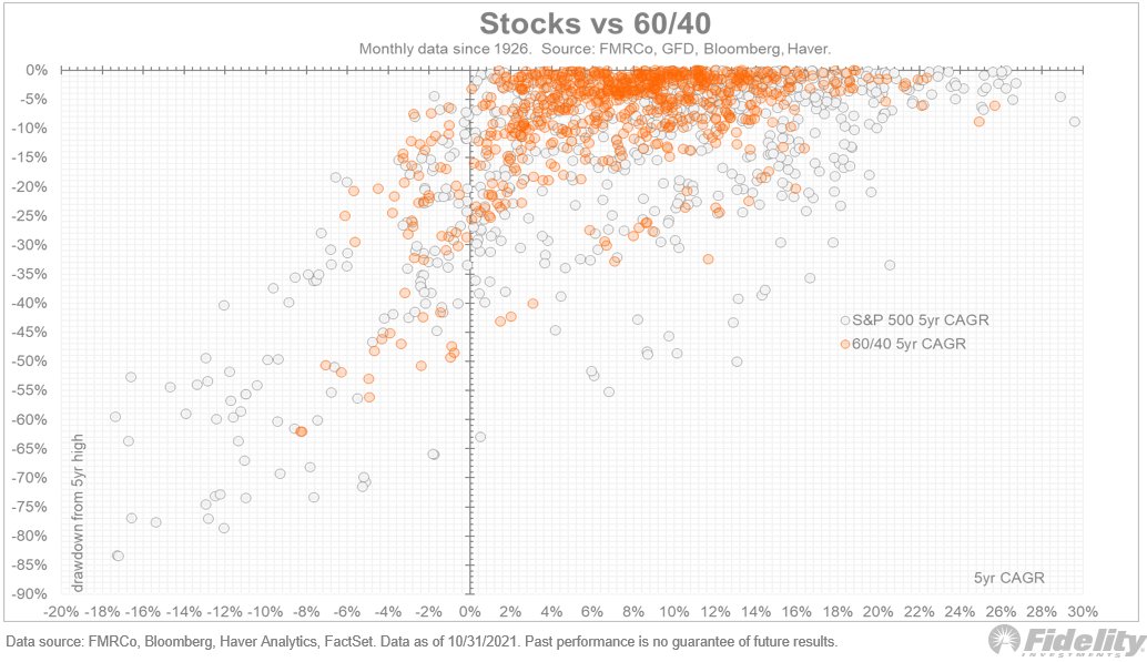
In recent years, the reason to go with a 60/40 portfolio was to diversify and protect. We can see this in the chart above. /2
60/40 produced about 2 percentage points less return per year than the S&P 500, but still a very respectable 9% – well above the inflation rate. It also helped investors sleep at night when the stock market was down (which it was about 40% of the time). /3
Read 8 tweets
4 Nov
Following up on the last thread regarding sector returns during periods of inflation: Here is the energy sector relative return during the four inflation regimes (1942-50, 1965-80, 1987-92, 2003-08): (THREAD)
And here is the retail industry group (GIC2). Consumer stocks can do OK at the start of an inflation wave, but apparently the lack of pricing power eventually takes over. /2
Next, the healthcare-equipment industry group. Huge winner during the 1940s, and did well during the 1960s and early '70s also—perhaps because both were war periods? Big pharma stocks were part of the Nifty Fifty, which carried the market into its peak in 1973. /3
Read 8 tweets
3 Nov
Until a few years ago, investors pursuing a diversified 60/40 portfolio got decent bond yields and downside protection when stocks slumped. But if that regime comes to an end (not a prediction, but certainly a possibility), how do we diversify from here? (THREAD)
The chart above shows that during the past two inflation super-cycles (the 1940s and 1965-80), bonds offered little protection. The scatter plot shows the nominal return index for the 60/40 model on the horizontal axis, and the real return index on the vertical. /2
Indexed to this series are the real returns for long-term government bonds, cash, high yield, TIPS (using a colleague’s synthetic series), gold, silver, the CRB, and the S&P 500. /3
Read 6 tweets
3 Nov
Following up on yesterday’s thread: Why would anyone bother buying bonds now? Traditionally, the 60/40 paradigm offered diversification and insurance, peace of mind. But what lies ahead? Take a look at this chart and we'll dive in. (THREAD)
As the chart shows, the only other time the 5-year inflation rate crossed above the nominal yield was 1942. That spurred a long period of very low nominal returns and negative real returns. The 20-year forward real return (yellow line) was negative for almost three decades. /2
The correlation between stocks and bonds back then was positive, from the 1930s all the way to the '50s. In other words, with perfect hindsight, there was absolutely no reason to follow any kind of 60/40 model back then. /3
Read 12 tweets
2 Nov
Increasingly, investors are questioning whether the tried-and-true 60/40 paradigm is still relevant after a two decades-long reign. Those concerns may be justified. Take a look at this chart, and I'll explain. (THREAD)
Investors are reacting to the back-up in rates from their historically low levels amid persistent, high-inflation prints. The chart above shows that over the long term, forward bond returns have an inverse relationship to their current yield (or valuation). /2
The chart shows the long-term Government bond yield (using the Ibbotson SBBI series), which on average has a maturity of around 20 years (give or take). Overlaid is the 20-year forward return. /3
Read 9 tweets

Did Thread Reader help you today?

Support us! We are indie developers!


This site is made by just two indie developers on a laptop doing marketing, support and development! Read more about the story.

Become a Premium Member ($3/month or $30/year) and get exclusive features!

Become Premium

Too expensive? Make a small donation by buying us coffee ($5) or help with server cost ($10)

Donate via Paypal Become our Patreon

Thank you for your support!

Follow Us on Twitter!

:(