Filed under:

'random Canadian-Scottish geography questions you can answer quickly while having your breakfast at the weekend'

- I may also have calculated the Scottish-Latitude population of Canada while I was at it, surprisingly low Image
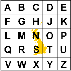
plus, not everyone knows that the northern bits of Shetland are further north than the southern tip of Greenland - and even when you hear this you are duty-bound to check it yourself on Google maps because it sounds made up ImageImage
the answer to my vital question, thanks to some 10km gridded data, is that a little over 570,000 people would appear to live at Scottish latitudes in Canada, and I think we can all sleep easy now

open.canada.ca/data/en/datase…
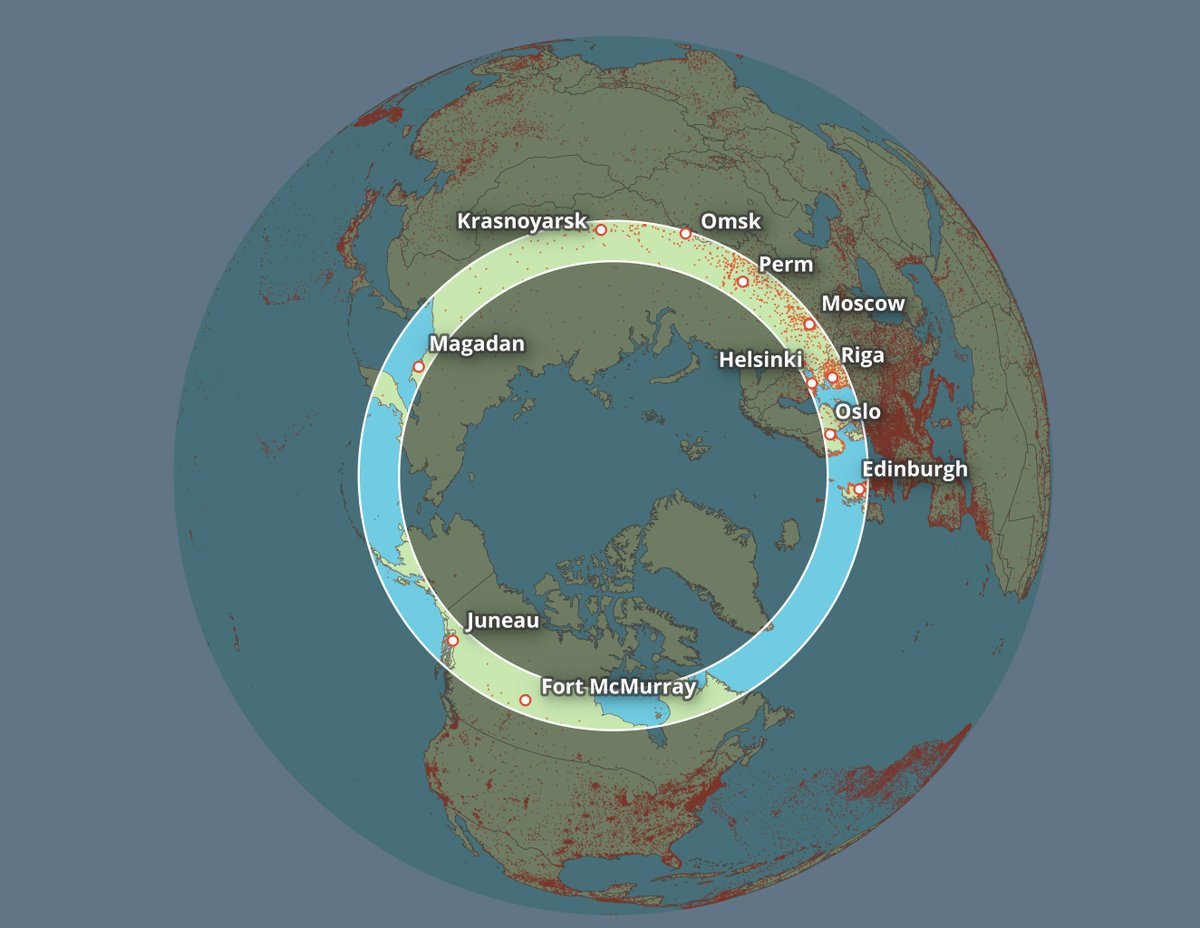
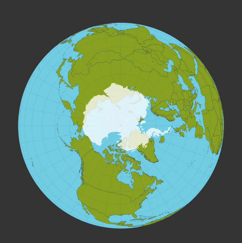
to end this little 'We the North' thread, I'll add in a global Scotland-latitudes donut map with a few places labelled - area shown in bright circle is roughly between 54.63 (Mull of Galloway) and 60.85 degrees north (Muckle Flugga) Image
putting together more training datasets and finding out all sorts of interesting 🤓 stuff that I probably sort of already knew but hadn't seen in a latitude donut map before ImageImageImage
probably should include New Zealand latitudes in this thread as well Image
north isn't actually a direction at all but a state of being, a mindset, a way of life and did you know more than 2,000 people live in Longyearbyen in Svalbard (an entirely visa-free zone, as it happens - see the Svalbard Treaty) ImageImageImageImage
I've never been, but Svalbard Museum did once send me a very warm hat! (made in New Zealand)

these different polar coordinate systems are a) quite a good way of teaching/learning about projections, b) an interesting way of looking at the world, and c) good for making 'what's at the top vs what's at the bottom' comparisons - e.g. 👇 ImageImageImage
one last tip for anyone looking to try this - in QGIS you can just right-click > Copy Coordinate > and then hit the Map CRS - option to identify any lat/long you want, or Set Custom CRS... to add a different coordinate system to the list and copy lat/long - it's quite handy ImageImage
I'm planning to do a little write up of methods on all this on my blog fairly soon, including how to very quickly create a glowy globe in QGIS with just a few layers of free data Image
adding Nova Scotia to this thread, as suggested by @Arnold_Platon Image
borrowed the colours from the very excellent Nova Scotia flag, obviously Image

• • •

Missing some Tweet in this thread? You can try to force a refresh
 

Keep Current with Alasdair Rae

Alasdair Rae Profile picture

Stay in touch and get notified when new unrolls are available from this author!

Read all threads

This Thread may be Removed Anytime!

PDF

Twitter may remove this content at anytime! Save it as PDF for later use!

Try unrolling a thread yourself!

how to unroll video
  1. Follow @ThreadReaderApp to mention us!

  2. From a Twitter thread mention us with a keyword "unroll"
@threadreaderapp unroll

Practice here first or read more on our help page!

More from @undertheraedar

14 Nov
Just catching up on the latest in functional economic geography news

"A boundary commission should propose adjustments that reflect economic reality." 🥳 Image
already imagining some new shapes ImageImageImage
although my preference would be to add a fuzzy 'maybe zone' to the edge of these kinds of maps to reflect the reality of commuter reality Image
Read 6 tweets
21 Apr
A short city population/datanerdfest coming up in this thread, beginning with a little panoramic tour of the Tokyo metro area - city as far as the eye can see

(I made this using Google Earth Studio btw, a very useful tool)
background: I have been using/playing with/analysing global city population data quite a bit over the years, most recently in an academic paper on the topic with @CJHoole and @stehincks

open access version: eprints.whiterose.ac.uk/149455/3/Conto… Image
we looked at population density for the whole world, using 1km resolution data from the EU's GHSL project - e.g. here's a little snapshot of how it looks across part of West Africa, from our paper Image
Read 14 tweets
28 Nov 20
Here's the final version of the global population density graphic I made, because another one that is circulating was less well defined, and someone cropped NZ off it
this is the little 'About this print' sheet that goes along with it
and, should you have a burning question like 'how can I make one of these?' or 'where do I get the data?' then see my blog for all the answers

statsmapsnpix.com/2020/11/how-to…
Read 8 tweets
26 Nov 20
Possibly of use for UK boffins, data journalists and the like: our (beta) version of a single UK local authority file with insets included (+ all area codes) - join data once, turn insets on/off as required

github.com/alasdairrae/in…

(other files here - automaticknowledge.co.uk/resources/) Image
the bounding boxes are included as well, in a separate file

If you just wanted main map + an inset for London, you could filter layer like this:

"inset_area" IN ('Greater London','None')
you get an inset, you get an inset, everyone gets an inset - except they don't - we may do a version 2 at some point with (e.g. South Wales, Teesside) but for now this is inset in stone
Read 5 tweets
4 Oct 20
Short map thread, inspired @ScienceAndMaps earlier this week. Many people are familiar with @OrdnanceSurvey grid references (e.g. summit of Ben Nevis is NN 166 712) - those two letters you can see on the map of Great Britain below (2 letters = 100km x 100km - known as a 'myriad')
baffling combination of letters, no? Well, to crack that code you need to zoom out and see the 500km x 500km tiles this is based on (there's no letter I, so we have 25 squares) - image is from @EDINA_Digimap
isn't it nice that the N and the S align roughly with north and south? Ordnance Survey is the mapping agency for GB rather than the whole UK, hence no Northern Ireland on the grid. So, first letter from the 500km part, second letter from the 100km part (then we have 20km squares)
Read 10 tweets
1 Oct 20
Just had a behind the scenes tour at @NorthendPrint in Sheffield as they finalise our global population print and was blown away by the tech. Amazing stuff. Prints look super sharp too. Image
I could watch this all day, but probably shouldn't
it's just slightly bigger than a desktop inkjet Image
Read 4 tweets

Did Thread Reader help you today?

Support us! We are indie developers!


This site is made by just two indie developers on a laptop doing marketing, support and development! Read more about the story.

Become a Premium Member ($3/month or $30/year) and get exclusive features!

Become Premium

Too expensive? Make a small donation by buying us coffee ($5) or help with server cost ($10)

Donate via Paypal

Thank you for your support!

Follow Us on Twitter!

:(