It's estimated that ~1% of the world's population eats at McDonald's every day.
McDonald's best lever to influence purchase decisions is the menu, which the $190B fast-food chain designs with many psychological hacks to boost sales.
Here are 10 of them 🧵
McDonald's best lever to influence purchase decisions is the menu, which the $190B fast-food chain designs with many psychological hacks to boost sales.
Here are 10 of them 🧵

1/ In the mid-2010s, McDonald's sales were lagging. The brand turned around its fortunes with a multi-year menu & store redesign that:
◻️emphasized simplicity (speeding up avg. drive thru time from 400 secs to 350 secs)
◻️highlights signature items (pricier = higher margins)
◻️emphasized simplicity (speeding up avg. drive thru time from 400 secs to 350 secs)
◻️highlights signature items (pricier = higher margins)

2/ Here is McDonald's challenge: loyal customers love the classics (Big Mac, McChicken).
And they spend only 30 secs on the menu (getting them off default options is hard).
But McDonald's sells 2B+ meals a month, so influencing choices for a small % of customers boosts profits.
And they spend only 30 secs on the menu (getting them off default options is hard).
But McDonald's sells 2B+ meals a month, so influencing choices for a small % of customers boosts profits.

3/ Attention cues
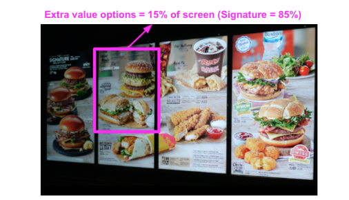
Dynamic menus were the biggest change. While value items are typically static pics, signature items are animated.
Our peripheral vision specializes in detecting motion. Dynamic signature items capture our attention and end up in our potential choice set.
Dynamic menus were the biggest change. While value items are typically static pics, signature items are animated.
Our peripheral vision specializes in detecting motion. Dynamic signature items capture our attention and end up in our potential choice set.
4/ Decision anchoring
First options are key in decision-making. In a study of buffets, 70% of eaters put one of the first 3 items on the plate.
Signature items are often the 1st thing you see. By highlighting them, they are nudging the higher-margin items into your choice set.
First options are key in decision-making. In a study of buffets, 70% of eaters put one of the first 3 items on the plate.
Signature items are often the 1st thing you see. By highlighting them, they are nudging the higher-margin items into your choice set.

5/ Optimized for working memory
Cognitively, humans can hold 5-9 "items" in our working memory at one time (e.g., 7-digit phone numbers).
McDonald's dynamic menus highlight 7-10 items. Naturally, the majority of the menu real estate emphasizes higher-margin items or combos.
Cognitively, humans can hold 5-9 "items" in our working memory at one time (e.g., 7-digit phone numbers).
McDonald's dynamic menus highlight 7-10 items. Naturally, the majority of the menu real estate emphasizes higher-margin items or combos.

6/ Price anchoring
Even if *none* of the signature item nudges work, we've been exposed to the priciest items on McDonald's menu.
A subsequent purchase from regular (or value) menu will seem like more of a deal based on the price difference...leading to the perception of value.
Even if *none* of the signature item nudges work, we've been exposed to the priciest items on McDonald's menu.
A subsequent purchase from regular (or value) menu will seem like more of a deal based on the price difference...leading to the perception of value.

7/ The power of grouping images
Gestalt principles describe how humans perceive objects and one of them is pattern matching.
McDonald's often groups 3 similar images together of a single product category (usually Signatures) to create a "pattern" that captures our attention.


Gestalt principles describe how humans perceive objects and one of them is pattern matching.
McDonald's often groups 3 similar images together of a single product category (usually Signatures) to create a "pattern" that captures our attention.


8/ Health halo
Studies show that menus with healthy food items actually end up pushing people to eat junk food.
Why? The healthy images raise the "health index" of an entire choice set, giving us permission to indulge.
Naturally, McDonald's includes such images on its menu.
Studies show that menus with healthy food items actually end up pushing people to eat junk food.
Why? The healthy images raise the "health index" of an entire choice set, giving us permission to indulge.
Naturally, McDonald's includes such images on its menu.

9/ Experience chunking
Inside the restaurant, McDonald's separated the order and waiting lines.
The key here is that our perception of "waiting" is reduced vs. if it was a single line. Thus, our memory of the experience is that the wait "wasn't too long".
Inside the restaurant, McDonald's separated the order and waiting lines.
The key here is that our perception of "waiting" is reduced vs. if it was a single line. Thus, our memory of the experience is that the wait "wasn't too long".

10/ Self-order kiosks
You've probably used one. While the joke is that McDonald's is making us work, the kiosks are *def* effective at making us spend.
How? We don't feel pressure/anxiety of ordering in line. Instead, we take time and fully customize (=spend more) on the order.
You've probably used one. While the joke is that McDonald's is making us work, the kiosks are *def* effective at making us spend.
How? We don't feel pressure/anxiety of ordering in line. Instead, we take time and fully customize (=spend more) on the order.

11/ The logo
This isn't part of the redesign but worth flagging: the colors in McDonald's logo are very strategic.
We see color before words and images. And many fast food chains use red, which evokes urgency and desire.
(Research suggests it raise blood pressure/appetites).
This isn't part of the redesign but worth flagging: the colors in McDonald's logo are very strategic.
We see color before words and images. And many fast food chains use red, which evokes urgency and desire.
(Research suggests it raise blood pressure/appetites).

12/ If you enjoyed that, I write threads breaking down tech and business 1-2x a week.
Def follow @TrungTPhan to catch them in your feed.
Here's a one that might tickle your fancy:
Def follow @TrungTPhan to catch them in your feed.
Here's a one that might tickle your fancy:
https://twitter.com/TrungTPhan/status/1451938190110052360
13/ I also do a Saturday round-up of the funniest tweets and memes on a trending topic (+ occasional thinkboi piece).
Subscribe here: trungphan.substack.com
Subscribe here: trungphan.substack.com
14/ Source
RD: rd.com/article/mcdona…
CNN: cnn.com/2020/11/11/bus…
The Hustle: thehustle.co/11182020-mcdon…
Behavioral Econ (this is the main source, very good): behavioraleconomics.com/loving-psychol…
RD: rd.com/article/mcdona…
CNN: cnn.com/2020/11/11/bus…
The Hustle: thehustle.co/11182020-mcdon…
Behavioral Econ (this is the main source, very good): behavioraleconomics.com/loving-psychol…
16/ Here’s an interesting video breaking down McDonald’s dynamic menu.
🔗
🔗
17/ Old school!
https://twitter.com/dividendgrowth/status/1459938225674412036
18/ The biggest McDonald’s hack…A+ Twitter ad placement
https://twitter.com/ian_barnard/status/1460013667710345217
• • •
Missing some Tweet in this thread? You can try to
force a refresh


