1/ Poverty lines in high-income countries are drawn at about int-$ 30 per day.

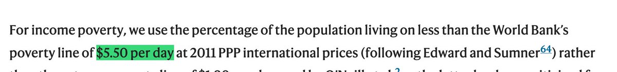
I find it extremely unethical that researchers from high-income countries publish articles in which they assess whether people live in a "safe and just space" and use a poverty line of *$5.50 / day*.
2/ These researchers are from the UK, a country where less than 1% of the population live on less than int-$5.50 per day.

Do these researchers actually believe that this is a reasonable assessment of poverty in the UK?
3/ Would these British researchers agree if Boris Johnson would quote their research and declare that only less than 1% of the British population live in poverty?
4/ Here is the paper: nature.com/articles/s4189…
5/ There is a need to use extremely low poverty lines (like $5.50). They focus the attention on the extremeley poor people.

But I find it incomprehensible – despicable really – to use such low poverty lines for the assessment of whether people live in a 'safe and just space'.
6/ Global Poverty is one of the biggest injustices in our world and these authors are glossing over the deep poverty that billions of people live in.
7/ In my view it's an unbelievably large ethical failure of these researchers to publish such writing that minimizes the poverty of others.

It's beyond me why they can write it and also how someone can publish it.
/ If you are interested, here is my text from earlier this year on why we need extremely low poverty lines, but why we should definitely not use these poverty lines in any assessment of whether people live in a 'safe and just space'.

ourworldindata.org/higher-poverty…

• • •

Missing some Tweet in this thread? You can try to force a refresh
 

Keep Current with Max Roser

Max Roser Profile picture

Stay in touch and get notified when new unrolls are available from this author!

Read all threads

This Thread may be Removed Anytime!

PDF

Twitter may remove this content at anytime! Save it as PDF for later use!

Try unrolling a thread yourself!

how to unroll video
  1. Follow @ThreadReaderApp to mention us!

  2. From a Twitter thread mention us with a keyword "unroll"
@threadreaderapp unroll

Practice here first or read more on our help page!

More from @MaxCRoser

16 Nov
The @IEA produces detailed, global energy and climate data.

But its funders – the energy ministries – force it behind paywalls.

Now @chrismatisch built a site in which you can write to your minister to ask them to make this data public.

It takes 1 minute.
This is the email template.

For some countries the email template is in the country's language and addressed to the minister (as in my screenshot for the US minister).

For other countries I'm sure @chrismatisch would appreciate a translation if you speak the country's language. Image
Here is the website: free-iea-data.com
Read 4 tweets
2 Nov
The first "major outcome" of #COP26 is that the politicians made the promise "to end and reverse deforestation" by 2030 and allocate $14 billion to this: bbc.com/news/science-e…

Is this realistic? Here is the long-term perspective on global deforestation:
ourworldindata.org/global-defores… Image
The @OurWorldInData text I linked above is @_HannahRitchie's summary of the history of deforestation.

Deforestation peaked in the 80s and has slowed down since, but is still very large.
If we want to end deforestation – as now declared at COP – we need to understand the drivers of deforestation.

Here is Hannah's text on that: ourworldindata.org/what-are-drive…
Read 4 tweets
12 Oct
Ich denke die Journalisten die ständig darauf abzielen vermeintliches Versagen in den Vordergrund zu stellen, sind Teil der Antwort warum sich nicht mehr Menschen in Deutschland impfen lassen.

Unverantwortlich jedenfalls vom Spiegel diese Schlagzeile abzudrucken.

1/n
Wie weiter unten im Artikel erklärt wird, ist ein Anstieg der Impfdurchbrüche logischerweise die Konsequenz wenn mehr Menschen geimpft sind.

Der Anstieg der Impfdurchbrüche ist die Folge einer positiven Entwicklung. (Wären 100% geimpft, dann wären alle Infektionen Durchbrüche!)
Die Statistik die aussagekräftig ist, ist der *Vergleich* zwischen Geimpften und Ungeimpften.
Und der macht sehr klar wie gut uns die Impfung schützt.
Read 8 tweets
9 Oct
It is not 'incoherent' to rely on GDP.

GDP per capita is a measure of average income.

If you want to know several other things about our world, you can look at other measures.

[↓ a thread with some thoughts]
For some reason journalists copy this lazy 'criticism' of GDP from each other.
Yes, we want to know many things, but it's nonsense to criticize one metric for not being all the other metrics.

Child mortality also doesn't tell us about environmental degradation. That's fine too.
If you want to know about environmental degradation then look at measures of environmenal degradation.

You find it all on @OurWorldInData – and elsewhere.
Read 7 tweets
7 Oct
My new post with ⁦@_HannahRitchie⁩ is out.

We are trying to improve the situation of the @IEA.

The title is: ‘The IEA publishes the detailed, global energy data we all need, but its funders force it behind paywalls. Let’s ask them to change it.’ ourworldindata.org/iea-open-data
As we explained in that post, it’s the energy ministers who are responsible. They could change it and make this data and research available to the public.

If you want to help, you can write to them and tell them that the public needs this data
The prices for access to some of the @iea's datasets are incredibly high. For example a single license for this dataset costs €1400.
Read 5 tweets
10 Sep
When I make data visualizations I use the software @Tableau.

It is great, though very expensive ($70 per month) – but amazingly, if you are a student, professor, or academic they make it available to you for free.

You can apply for a license here: tableau.com/community/acad…
@tableau All interactive visualizations on @OurWorldInData – for example our COVID Data Explorer ourworldindata.org/coronavirus-da… – are built by us with software that we produce in our team.

We call it Our World in Data Grapher and it’s available open source here github.com/owid/
@tableau @OurWorldInData Non-interactive visualizations – one-off visualizations that are a bit more unusual – I almost always start in @tableau.

I load the data, explore it and build the basic visualization there.

Tableau is super powerful and you can do all kinds of things.
Read 6 tweets

Did Thread Reader help you today?

Support us! We are indie developers!


This site is made by just two indie developers on a laptop doing marketing, support and development! Read more about the story.

Become a Premium Member ($3/month or $30/year) and get exclusive features!

Become Premium

Too expensive? Make a small donation by buying us coffee ($5) or help with server cost ($10)

Donate via Paypal

Thank you for your support!

Follow Us on Twitter!

:(