When I make data visualizations I use the software @Tableau.

It is great, though very expensive ($70 per month) – but amazingly, if you are a student, professor, or academic they make it available to you for free.

You can apply for a license here: tableau.com/community/acad…
@tableau All interactive visualizations on @OurWorldInData – for example our COVID Data Explorer ourworldindata.org/coronavirus-da… – are built by us with software that we produce in our team.

We call it Our World in Data Grapher and it’s available open source here github.com/owid/
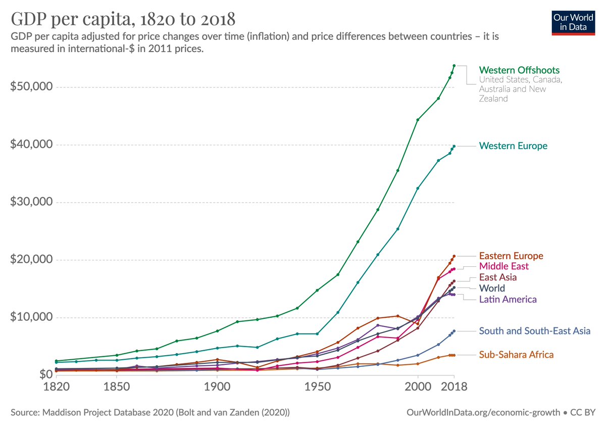
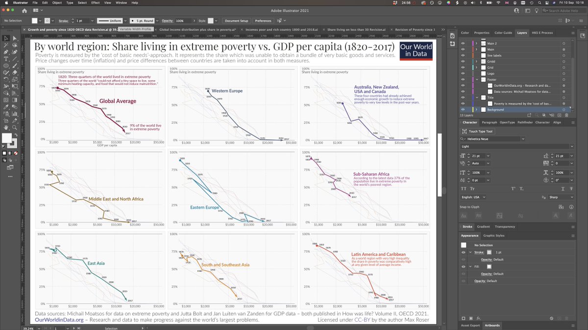
@tableau @OurWorldInData Non-interactive visualizations – one-off visualizations that are a bit more unusual – I almost always start in @tableau.

I load the data, explore it and build the basic visualization there.

Tableau is super powerful and you can do all kinds of things.
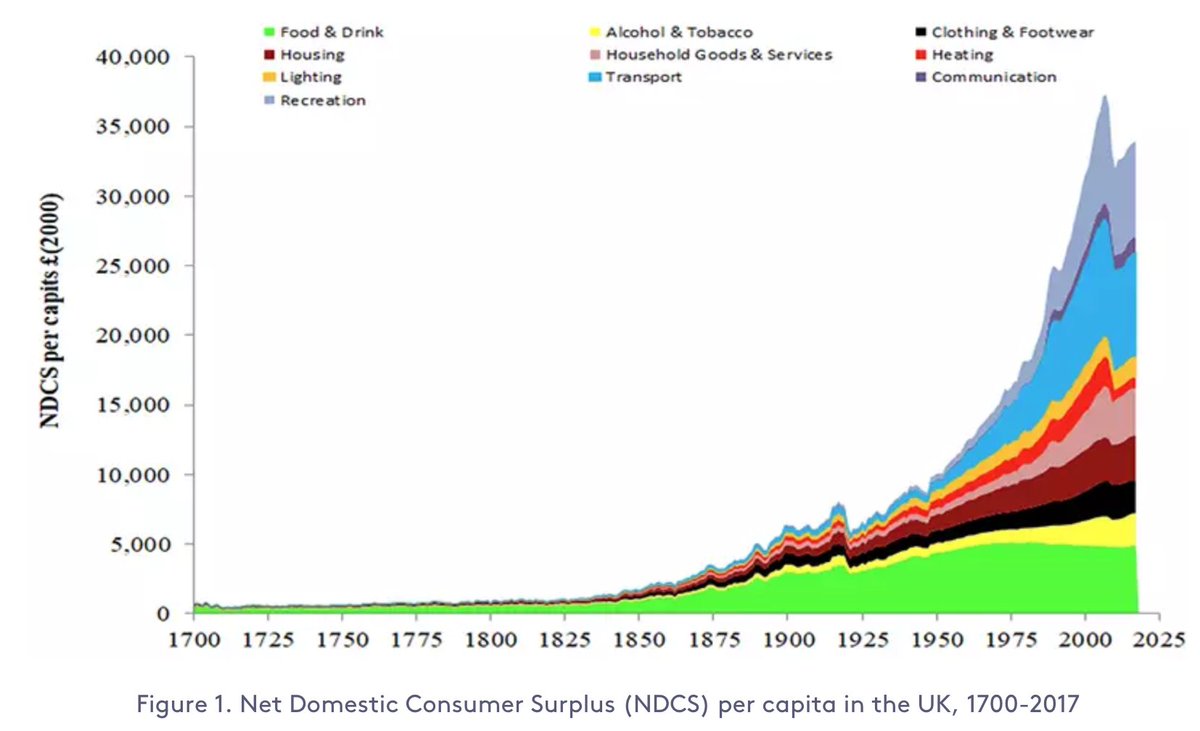
@tableau @OurWorldInData And once I have the main visualization built in Tableau I export it as a pdf and import it into Adobe Illustrator where I finish it all.

I put a title on top, add explanations into the visualization, choose the colors, add source information, etc. etc.
This last point is one of my data-viz-tips for every situation:

I think some people spend way too much time adding nice annotations and titles in their data-analytics software (R, Stata etc.) when it’s much better to export the chart and add those in a graphics-software instead.
Anyways, the main point of this thread was to tell all you academics out there that you can get @tableau for free.

And to thank @tableau for making their awesome software available for free to me and my colleagues at @OurWorldInData. Thank you!

• • •

Missing some Tweet in this thread? You can try to force a refresh
 

Keep Current with Max Roser

Max Roser Profile picture

Stay in touch and get notified when new unrolls are available from this author!

Read all threads

This Thread may be Removed Anytime!

PDF

Twitter may remove this content at anytime! Save it as PDF for later use!

Try unrolling a thread yourself!

how to unroll video
  1. Follow @ThreadReaderApp to mention us!

  2. From a Twitter thread mention us with a keyword "unroll"
@threadreaderapp unroll

Practice here first or read more on our help page!

More from @MaxCRoser

4 Sep
@JKSteinberger @musta_joutsen @_HannahRitchie Hi Julia. I’ve been thinking about this paper after I read it last weekend and I I just can’t understand how you possibly wrote this paper.

I don’t understand how you ever thought it was reasonable to think of measuring human needs with a poverty line of $3.20?
@JKSteinberger @musta_joutsen @_HannahRitchie It’s good to hear that you now agree that $3.20 is the “wrong” poverty line.

But the fact that you relied on this extreme poverty line in your research paper is not a minor thing in this paper. It is what is driving your main result.
@JKSteinberger @musta_joutsen @_HannahRitchie If you would have relied on any reasonable poverty line – $20, $30, $40 a day – you would have obviously found that *the world needs very, very large growth to end poverty*.
Read 10 tweets
26 Aug
1/ A mistake that I see often in the websites of international organizations is that they build data presentation tools as one-off projects.

Right when the new site launches it works well – but as the web & their data changes it quickly gets worse.

Two years later it's broken.
2/There are two ways to avoid this:

– You can hire a team of developers dedicated to maintaining the data presentation across your site. That is great, but it is expensive.

– You can rely on the software that is actively maintained and improved by others.
3/For the second option you can rely on our software if you like our tools.

We at @OurWorldInData make all our work available as global public goods. Our software too.

You find all our software open-source here: github.com/owid
Read 7 tweets
29 Jul
Mini-thread on why to donate.

– If you do have a high income then this is largely because you were lucky to be born at the right place and time.

– If you were born in the past or in a low-income country you'd be poor.

[See my post 'What is growth?' ourworldindata.org/what-is-econom…]
2/ Research shows: a person's home country explains *two-thirds* of the variation of income differences between all people in the world ourworldindata.org/poverty-growth…

This means where you are born is more important for how poor or rich you are than *everything else put together*.
3/ If you do have a high income, you have the opportunity to give some of your money away to support others who were less lucky than you.
Read 8 tweets
17 Jul
In their mission statement the @Guardian says that their work wants to "improve the world, not just critique it" and they want to "bring about a more hopeful future".

👇 This is their front page right now.

I am skeptical that their work "brings about a more hopeful future".
I was tweeting the above cause I want to achieve what the Guardian says in their mission.

I want my work to improve the world and I want to bring about a more hopeful future.

👇This is how I think about it.

(it's a paragraph from this brief essay: ourworldindata.org/much-better-aw…)
If you are interested in how journalists decide what to report on and how their decisions impact people's perception of their world.

Five years ago the journalists @tirosenberg and @dnbornstein wrote this article. I think about it often.
nytimes.com/2016/11/15/opi…
Read 5 tweets
5 Jul
'Energy poverty and indoor air pollution: a problem as old as humanity that we can end within our lifetime'

My new post is out: ourworldindata.org/energy-poverty…

👇 A thread with my main points below
The lack of access to modern energy sources subjects people to a life of poverty.

If you don’t have artificial light, your day is over at sunset.

This is why the students in this photo are out on the street: they had to find a spot under a streetlight to do their homework.
It’s a photo that shows both the determination of those who were born into poverty, but also the steep odds that they have to work against.
Read 23 tweets
18 May
A chart from a very interesting, ongoing research project of Roger Fouquet at the LSE lse.ac.uk/granthaminstit…

He estimates the 'Net Domestic Consumer Surplus' – as a measure of economic welfare to complement GDP – for the UK over the last 300 years.
It's a very ambitious project – he has to do extensive historical data work to reconstruct the consumption of goods and services over the last three centuries.
As Roger mentions in the link above, he is looking for funding to finish this work.

Do you know a person or an institution that would be interested to fund this research project?

If so, let him know – his email is at the link.
Read 5 tweets

Did Thread Reader help you today?

Support us! We are indie developers!


This site is made by just two indie developers on a laptop doing marketing, support and development! Read more about the story.

Become a Premium Member ($3/month or $30/year) and get exclusive features!

Become Premium

Too expensive? Make a small donation by buying us coffee ($5) or help with server cost ($10)

Donate via Paypal Become our Patreon

Thank you for your support!

Follow Us on Twitter!

:(