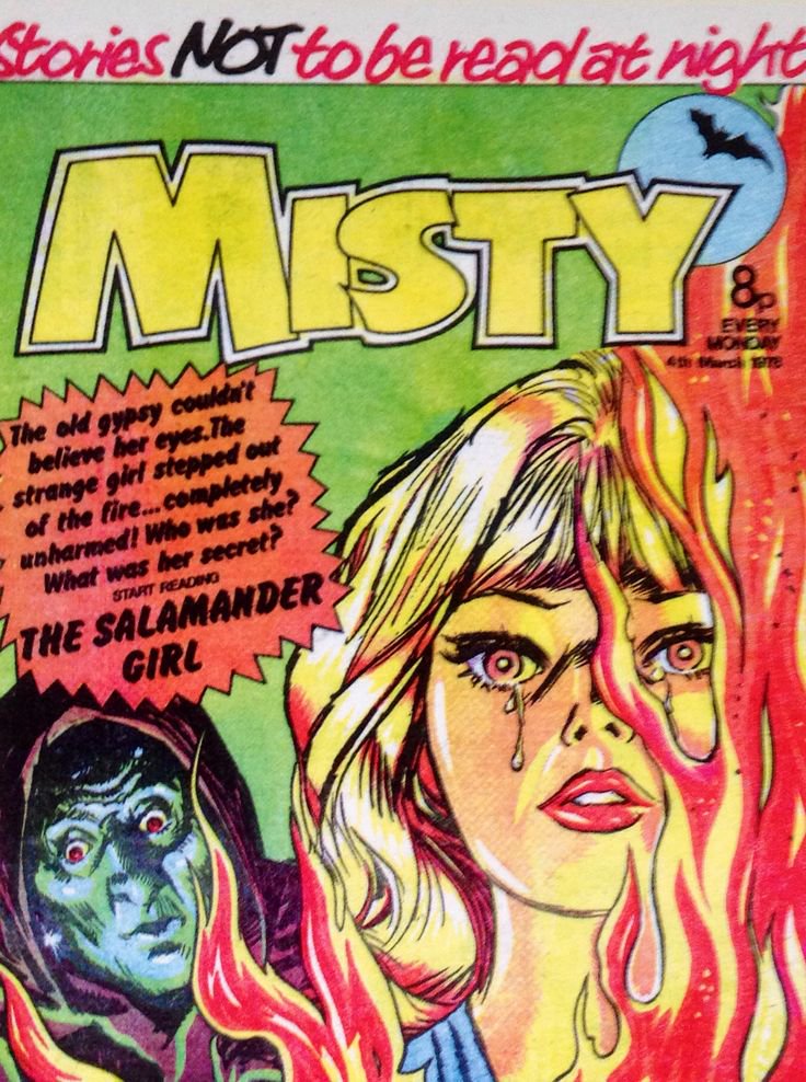
Today in pulp I look back at one of the most terrifying British comics of the 1970s: scary, supernatural and just for girls: Misty. 

IPC comics already had a reputation for tough titles by 1978: Action comic had been denounced in parliament for its violent content. But Pat Mills wanted a vehicle for fearful supernatural stories and persuaded IPC to run with his idea: a mystery comic aimed at girls. 

Rival publisher D.C. Thompson had already launched its own supernatural girl's comic Spellbound in 1976, but Misty would be in a league of its own when it hit newsstands in 1978. 

Mills had just left IPC's 2000AD comic when he set up Misty, although he would only be a consultant editor on the new title. He took the comic's name from the film Play Misty For Me. 

Misty stories focused on the occult, horror and the supernatural. It boasted of "Stories NOT to be read at night!" But Mills had wanted it to be even stronger in its storytelling, and apparently believed the comic pulled its punches a little. 

Like many IPC titles Misty had a 'narrator' who introduced each issue - the eponymous Misty, drawn by Shirley Bellwood. Her role was to be a point of entry for the reader to the various supernatural stories. 

Misty stories were far from ordinary however: in the Four Faces of Eve the amnesiac heroine discovers she is a re-animated entity made from the corpses of four different girls and her 'parents' are actually scientists monitoring her. Pretty strong stuff for a pre-teen audience. 


The Sentinels was a story of two huge tower blocks, which were actually gateways to a parallel Earth where the Nazis had won the war. School of the Lost was a macabre twist on the boarding school story, where parents paid a special 'tribute' for their children's education. 


But Misty's lead story was Moonchild, about a girl with telekenetic powers. IPC had a habit of borrowing themes from popular movies, and Moonchild is a story strongly influenced by Stephen King's Carrie. 


Misty also included a number of single stories, normally across three or four pages. The panel layout often emphasised the drama: lots of jagged edges and tightly framed images. 


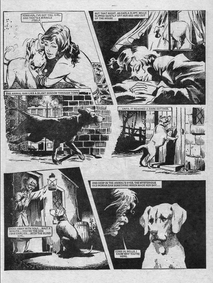


There's no doubt that Misty was hugely popular with readers: the first issue sold a quarter of a million copies. It genuinely treated pre-teen girls as a mature and savvy audience that would enjoy gothic tales of terror and the occult. 


However IPC was notorious for merging comics, even popular ones, at short notice. Sadly in 1980 Misty was merged with Tammy, and soon the supernatural horror stories faded away... 


Misty Christmas annuals continued to be issued by Fleetway Publications up to 1986. These mostly contained old stories as well as quizzes, puzzles and jokes. 


Misty stories were genuinely frightening, reusing a number of horror movie concepts from the 1970s. It's doubtful whether parents ever knew exactly what their children were reading, though the readers knew they were enjoying it. 


Fortunately Misty stories have now been republished by Rebellion comics, so if your mum threw your old issues out you can finally read 'em again. Do check out the epic Misty fan site as well: mistycomic.co.uk/Welcome.html 

Will there ever be another Misty? Who knows. Comics of the 1970s treated children as an intelligent audience, and weren't afraid to push the limits of 'appropriate' storytelling for them. That's why we remember them so fondly.
More stories another time...
More stories another time...

• • •
Missing some Tweet in this thread? You can try to
force a refresh


