Should crypto investors buy the dip or cut their losses?
While there's a lot of discussion, most of it isn't backed by data.
Here's a thread on what the numbers tell us about altcoins bouncing back and the validity of dip-buying:👇
While there's a lot of discussion, most of it isn't backed by data.
Here's a thread on what the numbers tell us about altcoins bouncing back and the validity of dip-buying:👇
For simplicities sake, we're looking within market cycles, not from market cycle to market cycle.
So this thread will look at four points in time:
• April 14, BTC ATH (Peak 1)
• July 20, BTC bottom (Trough)
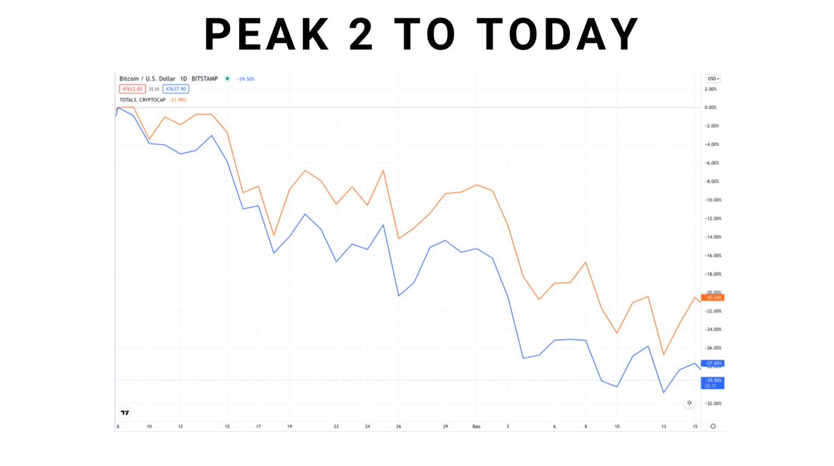
• November 8, BTC ATH (Peak 2)
• December 15, (Present)
So this thread will look at four points in time:
• April 14, BTC ATH (Peak 1)
• July 20, BTC bottom (Trough)
• November 8, BTC ATH (Peak 2)
• December 15, (Present)
First thing to look at: are alts even worth investing in?
Answer is undoubtedly, yes. Alts have beaten BTC from:
• Trough (July) - Present
• Peak 1 (Apr) - Present
• Peak 2 (Nov) - Present
Answer is undoubtedly, yes. Alts have beaten BTC from:
• Trough (July) - Present
• Peak 1 (Apr) - Present
• Peak 2 (Nov) - Present

First part of the analysis: how do top 200 alts perform by market cap?
Below graph looks at April to July pullback
Below: alt returns compared to market cap ranking.
Line of best fit shows a trend downward, meaning the smaller the alt, the worse the drawdown, at least on avg.
Below graph looks at April to July pullback
Below: alt returns compared to market cap ranking.
Line of best fit shows a trend downward, meaning the smaller the alt, the worse the drawdown, at least on avg.

In this next chart, each dot represents a single crypto.
Vertical axis: % pump from trough to peak
Horizontal axis: % drawdown peak to trough
Line of best fit has negative slope, meaning that the further a crypto draws down, the harder it pumps!
Vertical axis: % pump from trough to peak
Horizontal axis: % drawdown peak to trough
Line of best fit has negative slope, meaning that the further a crypto draws down, the harder it pumps!

That's a crazy takeaway. This graph makes strength in a downturn look irrelevant.
So:
• “Ride winners and cut losers.”
• “Buy relative strength.”
Might be bad investing advice.
So:
• “Ride winners and cut losers.”
• “Buy relative strength.”
Might be bad investing advice.
One more graph:
Vertical axis: % drop from peak to trough
Horizontal axis: % pump from peak to peak
Bottom left: dropped but hasn't pumped past april price
Bottom right: dropped and has pumped past April price
Top right: Pumped during drawdown, continued to pump afterwards
Vertical axis: % drop from peak to trough
Horizontal axis: % pump from peak to peak
Bottom left: dropped but hasn't pumped past april price
Bottom right: dropped and has pumped past April price
Top right: Pumped during drawdown, continued to pump afterwards

Avg return, July - Nov:
• Cryptos that dropped Apr-Jul: 186%
• Cryptos that pumped Apr-Jul: 113%
Cryptos that lost ground pumped harder. Winners didn't do as well.
• Cryptos that dropped Apr-Jul: 186%
• Cryptos that pumped Apr-Jul: 113%
Cryptos that lost ground pumped harder. Winners didn't do as well.
So the real takeaway from this is:
• Losers tend to bounce back (surprisingly well)
• Buying the top is a bad idea
• Winners tend to continue doing well
• Losers tend to bounce back (surprisingly well)
• Buying the top is a bad idea
• Winners tend to continue doing well
If you'd like to take a look, here are the biggest losers and winners of the last 1.5 months.
$MATIC is the only top 200 crypto that pumped across all time frames:
• 66% Apr -July
• 162% July - Nov
• 12% Nov - Today.

$MATIC is the only top 200 crypto that pumped across all time frames:
• 66% Apr -July
• 162% July - Nov
• 12% Nov - Today.


Did you like the thread? Please do me a favor by favoriting/retweeting it. I've got it linked below.👇
Give me a follow if you're interested in more data-backed altcoin analysis: @jackniewold
Give me a follow if you're interested in more data-backed altcoin analysis: @jackniewold
https://twitter.com/JackNiewold/status/1471658337418637313?s=20
Last thing: this thread is based on a newsletter I wrote! You should check it out, we perform crypto analysis and write reports on altcoins!
Link below: cryptopragmatist.com/sign-up-twitte…
Link below: cryptopragmatist.com/sign-up-twitte…
• • •
Missing some Tweet in this thread? You can try to
force a refresh


