Some may recall I got into a brief disagreement with @jfeldman_epi a few weeks back about whether or not it's *always* appropriate to adjust for age when running COVID death rate numbers. Having said that, he makes some valid points here: jmfeldman.medium.com/a-year-in-how-…
For me, the single biggest mistake made by the Biden Administration (or at least the CDC...but the buck stops w/the WH) was on May 13th when @CDCDirector Walensky issued her "fully-vaxxed can take of their masks!" guidance, which was a TERRIBLE change. abcnews.go.com/Politics/fully…
Many people, including myself, roasted the @CDCgov at the time for this change at the time (I wrote a whole thread about it), but the moment the words left her mouth it was too late anyway; genie out of the bottle/etc:
Having said that, I think he also does a lot of hand-waving away of the political realities with statements like this:
He *does* acknowledge the political/polarization factor later on, but again, I think he vastly understates just how "entrenched" that Republican opposition is:
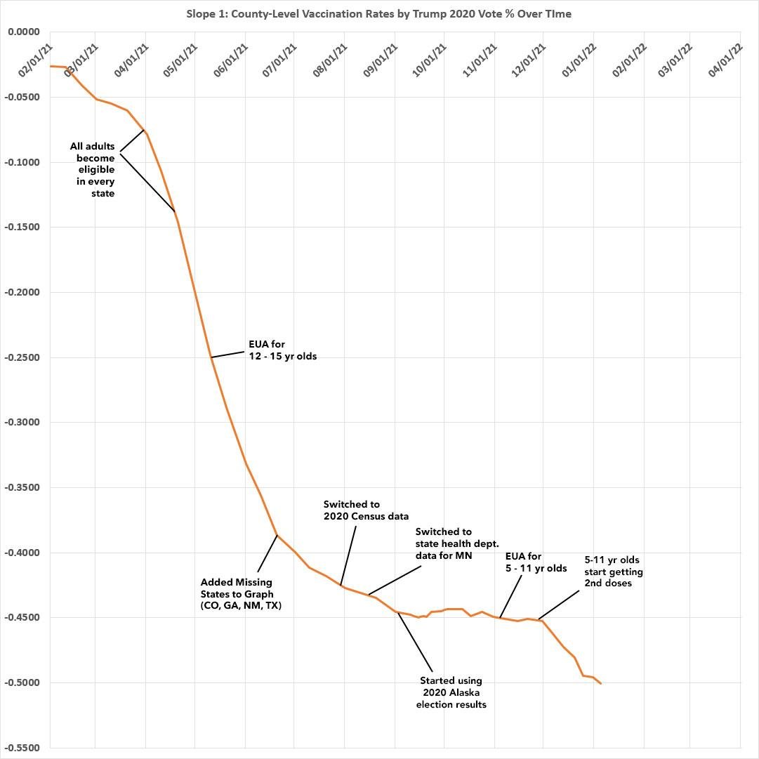
I've posted the graph below many times over the past 8 months or so, but I don't think people fully understand that it's not just how steep the slope is NOW, it's how it's CHANGED over time:
This animation only runs from February 2021 - August 2021, but you can clearly see that the Red/Blue vaccination divide only started AFTER most senior citizens had gotten vaxxed:
THESE graphs tell the story all the way from February through the end of December. The first is the R^2 (correlation strength). The second is the slope itself (the angle of the trend line).
Notice what happened the moment the vaccines became available to all adults?
The moment grandma & grampa were fully vaxxed, the GOP/MAGA/FOX went into overdrive on a robust anti-vaxx campaign. It worked like a charm, though the effect started to flatten out around mid-September...only to start up again as soon as 5-11 yr olds were approved.
• • •
Missing some Tweet in this thread? You can try to
force a refresh
This morning I noted that the first week of 2021 (Omicron) looks very different than the last 6 months of 2021 (Delta).
First 2 graphs: Case/Death rates from 7/01/21 - 12/31/21
Second 2 graphs: Case/Death rates for the first 6 days of 2022 (w/projections for the full month):
When looked at by *vaccination rate* it's a similar story, but far less dramatic of a shift (so far): Case rates are actually *higher* in the most-vaxxed counties, but death rates are still much higher in the least-vaxxed counties...just less so than during the Delta wave.
Again, the second set of graph only include the first 6 days of January; each additional day of data can shift these around dramatically. And of course the new wave hit the big, densely-populated cities first (as prior waves have) so it makes sense that they'll get slammed first.
📣 CURRENT ENROLLEES: If you've learned the plan you're enrolled in now isn't the best value, preferred docs/hospitals aren't in network, etc, YOU CAN STILL SWITCH PLANS BETWEEN NOW & THE END OF OPEN ENROLLMENT!
You can switch to a different plan which will start February 1st.
📣 ENROLL VIA AN *OFFICIAL* #ACA EXCHANGE (or an *authorized* enrollment partner)!
Avoid scams by enrolling via HealthCare.Gov in most states (if you live in one of the 18 states w/its own exchange, HC.gov will redirect you when you enter your state).
Remember when @LeePrevost insisted that I was cherry-picking COVID data & I'd ignore it if the tide turned back to blue/Dem counties being hit harder again (even though I'd already been tracking it since the 1st wave in spring 2020)? Seriously, he spammed Twitter with his claim.
Well, I'm sure he'll be disappointed to see this: While the Delta Wave decimated red counties, for the first 6 days of 2022, at least, the *case* rates are a very different story: January cases so far are running 2.3x higher in the bluest 10th of the U.S. than the reddest 10th.
Meanwhile, the *death* rate for the first week of January continues to swing heavily towards heavily red counties...but the gap is far less dramatic so far than it was during the Delta Wave: It's "only" 86% higher in the reddest 10th of the U.S. than the bluest 10th.
.@NateSilver538 just literally compared a year of remote learning to nearly half a million people being killed.
Does he have any children? I do. He hated remote learning but not once did he or I ever think “man, I’d kill 460,000 people just to get back to in-person learning!”
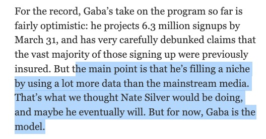
There was a time when, as a data wonk, I considered him to be a role model. Back in 2014 when I got my 15 minutes of fame for my ACA data tracking, a few folks referred to me as "the Nate Silver of Obamacare" and I was embarrassed because I didn't think I was worthy.