
THREAD: Could the current energy crisis be even worse than the 1970s oil price shock? Given the legendary status of that event it might seem like a preposterous question. But we’ve crunched the numbers on this and they’re not pretty…
Before we get to the data it’s perhaps worth splitting up the 1970s comparison into two parts: first, the financial impact on households.
Second, the impact on the wider economy: shutdowns, three days weeks and so on. Let’s deal with household finances first.
Second, the impact on the wider economy: shutdowns, three days weeks and so on. Let’s deal with household finances first.
It so happens the UK has an excellent set of statistics on what the “average” household spends its money on each year. £588 a week Everything from restaurants, culture, food/drink, mortgage payments, council tax, income tax and, of course energy bills: a quick guided tour here:
Now that energy bill slice may not look big but bear in mind if it goes up to £2k this spring that's up from £25 a week to £38 a week.
If, as is plausible given where wholesale prices are, the formula puts it at £2.4k in autumn, that's £46.
If, as is plausible given where wholesale prices are, the formula puts it at £2.4k in autumn, that's £46.
If u assume other spending rises in line with nominal GDP (I've used OBR forecasts) then that £38 a week would equate to 5.6% of total spending.
That £46 (in the event of the price cap going all the way to £2.4k) would be 6.8% of total spending.
How high is that vs history?
That £46 (in the event of the price cap going all the way to £2.4k) would be 6.8% of total spending.
How high is that vs history?
Happily we have a LONG run of data on this. Not all of it is on the @ONS website but I've managed to get hold of family spending numbers going back to 1970.
Look at spending on domestic energy up til recently: rises quite high in the 70s and 80s. Drops lower in the 90s/2000s
Look at spending on domestic energy up til recently: rises quite high in the 70s and 80s. Drops lower in the 90s/2000s

Now let's add on the numbers if the price cap goes up to £2,000. The proportion of household spending going on heat/power is suddenly up to the highest since the late 1980s, 1987 to be precise.

If the price cap were to rise to £2.4k later this year then the proportion UK households spend on heat and power would be the highest ON RECORD. Higher even than the 1970s. So it's not preposterous to compare this: in many ways the domestic impact could be worse than the 70s

How "unprecedented" are these numbers? Not 100% sure. In general energy prices came down quite a lot in the 1950s and 1960s.
Then again, I've seen some papers suggesting that even in the 1930s the avg amount people paid for energy was well below this: jstor.org/stable/23015065
Then again, I've seen some papers suggesting that even in the 1930s the avg amount people paid for energy was well below this: jstor.org/stable/23015065

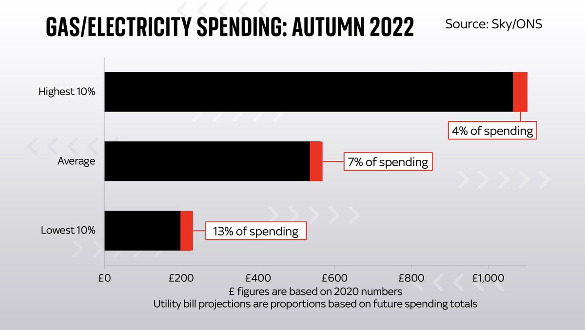
Of course, there's no such thing as an "average" household, and the impact will be far greater on low income households for whom energy already constituted a bigger share. So while the top tenth may see bills up from c.3% of total to 4%, for the bottom 10% it's up to 13% or more
Now, as we established above, the 70s crisis wasn't just about domestic bills. In many senses it was about the nature of industry: factories were shuttered, power was rationed, 3 day week etc. Could that happen again?
This seems less likely, but not for an altogether encouraging reason. The key is this chart. Back in the 60s and 70s, more than 40% of people worked in the energy/manufacturing sectors. They were at the core of the economy so everyone NOTICED if they were curtailed...
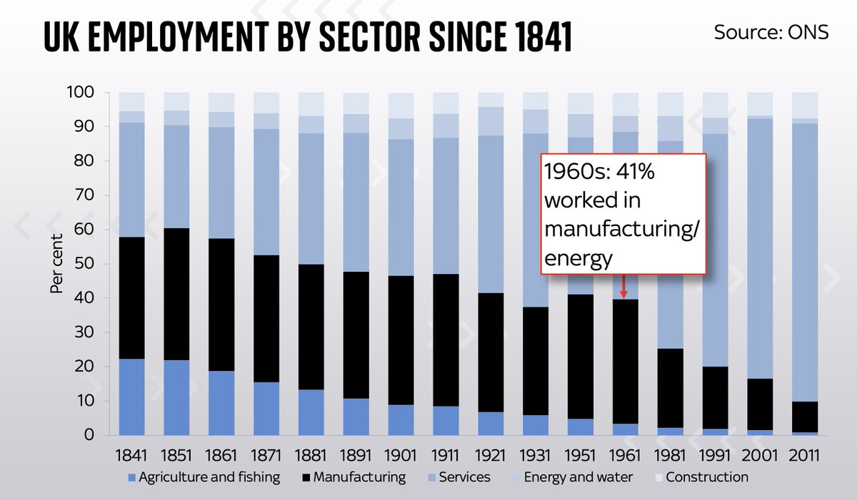
Roll on to the 2000s and barely a tenth of people work in the kinds of sectors which have high energy usage and might therefore be curtailed. Even if there are shutdowns they're unlikely to have the same cultural impact as back in the 1970s

This doesn't mean there won't be an industrial impact. But in the same way as we've offshored our manufacturing the industrial energy impact is offshored too.
Factories in China are already shutting down (part Covid, part energy).
Which portends more supply chain problems ahead
Factories in China are already shutting down (part Covid, part energy).
Which portends more supply chain problems ahead
Consider that this is all coming at the same time as payroll taxes and interest rates are going up. And the @bankofengland is raising interest rates too. All told, discretionary items accounting for nearly 40% of household spending (the red bits) are on the way up. Big squeeze.

Full news story: families facing the biggest energy squeeze on record as prices begin to bite news.sky.com/story/energy-c…
Here, in video form, is my analysis on the impact higher energy prices could have on household bills in the coming months. In short: this could be an even worse squeeze than following the famous energy crises in 70s/80s. Produced by @aoifeyourell
• • •
Missing some Tweet in this thread? You can try to
force a refresh


