Ed Conway Profile picture
Jan 19 5 tweets 3 min read
NEW: UK benchmark inflation rate rises to highest level since 1992. Consumer Prices Index hit 5.4% in Dec, up from 5.1% in Nov and way above @bankofengland 2% target ons.gov.uk/economy/inflat…
Two questions: first, how high will CPI get in the coming months? @bankofengland said 6% but many economists think 7%.
Second, how soon does BoE raise int rates again? Could be as soon as next meeting in Feb (prob up from 0.25% to 0.5% so still v v low by historical standards)
The point here (and this can't be emphasised enough) is that this 30yr high in inflation is happening BEFORE the impact of a record increase in energy bills which, as I ran through in this thread last night, will squeeze households even further
Of course prices can go down too. And eventually they will. But for the time being the momentum is v much 🆙.
Consider food price inflation:
Already at a 9yr high.
But high gas prices ➡️ fertiliser plant shutdowns ➡️ higher fertiliser prices ➡️ higher food prices next harvest
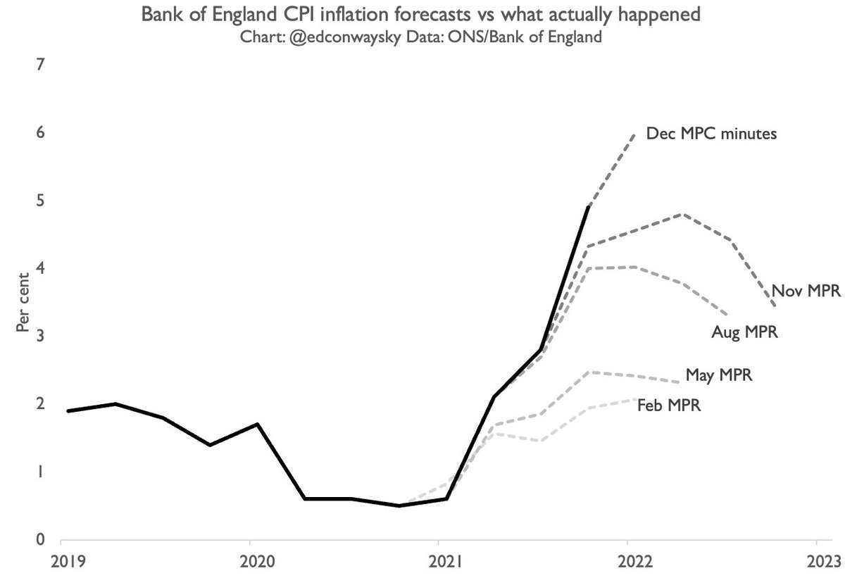
CHART: How the @bankofengland’s inflation forecasts over the past year (grey dashed lines) compare with what actually happened.
See if you can spot a trend.

• • •

Missing some Tweet in this thread? You can try to force a refresh
 

Keep Current with Ed Conway

Ed Conway Profile picture

Stay in touch and get notified when new unrolls are available from this author!

Read all threads

This Thread may be Removed Anytime!

PDF

Twitter may remove this content at anytime! Save it as PDF for later use!

Try unrolling a thread yourself!

how to unroll video
  1. Follow @ThreadReaderApp to mention us!

  2. From a Twitter thread mention us with a keyword "unroll"
@threadreaderapp unroll

Practice here first or read more on our help page!

More from @EdConwaySky

Jan 18
THREAD: Could the current energy crisis be even worse than the 1970s oil price shock? Given the legendary status of that event it might seem like a preposterous question. But we’ve crunched the numbers on this and they’re not pretty…
Before we get to the data it’s perhaps worth splitting up the 1970s comparison into two parts: first, the financial impact on households.
Second, the impact on the wider economy: shutdowns, three days weeks and so on. Let’s deal with household finances first.
It so happens the UK has an excellent set of statistics on what the “average” household spends its money on each year. £588 a week Everything from restaurants, culture, food/drink, mortgage payments, council tax, income tax and, of course energy bills: a quick guided tour here:
Read 17 tweets
Jan 12
Back in 2014 the UK population was projected to be closing in on 75m by 2040.
Latest projections, released today, suggest we’ll have barely more than 70m people by then.
This is a big change.
Some will argue it’s good news. Others bad.
Either way, it’s enormously consequential.
According to the latest official population projections, the UK’s total fertility rate is now 1.59 (long term average of children per woman).
Down from 1.78 in 2018. BIG drop taking it down from comfortably above the OECD avg to below it (tho OECD avg will prob also fall too).
Blimey.
While overall UK population is projected to rise for the foreseeable future, @ONS projections say the Scottish population has now nearly peaked and will be falling quite rapidly by the middle of the century.
Whether this turns out to be right or not, it’s quite a chart.
Read 4 tweets
Jan 10
How many people have died in this country since the beginning of the pandemic?
How does the toll compare with history?
And was 2021 any “better” for mortality than 2020?
Now that we have nearly all the data from 2021 it’s time for an update🧵
Let’s begin with the official death toll, as portrayed on the @UKHSA gov.uk dashboard.
This recently passed 150k and while the numbers are much lower day-by-day than in previous periods, the seven day avg hasn’t dropped below 100 since August. Ugh
But the official toll (150k) is not the only one.
There’s also the ONS toll, based on the no of death certificates where Covid is mentioned: 175k
This overstates it since 10%ish are primarily from other causes.
Then there’s excess deaths (deaths from all causes vs 5yr avg): 151k
Read 16 tweets
Jan 9
It is the great paradox of addressing climate change: in order to go green we may have to do MORE dirty things: burning fossil fuels, digging stuff out of the ground.
The thing we want to escape is the very thing we need to help us escape.
We are not talking enough about this! 🧵
Let’s start by pondering a couple of recent contentious decisions: the first was the decision to shelve the Cambo oilfield in the Shetlands. Shell recently pulled out. The project may not go ahead reuters.com/business/energ…
There are engineering reasons why Cambo might not have made sense: it’s quite distant/deep and the crude is quite “heavy” meaning you need to heat it, and hence expend a lot of energy/carbon to get it to shore. But there was also much political opposition huffingtonpost.co.uk/entry/everythi…
Read 28 tweets
Dec 24, 2021
A few tweets on how we treat absence of evidence and neutrality of science.
Building in a sense from this excellent @slatestarcodex blog astralcodexten.substack.com/p/the-phrase-n…
When omicron appeared we knew v little save for some of its genomic features and fact that it was spreading fast in S Africa.
Ensuing weeks have been unsettling because the virus has spread faster than our ability to understand key features - eg virility & vaccine resistance
Up until quite recently there has been a consistent message from public health officials:
a) we know boosters work. So much so that, says @SajidJavid, 3x doses will soon be considered a "full course" eg not two
b) there's "no evidence" omicron is necessarily milder/less virulent
Read 16 tweets
Dec 22, 2021
A quick tour through the Covid data as of the latest number. Slightly more bad news than good, but that doesn’t mean there’s no good. Let’s start with the overall UK picture. That 106k number a new daily record. And possibly not the last.
The good news is that for the time being the divergence between cases and admissions remains evident for the UK as a whole. Look at the red line vs the black line and look how different that relationship was last winter (eg before vaccines). Amazing really…
But you get a better sense of what’s going on by looking not at UK but at London, where most case growth is. This chart (hat-tip to @PaulMainwood for the concept) shows where we are vs the winter wave. On bright side, the blue/red lines aren’t going up in lockstep with cases.
Read 8 tweets

Did Thread Reader help you today?

Support us! We are indie developers!


This site is made by just two indie developers on a laptop doing marketing, support and development! Read more about the story.

Become a Premium Member ($3/month or $30/year) and get exclusive features!

Become Premium

Too expensive? Make a small donation by buying us coffee ($5) or help with server cost ($10)

Donate via Paypal

Or Donate anonymously using crypto!

Ethereum

0xfe58350B80634f60Fa6Dc149a72b4DFbc17D341E copy

Bitcoin

3ATGMxNzCUFzxpMCHL5sWSt4DVtS8UqXpi copy

Thank you for your support!

Follow Us on Twitter!

:(