A quick tour through the Covid data as of the latest number. Slightly more bad news than good, but that doesn’t mean there’s no good. Let’s start with the overall UK picture. That 106k number a new daily record. And possibly not the last.
The good news is that for the time being the divergence between cases and admissions remains evident for the UK as a whole. Look at the red line vs the black line and look how different that relationship was last winter (eg before vaccines). Amazing really…
But you get a better sense of what’s going on by looking not at UK but at London, where most case growth is. This chart (hat-tip to @PaulMainwood for the concept) shows where we are vs the winter wave. On bright side, the blue/red lines aren’t going up in lockstep with cases.
That being said, hospitalisations in London are rising fast. By about 9% a day on average this past week. What we don’t know is a) how serious those hospitalisations are. ICU numbers still low and b) how long they’ll stay in. In SA hospital stays are much shorter this wave
Another way of looking at the London figs.
Black lines show you trajectory of the Alpha/Kent variant wave last winter.
Red lines show you case growth in this wave.
Cases rising far faster than last winter.
Hospitalisations broadly similar.
Still v early to jump to conclusions tho
Incidentally, it looks as if case growth may now have plateaued in the hottest of London’s Covid hotspots. This is 7 day cases in Lambeth by publication date. Look: is that line turning at the top right? Might be. @AlastairGrant4 keeping a close eye on this stuff.
Finally, for those wondering whether the reason we’re seeing such high case numbers is that we’re testing so much (we are testing a lot), here’s something that adjusts for that: test positivity %.
These lines are also basically vertical. Albeit not yet as high as last winter.
Today’s data was frankly a bit worse than I’d hoped.
That said, it’s still consistent with lower hospitalisation numbers per case, which is something.
Upon which note, good to see Imperial research on Omicron hospitalisations.
Last week: “no evidence”. This week: “some evidence”.

• • •

Missing some Tweet in this thread? You can try to force a refresh
 

Keep Current with Ed Conway

Ed Conway Profile picture

Stay in touch and get notified when new unrolls are available from this author!

Read all threads

This Thread may be Removed Anytime!

PDF

Twitter may remove this content at anytime! Save it as PDF for later use!

Try unrolling a thread yourself!

how to unroll video
  1. Follow @ThreadReaderApp to mention us!

  2. From a Twitter thread mention us with a keyword "unroll"
@threadreaderapp unroll

Practice here first or read more on our help page!

More from @EdConwaySky

14 Dec
Remember this from last night, on the front of pretty much every paper this morning?
The claim that Omicron is infecting 200,000 people every DAY.
There’s been a lot of speculation about whether the number is wrong, based on new data, or something else.
Well, I’ve worked it out🧵
TLDR it’s a back-of-an-envelope sum worked out by @UKHSA to illustrate where Omicron *might* be.
Not new data.
Not definitive.
This doesn’t mean it’s not a valid illustrative number.
But it’s not quite what everyone thought it was.
Let me show you how they came up with it.
It starts with this.
Infections (a modelled estimate of how many people catch Covid at any given time) are not the same as the number of cases (positive test results).
Infections are always higher cos not everyone gets symptoms/tested.
Eg on 21 Nov: 35k cases, 78k infections
Read 16 tweets
1 Dec
NEW: @OECD chief economist @LaurenceEco tells me the Omicron variant is an urgent reminder that rich countries need to do more to help poorer countries get vaccinated.
“As long as the global population is not vaccinated, this type of variant can come in and bring restrictions.”
“We G20 countries have spent about $10tr to support our economies in the pandemic – it costs $50bn to bring vaccines to the entire population,” said @LauBooneEco. “As long as the world stays as is we’re going to see countries which are going to have to shut down their economies.”
Full story here: @OECD warns that the rich world must be prepared for more variant-related shocks if it doesn’t help vaccinate poor countries: news.sky.com/story/help-vac…
Read 13 tweets
29 Nov
What does the data tell us about #Omicron?
Frustratingly little, if we're being absolutely honest.
Much of what's being written about it at the moment is stabs in the dark, based on anecdote or at best small scraps of data.
No point in pretending otherwise
news.sky.com/story/covid-19…
Here's a short video running through some of the data we do actually have on #Omicron.
As I say, uncertainty abounds.
We'll have a lot more data - more reliable, robust stuff - in a week or two. Not that that's all that much help in deciding what policy to enact now.
Problem with charts like this (leaving aside fact that something being 500% higher is NOT the same as it being 500 times higher) is they imply considerably more certainty abt the growth rate of Omicron vs other variants than we really have. Consider…
Read 11 tweets
23 Nov
How many people could still die of #Covid19 in the UK?
It’s an unpalatable question I know, but is worth pondering given cases are on the rise in many parts of Europe.
The good news is that, well, this thread contains better news than you might have thought.
First, the data:
Here’s the big picture. Covid may have been out of the headlines in recent months but the death toll has been creeping higher.
Now up to nearly 168k in the UK, 142k in England.
These are deaths where Covid is mentioned in certificate. Abt 90% were directly attributed to Covid.
You can split it into three broad phases:
1 Wave 1 last spring.
2. Wave 2 (arguably two waves in one) last winter.
3 The period since May.
Here’s the death toll in each (for England). Raising the question: what next. How many more deaths…?
Read 13 tweets
23 Nov
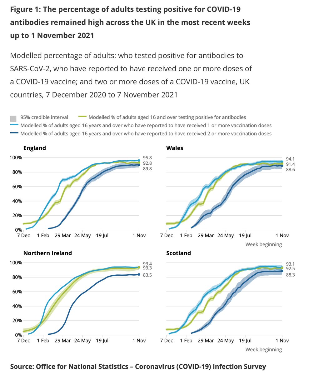
Some 95.8% of adults in England have #Covid19 antibodies, according to @ONS data just released. Figures are broadly similar in Scotland, Wales and NI ons.gov.uk/peoplepopulati…
Couple of striking (if unsurprising) things from age breakdown:
- Among younger people (top row) note how antibodies (green line) is above vaccinations -> immunity from prev infection.
- Among older people (bottom row) you can see the “booster effect” pushing antibodies back up
Apologies I took the number from the wrong line here. Antibodies levels in England are 92.8% of adult population - that 95.8% was the number with 1 or more vaccination. Still very, very high.
Read 4 tweets
3 Nov
CLIMATE FINANCE THREAD
Let's start with a simple question: how much is UK donating to poorer countries to help with climate change?
It's an important question given rich countries collective pledges are falling short of goals. That's been one of the big disappointments of #COP26
So: is the UK a leader or laggard when it comes to the $100bn?
Short answer: we give surprisingly little, given our typical leadership role in international development. But getting to the bottom of this involves diving deep inside a climate finance wormhole. Deep breath...
Let's start with the big picture. The idea behind climate finance is that rich countries should help poorer countries both to adapt to higher temperatures and to reduce their reliance on fossil fuels.
The target was to get to $100bn a year by 2020.
We failed.
Might hit it by 2023
Read 15 tweets

Did Thread Reader help you today?

Support us! We are indie developers!


This site is made by just two indie developers on a laptop doing marketing, support and development! Read more about the story.

Become a Premium Member ($3/month or $30/year) and get exclusive features!

Become Premium

Too expensive? Make a small donation by buying us coffee ($5) or help with server cost ($10)

Donate via Paypal

Or Donate anonymously using crypto!

Ethereum

0xfe58350B80634f60Fa6Dc149a72b4DFbc17D341E copy

Bitcoin

3ATGMxNzCUFzxpMCHL5sWSt4DVtS8UqXpi copy

Thank you for your support!

Follow Us on Twitter!

:(