OK, folks, brace yourselves because here comes the ultimate #BreakfastPaleography thread, in which I will follow the development of the wonderful, magical, mysterious and apparently very flexible letter [g] over the course of more than 2,000 years! Image
We’ll start in Rome, then jump up to the British Isles before heading back to the Continent. Buckle up, ‘cause here we go!
First up, majuscule [G]. This is the boring part of the story. Ancient Latin epigraphic and numismatic inscriptions form capital [G] in just about the same way we still do. Here’s one from 1st-c. Pompei. There, that was easy! db.edcs.eu/epigr/bilder.p… Image
Ah, but minuscule (lower case) [g]? That’s a really interesting tale indeed. Some of the earliest examples of lower-case lettering in the Latin alphabet are written in New Roman Cursive, starting in the 3rd c. Here's @BeineckeLibrary P.CtYBR inv. 2125 (Ravenna, 613-641 CE) Image
Here we see a few different [g]s, but generally it’s an open hook. In ligature, as here, a second stroke makes a crossbar at the top; this will lead us directly to the insular flat-topped [g] in a few centuries. Image
Speaking of flat-topped [g], let’s head up to Northumbria and Ireland, where things were still hopping in the centuries after the withdrawal of the Romans from Britain. Majuscule [G] shows up in uncial manuscripts like the extraordinary 7th-c. Codex Amiatinus (note the descender) Image
Manuscripts written in Insular minuscule use the flat-topped [g] that will continue to be closely associated with insular scripts, especially in the vernacular (here's St. Gall MS 51, from Ireland: e-codices.unifr.ch/en/csg/0051/8). Image
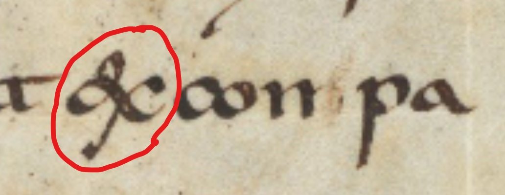
Meanwhile, over on the continent, minuscule forms develop into Merovingian, Visigothic, and other pre-Caroline scripts. TBH, it’s a crazypants free-for-all over there. Look at these [g]s! When they’re ligated, things get even more interesting. (l-r: Luxeuil, Corbie, poss. Laon) ImageImageImage
OK, settle down, everyone. Here comes the standardization of minuscule script during the reign of Charlemagne (hence “Caroline” script). Looks familiar, right? There’s a direct line from 9th-c. Caroline letterforms to the typeface Twitter uses! Image
As Caroline slowly morphs into Romanesque in the 11th-c. (or “proto-Gothic” if you prefer), [g] becomes a bit more structured, sometimes with two closed bows, and sometimes with an open lower bowl. Here’s Gottschalk of Lambach, in the late 12th c. Image
In the early 13th-c., a major aesthetic shift happens in script, just as in architecture. The round vs. angular contrast shows up in script as well. Here’s a Gothic quadrata from 15th-c. France and a bâtarde from the same place and time: ImageImage
Meanwhile, down south in Italy, dudes like Petrarch and Boccaccio resurrect Caroline models in their own 14th-c. scripts, bringing us back to that rounded, two-compartment [g] that looks an awful lot like the one in this very font! Image
And that’s the story of the gorgeous, gregarious, glamourous letter [g]. Drop your favorite in the comments! Come back next week and we’ll do [&]! Image

• • •

Missing some Tweet in this thread? You can try to force a refresh
 

Keep Current with Lisa Fagin Davis

Lisa Fagin Davis Profile picture

Stay in touch and get notified when new unrolls are available from this author!

Read all threads

This Thread may be Removed Anytime!

PDF

Twitter may remove this content at anytime! Save it as PDF for later use!

Try unrolling a thread yourself!

how to unroll video
  1. Follow @ThreadReaderApp to mention us!

  2. From a Twitter thread mention us with a keyword "unroll"
@threadreaderapp unroll

Practice here first or read more on our help page!

More from @lisafdavis

Jan 30
Well, you asked for it, so here it is: a brief history of the mighty ampersand! #BreakfastPaleography
The character we know as the ampersand [&] is used in nearly every Latinate language as a stand-in for the word [and]. But it didn’t start life as an abbreviation. It is actually a ligature, a Latin combination of two letters: [e] and [t], or [et], which in English means [and].
Now that you know that much, you can sort of tell that early ampersands are a capital [E] connected to a [t], right? But then the basic form gets stretched and twisted and transformed until it doesn’t really look like e+t anymore.
Read 15 tweets
Dec 22, 2021
So I thought about going to a museum in Boston today before Omicron shuts them all down but it's damp and foggy and cold and so I think I'll spend the day thinking about interesting paleographical features of the #Voynich manuscript instead. Here comes a Voynich paleography 🧵 ImageImage
Among the most unusual symbols in the manuscript are these, known to Voynichologists as “gallows.” There are four, classified by the number of legs and the number of loops. For convenience, we call them (l-r, t-b) f, p, k, t. Image
Gallows behave in interesting and not-yet-understood ways. They appear to be able to be ligated, like these specimens: Image
Read 8 tweets
Sep 2, 2021
That's all, folks. Here comes a thread on the Vinland Map, one of the OTHER controversial objects at the Beinecke (and here you thought it was all about the #Voynich)...
The story of the map's time in New Haven is fascinating. In the 1960s, the Italian-American community was furious that the map, when thought to be authentic, "proved" that other explorers from Europe had crossed the Atlantic before Columbus (gasp!) (nvm that we knew that already)
Here are some images of political cartoons and letters that Yale received in the '60s from angry alums and members of the Italian-American community:
Read 12 tweets
Dec 6, 2020
In honor of the Feastday of St. Nicholas, let’s take a close look at some scenes from his life as illustrated by Gottschalk of Lambach in the late 12th c., @StaBi_Berlin Theol. Lat. q.140: digital.staatsbibliothek-berlin.de/werkansicht?PP…
This manuscript is a collection of Saint’s Lives and begins (f. 2r) with a visual table of contents: Gottschalk presenting his finished book to the Virgin and Child, with saints around the border. St. Nicholas is in the center right, as Bishop of Myra.
On the verso are four scenes from the Life of St. Nicholas, with original verses as rubrication around the edges.
Read 8 tweets
Aug 27, 2020
OK, brace yourselves, because here comes a REALLY LONG THREAD on liturgical calendars, starring the great Sherborne Missal (a.k.a. @BLMedieval Add MS 74236): access.bl.uk/item/viewer/ar…
Ever found yourself flummoxed by medieval liturgical calendars? I’m here to break it down for you, using the extraordinary Sherborne Missal because this calendar HAS IT ALL! access.bl.uk/item/viewer/ar…
OK, here we go, Liturgical Calendars 101. Liturgical calendars are designed to give a lot of information in a small space and are incredibly efficient. This manuscript has one month per page. We’re looking at folio 4r, a.k.a. July.
Read 21 tweets

Did Thread Reader help you today?

Support us! We are indie developers!


This site is made by just two indie developers on a laptop doing marketing, support and development! Read more about the story.

Become a Premium Member ($3/month or $30/year) and get exclusive features!

Become Premium

Too expensive? Make a small donation by buying us coffee ($5) or help with server cost ($10)

Donate via Paypal

Or Donate anonymously using crypto!

Ethereum

0xfe58350B80634f60Fa6Dc149a72b4DFbc17D341E copy

Bitcoin

3ATGMxNzCUFzxpMCHL5sWSt4DVtS8UqXpi copy

Thank you for your support!

Follow Us on Twitter!

:(