Friday thread time featuring images!
Here's a quick summary thread on how I structure my content pages on my sites.
I'm currently in the process of moving my older sites into this format too.
🧵 #seo #nichesites #nichecontent
Here's a quick summary thread on how I structure my content pages on my sites.
I'm currently in the process of moving my older sites into this format too.
🧵 #seo #nichesites #nichecontent

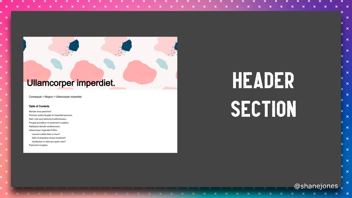
First up we have a header section this has
✅ Relevant image. Optimised and responsive.
✅ Large title, usually the main keyword
✅ Breadcrumb - make sure to use Breadcrumb Schema
✅ Table of Contents - Longer posts this should be collapsed with a "show table of contents" button
✅ Relevant image. Optimised and responsive.
✅ Large title, usually the main keyword
✅ Breadcrumb - make sure to use Breadcrumb Schema
✅ Table of Contents - Longer posts this should be collapsed with a "show table of contents" button
Core Section - We have an introduction section which includes
✅ H2 with a variation on the H1
✅ Large lead paragraph
✅ Bold paragraph that solves the question the page is trying to answer
✅ Continuation paragraph to lead into the rest of the sites content
✅ H2 with a variation on the H1
✅ Large lead paragraph
✅ Bold paragraph that solves the question the page is trying to answer
✅ Continuation paragraph to lead into the rest of the sites content

Then we go into the optional sections. These can be used in any order, any number of times throughout the page.
Option 1 - is a basic Image and Content block. This has
✅ H2 that is relevant to the content in this section
✅ Well spaced content section with short paragraphs
✅ Internal linking to other pages on the site if possible
✅ Optimised WebP / Avif Image on the right
✅ H2 that is relevant to the content in this section
✅ Well spaced content section with short paragraphs
✅ Internal linking to other pages on the site if possible
✅ Optimised WebP / Avif Image on the right

Option 2 - This is the same as the previous section except we have the image and the content flipped 

Option 3 - A Double Image section
This is something I tend to use between block paragraphs of content|
✅ Make sure all images are responsive, optimised WebP or Avif images
This is something I tend to use between block paragraphs of content|
✅ Make sure all images are responsive, optimised WebP or Avif images

Option 4 - List section which comes with
✅ H2 that is relevant to the content in this section
✅ Introduction sentence
✅ List items - If possible I format by length. I've seen this a lot on Twitter. Potentially some science to it but IDK 🤣
✅ Outro paragraph
✅ H2 that is relevant to the content in this section
✅ Introduction sentence
✅ List items - If possible I format by length. I've seen this a lot on Twitter. Potentially some science to it but IDK 🤣
✅ Outro paragraph

Option 5 - A basic content section which has
✅ H2 that is relevant to the content in this section
✅ Well spaced content section with short paragraphs
✅ Internal linking to other pages on the site if possible
Try to not have 2 of these blocks together to avoid a wall of words
✅ H2 that is relevant to the content in this section
✅ Well spaced content section with short paragraphs
✅ Internal linking to other pages on the site if possible
Try to not have 2 of these blocks together to avoid a wall of words

Core Section - FAQ Section which contains
✅ H2 that is the H1 text + FAQ
✅ Intro paragraph
✅ Multiple questions answered in short form
✅ FAQ Schema - I've already got featured snippets using this
✅ Internal linking to other pages on the site if possible
✅ H2 that is the H1 text + FAQ
✅ Intro paragraph
✅ Multiple questions answered in short form
✅ FAQ Schema - I've already got featured snippets using this
✅ Internal linking to other pages on the site if possible

Core Section - Summary section which contains
✅ H2 to start the summary
✅ A few short paragraphs to round off the page
✅ Internal linking to other pages on the site if possible
✅ H2 to start the summary
✅ A few short paragraphs to round off the page
✅ Internal linking to other pages on the site if possible

Using this sectioned layout you should be able to create long, easy to consume pages for your users that keep them on your site.
The core sections all stay, the optional sections you can choose any number of depending on what section fits the content you're trying to write.
The core sections all stay, the optional sections you can choose any number of depending on what section fits the content you're trying to write.
Also on a general page level, don't forget Schema markup!
Depending on what you're writing about there is likely markup that can help
Review - schema.org/Review
Recipe - schema.org/Recipe
Product - schema.org/Product
Place - schema.org/Place
#techseo
Depending on what you're writing about there is likely markup that can help
Review - schema.org/Review
Recipe - schema.org/Recipe
Product - schema.org/Product
Place - schema.org/Place
#techseo
There are a large number of opportunity for ad placements here too.
You can drop ad spaces between each sections or even replace some of the images with Ads.
You can drop ad spaces between each sections or even replace some of the images with Ads.
And thats it. Thats the end of the thread 🙌
How do you structure your pages?
Do you have anything additional that I don't?
How do you structure your pages?
Do you have anything additional that I don't?
Bonus Tip: I used Pixlr to create these images. pixlr.com
It's like photoshop except its free and runs in your browser.
It's like photoshop except its free and runs in your browser.
• • •
Missing some Tweet in this thread? You can try to
force a refresh


