1/
Everyone loves those pretty colored fMRI pictures with the blobs. But what do they mean? How do they make them?
A #tweetorial called “F— that: Understanding fMRI”. #FOAMed #medtwitter #Medstudenttwitter #neurotwitter #FOAMrad #neuroradiology #radiology
Everyone loves those pretty colored fMRI pictures with the blobs. But what do they mean? How do they make them?
A #tweetorial called “F— that: Understanding fMRI”. #FOAMed #medtwitter #Medstudenttwitter #neurotwitter #FOAMrad #neuroradiology #radiology

2/
fMRI is based on a principle called “neurovascular coupling.” This is the principle if there is increased neuronal activity in a region, there will be increased blood flow to that region to meet the increased demand
fMRI is based on a principle called “neurovascular coupling.” This is the principle if there is increased neuronal activity in a region, there will be increased blood flow to that region to meet the increased demand

3/
Think of it like a baby crying because it is hungry—parents immediately rush to feed it. The increased oxygen demand of the neurons immediately brings increased fuel to feed it.
Think of it like a baby crying because it is hungry—parents immediately rush to feed it. The increased oxygen demand of the neurons immediately brings increased fuel to feed it.

4/
However, the body actually overreacts to that demand—it is like going McDonald’s when you are starving—you are going to walk away with way more food than you need and end up feeling incredibly stuffed. The neurons end up getting way more oxygenated blood than they need.
However, the body actually overreacts to that demand—it is like going McDonald’s when you are starving—you are going to walk away with way more food than you need and end up feeling incredibly stuffed. The neurons end up getting way more oxygenated blood than they need.

5/
This changes the oxygenated to deoxygenated blood ratio. Initially deoxygenated blood is increased b/c activated neurons are using up oxygen, but this is soon overwhelmed by supply. So counterintuitively—oxygenated blood is more with this metabolic activity.
This changes the oxygenated to deoxygenated blood ratio. Initially deoxygenated blood is increased b/c activated neurons are using up oxygen, but this is soon overwhelmed by supply. So counterintuitively—oxygenated blood is more with this metabolic activity.

6/
This is important b/c deoxygenated blood⬇️fMRI signal & oxygenated blood⬆️it. Initially, a signal drop occurs as neurons use up oxygen, but the tidal wave of oxygenated blood coming in overwhelms this & you get increased signal w/neuronal activity.
This is important b/c deoxygenated blood⬇️fMRI signal & oxygenated blood⬆️it. Initially, a signal drop occurs as neurons use up oxygen, but the tidal wave of oxygenated blood coming in overwhelms this & you get increased signal w/neuronal activity.

7/
So if you perform an activity, say finger tapping, the regions involved in finger tapping (motor cortex) will experience increased blood flow compared to regions of the brain that are not involved in that activity.
So if you perform an activity, say finger tapping, the regions involved in finger tapping (motor cortex) will experience increased blood flow compared to regions of the brain that are not involved in that activity.

8/
B/c of increased blood flow, oxygenated blood & fMRI signal will increase in regions involved in a task compared to those not involved. This is how we map what brain regions are associated with an activity—not just finger tapping, but language, memory, etc.
B/c of increased blood flow, oxygenated blood & fMRI signal will increase in regions involved in a task compared to those not involved. This is how we map what brain regions are associated with an activity—not just finger tapping, but language, memory, etc.

9/
fMRI images are made by subtracting images taken during baseline (no activity) from images taken during activity. All that will left after the subtraction is the increased flow/signal over baseline--and this will only be in regions activated by the task.
fMRI images are made by subtracting images taken during baseline (no activity) from images taken during activity. All that will left after the subtraction is the increased flow/signal over baseline--and this will only be in regions activated by the task.

10/
For the baseline image, no activity is performed, and so no regions are activated, so all regions will show low signal.
For the baseline image, no activity is performed, and so no regions are activated, so all regions will show low signal.

11/
When a task begins, blood flow only increases to regions involved in the task, so only those regions will have increased blood flow/signal over baseline. This example is finger tapping, but we can map which regions are associated w/more complex brain activities.
When a task begins, blood flow only increases to regions involved in the task, so only those regions will have increased blood flow/signal over baseline. This example is finger tapping, but we can map which regions are associated w/more complex brain activities.

12/
Here is an example w/finger tapping. At baseline, the motor cortex is not activated & has low flow. But w/finger tapping, signal increases w/increased flow. So when we subtract baseline images from activity images, the increased signal over baseline remains.
Here is an example w/finger tapping. At baseline, the motor cortex is not activated & has low flow. But w/finger tapping, signal increases w/increased flow. So when we subtract baseline images from activity images, the increased signal over baseline remains.

13/
On the fMRI images, we see the increased signal over baseline as the colored blobs you all recognize. These just mean there is increased blood flow in this region over baseline with a given activity, and so that specific activity maps to that region.
On the fMRI images, we see the increased signal over baseline as the colored blobs you all recognize. These just mean there is increased blood flow in this region over baseline with a given activity, and so that specific activity maps to that region.

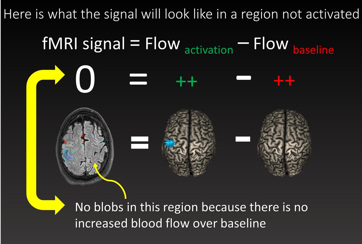
14/
Now let’s look at a region not activated by finger tapping. At baseline, it is not activated & has low flow. W/finger tapping, it is also not activated & flow is same as baseline. So w/subtraction, the 2 images are identical & cancel out, so signal is 0.
Now let’s look at a region not activated by finger tapping. At baseline, it is not activated & has low flow. W/finger tapping, it is also not activated & flow is same as baseline. So w/subtraction, the 2 images are identical & cancel out, so signal is 0.

15/
Since signal is zero, there are no colored blobs in this region and so we know this region is not associated with the task.
Since signal is zero, there are no colored blobs in this region and so we know this region is not associated with the task.
16/
So those fMRI colored blobs just mean there is⬆️flow in a region w/an activity & so that region is involved in performing that task. That's how we map the different "functions" of brain regions
So next time if someone asks you if you understand fMRI you can say “F--- yeah!”
So those fMRI colored blobs just mean there is⬆️flow in a region w/an activity & so that region is involved in performing that task. That's how we map the different "functions" of brain regions
So next time if someone asks you if you understand fMRI you can say “F--- yeah!”

• • •
Missing some Tweet in this thread? You can try to
force a refresh