A thread about using fonts/typography in presentations. Decisions about text matter. Just as you can speak the same word in many ways, the way you write text can affect communication, emotion, and attitude. 🧵1/19 Before and after examples of text/typography choices in pres
Some basics: Fonts are commonly characterized as serif fonts or sans serif fonts. Serifs are little projections that hang off the ends of letters. Sans serif fonts do not have these projections. 🧵2/19 Serif vs sans serif fonts
Serif fonts are great for printed words on a page. In fact, the purpose of the serifs are to guide the eye in reading text from left to right on a page. This is why most journals/books/magazines use serif fonts. 🧵3/19 The serif fonts Garamond, Georgia, and Times New Roman
Sans serif fonts are easier to see and perceive from a distance. All billboards and theater marquees feature sans serif fonts. Sans serif fonts are best for slides and posters because text is easier to read from across a room. 🧵4/19 The sans serif fonts Calibri, Century Gothic, and Helvetica
In figures, sans serif fonts are always the best choice because they are easiest to perceive. Arial or Helvetica are always excellent and accepted by any printed journal. 🧵5/19 Before and after versions of a graph with serif versus sans
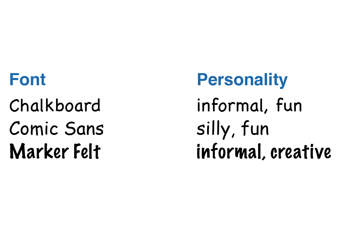
Some sans serif fonts convey a bit more personality than others. They can make a slide or poster presentation seem less standard or routine without being too playful or unprofessional. 🧵6/19 Sans serif fonts Futura, Gill Sans, and Myriad Pro
Some sans serif fonts are extremely playful. However, they may be conspicuously playful in a way that is distracting and draws attention from the content. They also might look like a presenter is trying too hard to be fun. 🧵7/19 Fonts Chalkboard, Comic Sans, and Marker Felt
Non-proportional (also called “monospaced”) fonts are fonts in which each character has the same width. These fonts are terrific for writing letters in a sequence, such as sequences of DNA, amino acids, or computer code. 🧵8/19 Monospace Type fonts Courier, Letter Gothic, and Lucida Sans
Specialty fonts convey a lot of personality and tone. They are ideal during moments when you may want to conspicuously capture an audience’s attention, but can easily be distracting. I use them sparingly. 🧵9/19 Fun alternative fonts: Adventure, Princetown Let, and The Ne
Obviously, the ultimate goal of a font is to be legible. In written presentations, a standard serif font is usually best. For slide or poster presentations, casing, contrast, bolding, italicization, and color can all affect legibility. 🧵10/19 Legibility of sentences depending on bold, italics, casing,
A common misconception is that the size of a font is the distance from the bottom to top of a character. In reality, a font size is the height of an imaginary metal block, as it would exist in an old-fashioned typewriter! 🧵11/19 The characters "p" and "d" as they would
Computers specify the size of a font in “points.” A point is defined as 1/12 of a pica, which itself is about 1/6 of an inch. 🧵12/19 The definition of font point size relative to a pica and an
Because the point size is the height of an imaginary block in a typewriter and not the height of the character itself, the only way to know exactly how large a font will appear in a particular point size is to try it! 🧵13/19 Examples of different fonts written in the same point size t
It is fun to be deliberate about typesetting, the way characters are arranged together in a word, in a sentence, or on a page. 🧵14/19 Examples of changing tracking, font height, and leading betw
Communication is also enhanced when words are grouped together in a pleasing manner on a slide or poster. 🧵15/19 Examples of two-dimensional shapes caused by lines of text o
I have only seen one exception in which isolated words look good and unless you are the director of Star Wars, I wouldn’t advise it. 🧵16/19 The Star Wars opening slide: A long time ago, in a galaxy fa
Bullets are a great way to group items into a list or sequence. Like any other visual element, their use should incorporate some simple design principles to increase clarity and communication. 🧵17/19 Examples of good bullet design
Use numbers when you want to show an ordered sequence and a bullet when the sequence is arbitrary. 🧵18/19 Example of when to use bullets versus numbers
I’ll have more to say about fonts and typography in the coming days when talking about slides and posters! Fonts and typography enhance communication and attitude in all forms of presentations. 🧵19/19

• • •

Missing some Tweet in this thread? You can try to force a refresh
 

Keep Current with IAmSciComm - Hosted this week by Matt Carter

IAmSciComm - Hosted this week by Matt Carter Profile picture

Stay in touch and get notified when new unrolls are available from this author!

Read all threads

This Thread may be Removed Anytime!

PDF

Twitter may remove this content at anytime! Save it as PDF for later use!

Try unrolling a thread yourself!

how to unroll video
  1. Follow @ThreadReaderApp to mention us!

  2. From a Twitter thread mention us with a keyword "unroll"
@threadreaderapp unroll

Practice here first or read more on our help page!

More from @iamscicomm

May 31
A thread about using color as a design tool in science presentations. Color is a great tool to separate different categories of information, to highlight information, or to establish an emotional tone. 🧵1/20 Scientific graphs showing how good color choices enhance com
Color is best when used deliberately. When color is used to decorate rather than to design, important information can be obscured, and slides and posters can look like a trip to the circus. 🧵2/20 Examples of good and bad use of color in slides
The most fundamental colors are pure hues: a color’s purest identity. 🧵3/20 Color hues: red, orange, yellow, green, blue, and purple
Read 20 tweets
May 30
I have been inspired in scientific presentation design not only by my scientific mentors and colleagues, but also by famous designers. Here are 12 quotes that inspire me that may inspire your own science presentation design as well: 🧵1/13
"Good design is a lot like clear thinking made visual." Edward Tufte, data visualization and information design pioneer 🧵2/13
"Design brings content into focus; design makes function visible." Jennifer Morela, graphic designer and professor 🧵3/13
Read 13 tweets
May 30
A thread about what it means to “design” a science presentation. Design is ultimately about determining the impact you want to have on other people and then establishing the best way to achieve that objective. 🧵1/14 Cartoon of a scientist presenting a data slide
We live in a world with excellent “product design,” “website design,” “graphic design,” etc. Professional designers envision the user experience and work backwards to create great design to best impact the end user. 🧵2/14 Apple designer Jony Ive showing his design of a MacBook Pro
The Twitter feed you are reading right now was designed. So was the physical device you are reading this on. Every pen, every stapler, every coffee mug… at some point a designer thought about your experience using these items. 🧵3/14 Various consumer products that were designed to maximize the
Read 14 tweets
Sep 27, 2021
A thread on understanding the importance of 'complementary colors' in science figures 🎨👇🏼
(tl;dr, it will enhance color harmony, make your data 'pop', highlight antagonistic reactions, and keep your images color-blind accessible) an image describing the com...
Some of the top companies in the world make use of complementary colors to make their logos and branding 'pop'

(caution: I'd still avoid the red-green color combo to avoid colorblind accessibility issues!) Image
In other design industries, the use of complementary colors is subtle but extremely effective (especially when creating color balance and accent colors!) Image
Read 5 tweets
Aug 4, 2021
Thanks for being brave and helping us learn @AryaCampaigns! Here's my redesign!

Your focus is ACCESS. Currently that is buried and obscured. Suggest a #stackedbarchart #infographic to show your avg access, then break down by low and high health literate.
cont... Redesign of graphic showing support for eHealth intervention
honestly, in this case, your graphics are fighting your message, and I'd just get down to clearly showing your data. I'd also rather have labels than icons here, because I'm struggling to understand exactly what some of the icons are.
cont...
Possible to bring some images back in what I've labled demographics, but you may want to ask yourself what those are doing to help your message. Some of the side info could be cut.
Read 6 tweets
Aug 4, 2021
I've been thinking a lot about #illustration and #graphics in #scicomm and the place they play in design.

Like text, images hold info. I like to think of my images in terms of question-centered design as well. Here's a system of levels I've made to help me organize images:
1. Observational, descriptive. What something is, its inherent form, materials and characteristics. (what, who) Pen and ink drawing of a lithic
2. Contextual, locative. Puts the subject in a setting, either placing it in geographic or temporal space. Gives us the position relative to time or location. (where, when) lithic drawing, with leader lines placing it on a timeline a
Read 7 tweets

Did Thread Reader help you today?

Support us! We are indie developers!


This site is made by just two indie developers on a laptop doing marketing, support and development! Read more about the story.

Become a Premium Member ($3/month or $30/year) and get exclusive features!

Become Premium

Don't want to be a Premium member but still want to support us?

Make a small donation by buying us coffee ($5) or help with server cost ($10)

Donate via Paypal

Or Donate anonymously using crypto!

Ethereum

0xfe58350B80634f60Fa6Dc149a72b4DFbc17D341E copy

Bitcoin

3ATGMxNzCUFzxpMCHL5sWSt4DVtS8UqXpi copy

Thank you for your support!

Follow Us on Twitter!

:(